-
More artworks below this tip
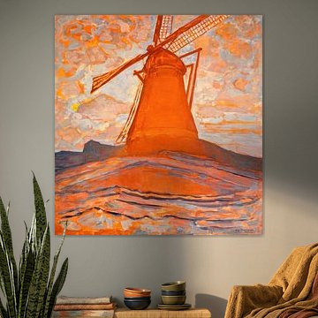
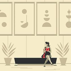
Living rooms suit geometric compositions with energy
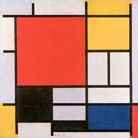
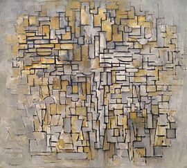
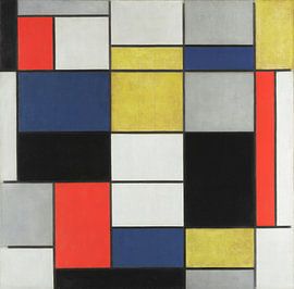
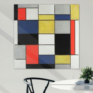
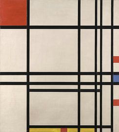
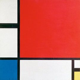
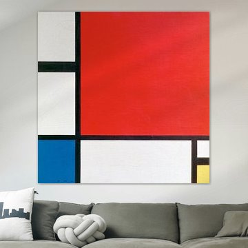
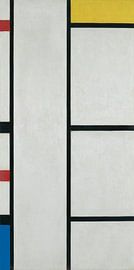
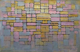
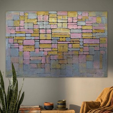
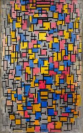
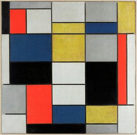
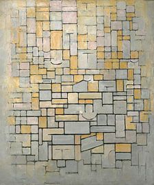
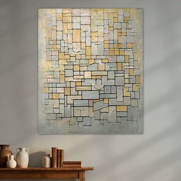
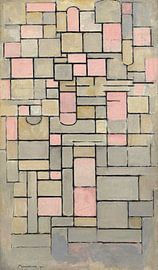
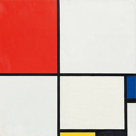
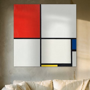
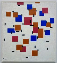
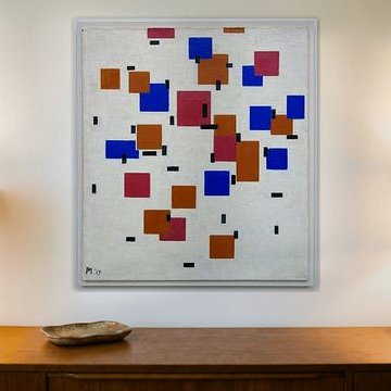
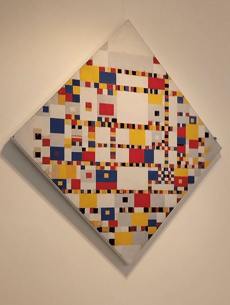
Artworks with clear structure and vibrant contrast bring focus to social spaces. The bold red and blue rectangles in Piet Mondriaan. Composition II in Red, Blue, and Yellow create visual interest without overwhelming a room. Hang it where natural light can highlight the clean lines and primary color balance throughout the day.
AnouschkaArt Stylist Questions? Check out our FAQ
 -
More artworks below this tip
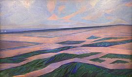
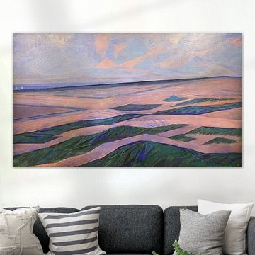
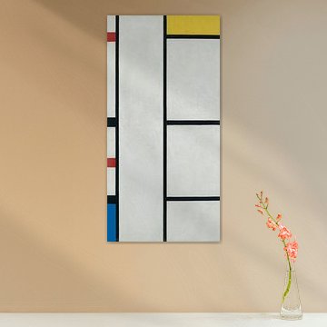
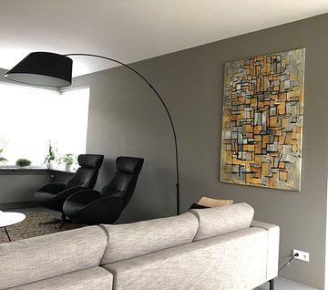
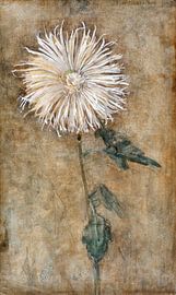
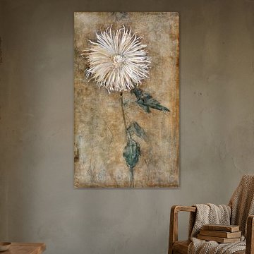
Portrait and landscape formats are equally popular here
Both vertical and horizontal layouts work well in this collection, so choose what suits your wall space. Portrait format adds height to narrow walls, while landscape orientation fits beautifully above sofas or sideboards. Select the format that matches your room layout and hanging area.
EileenStylist & Customer service Questions? Check out our FAQ
 -
More artworks below this tip
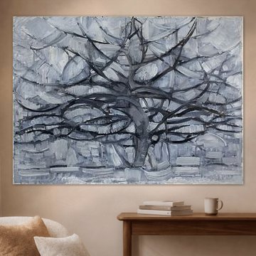
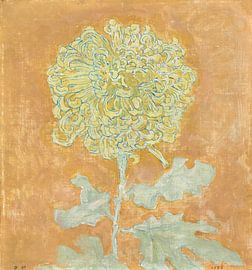
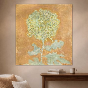
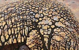
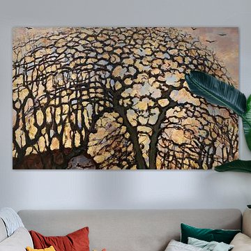
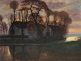
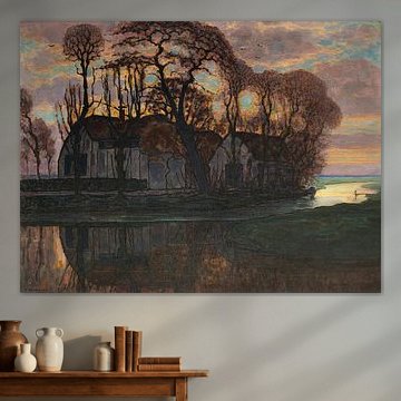
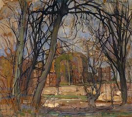
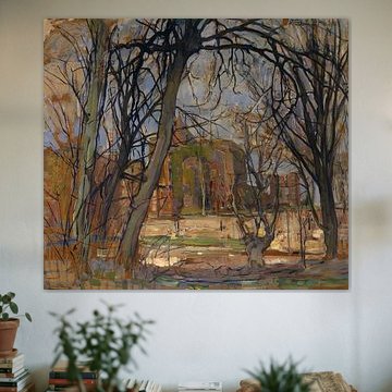
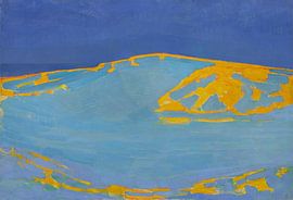
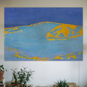
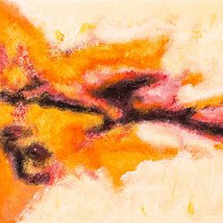
Softer tones bring a calming, organic feel
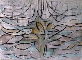
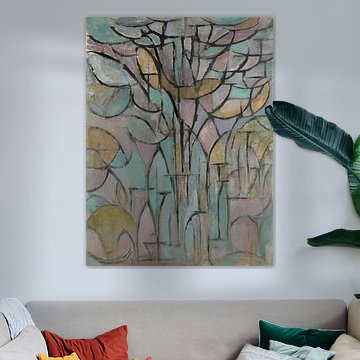
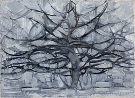
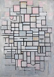
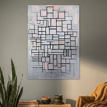
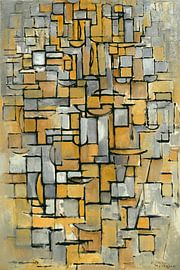
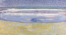
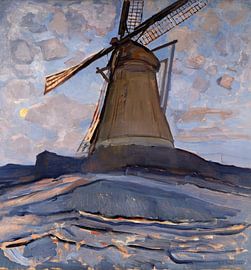
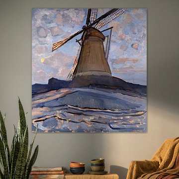
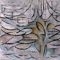
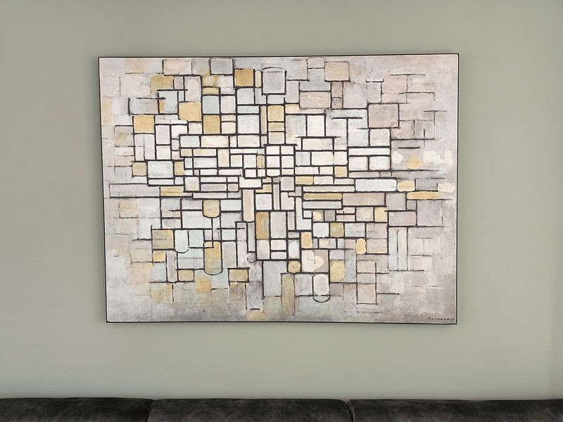
Abstract art doesn't always mean bold color blocks. The muted palette of sage green, taupe, and early dew in Trees, Piet Mondriaan creates a gentle, dreamy atmosphere. This approach works particularly well in bedrooms or reading corners where you want a quieter, more restful mood.
LianneStylist & Customer service Questions? Check out our FAQ
Piet Mondriaan
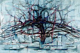
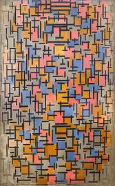
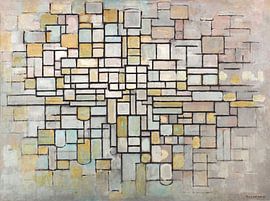
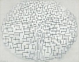
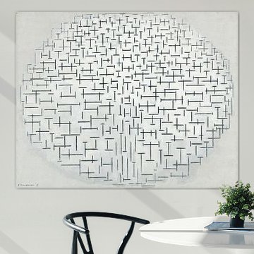
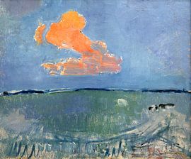
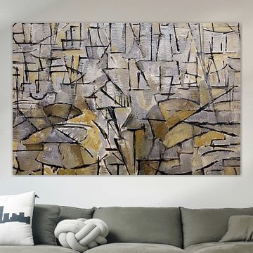
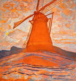
Piet Mondriaan's geometric precision brings calm and clarity to any space. His work evolved from expressive tree studies like Gray Tree (1911) Piet Mondrian to the iconic grids of primary colors that define modern abstraction. Whether you're drawn to his early nature-inspired compositions or the pure balance of his later neoplastic works, Mondriaan's art complements minimalist and contemporary interiors with timeless structure.
At Art Heroes, we create each piece to order - choose from ArtFrame™, Canvas, Poster and more. Free shipping and crafted by talented European artists.


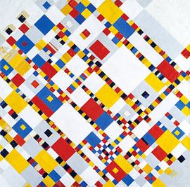


Be sure to check out the creative new masters
Our artists have created artworks inspired by the old masters.


Trusted and loved
Customers rate us 4.8!
High-quality materials
Sustainable and long-lasting beauty
Different sizes
From small to large, anything is possible.
Made for you
Made the moment you order.
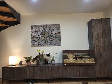
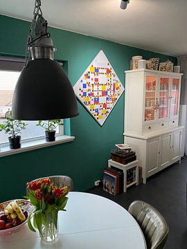
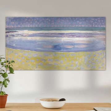
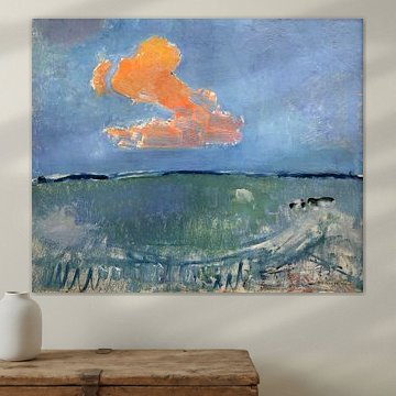
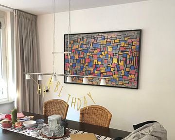
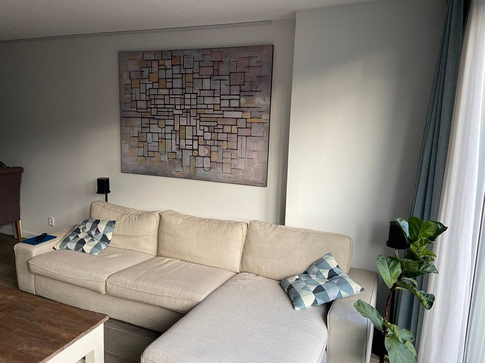
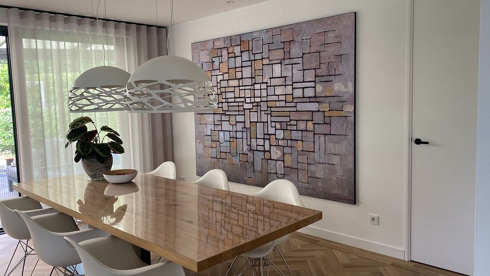
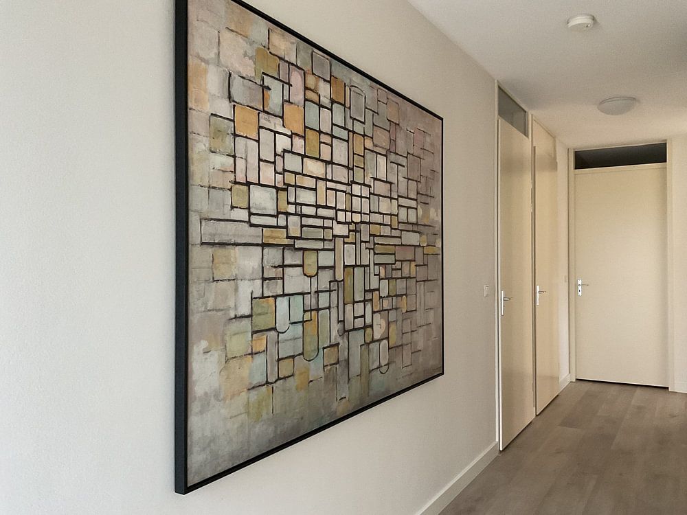
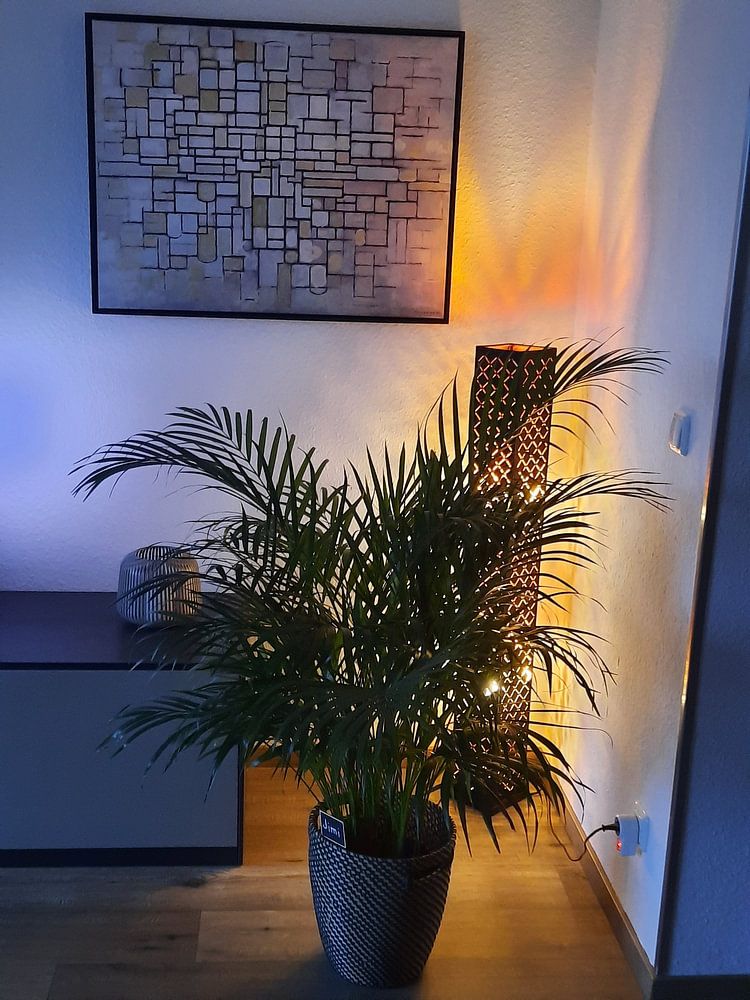
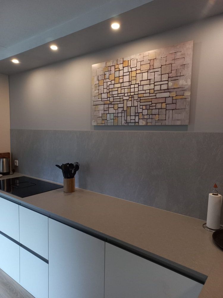
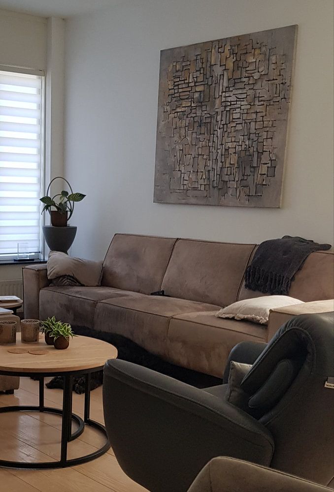
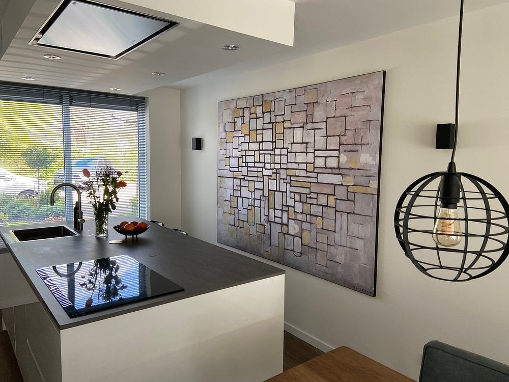
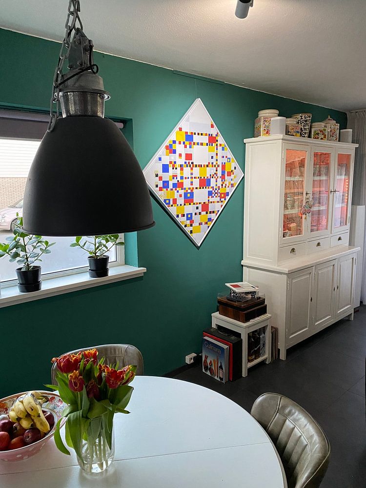
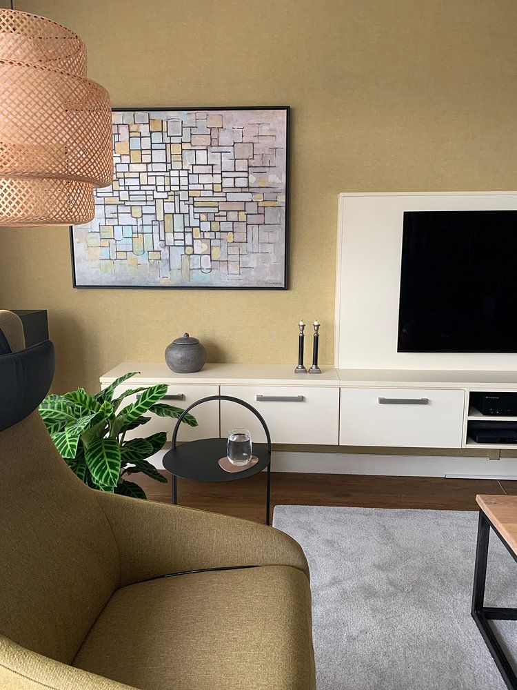
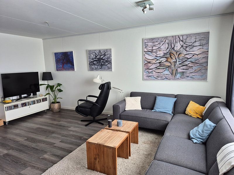
How they hang in other homes
Get inspired by beautiful artworks on other people's walls and see how they truly enhance an interior.


More like this


Which colors in Piet Mondriaan's work suit a minimalist interior?
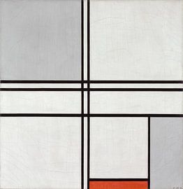
The neutral palette of beige, taupe, and grey in Piet Mondriaan's work pairs beautifully with minimalist interiors. These earthy tones create calm, balanced spaces without overwhelming your walls. Combine beige pieces with natural wood furniture and soft textiles for a warm minimalist look. Grey and taupe artworks work well alongside white walls and simple lines, while subtle mauve or brown accents add gentle depth to keep the space from feeling too stark.
How do you choose the right format for Piet Mondriaan art?
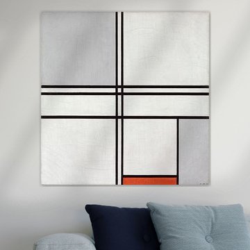
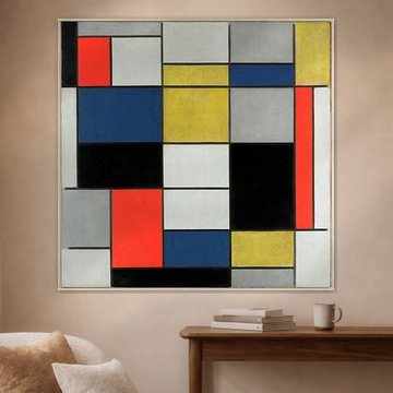
Square formats dominate this collection and work particularly well above sideboards or in narrow hallways where they create visual balance. A square piece sits naturally above a console table or between two windows, giving the wall structure without taking up too much horizontal space. Portrait formats offer a good alternative for tighter walls beside doorways or in staircases, where vertical artworks draw the eye upward and make the room feel taller.
Where does Piet Mondriaan work well in your home?
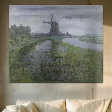
A bedroom is a good spot for this collection, thanks to the calm and mysterious moods that encourage rest and quiet reflection. The muted beige and grey tones create a soothing atmosphere that helps you unwind at the end of the day. Hang a piece above your bed or on the wall opposite your nightstand to set a peaceful mood. On Canvas, the soft texture adds warmth, while Poster offers an affordable way to refresh your bedroom walls with understated elegance.
