
Piet Mondriaan
Piet Mondriaan defined modern abstract art. His signature grids of black lines and primary colors remain instantly recognizable today. But his journey from expressive tree paintings to pure geometric forms reveals a fascinating evolution - one that continues to inspire minimalist and contemporary interiors alike.
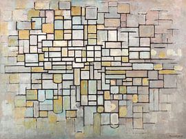
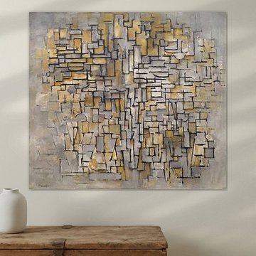
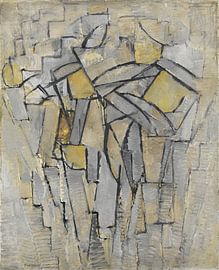
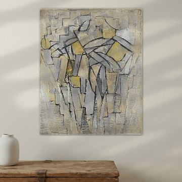
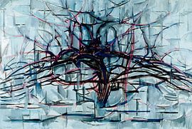
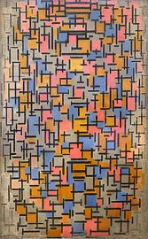
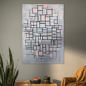
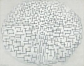
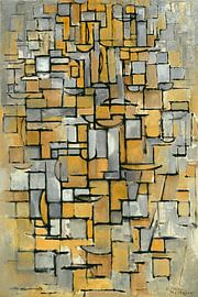
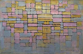
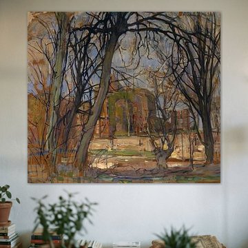
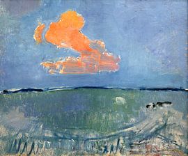
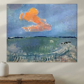
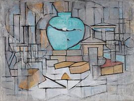
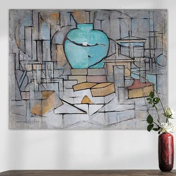
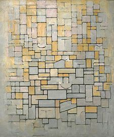
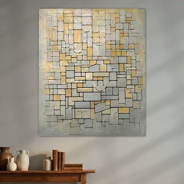
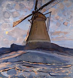
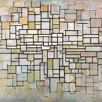
From the vibrant branches of Red Tree, Piet Mondrian 1908-10 to the refined balance of Abstraction, Piet Mondriaan, Mondriaan's artworks bring structure and calm to any space. His compositions work beautifully in clean, modern rooms where simplicity speaks volumes.
Available as Canvas, ArtFrame™, Poster and more - choose the format and size that fits your wall.
-
More artworks below this tip
Use softer tones for calm, layered spaces
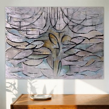
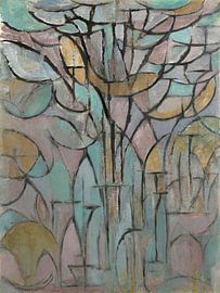
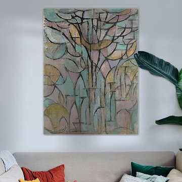
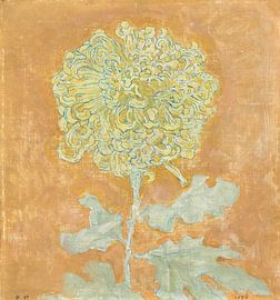
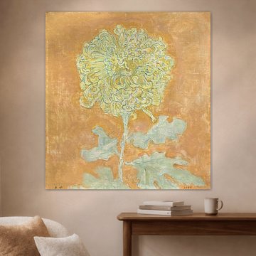
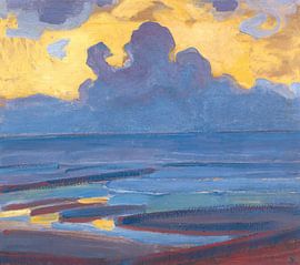
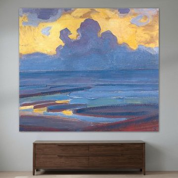
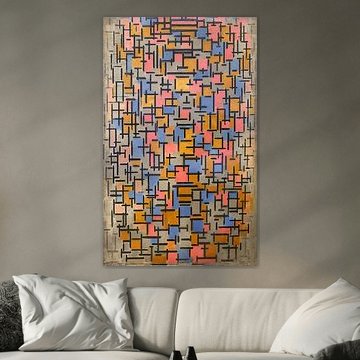
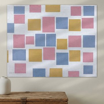
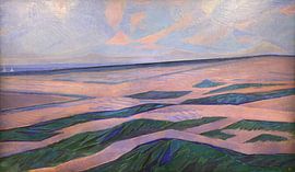
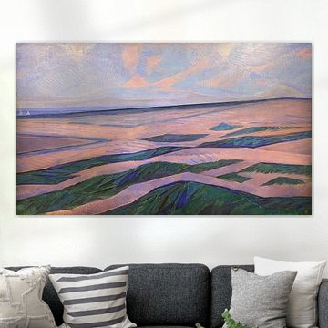
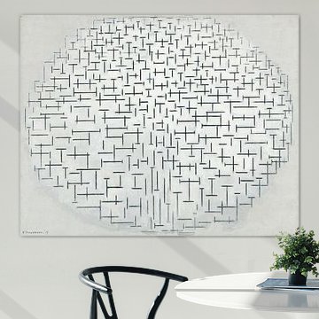
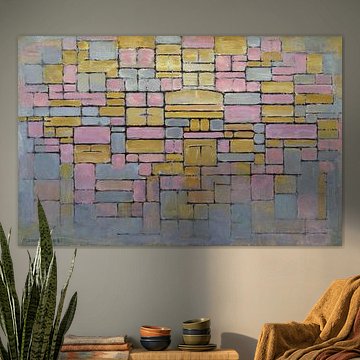
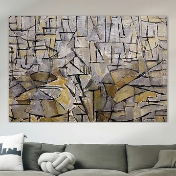
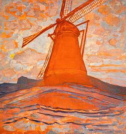
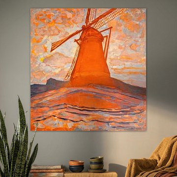
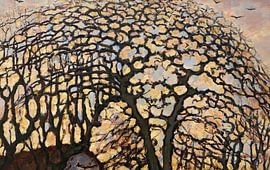
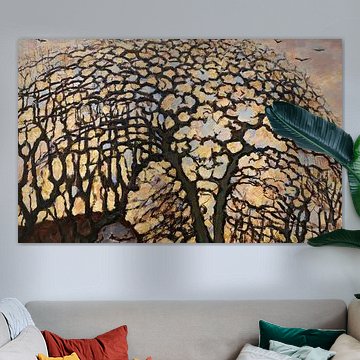
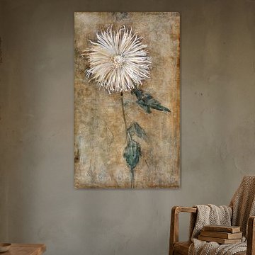
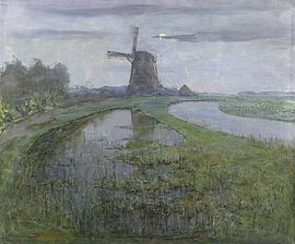
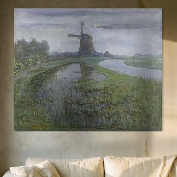
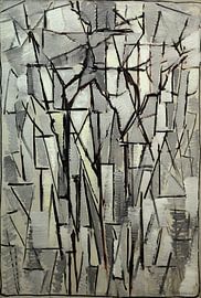
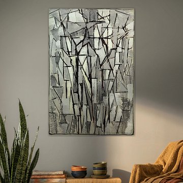
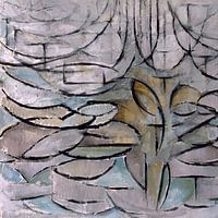
Not all abstract art needs to shout. Muted palettes with grey, taupe, and sage green introduce depth without overwhelming your interior. These softer hues work beautifully in bedrooms, reading corners, or anywhere you want a peaceful atmosphere. The gentle tones in Trees, Piet Mondriaan create a dreamy, understated mood.
KatharinaStylist & Customer service Questions? Check out our FAQ
 -
More artworks below this tip
Pair bold primary colors with neutral surroundings
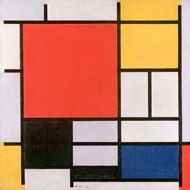
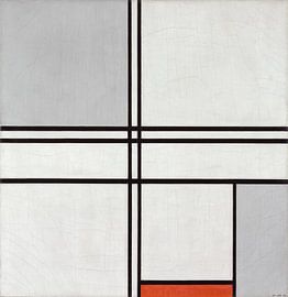
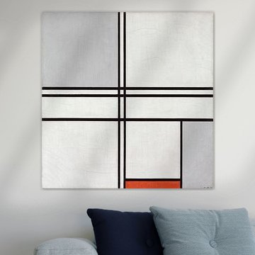
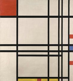
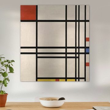
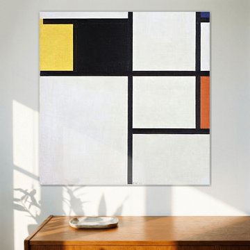
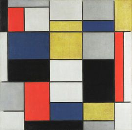
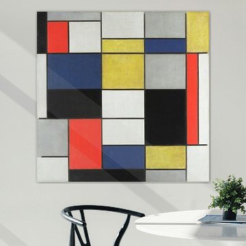
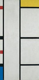
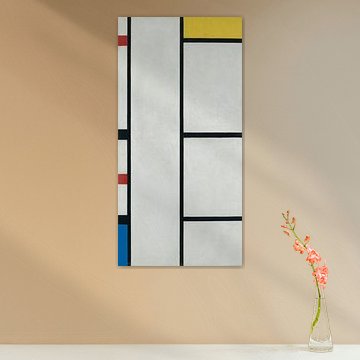
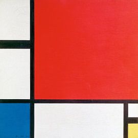
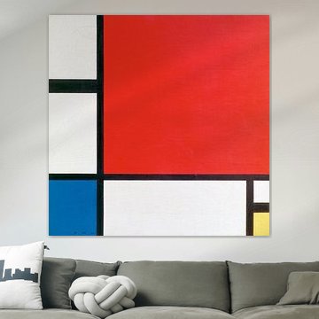
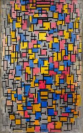
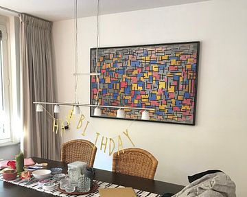
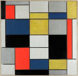
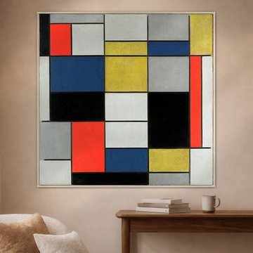
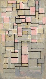
Primary reds, blues, and yellows create strong focal points that work best when balanced with calm, neutral tones. Let the artwork stand out by pairing it with beige, grey, or taupe furniture and walls. The bold red and blue rectangles in Piet Mondriaan. Composition II in Red, Blue, and Yellow gain even more impact against a muted backdrop.
GinaStylist & Customer service Questions? Check out our FAQ
 -
More artworks below this tip
Match the mood to the room's purpose
Vibrant artworks energize social spaces, while calmer pieces suit private areas. Consider what feeling you want to encourage in each room. A lively geometric design works well in a dining room or studio, while softer abstract forms bring tranquility to a bedroom or study nook.
EileenStylist & Customer service Questions? Check out our FAQ






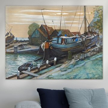
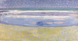
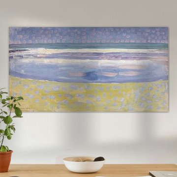
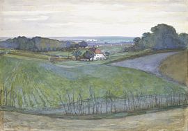
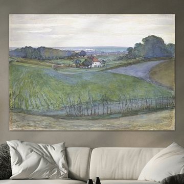
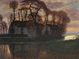
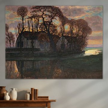
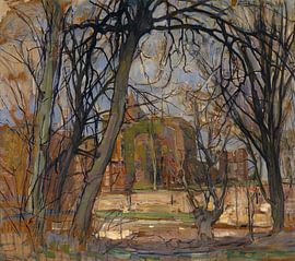
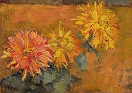
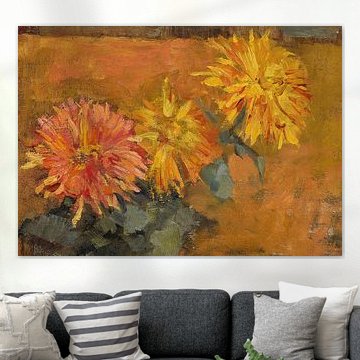
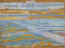
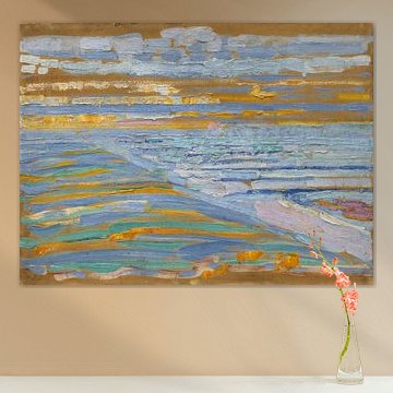


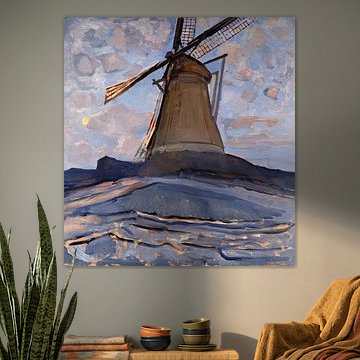
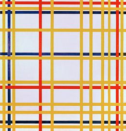
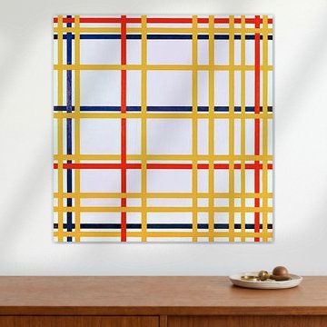
Be sure to check out the creative new masters
Our artists have created artworks inspired by the old masters.
Trusted and loved
Customers rate us 4.8!
High-quality materials
Sustainable and long-lasting beauty
Different sizes
From small to large, anything is possible.
Made for you
Made the moment you order.
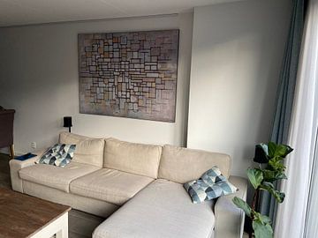
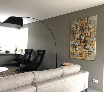
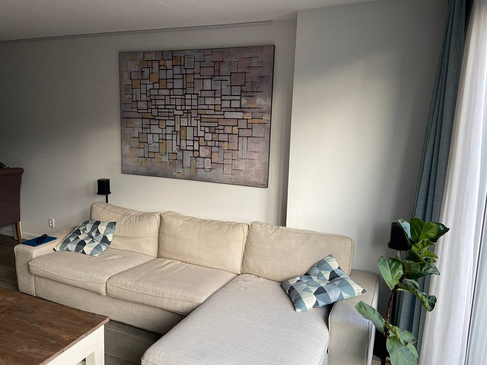
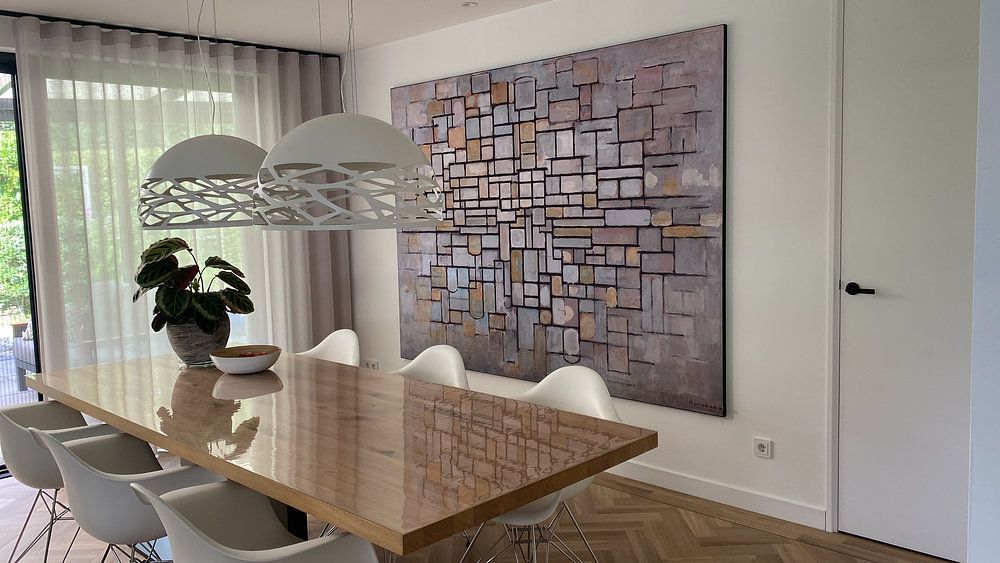
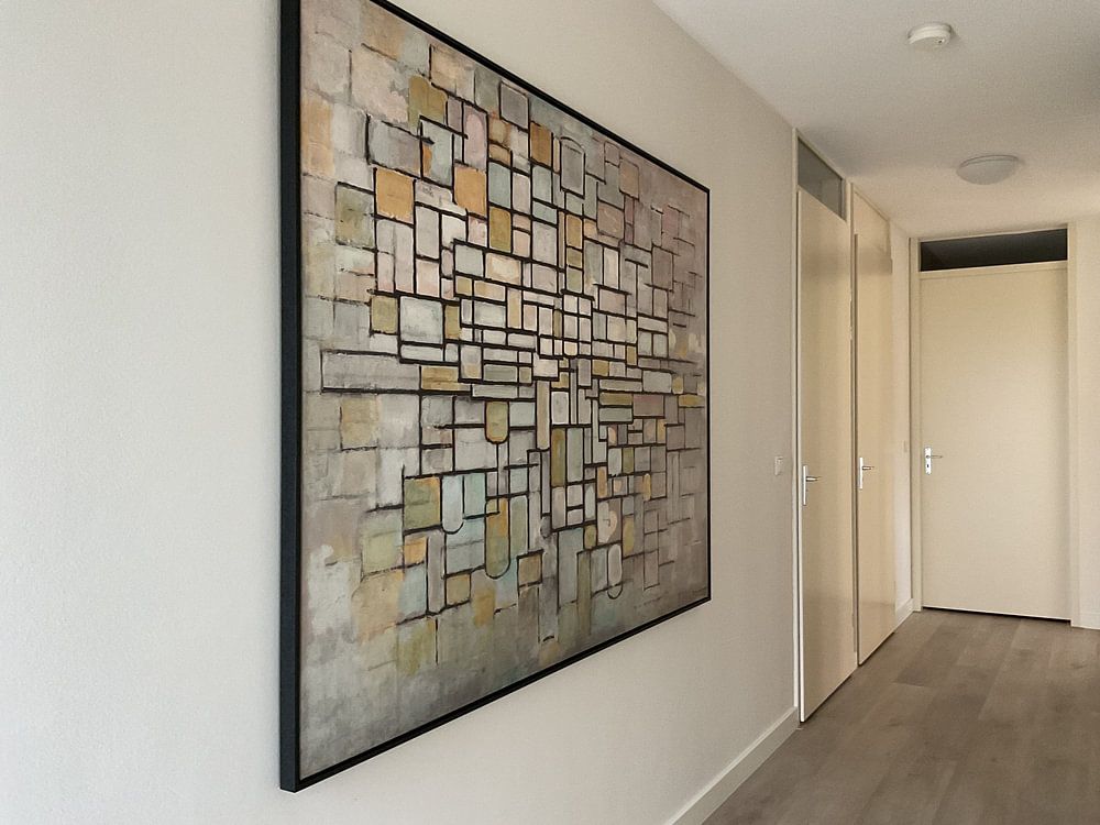
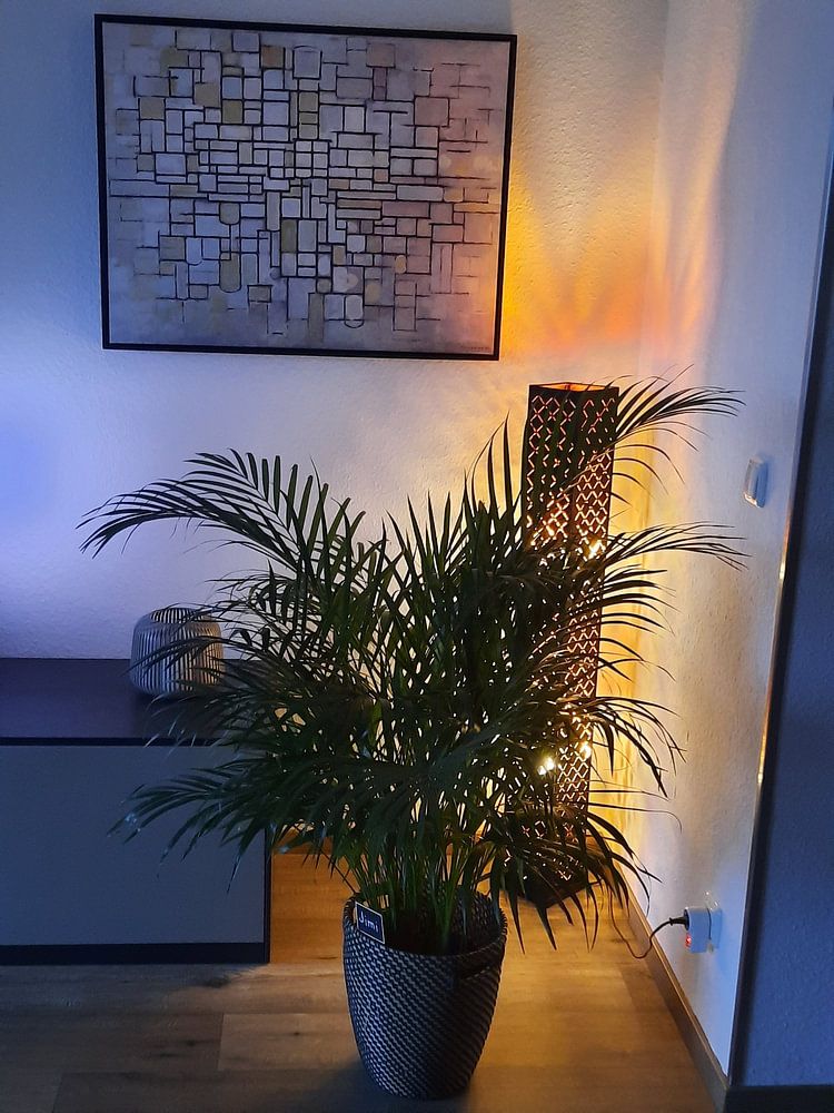
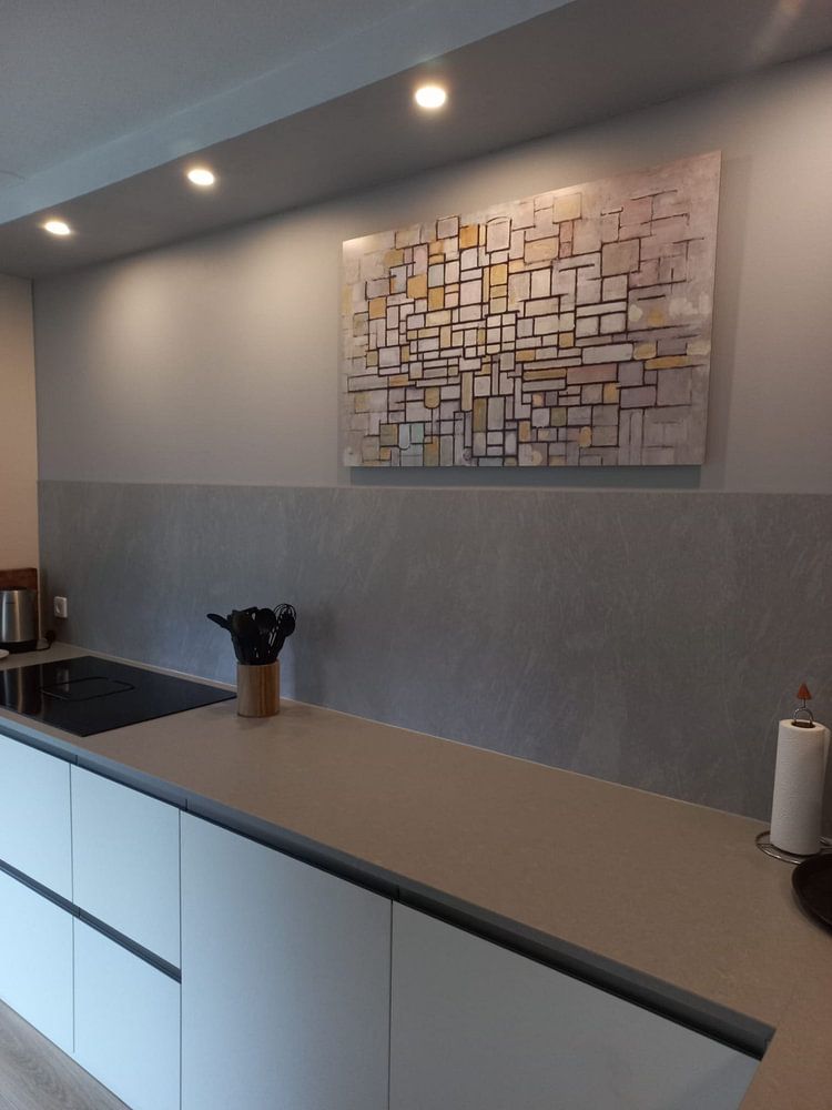
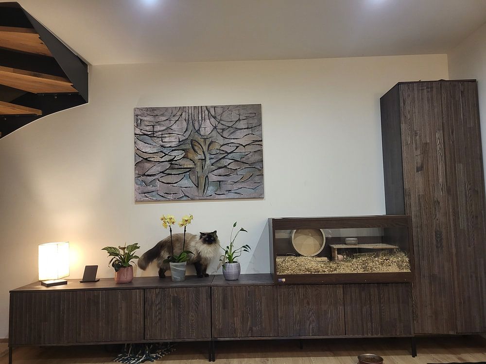
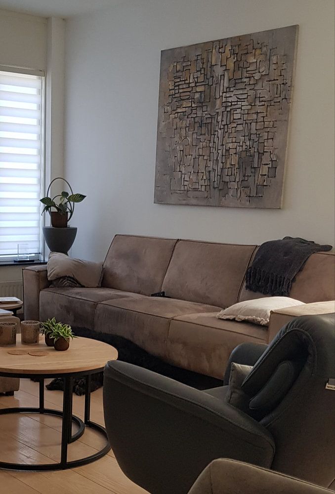
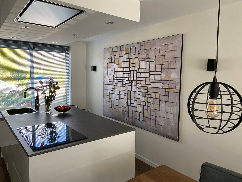
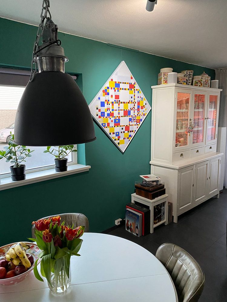
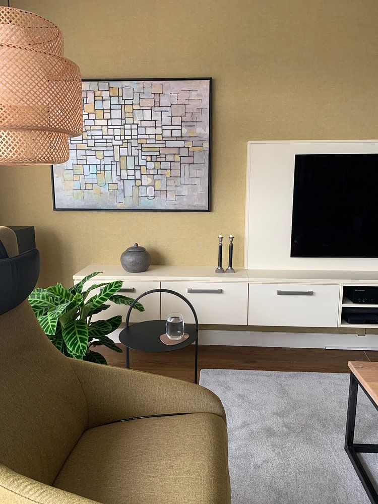
How they hang in other homes
Get inspired by beautiful artworks on other people's walls and see how they truly enhance an interior.


More like this
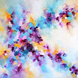
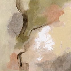

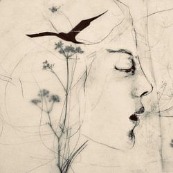

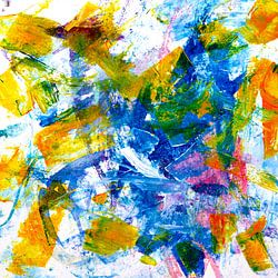

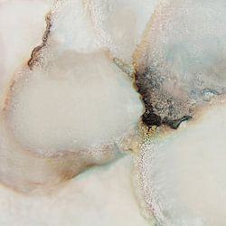
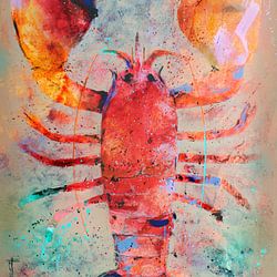

Where art by Piet Mondriaan works well in your bedroom
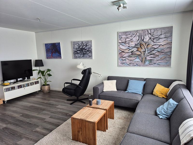
Art by Piet Mondriaan is a good spot for the bedroom, particularly when you want to create a calm retreat. The muted palette of beige, taupe, and grey tones supports a restful atmosphere that encourages relaxation at the end of the day. These earthy colors blend seamlessly with soft textiles and natural wood, making the space feel grounded without overwhelming the senses.
Choosing the right format for Piet Mondriaan artworks
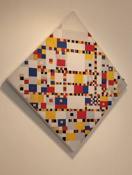
Piet Mondriaan artworks often suit square formats, which work well above a nightstand or centered on a narrow wall. The balanced proportions of a square create a sense of harmony that complements the structured compositions typical of this collection. For wider walls, such as above a dresser or headboard, a horizontal format offers better visual balance and anchors the furniture below.
Color styling with art by Piet Mondriaan
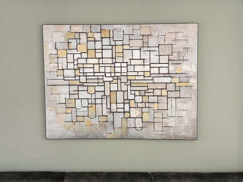
Art by Piet Mondriaan pairs naturally with a minimalist interior, where the restrained color palette of grey, beige, and taupe supports clean lines and uncluttered spaces. Combine these neutral tones with white walls and pale wood furniture to let the subtle mauve and brown accents stand out gently. This approach keeps the room feeling open and serene while adding visual interest through understated color variation.