-
More artworks below this tip
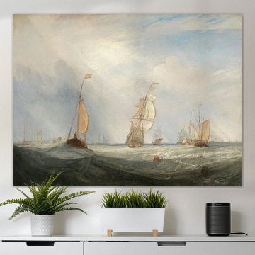
Pairing dramatic seascapes with calmer interiors
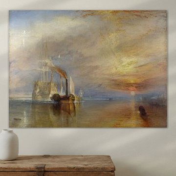
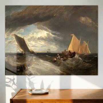
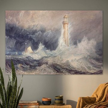
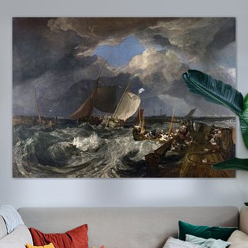
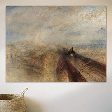
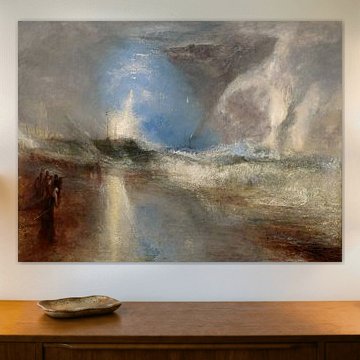
Turbulent maritime scenes bring natural energy to minimalist or neutral spaces. The movement and drama create a focal point without overwhelming your room. Balance works best when your furniture and walls stay understated. A powerful example is Long Ship's Lighthouse, Land's End, William Turner, where the crashing waves and stormy atmosphere command attention in calm, contemporary settings.
AnthiStylist & Customer service Questions? Check out our FAQ
 -
More artworks below this tip
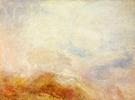
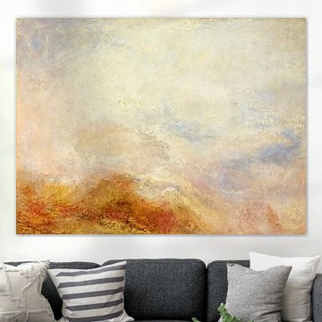
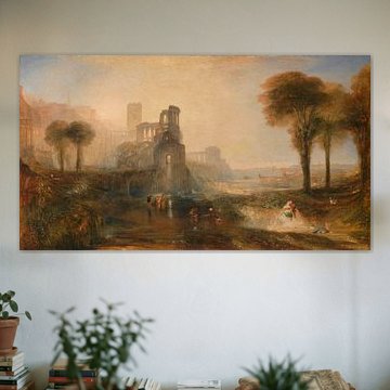
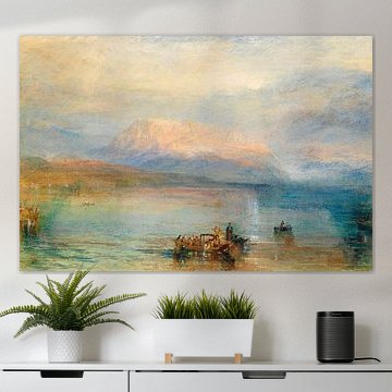
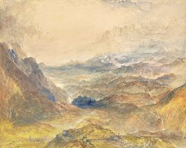
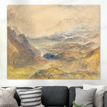
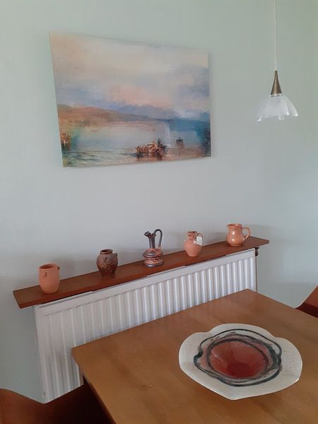
Working with warm earth tones
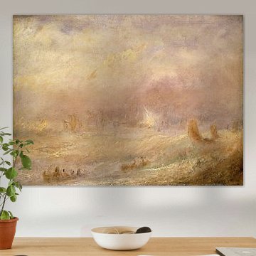
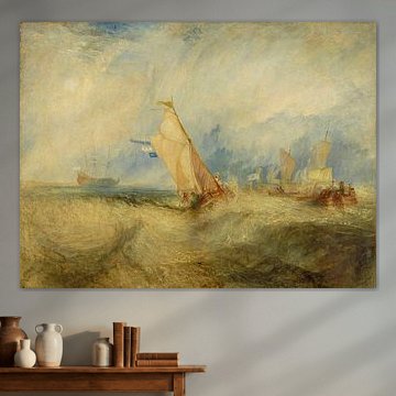
Beige, taupe, and bronze hues create a warm, grounded feel that suits many interiors. These colours pair beautifully with natural materials like wood, linen, or terracotta accessories. For a cohesive look, echo the soft sage and bronze tones in cushions or throws. The palette in Long Ship's Lighthouse, Land's End, William Turner works particularly well in living rooms with earthy textures.
EileenStylist & Customer service Questions? Check out our FAQ
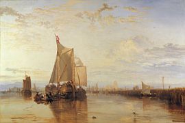
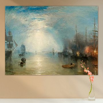
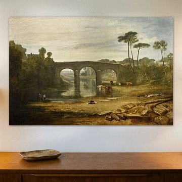
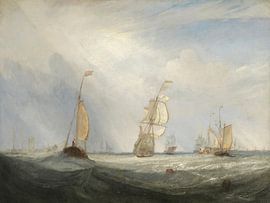
William Turner
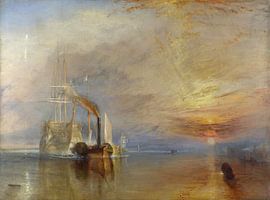
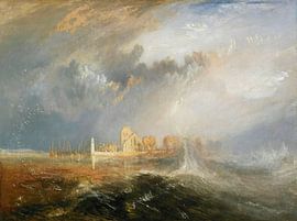
William Turner's landscapes capture light and atmosphere like few others. His mastery of color creates scenes that shift between clarity and mystery, where golden skies meet misty mountains and calm waters reflect dramatic clouds. These qualities make his work naturally suited to interiors that value tranquility and depth - from contemporary spaces to classic settings that embrace softer, layered palettes.
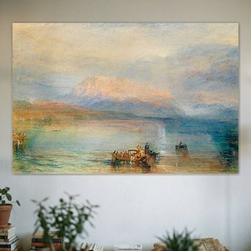
Whether you're drawn to the serene glow of The Red Rigi, William Turner or the dreamlike ambience of alpine vistas, Turner's artworks bring a sense of openness and calm. At Art Heroes, we print each piece to order on materials including canvas, poster, wallpaper and more - giving you the freedom to choose what fits your space.


Trusted and loved
Customers rate us 4.8!
High-quality materials
Sustainable and long-lasting beauty
Different sizes
From small to large, anything is possible.
Made for you
Made the moment you order.


How do William Turner's earthy tones enhance classic and Scandinavian interiors?
William Turner's palette of beige, taupe, brown, sage green, and bronze brings warmth to refined spaces. In classic interiors, pair the deeper bronze and brown tones with dark wood furniture and brass accents for a sophisticated, layered look. For Scandinavian settings, combine the softer beige and sage green shades with light oak pieces and natural textiles. These earthy hues create calm, grounded atmospheres that work beautifully in both traditional and pared-back modern homes.
Which format works best when displaying William Turner in your home?
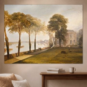
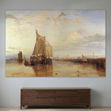
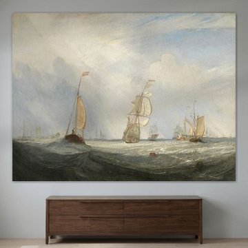
William Turner artworks suit a range of formats depending on your wall space and furniture arrangement. Horizontal prints work particularly well above sofas, sideboards, and beds, drawing the eye across the wall and balancing wider furniture pieces below. This landscape orientation complements the expansive, atmospheric quality often found in these artworks. If you're working with a narrower wall beside a doorway or between windows, a vertical format can make better use of the available space.
Choosing the right material
William Turner comes to life on each of our premium materials. Whether you choose Poster, Canvas, or ArtFrame™, each enhances the unique details and colors of these nostalgic, powerful compositions.
Choose ArtFrame™ and you benefit from two practical advantages that suit this collection perfectly. First, the easily interchangeable system lets you refresh your space in just five minutes - ideal when you want to rotate between the calm beige pieces and the more powerful bronze-toned artworks as your mood or season changes. Second, the textile print stretched in a modern aluminum frame brings out the layered taupe and sage green tones beautifully, while the frame options (gold, black, white, or silver) let you match the earthy palette to your existing décor. The sturdy construction also supports large formats, so you can create wall-filling statements that capture the nostalgic atmosphere these artworks are known for.
Still doubting which material suits your interior and chosen William Turner artwork? Use our material comparator to find the perfect match for your space.
