


Jacky
Digital artist
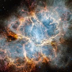
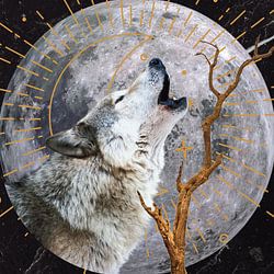
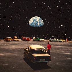
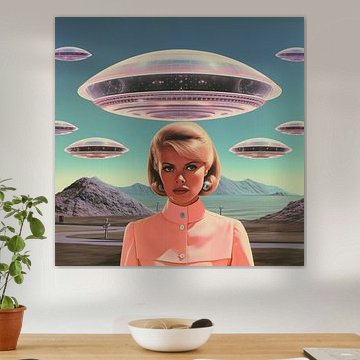
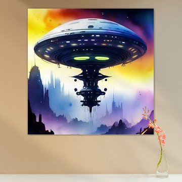
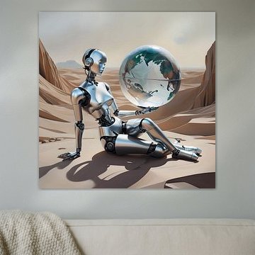
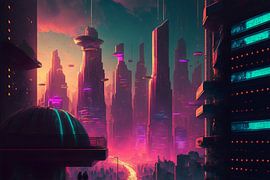
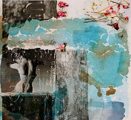
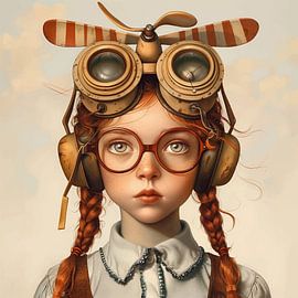
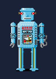
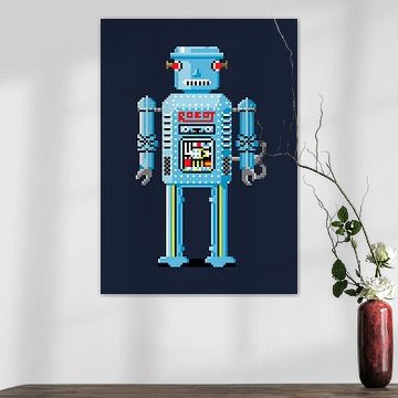
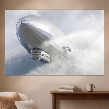
Sci-fi art brings the future into your home. Think alien landscapes, metallic robots, and mysterious spacecraft hovering in dramatic skies - visuals that spark curiosity and wonder. These artworks blend imagination with bold colors and striking contrasts, which makes them a natural fit for modern and industrial interiors.
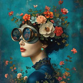
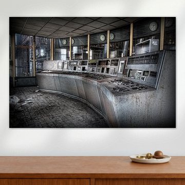
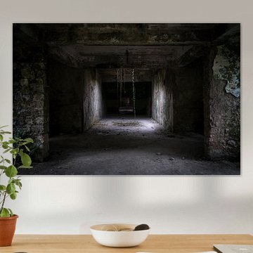
From the haunting atmosphere of Abandoned Land to reflective humanoid figures in desert scenes, sci-fi artworks create conversation. At Art Heroes, talented European artists craft these futuristic designs, and we print them custom-made. Choose Canvas, ArtFrame™ and more - free shipping included.
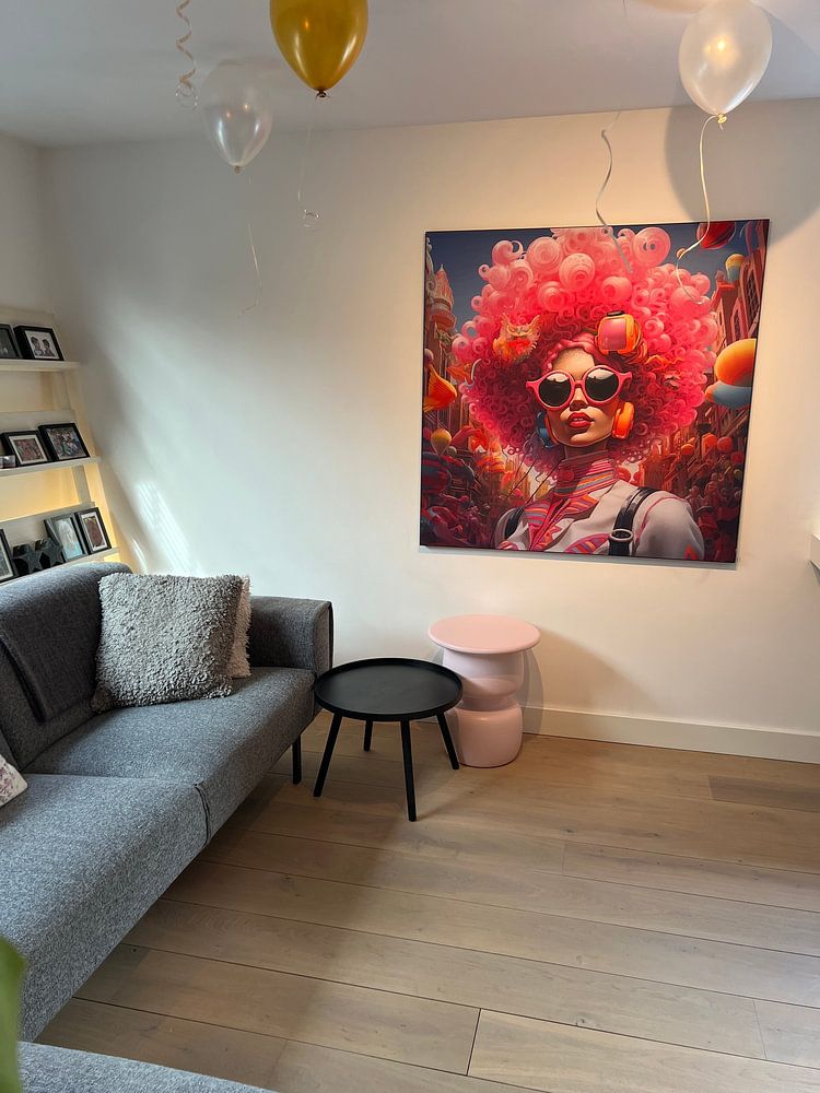
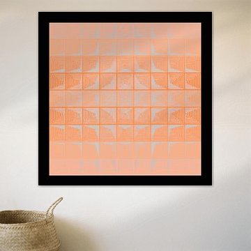
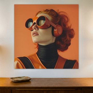
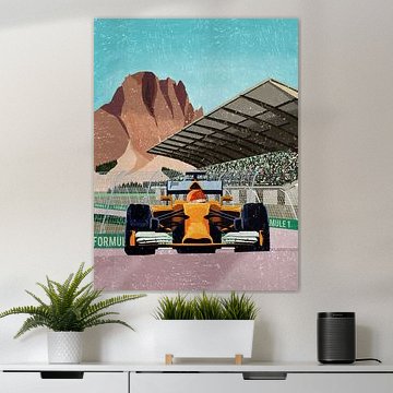
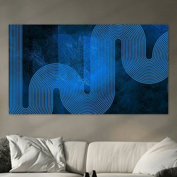
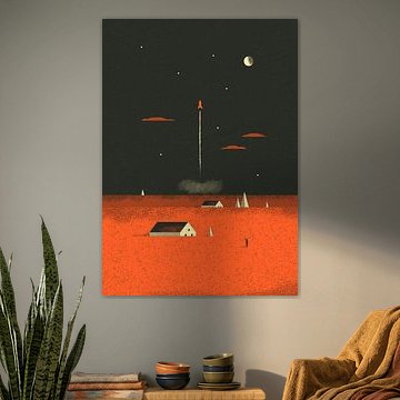
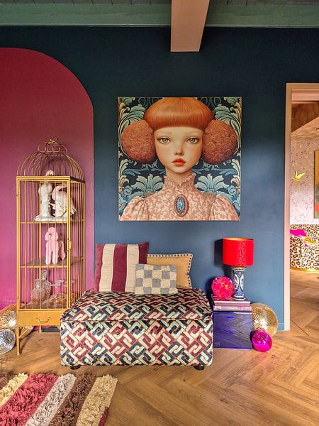
When your artwork features strong, saturated tones, let it stand out against calm surroundings. The deep red and coral palette in The Race is Over creates real impact when placed in a room with white, gray, or soft beige walls - the contrast helps the artwork breathe.

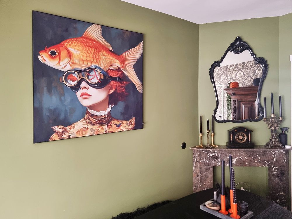
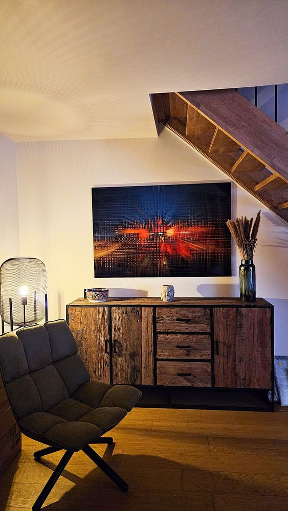
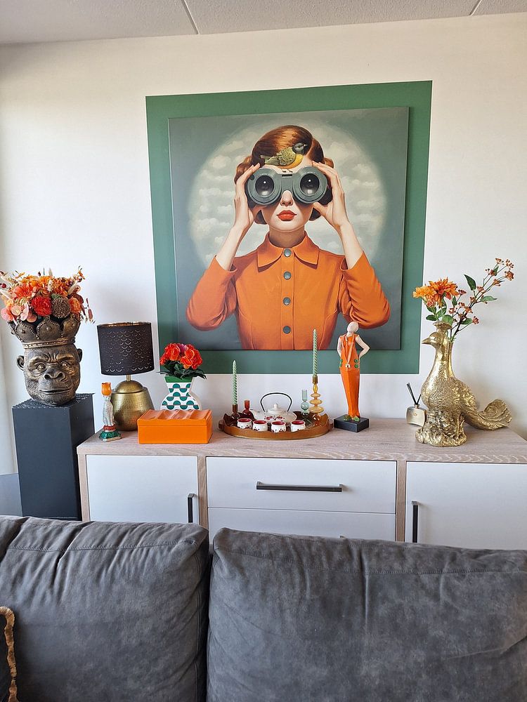
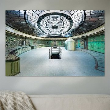
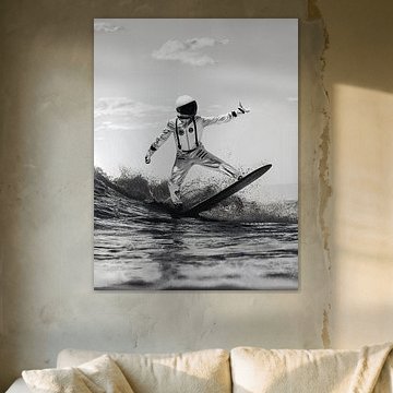
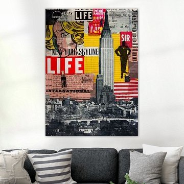
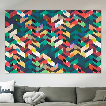
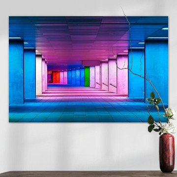
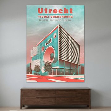
Both portrait and landscape formats are popular for sci-fi art. Portrait works well on narrow wall sections - think hallway entries or the space beside a bookshelf. Landscape fits naturally above sofas or consoles, where horizontal lines create balance without overwhelming the room.

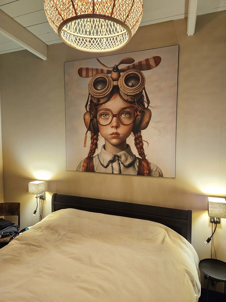
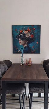
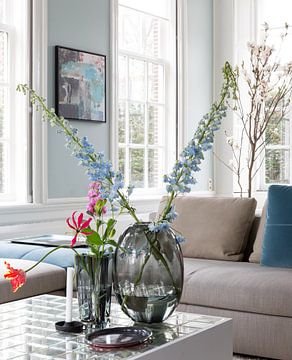
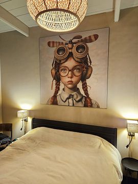
Position your artwork so the center sits roughly 145 - 150 cm from the floor - that's where our eyes naturally land when standing. In a bedroom or reading nook where you're often seated, drop it slightly lower to keep the composition comfortable and easy to take in.

Customers rate us 4.8!
Sustainable and long-lasting beauty
From small to large, anything is possible.
Made the moment you order.

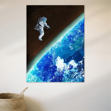
Sci-fi art is a good spot for your bedroom, where its mysterious and dreamy moods help create an immersive atmosphere. The futuristic themes and calm tones work particularly well above your bed or on the wall opposite it, turning your sleeping space into a personal retreat. Consider pairing these artworks with indirect lighting to enhance the otherworldly feel, and let the blue and teal tones complement your bedding or textiles for a cohesive look.

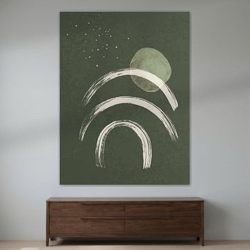
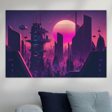
Landscape formats work especially well with sci-fi art, as they capture the expansive vistas and sweeping scenes often found in digital art and photography within this collection. A horizontal piece above your sofa or sideboard creates a striking focal point that draws the eye across the room. That said, portrait formats can work better in narrower spaces like hallways, where vertical sci-fi art adds height and drama without overwhelming the wall.
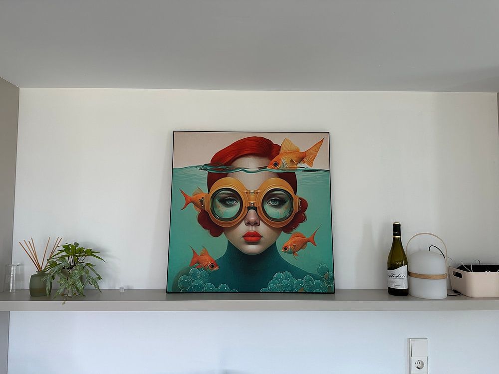
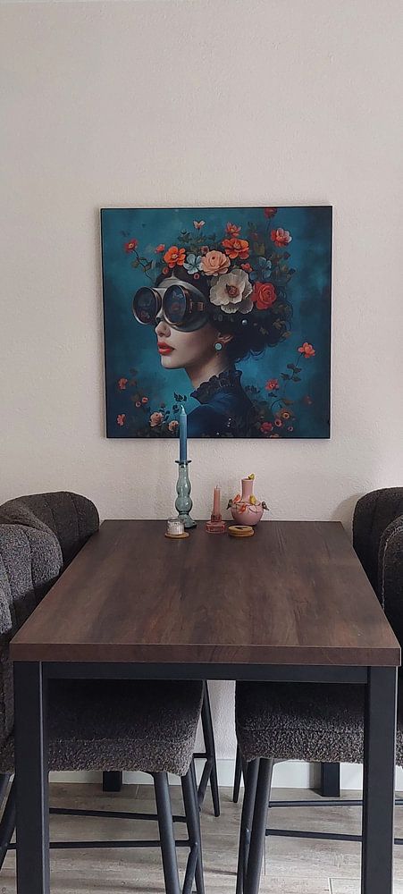
Sci-fi art fits naturally into modern and industrial interiors, where its futuristic aesthetic feels right at home. The collection's blue and teal shades pair beautifully with grey concrete walls, metal accents, and sleek furniture in modern spaces, while the brown and taupe tones soften industrial rooms with exposed brick or dark wood. Consider adding mauve touches through cushions or throws to create subtle contrast, or let the artwork's colors guide your choice of decorative objects on nearby shelves.