


Studio Allee
Painter
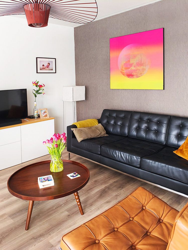
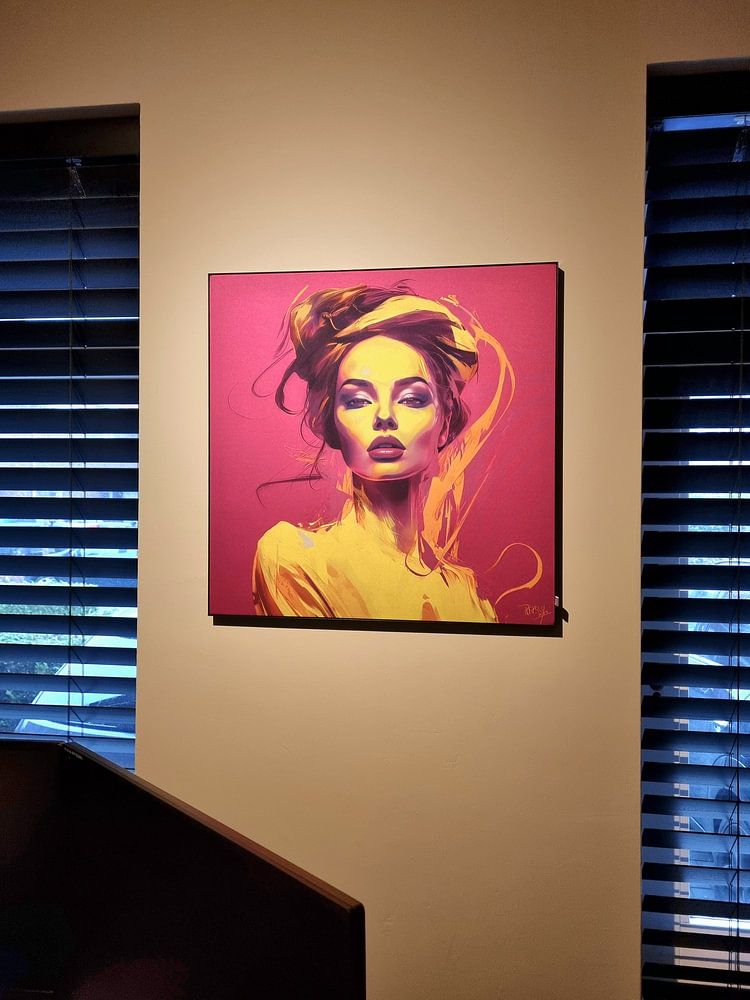
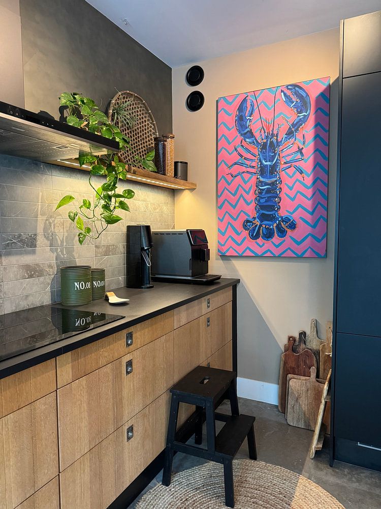
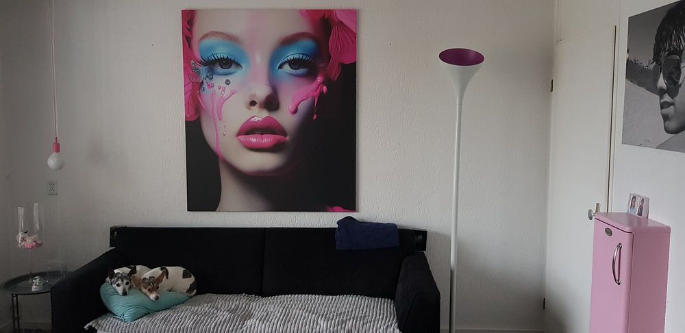
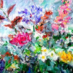
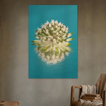
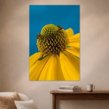
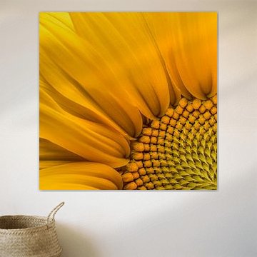
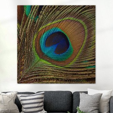
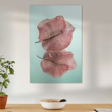
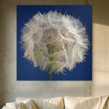
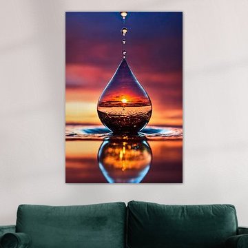
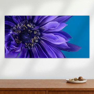
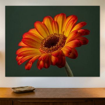
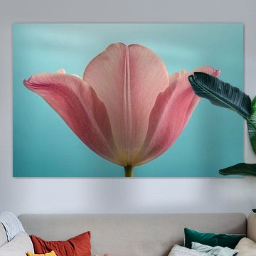
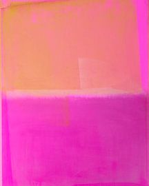
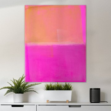
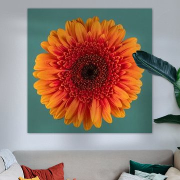
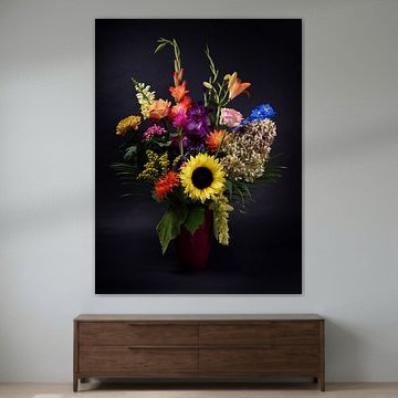
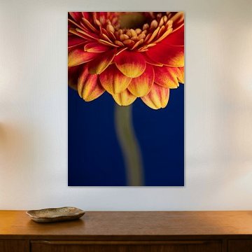
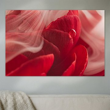
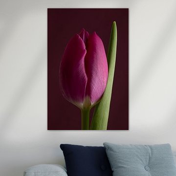
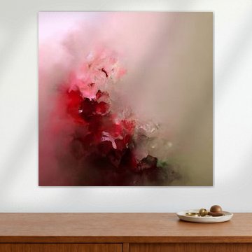
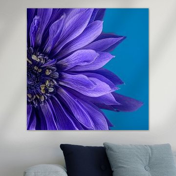
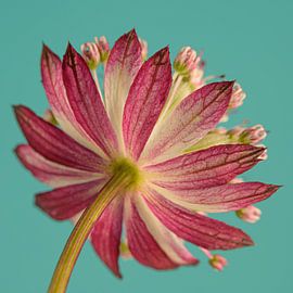
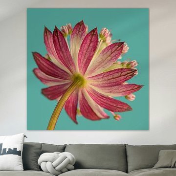
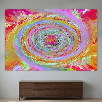
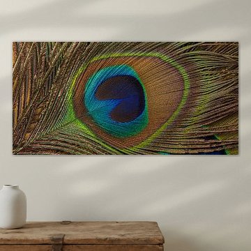
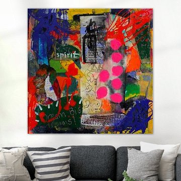
Looking for art that lifts your mood? Pop of Colour artworks bring energy and warmth into your home. Bold pinks, sunny yellows, and electric blues transform neutral walls, while playful compositions like Milkshake capture the spontaneity of street art mixed with contemporary design. These vibrant pieces suit modern interiors where personality matters more than perfection, whether your style leans minimalist or eclectic.
At Art Heroes, we work with talented European artists who specialize in colour-driven design. Choose from Canvas, ArtFrame™, Poster and more - all made to order and delivered with care.
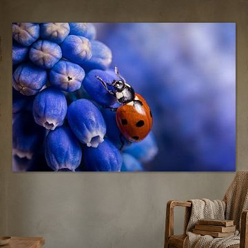
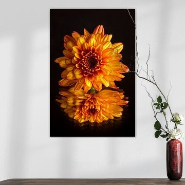
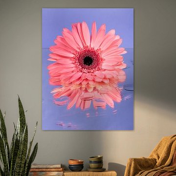
Both portrait and landscape formats are popular in the Pop of Colour range. Portrait prints suit narrow wall spaces like hallways or alcoves, while landscape prints work well above furniture. Choose the format that fits your available wall width and complements your room layout.

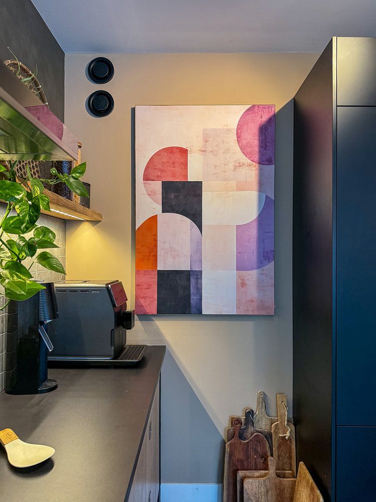
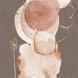
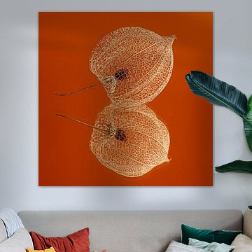
Muted neutrals work beautifully as a foundation when you want to introduce a single vibrant accent. The soft beige and taupe tones in AURA_No1 create a gentle backdrop, while the warm terracotta and coral hues add just enough colour to lift the mood without overwhelming your space.

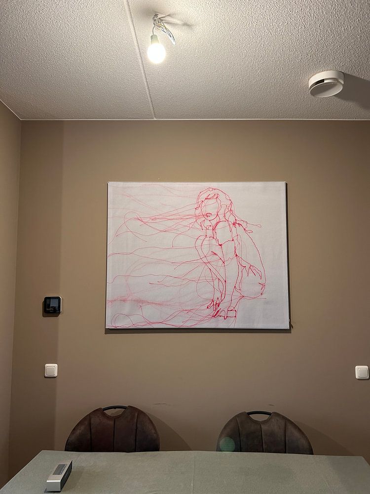
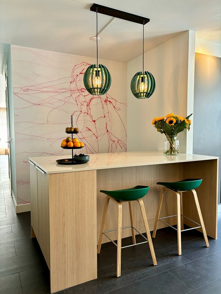
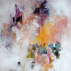
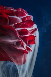
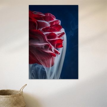
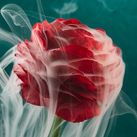
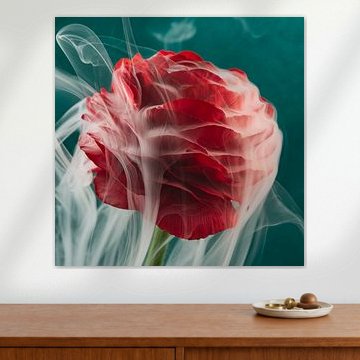
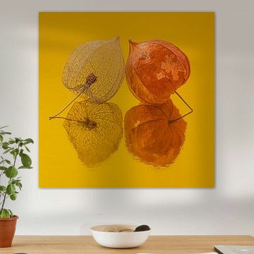
Combining soft facial features with intricate, colourful details adds depth to a room. The delicate profile and swirling textile patterns in 'Solace' bring movement and texture to your wall, making it a strong choice for spaces where you want a focal point with a handcrafted feel.

Customers rate us 4.8!
Sustainable and long-lasting beauty
From small to large, anything is possible.
Made the moment you order.
Pop of Colour comes to life on each of our premium materials. Whether you choose ArtFrame™, Canvas, or Poster, each enhances the unique details and colors.
Choose ArtFrame™ and you benefit from practical flexibility combined with visual impact. The first advantage is the interchangeable print system - when you want to refresh your space, simply swap the artwork in minutes without replacing the entire frame. This is particularly valuable for Pop of Colour pieces, where the vibrant browns, terracottas, and mauve tones let you match seasonal moods or style shifts. The second benefit is the acoustic function. If you work from home or enjoy a calm environment, optional sound-dampening panels reduce echo while staying invisible behind your print. This transforms your Pop of Colour artwork into both a visual and functional addition, especially useful in living rooms and home offices.
Still doubting which material suits your interior and chosen Pop of Colour artwork? Use our material comparator to find the perfect match.

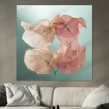
The warm palette of Pop of Colour works beautifully in modern and Scandinavian spaces. Pair terracotta and pink tones with light wood furniture and neutral walls for a Scandinavian feel. In modern interiors, combine the deeper browns and reds with sleek black frames and minimalist furniture. Mauve adds a softer touch that bridges both styles, working well alongside concrete, white textiles, or natural stone surfaces.
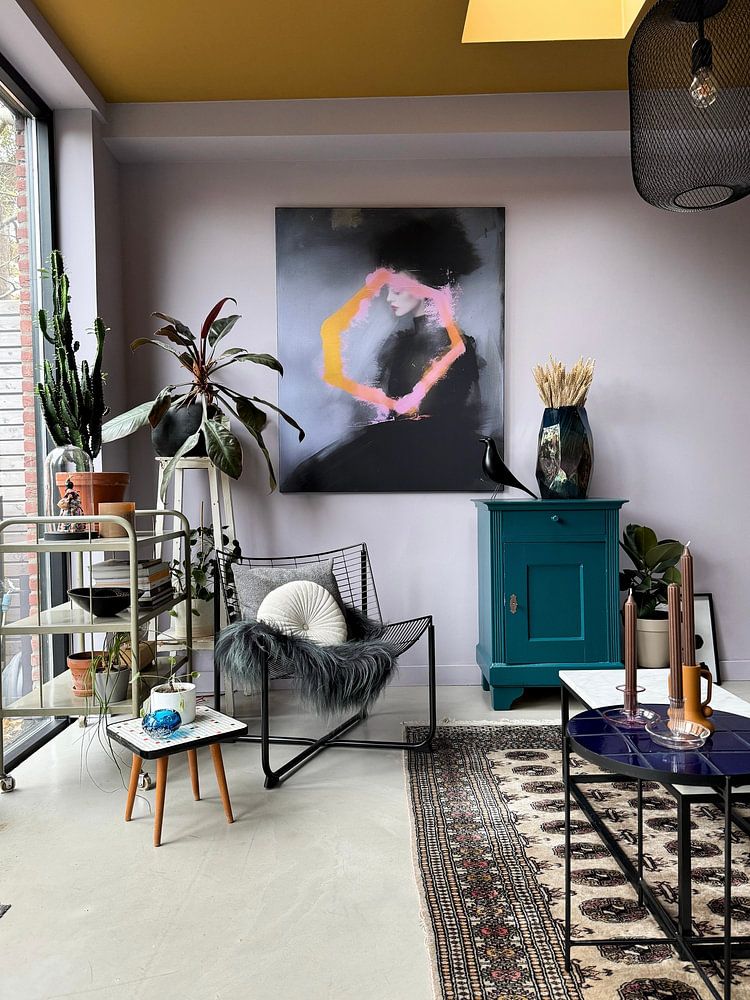
Pop of Colour artworks in vibrant, calm, and dreamy moods offer flexibility when building a gallery wall. Combine pieces that share similar color temperatures - group warm terracottas with reds, or pair mauve with pink for a softer corner. Mix portrait, square, and landscape formats to create visual rhythm. Add texture through plants with green foliage or ceramic vases in complementary earth tones. Let your space reflect your personal style with combinations that feel natural, not forced.