-
More artworks below this tip
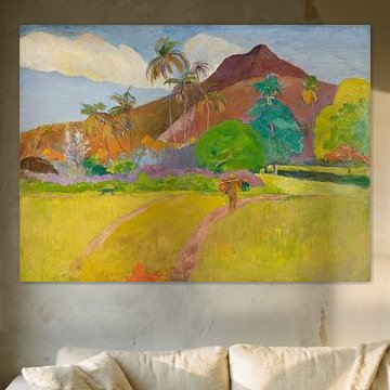
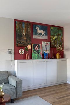
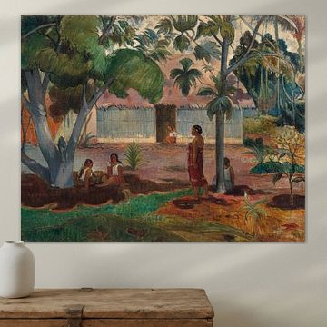
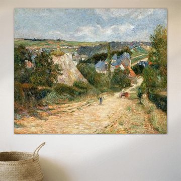
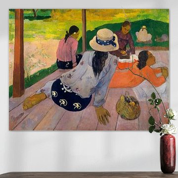
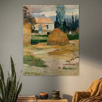
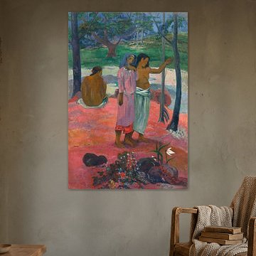
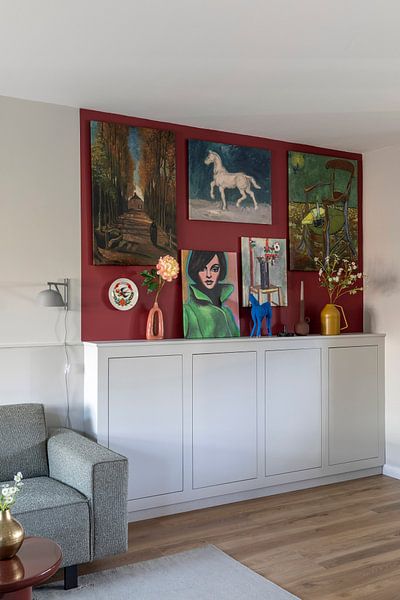
Balance Vibrant Colors with Neutral Surroundings
Bold color contrasts stand out best against simple backdrops. If your artwork features strong yellows or greens, hang it on a neutral wall in pale grey, cream, or white. This approach lets the artwork's colors take center stage without competing with patterned wallpaper or busy décor.
LianneStylist & Customer service Questions? Check out our FAQ
 -
More artworks below this tip
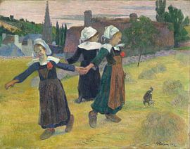
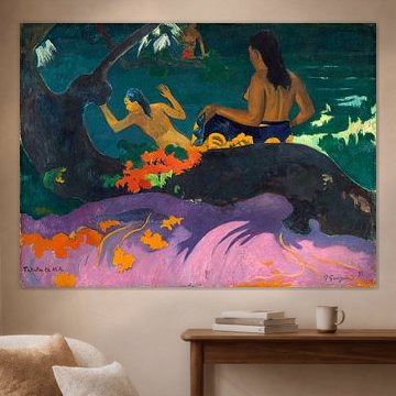
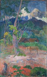
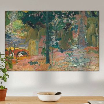
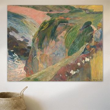
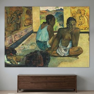
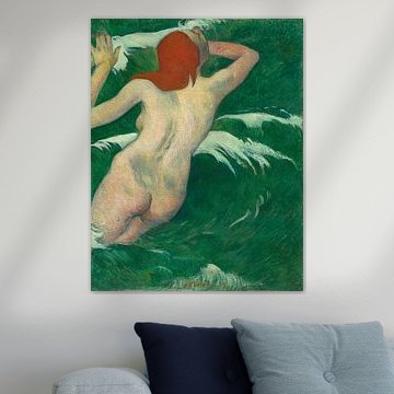
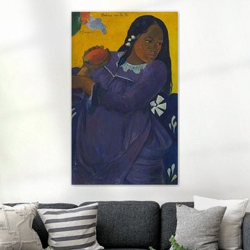
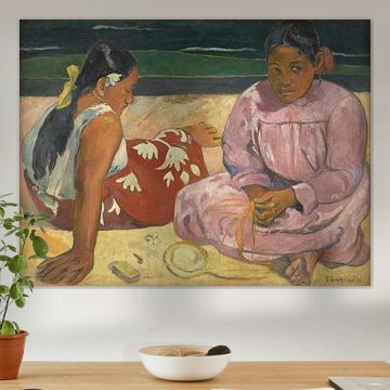
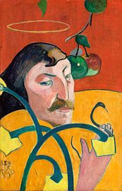
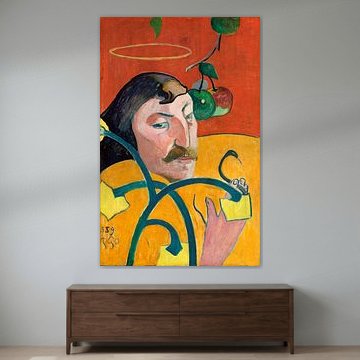
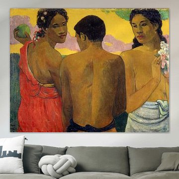
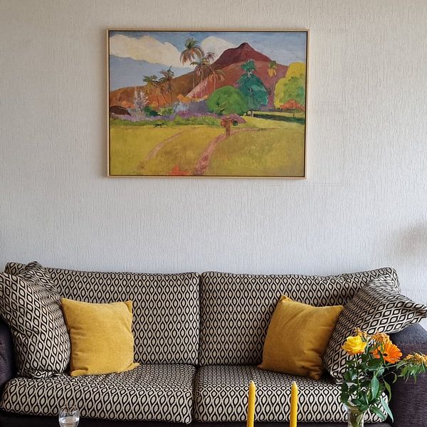
Choose Your Format
Portrait and square formats are both popular choices for Paul Gauguin artworks. Portrait works well in narrow wall spaces like hallways or beside doorways, while square formats suit balanced compositions above furniture. Choose the format that fits your available wall space and the room's proportions.
AnouschkaArt Stylist Questions? Check out our FAQ
 -
More artworks below this tip
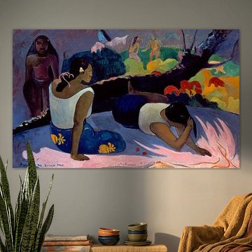
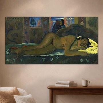
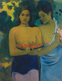
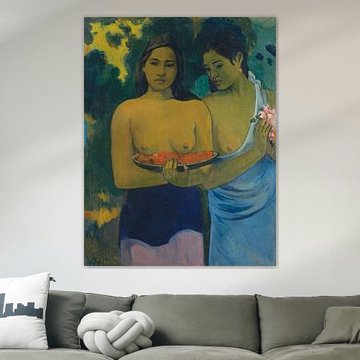
Place in Calm, Reflective Spaces
Artworks with contemplative subjects suit rooms where you unwind and relax. The serene mood in Nevermore, Paul Gauguin makes it well-suited to bedrooms or reading corners, where its teal and olive tones can help create a restful, personal retreat away from busier household areas.
RosanneStylist & Customer service Questions? Check out our FAQ
Paul Gauguin
Paul Gauguin's bold colors and experimental style bring warmth to any interior. His post-Impressionist vision captures tropical landscapes, Breton countryside, and intimate moments with vivid emotion. From the lush greens in The Large Tree, Paul Gauguin to the dreamy coastal tones of Fatata te Miti (By the Sea), Paul Gauguin, his palette ranges from earthy browns to vibrant teals - each artwork tells a story that fits beautifully in modern, eclectic, or minimalist spaces.
At Art Heroes, we print every Gauguin piece to order. Choose from Canvas, Poster, ArtFrame™ and more to match your space perfectly.


Be sure to check out the creative new masters
Our artists have created artworks inspired by the old masters.


Trusted and loved
Customers rate us 4.8!
High-quality materials
Sustainable and long-lasting beauty
Different sizes
From small to large, anything is possible.
Made for you
Made the moment you order.
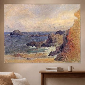
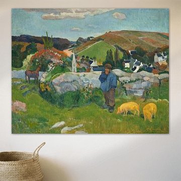
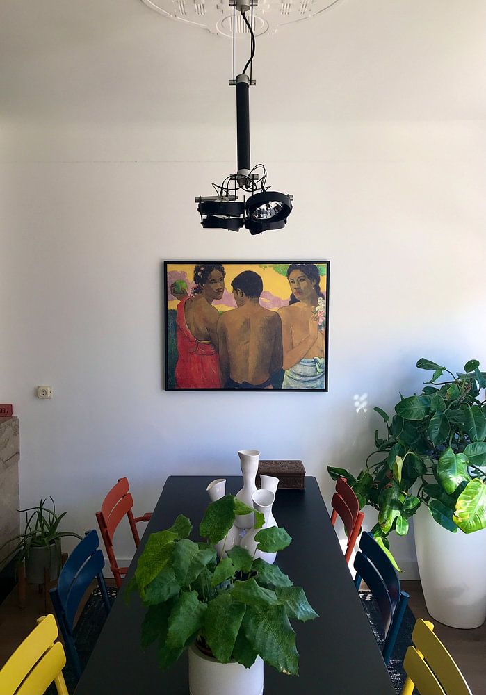
How they hang in other homes
Get inspired by beautiful artworks on other people's walls and see how they truly enhance an interior.


More like this


How do Paul Gauguin artworks combine with natural interior elements?
The calm and nostalgic character of Paul Gauguin reproductions pairs beautifully with natural materials and earthy tones. Combine these artworks with woven baskets, wooden furniture, and linen textiles to enhance their organic feel. Indoor plants like ferns or olive trees complement the green and teal hues found throughout the collection. The dreamy atmosphere works well when you layer different artworks together on a gallery wall, mixing portrait and square formats for visual interest. Let nature-inspired decor echo the colors in your chosen Paul Gauguin piece.
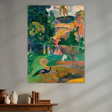
Which format suits Paul Gauguin reproductions in your home?
Portrait formats dominate this collection and work particularly well above narrow furniture like console tables, sideboards, or beds. The vertical composition draws the eye upward and suits walls where width is limited but height is generous. A portrait Paul Gauguin print creates a strong focal point in hallways or beside doorways where wall space is typically taller than it is wide. Square formats offer a good alternative when you want a more balanced look above sofas or in gallery wall arrangements with other artworks.
Where do Paul Gauguin artworks work well in your interior?

The bedroom is a good spot for Paul Gauguin reproductions, where the calm and dreamy moods support relaxation and rest. The brown, olive green, and taupe color palette creates a soothing atmosphere that helps wind down at the end of the day. Hang a Paul Gauguin artwork above your bed or on the wall opposite to set a peaceful tone. The nostalgic character adds depth without overwhelming the space, and the earthy colors coordinate easily with natural wood nightstands and soft bedroom textiles.
