-
More artworks below this tip
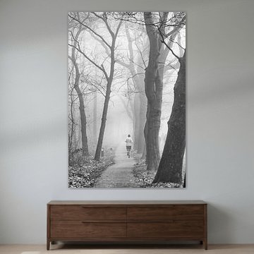
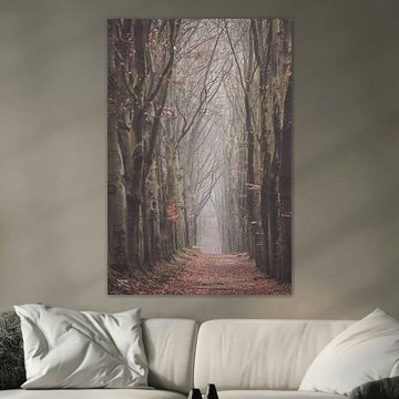
Choose Portrait or Landscape Format
Portrait and landscape formats are equally popular in this collection. Portrait works well on narrow wall sections, like the space between windows or beside doorways. Landscape fits naturally above furniture such as sideboards or beds. Square format also prints beautifully if you prefer balanced proportions.
LianneStylist & Customer service Questions? Check out our FAQ
 -
More artworks below this tip
Layer Soft Colours for a Serene Look
Muted greens and blues create a restful mood without overpowering your interior. Use these tones in bedrooms or bathrooms where you want a gentle, calming effect. The sage green and turquoise palette in Black grouse complements white walls and natural wood beautifully.
RosanneStylist & Customer service Questions? Check out our FAQ
 -
More artworks below this tip
Pair Bronze and Gold Tones with Natural Materials
Warm, earthy tones create a grounded atmosphere in living rooms and hallways. Combine these colours with wooden furniture, linen textiles, or terracotta accents to strengthen the natural feel. The bronze and gold hues in Quintelooijen IV pair beautifully with oak or walnut frames.
EileenStylist & Customer service Questions? Check out our FAQ
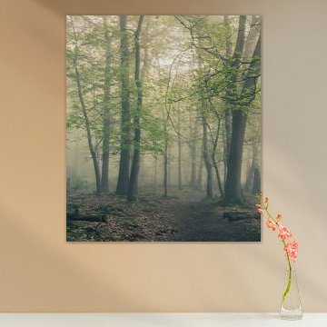
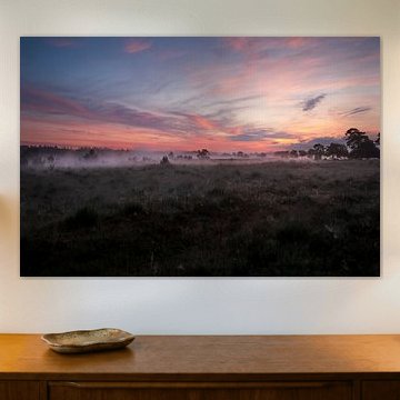
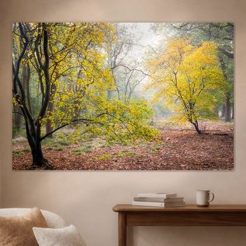
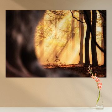
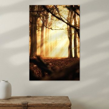
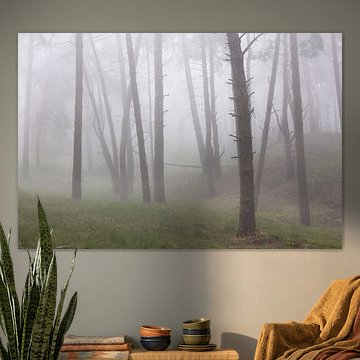
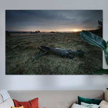
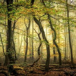
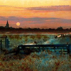
National Park
Want to bring the tranquility of nature indoors? National Park artwork captures the quiet beauty of protected wilderness areas, where heather fields meet ancient forests and morning mist softens the landscape. These scenes offer a peaceful escape, perfectly suited to interiors that value calm and connection to nature.
Dutch national parks like Sallandse Heuvelrug reveal purple heathlands under wide skies, while forest paths wind through dappled light - imagery that pairs beautifully with Scandinavian or natural design styles. Hiking trail on the Salland Ridge shows how golden sunbeams and wildflowers create depth and warmth in any room.
At Art Heroes, each piece is custom-made and ships free. Explore Canvas, ArtFrame™, Poster and more to find what works for your space.


Trusted and loved
Customers rate us 4.8!
High-quality materials
Sustainable and long-lasting beauty
Different sizes
From small to large, anything is possible.
Made for you
Made the moment you order.


More like this

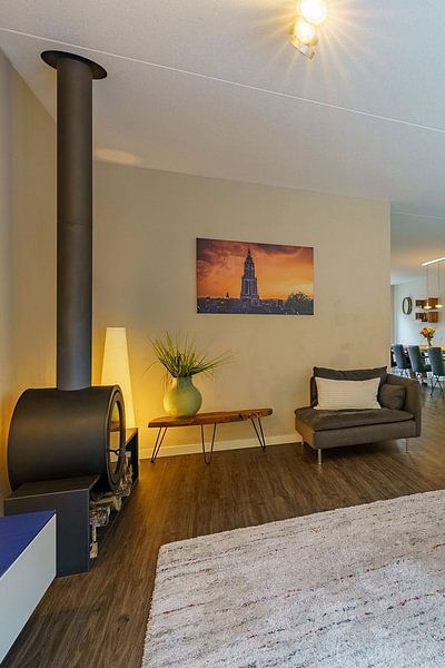
Where does National Park art work well in your home?

National Park artwork is a good spot for the living room, where calm landscapes can create a relaxing atmosphere. The earthy tones and natural scenery work well above a sofa or sideboard, bringing the outdoors into your everyday space. Consider a landscape format piece to complement the horizontal lines of your furniture. Canvas adds texture and depth, making photography and digital art feel authentic and gallery-ready.
How to combine National Park pieces with other decor
National Park art pairs beautifully with natural materials like wood, stone, and woven textiles that echo the outdoors. The calm and mysterious moods in this collection make it easy to create a cohesive gallery wall when you mix portrait and square formats together. Add plants with soft foliage or dried branches to reinforce the organic feel, and choose warm lighting to enhance the dreamy quality of these artworks. Let the earthy palette guide your choices - National Park pieces become anchors that tie a room together effortlessly.
Which colors and styles suit National Park artworks?

The brown, olive green, and taupe tones in National Park art fit naturally into Scandinavian and rustic interiors. Pair olive green pieces with light wood furniture and linen textiles for a fresh Scandinavian look, or combine brown and taupe artworks with weathered wood and natural fibers for a country-style space. Blue and mauve accents add subtle contrast without overwhelming the calm atmosphere. Choose Canvas with a natural frame border to bring out the warm, organic feel that complements both styles beautifully.
