


Wonderful Art
Painter
Some artworks stop you mid-scroll. Not because they shout, but because something in them quietly holds your attention - a figure facing the horizon, a wash of blush and sage that just works on that wall you can never get right. That feeling is worth following.
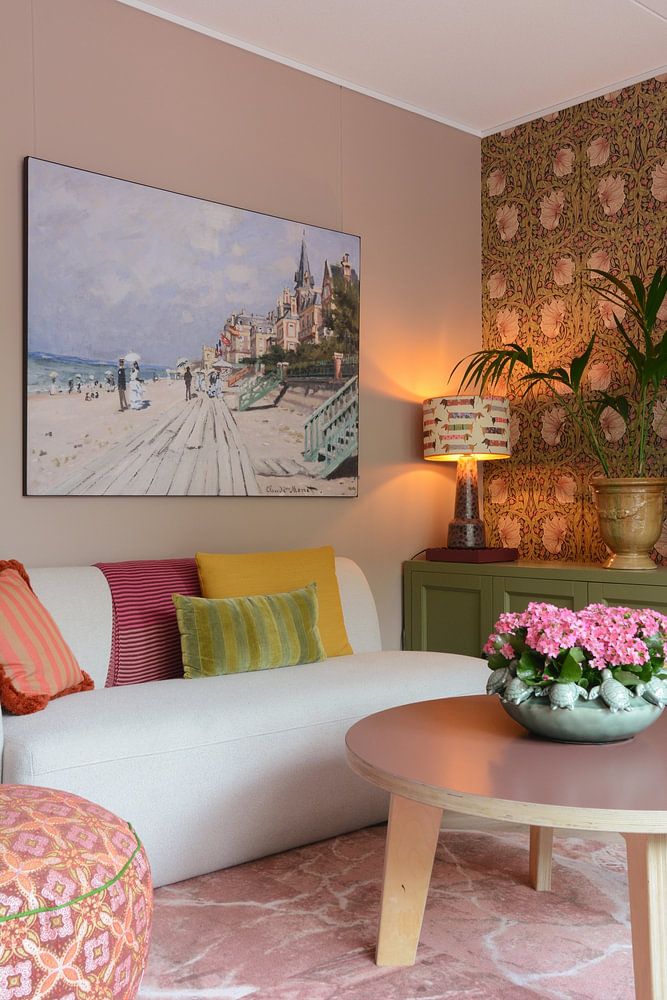
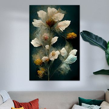
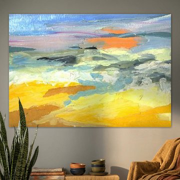
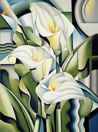
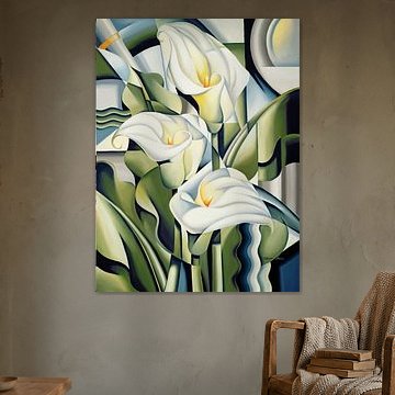
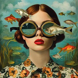
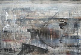
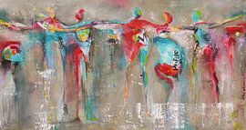
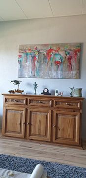
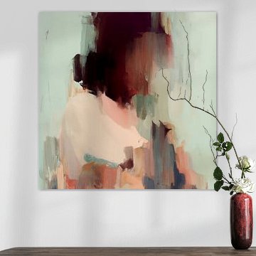
Much of this living room collection moves between the dreamlike and the grounded. Soft earth tones sit alongside surreal portraits, and muted abstract landscapes balance more expressive pieces. Blush & Sage no. 2 is a good example: broad, textured brushstrokes in pink, beige, and olive that feel both calm and alive - the kind of artwork that changes slightly depending on the light in the room.
Available as ArtFrame™, Canvas, Wallpaper and more, each piece can be ordered in the size that fits your space.
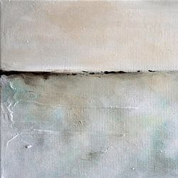
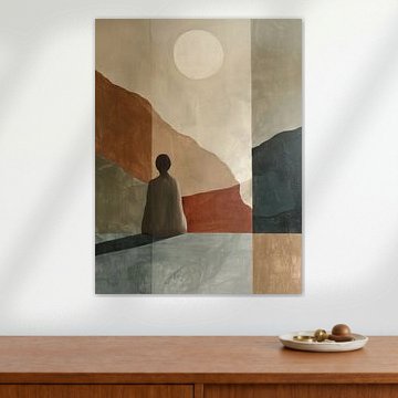
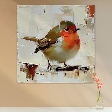
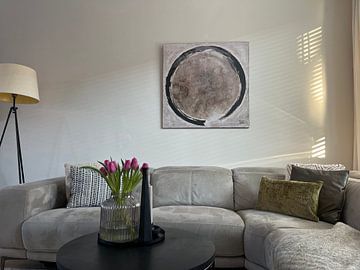
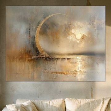
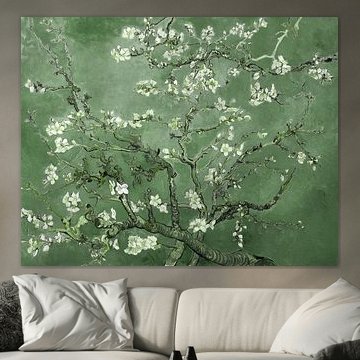
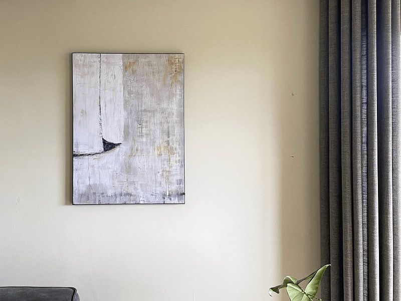
Muted, earthy tones tend to sit comfortably in living rooms alongside natural materials like wood and linen. If your space already has warm neutrals, look for artwork that carries similar tones. The taupe, beige, and soft gold in Silent Beauty connect naturally with warm-toned furniture and walls without competing for attention.

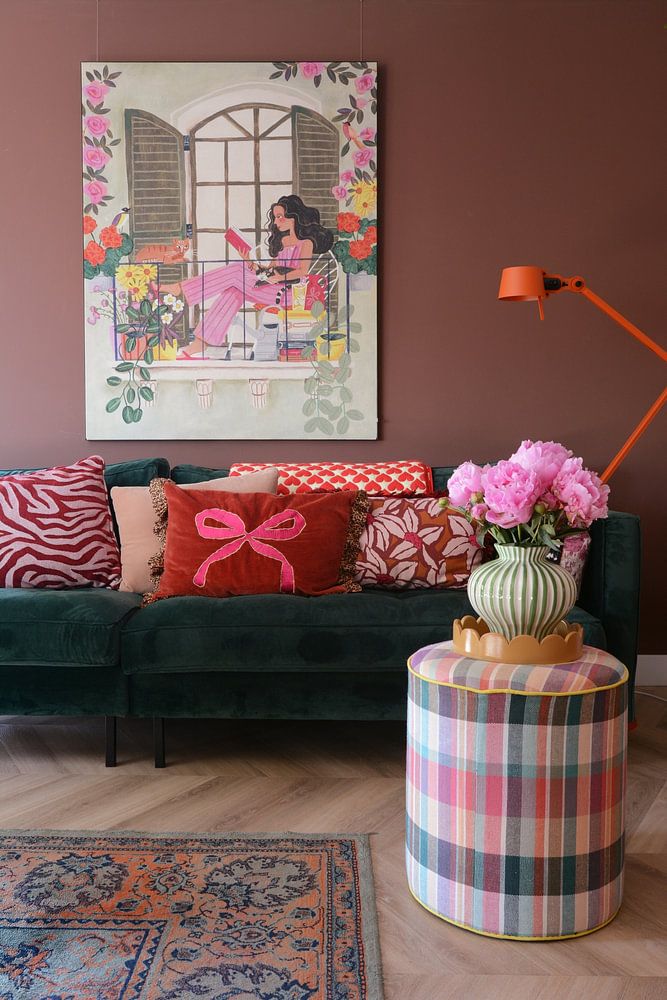
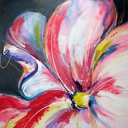
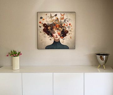
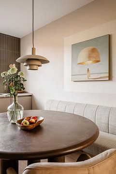
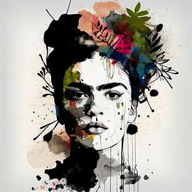
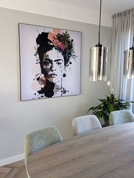
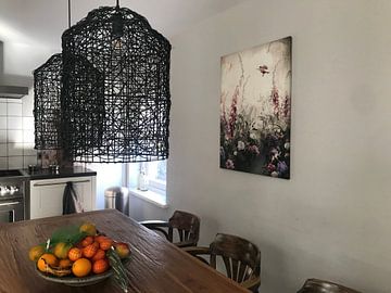
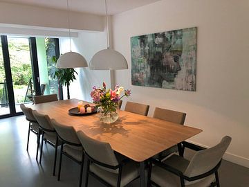
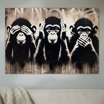
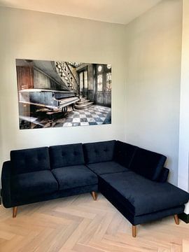
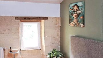
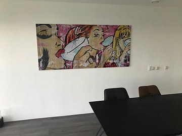
Eye level is the best starting point for hanging art in a living room - aim for the centre of the artwork to sit roughly 145 - 150 cm from the floor. Above a sofa, leave a small gap of around 15 - 20 cm between the furniture and the frame. The bold vertical ink drips in Black & white with flower colour splash make it a strong choice for a wall you want to draw attention to.

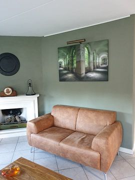
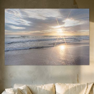
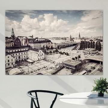
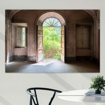
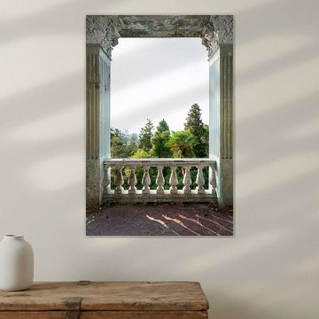
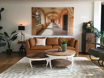
A wide, horizontal format fills a large wall without feeling heavy, while a tall portrait format works well in a narrower space or beside a doorway. Think about the shape of the wall before choosing. A panoramic horizontal format, for example, is a good fit for the full-width composition in Black-and-white panorama in Porto, Portugal, which is designed to be read from left to right across a wide scene.

Customers rate us 4.8!
Sustainable and long-lasting beauty
From small to large, anything is possible.
Made the moment you order.
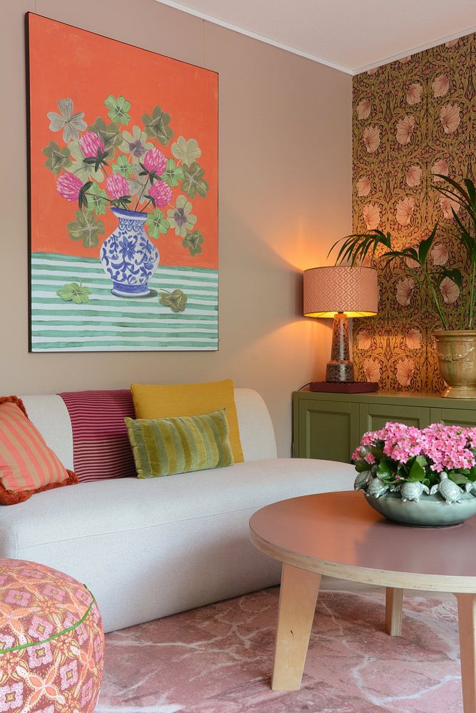
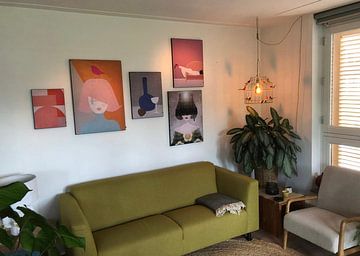
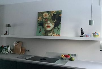
Living room art works best when it connects to how you actually use the space. Pair a door poster-sized artwork with a statement plant or textured throw for a calm, grounded look. For a more dramatic effect, group big wall art pieces into a gallery wall that plays with mysterious depth. Mix calm and vibrant moods side by side to keep the arrangement feeling alive without being restless.

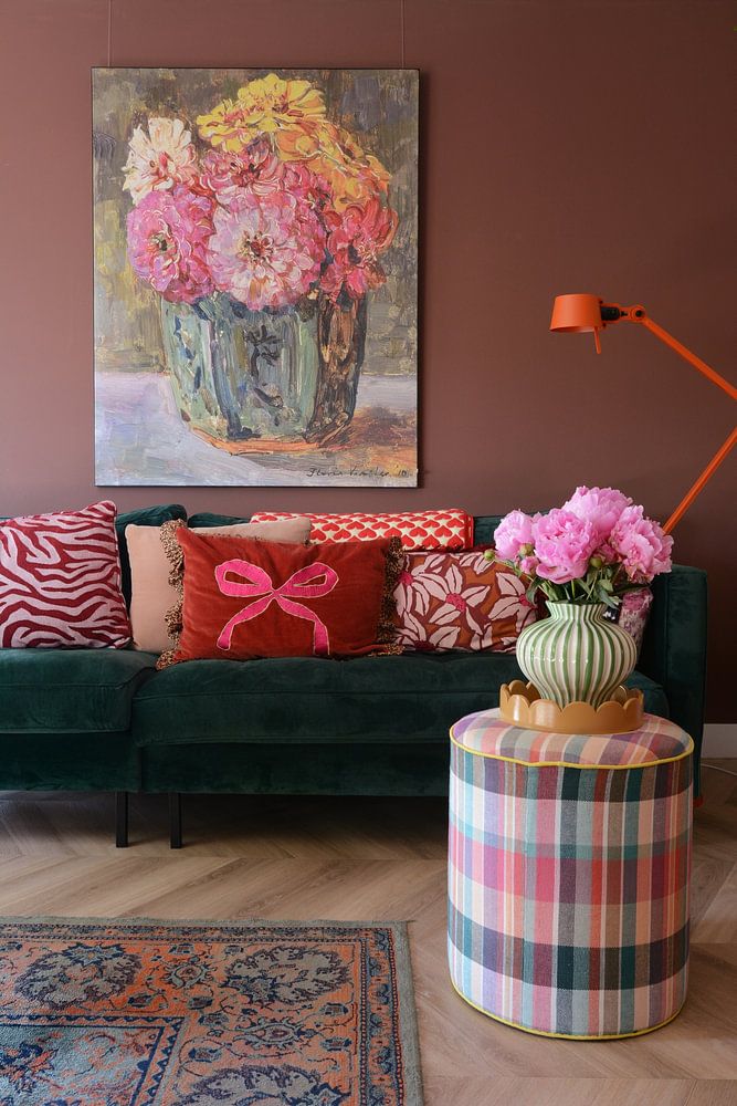
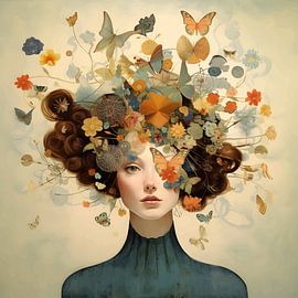
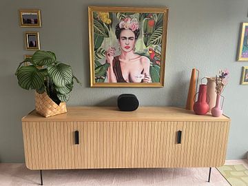
The browns, taupes, and olive greens in this collection sit naturally in a bohemian interior - think layered textiles, rattan furniture, and warm wood tones. Blues and mauves add a cooler, more contemporary edge that works well in modern living rooms with clean lines and neutral walls. Hang a blue or mauve artwork above a light sofa to anchor the room without overpowering it.
Photography and painting-based living room artworks translate particularly well onto Poster, where rich color depth really shows. Two strong alternatives are Canvas for a softer, relaxed finish or ArtFrame™ for a sleeker, more modern look.
Choose Poster and you benefit from two practical strengths. First, UV-resistant inks keep your chosen artwork's browns, blues, and olive greens vivid over time - no fading, no loss of depth, even in a well-lit room. Second, the thick, durable satin photo paper gives the artwork a solid, considered presence on the wall - especially important for larger living room formats where surface quality is immediately noticeable.
Still doubting which material suits your interior and chosen living room artwork? Use our material comparator https://www.artheroes.com/en/materials/materials-advisor-10669095 to find the perfect match.