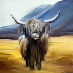
Lauwersmeer
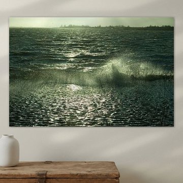
The Lauwersmeer region captures something rare: vast skies meeting still waters, where light shifts from soft dawn pinks to golden dusk. These artworks reflect that quiet drama, from weathered wooden posts standing in tidal flats to flocks of geese silhouetted against amber horizons. Serene tones - mauve, sage green, lilac - create a calm, contemplative mood that fits naturally into modern, Scandinavian, or coastal interiors. Whether you're drawn to the melancholic beauty of Old sea wall Moddergat or the dreamy haze of wetland triptychs, each piece invites stillness into your space.
At Art Heroes, every artwork is printed to order by talented European artists. Choose from Canvas, Poster, ArtFrame™ and more to match your style.
-
More artworks below this tip
Choose portrait or landscape to suit your wall
Lauwersmeer artworks are popular in portrait, square, and landscape formats. Portrait and landscape offer the most contrast: a tall format draws the eye upward and works well on narrow walls, while landscape suits wider spaces above sofas or sideboards. Choose what fits your available wall space.
AnouschkaArt Stylist Questions? Check out our FAQ
 -
More artworks below this tip
Let minimalist compositions breathe on open walls
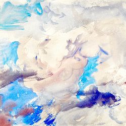
Abstract, minimal landscapes need space around them to show their full effect. Avoid placing them in crowded gallery walls or above busy shelves. The clean lines and subtle textures in Snow dunes form beautiful abstract shapes in Lauwersmeer National Park. stand out best on a single, uncluttered wall where the eye can rest and appreciate the simplicity.
LianneStylist & Customer service Questions? Check out our FAQ
 -
More artworks below this tip
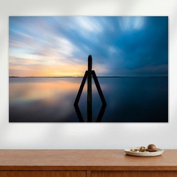
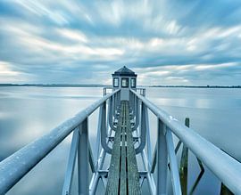
Hang coastal scenes in spaces where you want calm
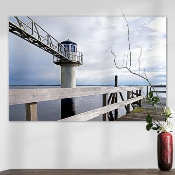
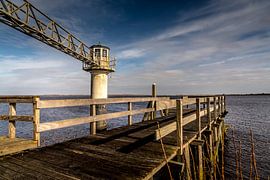
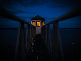
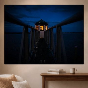
Waterfront scenes bring a sense of stillness and space into your home. These artworks suit rooms where you unwind - bedrooms, reading corners, or quiet hallways. The serene twilight mood in Beacon of light in Friesland works particularly well in a bedroom, where soft colour and gentle reflections help create a restful environment.
RosanneStylist & Customer service Questions? Check out our FAQ


Trusted and loved
Customers rate us 4.8!
High-quality materials
Sustainable and long-lasting beauty
Different sizes
From small to large, anything is possible.
Made for you
Made the moment you order.


More like this


Which colors from Lauwersmeer suit a Scandinavian interior
The Lauwersmeer collection brings together blue, grey, taupe, brown, and mauve tones that work beautifully in light, airy spaces. These colors align perfectly with a Scandinavian interior style, where soft neutrals meet muted accent shades. Combine grey and taupe artworks with natural wood furniture for a cohesive look, or add blue pieces to introduce a calming contrast against white walls. Mauve offers a gentle warmth without overwhelming the minimalist aesthetic.
Choosing the right material
Lauwersmeer comes to life on each of our premium materials. Whether you choose Poster, Canvas, or ArtFrame™, each enhances the unique details and colors.
Choose Poster and you benefit from museum-grade printing on heavy satin paper that captures every subtle shade in the collection. The fine-art quality brings out the calm and mysterious moods of Lauwersmeer beautifully, letting the blue and grey tones appear rich and layered. The UV-resistant inks ensure these colors stay vibrant year after year, which matters especially for artworks with delicate taupe and mauve hues that could otherwise lose their depth over time. This durability makes posters ideal for the dreamy atmosphere Lauwersmeer creates in your home.
Still doubting which material suits your interior and chosen Lauwersmeer artwork? Use our material comparator to find the perfect match.
Where to display portrait and square formats from Lauwersmeer
The Lauwersmeer collection offers artworks in portrait, square, and landscape orientations, with portrait formats being particularly popular. A portrait piece works well on narrow wall sections beside doorways or between windows, making use of vertical space that might otherwise feel empty. Hang one above a sideboard or console table to draw the eye upward. Square formats offer a versatile alternative when you want symmetry, especially when grouping multiple artworks together in a gallery-style arrangement.
