-
More artworks below this tip
Pairing colors from your artwork
Look to the colors in your chosen artwork to guide your room palette. The coral and pink tones in Retro Red Beetle in Oaxaca Mexico II pair naturally with neutral beige or taupe accents in cushions, throws, or wooden furniture, creating a cohesive and inviting space.
EileenStylist & Customer service Questions? Check out our FAQ
 -
More artworks below this tip
Finding the right room
Match your artwork's mood to how you use each room. Calm, nostalgic pieces suit bedrooms and reading corners, while educational designs work well in home offices or children's rooms. For example, Typographic World Map | Dutch brings a modern, informative touch to study spaces.
KatharinaStylist & Customer service Questions? Check out our FAQ
 -
More artworks below this tip
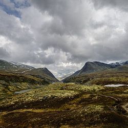
Where to hang your artwork
Place artwork at eye level in spaces where you naturally pause - hallways, entryways, or above seating areas. The warm palette and nostalgic scene in Into the Hills work beautifully in living rooms or bedrooms, where its peaceful mood can be fully appreciated.
AnthiStylist & Customer service Questions? Check out our FAQ
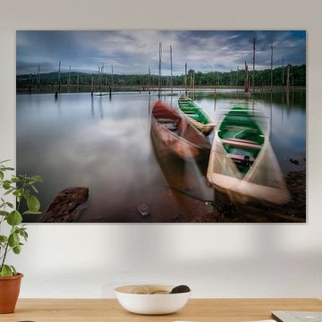
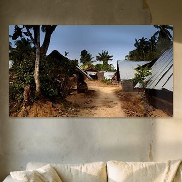
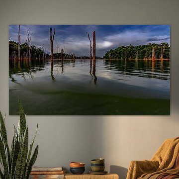
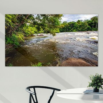
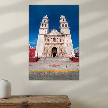
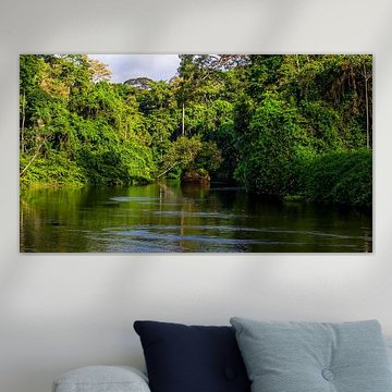
Latin America
Latin America wall art captures the region's vibrant energy and cultural richness. From colorful colonial streets to lush jungle canopies, these artworks bring warmth and character into any space. The bold colors and diverse themes connect beautifully with eclectic or modern interiors, while serene landscapes offer calm and balance.
Whether you're drawn to portraits like Surinamese woman or scenic views, each piece tells a unique story. At Art Heroes, we print your chosen artwork to order on Canvas, Poster, Wallpaper, and many more options. Explore the collection and choose what suits your space.


Trusted and loved
Customers rate us 4.8!
High-quality materials
Sustainable and long-lasting beauty
Different sizes
From small to large, anything is possible.
Made for you
Made the moment you order.
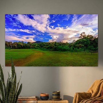
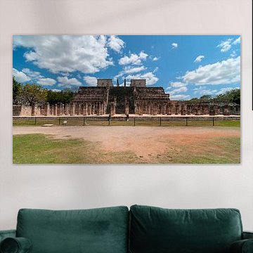
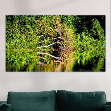
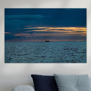
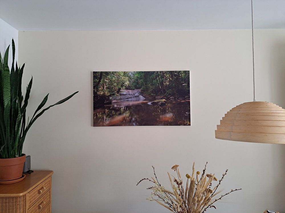
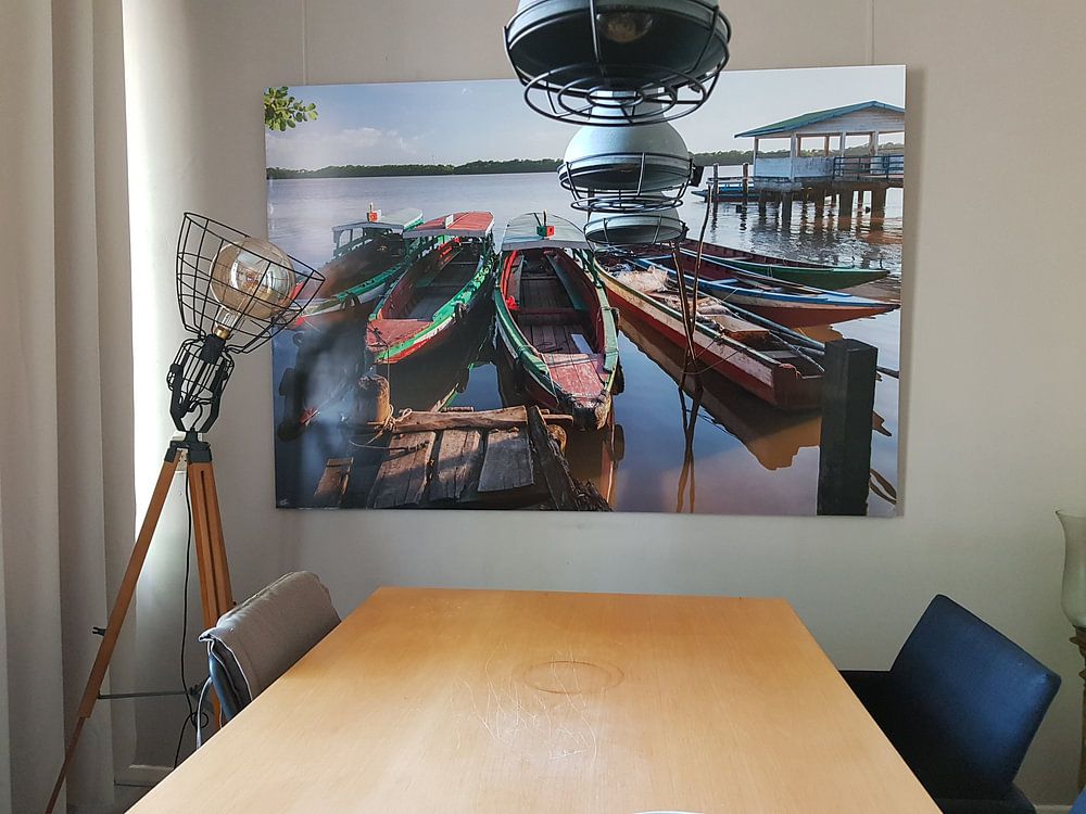
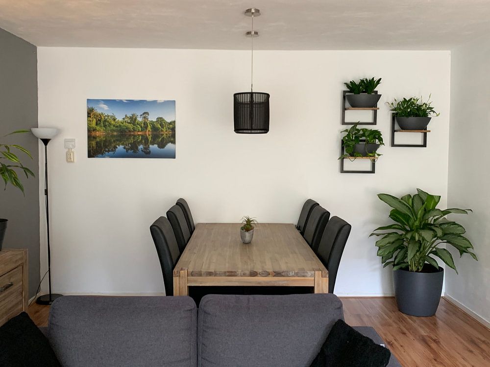
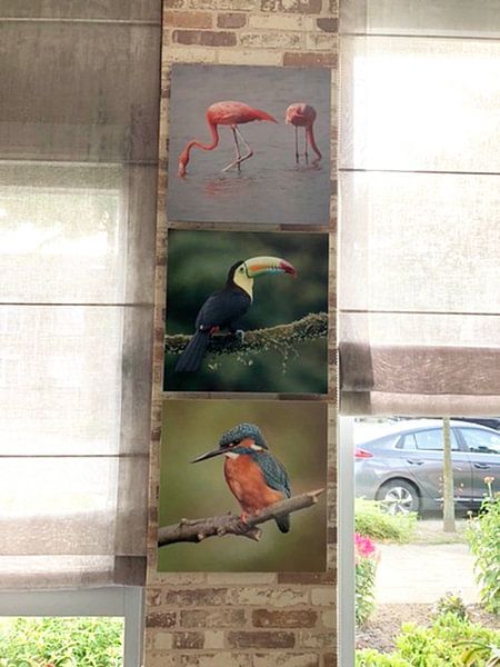
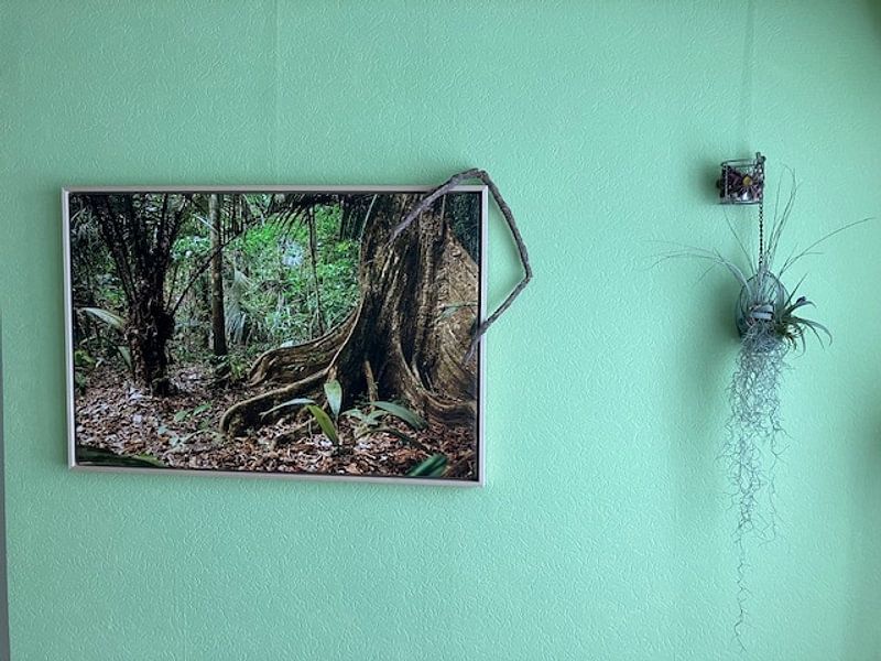
How they hang in other homes
Get inspired by beautiful artworks on other people's walls and see how they truly enhance an interior.


More like this


How to combine Latin America art in your interior

Latin America artworks bring together calm, vibrant, and powerful moods that work beautifully as a unified gallery wall or scattered across different rooms. Pair photography with digital art and illustrations to create visual rhythm, or combine pieces from the Suriname sub collection for a cohesive cultural thread. The earthy palette of brown, taupe, and olive green pairs well with natural materials like rattan and linen, while blue and green accents connect nicely with indoor plants. Let the diversity of Latin America art guide your interior choices and discover what suits your space.
Where Latin America art works well in your home
A home office is a good spot for Latin America artworks, especially when you want to balance focus with inspiration. The mix of calm and powerful moods helps create an energizing yet grounded atmosphere for work or creative projects. Hang a landscape format above your desk or place a portrait piece on a sideboard to add visual interest without overwhelming the space. The brown and taupe tones bring warmth to task-focused environments, while blue and green shades offer a refreshing contrast that keeps the room from feeling too serious.
Which format suits Latin America artworks best
Landscape format dominates the Latin America collection and works particularly well above low furniture like sideboards, sofas, or console tables where the horizontal lines complement the room's architecture. This format draws the eye across the wall and creates a sense of openness in living rooms and hallways. Portrait orientation offers a strong alternative when you're working with narrow walls or want to emphasize height, while square formats bring balance to smaller spaces or gallery wall arrangements. Choose what fits your wall dimensions and the visual flow you want to create.
