-
More artworks below this tip
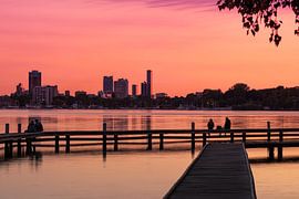
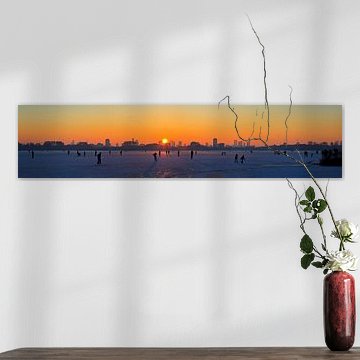
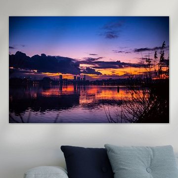
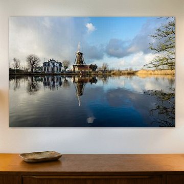
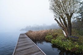
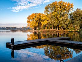
Working with grey and mauve for a balanced palette
Grey and mauve create a sophisticated, neutral foundation that works well with both warm and cool accent colors. The muted tones in Kralingse plas with Rotterdam pair beautifully with natural wood furniture, white walls, or soft textile touches like linen cushions and wool throws.
EileenStylist & Customer service Questions? Check out our FAQ
 -
More artworks below this tip
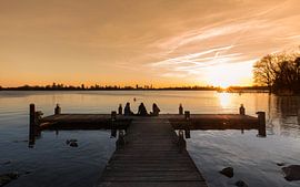
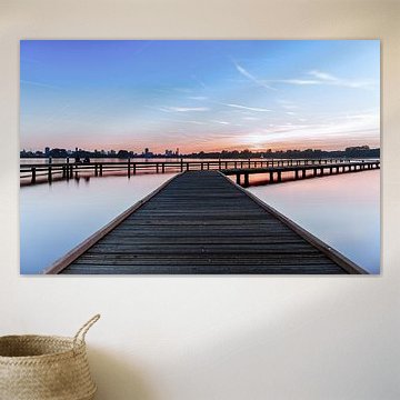
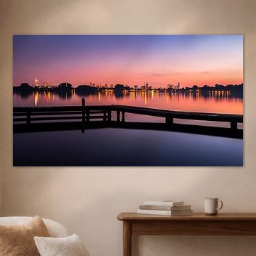
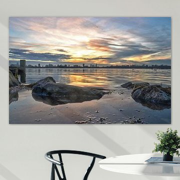
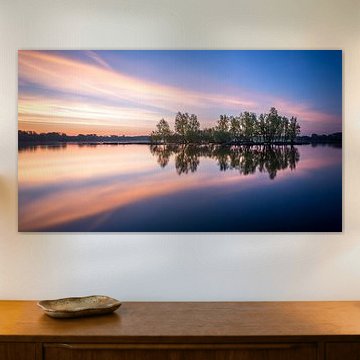
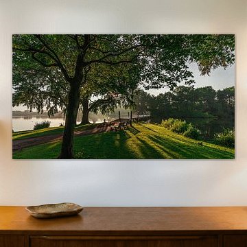
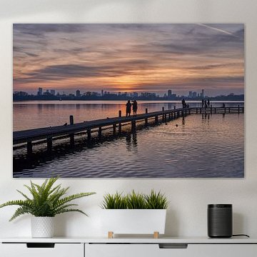
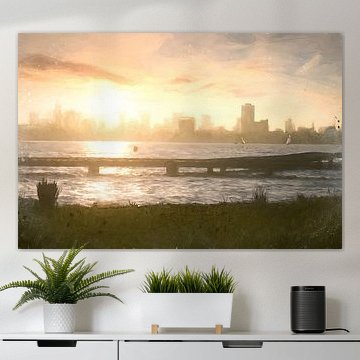
Pairing tranquil water views with the right room
Water scenes bring a sense of calm to your interior, making them ideal for spaces where you want to unwind. Consider placing Skyline from Kralingse plas in a bedroom or reading nook, where its serene reflections and soft pink-blue tones create a restful atmosphere at any time of day.
AnouschkaArt Stylist Questions? Check out our FAQ
 -
More artworks below this tip
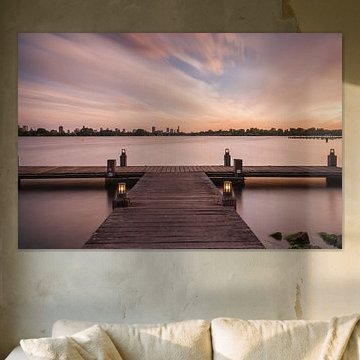
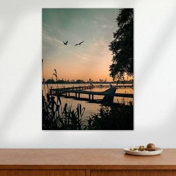
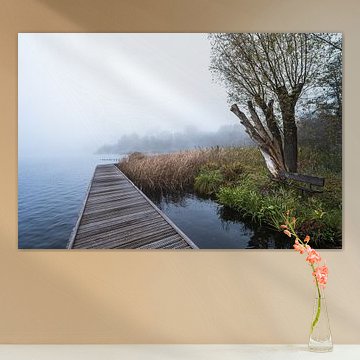
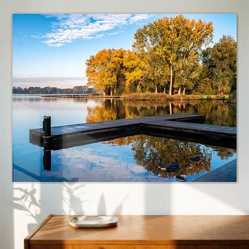
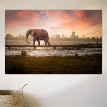
Choosing between portrait and landscape formats
Both portrait and landscape formats are popular choices for this collection. Portrait suits narrow wall spaces like hallways or beside doorways, while landscape works well above sofas or sideboards. Choose the format that fits your available wall space and surrounding furniture.
RosanneStylist & Customer service Questions? Check out our FAQ
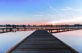
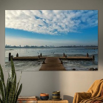
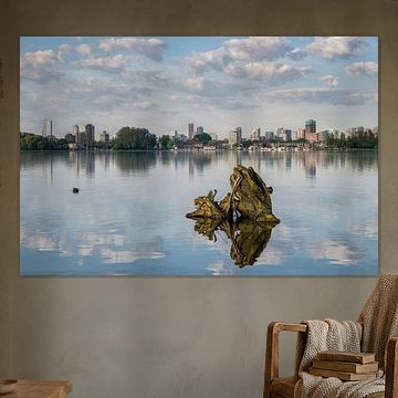
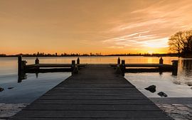
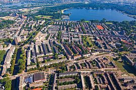
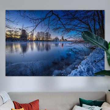
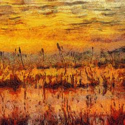
Kralingse Bos & Kralingse Plas
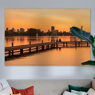
Sunset reflections and skyline silhouettes define this iconic Rotterdam destination. The Kralingse Plas draws photographers to its wooden piers and calm waters, where warm terracotta, coral and mauve skies meet the city horizon. These tranquil scenes work beautifully in contemporary and modern interiors, bringing natural serenity indoors. Kralingseplas Rotterdam captures that peaceful evening light perfectly, while other artworks explore winter mornings and golden-hour glow.
At Art Heroes, you'll find artwork from talented European artists, printed to order. Choose from Canvas, ArtFrame™, Poster and more to suit your space.


Trusted and loved
Customers rate us 4.8!
High-quality materials
Sustainable and long-lasting beauty
Different sizes
From small to large, anything is possible.
Made for you
Made the moment you order.


More like this


How do you combine artwork from Kralingse Bos & Kralingse Plas?
The calm and dreamy mood of this collection pairs beautifully with natural textures and muted tones. Consider creating a gallery wall where you mix portrait and square formats for visual variety. Combine these artworks with soft textiles like linen cushions or a wool throw in complementary taupe or grey shades. Adding greenery - ferns or eucalyptus branches - echoes the natural feel of the imagery. Layer in warm wood accents or ceramic pieces to ground the mysterious atmosphere. Let the brown and mauve tones guide your styling choices for a cohesive, inviting display.
Where does art from Kralingse Bos & Kralingse Plas work well?
A bedroom is a good spot for artwork from this collection. The calm, dreamy qualities help create a restful atmosphere that supports relaxation and sleep. Hang a landscape format piece above your bed to draw the eye horizontally and make the space feel wider, or place a square format on the wall opposite your bed as a gentle focal point. The soft blue and grey tones work particularly well in sleeping spaces without overstimulating the senses. Choose Canvas for a softer, more tactile finish that suits the intimate nature of a bedroom.
Which interior styles suit Kralingse Bos & Kralingse Plas artwork?
The earthy brown, taupe, and mauve palette makes artwork from Kralingse Bos & Kralingse Plas a natural fit for Scandinavian interiors. Pair the grey and blue tones with light wood furniture, white walls, and natural linen to let the artwork breathe. For a warmer approach, combine the brown and taupe pieces with rustic country-style elements like reclaimed wood shelving or woven baskets. The mysterious mood adds depth without disrupting the clean lines typical of both styles. Mix formats - portrait pieces near doorways, landscape above sideboards - to guide movement through your space naturally.
