Jan Toorop
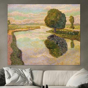
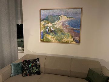
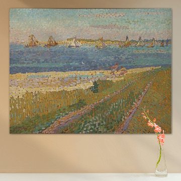
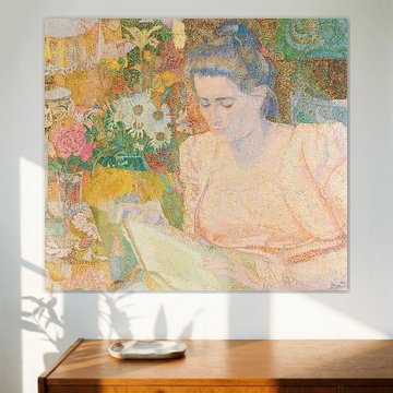
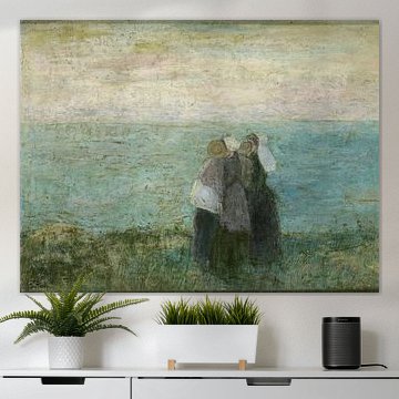
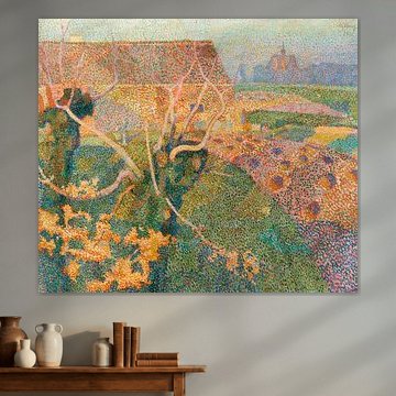
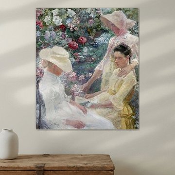
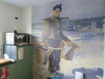
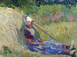
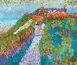
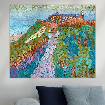
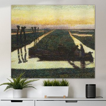
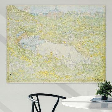
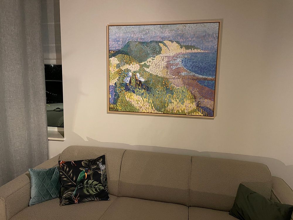
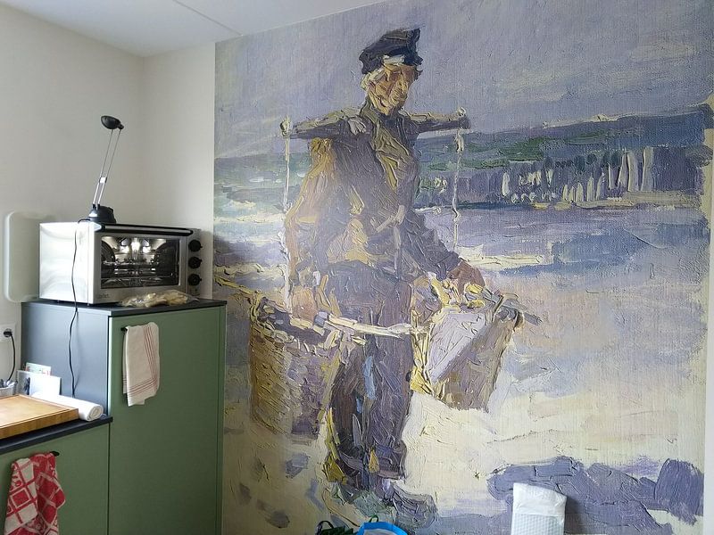
Jan Toorop's pointillist technique brings calm and nostalgia to every scene. His tranquil Dutch landscapes and intimate portraits capture light through thousands of delicate color dots, creating depth that feels both gentle and alive. Works like Sea and dunes near Zoutelande, Jan Toorop, showcase his mastery of coastal atmospheres, while his palette of sage greens, warm taupes, and soft blues suits minimalist and natural interiors beautifully.
At Art Heroes, we print each Jan Toorop artwork to order. Choose Canvas, Poster, Wallpaper, and more to match your space perfectly.
-
More artworks below this tip
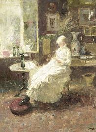
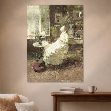
Working with warm neutrals
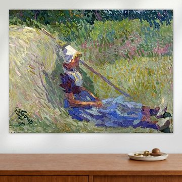
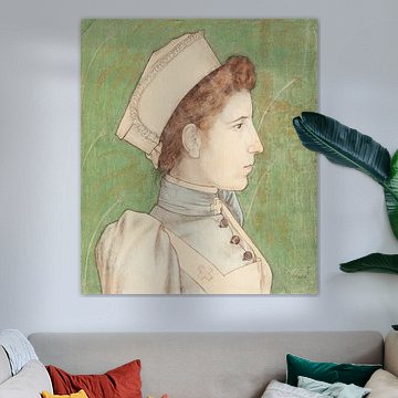
Warm neutrals anchor a room without competing for attention. Beige and taupe dominate this Jan Toorop collection, making these artworks easy to integrate with existing furniture and textiles. They suit spaces where you want visual interest without bold color - think reading nooks or home offices.
GinaStylist & Customer service Questions? Check out our FAQ
 -
More artworks below this tip
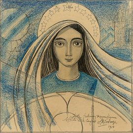
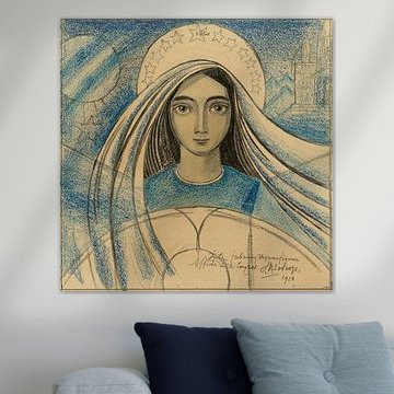
Adding depth with intricate line work
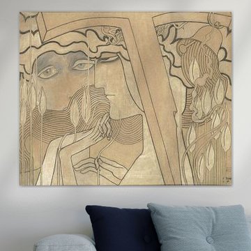
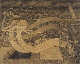
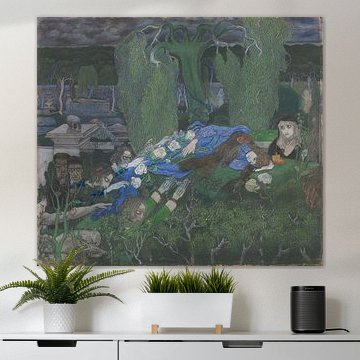
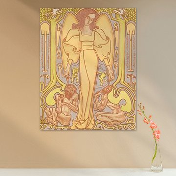
Detailed drawings reward closer viewing and add visual depth to smaller spaces. The intricate chalk work and flowing forms in O Grave, Jan Toorop create interest on a wall where you spend time nearby - next to a desk, above a console table, or in a cozy corner where the detail can be appreciated.
RosanneStylist & Customer service Questions? Check out our FAQ




















Trusted and loved
Customers rate us 4.8!
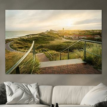
High-quality materials
Sustainable and long-lasting beauty
Different sizes
From small to large, anything is possible.
Made for you
Made the moment you order.
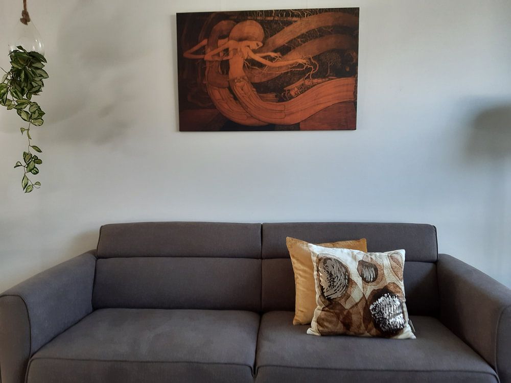
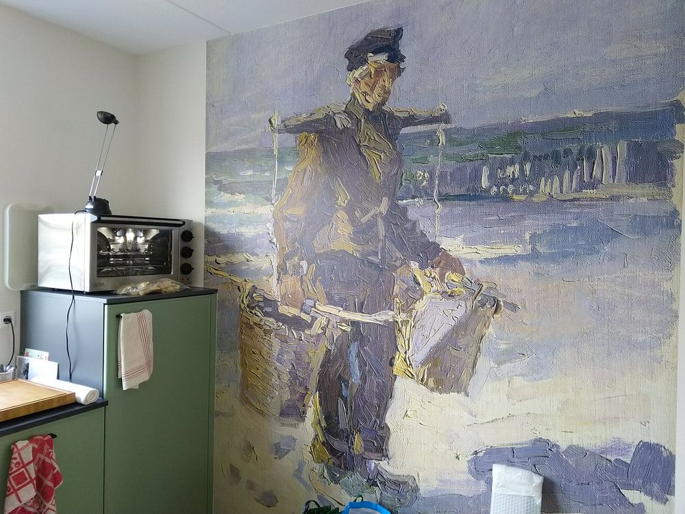
How they hang in other homes
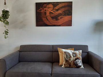
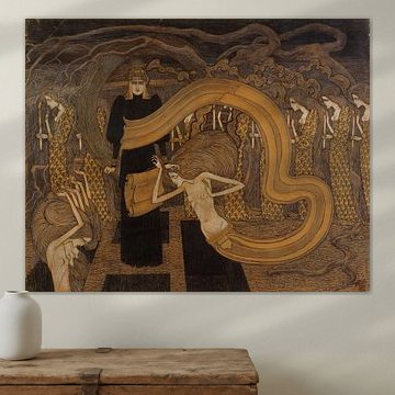
Get inspired by beautiful artworks on other people's walls and see how they truly enhance an interior.


More like this
How to style Jan Toorop artworks in your interior
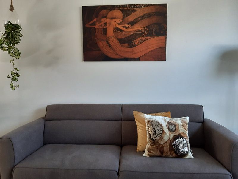
Jan Toorop artworks bring calm, nostalgic, and dreamy moods into your home, making them ideal for creating serene gallery walls or pairing with natural decor elements. Combine these pieces with soft textiles in complementary earth tones, or place them alongside dried flowers and wooden accessories to enhance their organic feel. Layer different sizes to create visual depth, and mix paintings with illustrations for variety. Let the gentle palette guide your styling choices and create a space that feels both collected and cohesive.
Which colors in Jan Toorop art suit Scandinavian interiors
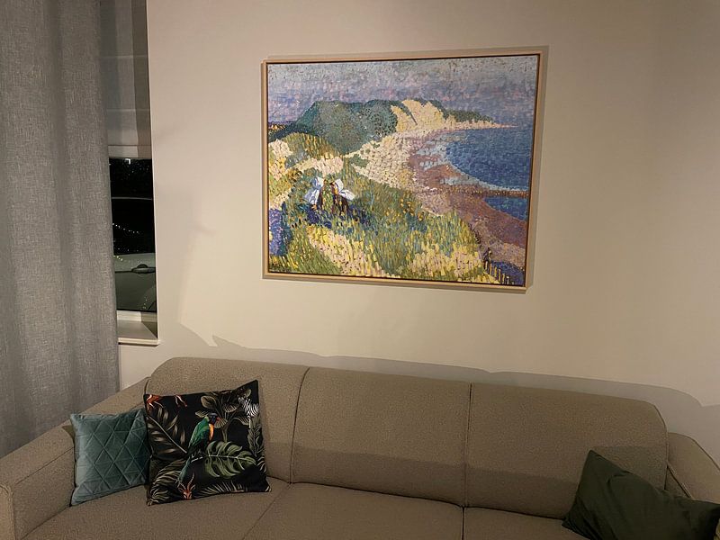
Jan Toorop artworks feature beige, taupe, sage green, brown, and olive green - colors that naturally complement Scandinavian interiors. The soft beige and taupe tones pair beautifully with light wood furniture and white walls, creating the airy, understated aesthetic Scandinavian design is known for. Introduce sage green or olive green pieces near natural linen curtains or woven baskets to bring warmth without overwhelming the space. These muted earth tones anchor minimalist rooms while maintaining the calm, nature-inspired atmosphere that defines Scandinavian style.
Which material suits Jan Toorop art best
The dreamy, nostalgic quality of Jan Toorop art shines beautifully on ArtFrame™, though Canvas and Poster offer great alternatives depending on your space. Choose ArtFrame™ and you benefit from two standout features that enhance this collection. First, the interchangeable print system lets you refresh the calm, earthy mood of your interior in minutes - simply swap between different illustrations or paintings without replacing the entire frame, perfect for rotating seasonal looks or exploring the collection's full range. Second, the acoustic panels work especially well with the serene, contemplative moods these artworks evoke: they reduce echo while staying hidden behind the beige, taupe, and sage green prints, creating a quieter, more focused atmosphere that matches the nostalgic tone. Still doubting which material suits your interior and chosen Jan Toorop artwork? Use our Material Advisor to find the perfect match.