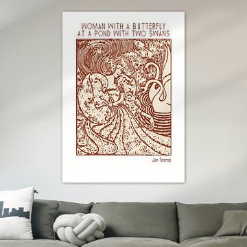
Jan Toorop
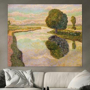
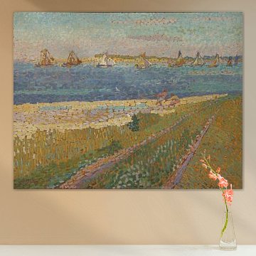
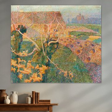
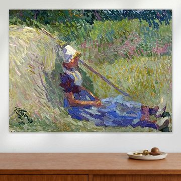
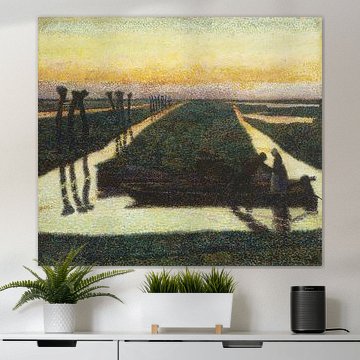
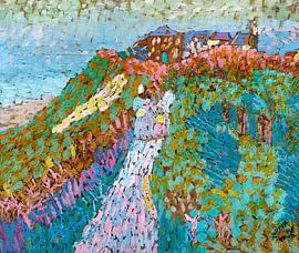
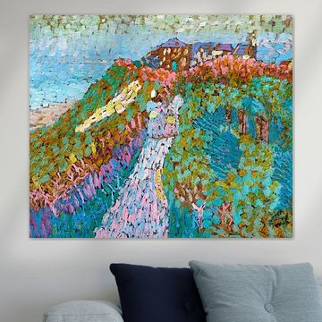
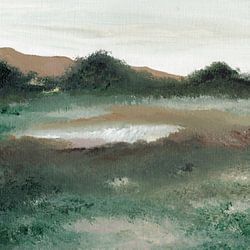
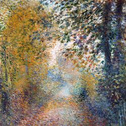
Jan Toorop's pointillist technique brings calm and nostalgia to every scene. His tranquil Dutch landscapes and intimate portraits capture light through thousands of delicate color dots, creating depth that feels both gentle and alive. Works like Sea and dunes near Zoutelande, Jan Toorop, showcase his mastery of coastal atmospheres, while his palette of sage greens, warm taupes, and soft blues suits minimalist and natural interiors beautifully.
At Art Heroes, we print each Jan Toorop artwork to order. Choose Canvas, Poster, Wallpaper, and more to match your space perfectly.
-
More artworks below this tip
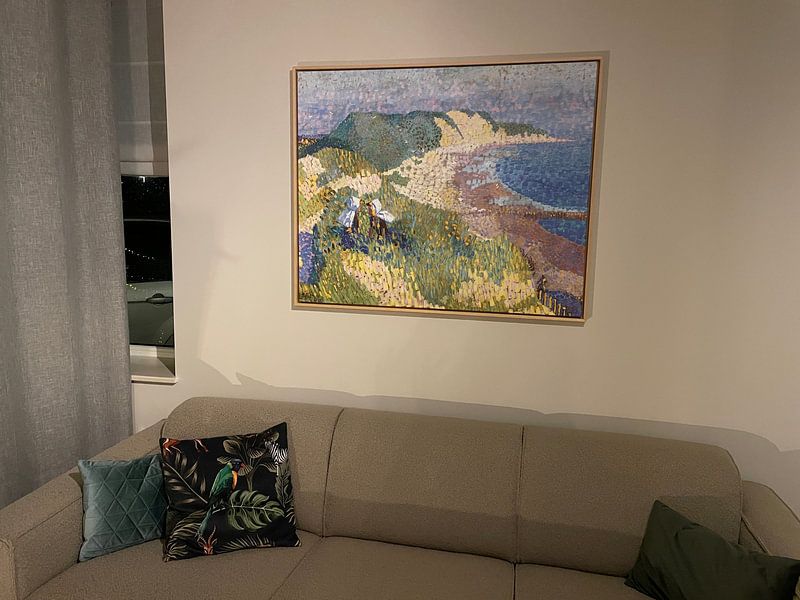
Hang at natural eye level
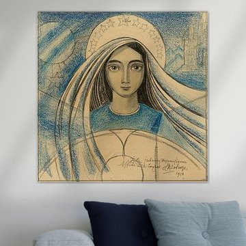
Figurative scenes feel most engaging when positioned where you'd naturally meet someone's gaze. For artworks showing standing figures, place the center roughly 145 - 150 cm from the floor. This creates an intuitive connection with the scene, especially in hallways or living areas where you pause to look.
KatharinaStylist & Customer service Questions? Check out our FAQ
 -
More artworks below this tip
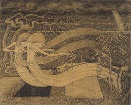
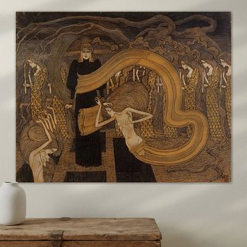
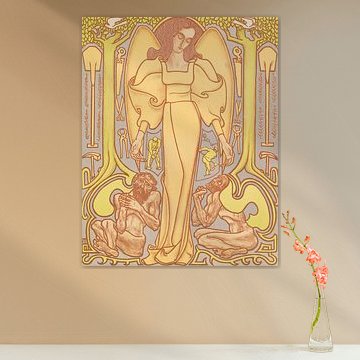
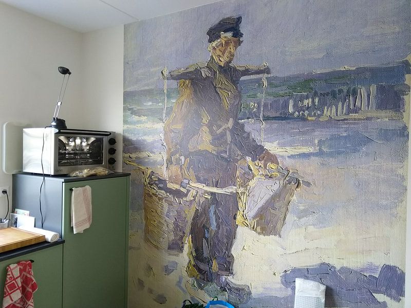
Let detailed drawings breathe
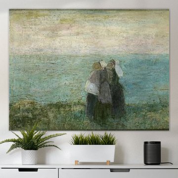
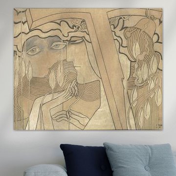
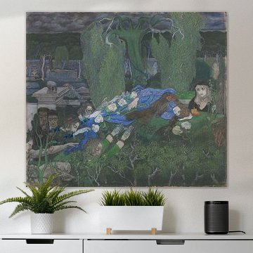
Intricate line work needs space to be appreciated up close. If you're drawn to the detailed composition in O Grave, Jan Toorop, consider placing it in a spot where you can step near - above a console table or beside a reading chair. This lets you discover new details each time you look.
RosanneStylist & Customer service Questions? Check out our FAQ


Trusted and loved
Customers rate us 4.8!
High-quality materials
Sustainable and long-lasting beauty
Different sizes
From small to large, anything is possible.
Made for you
Made the moment you order.
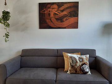
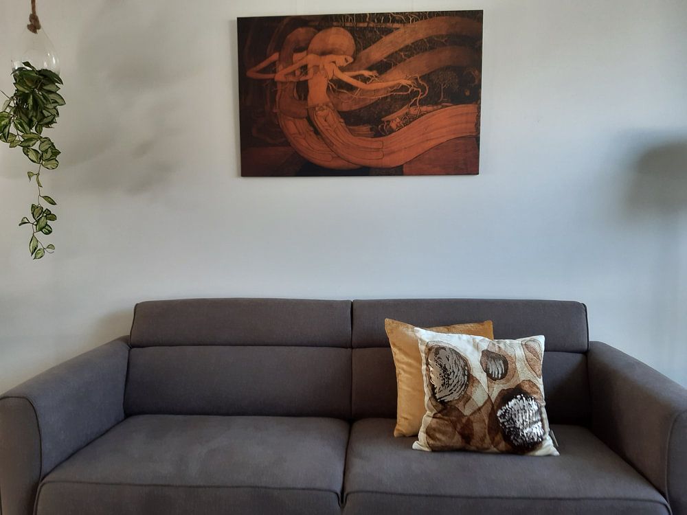
How they hang in other homes
Get inspired by beautiful artworks on other people's walls and see how they truly enhance an interior.


More like this

Choosing the right material for Jan Toorop
Jan Toorop comes to life on each of our premium materials. Whether you choose ArtFrame™, Poster, or Canvas, each enhances the unique details and colors of his work.
Choose ArtFrame™ and you benefit from practical flexibility combined with visual impact. The interchangeable print system means you can swap between different Jan Toorop artworks whenever you want - perfect if you're drawn to both his calm, dreamy compositions and his more nostalgic pieces. Simply remove one print and click in another, no tools needed. The textile print surface brings out the subtle beige, taupe, and sage green tones beautifully, while the aluminum frame in gold, black, white, or silver lets you match the earthy, muted palette to your interior. If you work from home or have a space where sound echoes, the optional acoustic panels reduce reverberation while staying completely hidden behind the artwork - a smart solution that combines the contemplative mood of Jan Toorop with better room acoustics.
Still doubting which material suits your interior and chosen Jan Toorop artwork? Use our material comparator to find the perfect match.
Which format works best for Jan Toorop artworks
Jan Toorop's work translates well across different formats, making placement flexible. If you're working with a narrow wall - beside a bookcase, in a hallway, or flanking a window - a vertical format draws the eye upward and makes good use of limited width. Vertical prints also work well above a console table or sideboard where floor space is tight. For wider walls above a sofa or bed, a horizontal format balances the furniture better and creates a more relaxed, anchored feel.
Where Jan Toorop works well in your home

A bedroom is a good spot for Jan Toorop. The calm, dreamy mood and soft color palette - beige, taupe, olive green, and brown - create a restful atmosphere that suits a space meant for unwinding. Hang a piece above the headboard to establish a quiet focal point, or place one on the wall opposite your bed so it's the first thing you see in the morning. Pair the muted tones with natural linen bedding and wooden furniture to reinforce the nostalgic, grounded feel of his work.
