
Gustave van de Woestyne
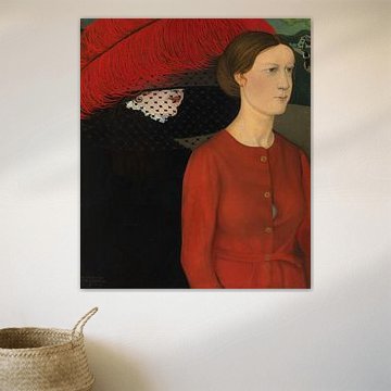
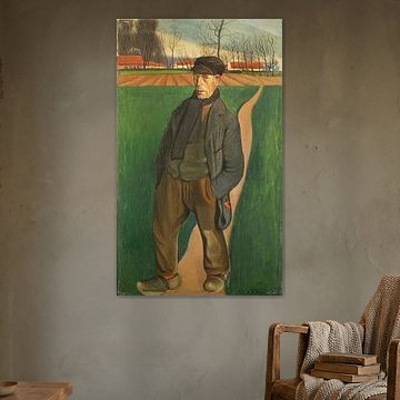
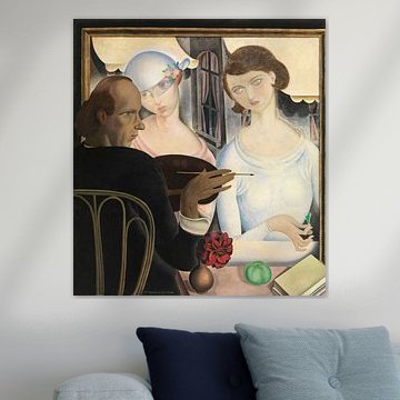
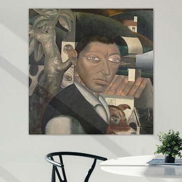
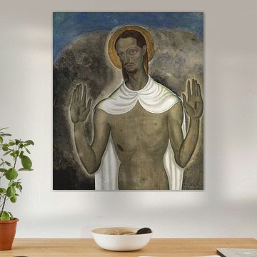
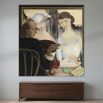
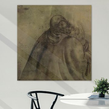
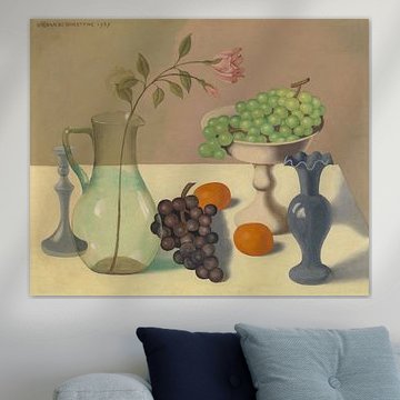
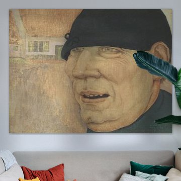
Choosing Gustave van de Woestyne means welcoming introspective depth into your space. His Belgian expressionism carries a quiet spiritual weight. Muted earth tones - taupe, bronze, sage green - merge with moments of vivid red, creating compositions that feel both grounded and mysterious.
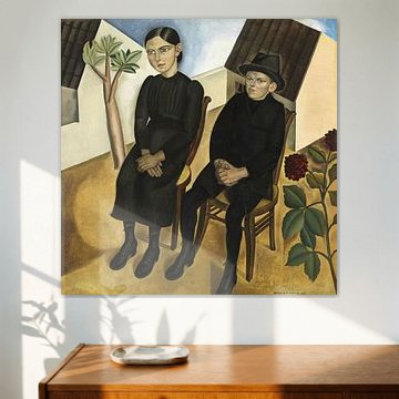
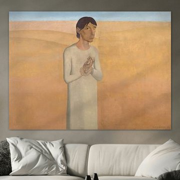
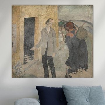
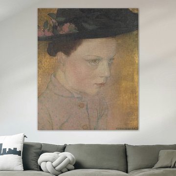
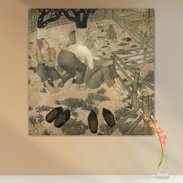
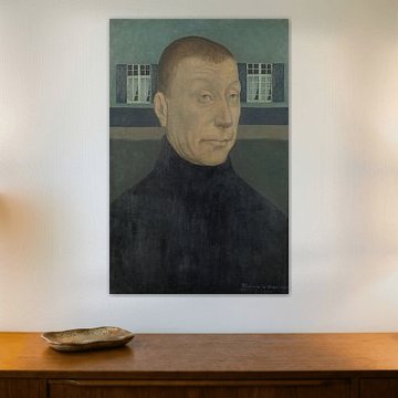
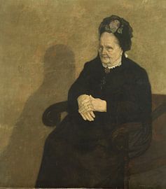
Works like The two springs, Gustave Van de Woestyne showcase his masterful use of contrast, while the calm melancholy in Gaston and his Sister, Gustave Van de Woestyne reflects his signature contemplative style. These paintings suit interiors that value subtlety over loudness, where art invites reflection rather than shouts for attention.
Available as Canvas, Poster, ArtFrame™ and more - choose what works for your wall.
-
More artworks below this tip
Style bedrooms and living areas with muted colour
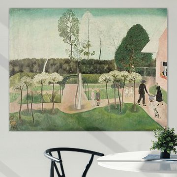
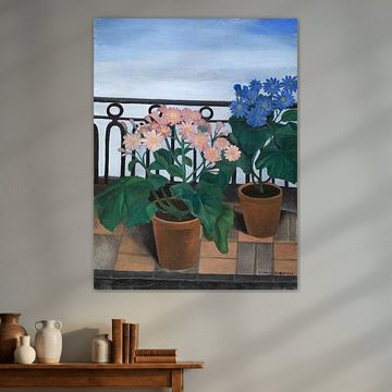
Soft greens, browns, and sage tones create a restful backdrop in private spaces. These colours sit comfortably in bedrooms, home offices, or living rooms where you want atmosphere without visual noise. The gentle palette in Balcony with Flowers (Cinerarias), Gustave Van de Woestyne complements neutral interiors and brings quiet character to the wall.
RosanneStylist & Customer service Questions? Check out our FAQ
-
More artworks below this tip
Choose your format to fit the wall
Format availability varies by artwork, so check the options for your chosen piece. If you're working with a narrow wall or vertical space, portrait formats create height and structure. For wider wall areas or above furniture, landscape formats help balance the room horizontally. Choose what suits your space.
AnthiStylist & Customer service Questions? Check out our FAQ






















Trusted and loved
Customers rate us 4.8!
High-quality materials
Sustainable and long-lasting beauty
Different sizes
From small to large, anything is possible.
Made for you
Made the moment you order.


More like this




Where to display art by Gustave van de Woestyne in your home
Horizontal formats work particularly well for artworks by Gustave van de Woestyne, creating balance and calm above sofas, sideboards, or beds. The earthy palette of beige, brown, and taupe feels grounded in these positions, drawing the eye without overwhelming the room. When wall space is narrow or vertical - think hallways or alcove walls - a vertical format often works better to complement the architecture.
Which material suits art by Gustave van de Woestyne best
ArtFrame™ highlights the nostalgic, muted tones in this collection beautifully, though Canvas and Poster offer accessible alternatives. Choose ArtFrame™ and you benefit from two thoughtful features that enhance the character of Van de Woestyne's work. The interchangeable print system lets you refresh your space effortlessly - ideal when you want to rotate between the calm, mysterious moods these artworks evoke without committing to one piece permanently. The aluminum frame comes in gold, black, white, or silver, allowing you to match the bronze and green undertones or create subtle contrast with a sleek black or warm gold finish. The sturdy textile print preserves the layered, painterly quality of the original techniques, ensuring the beige and taupe hues remain soft yet defined on your wall. Still doubting which material suits your interior and chosen Gustave van de Woestyne artwork? Use our Material Advisor to find the perfect match.
Styling tips for combining art by Gustave van de Woestyne
Pair these calm, nostalgic artworks with natural materials like linen cushions, wooden furniture, or ceramic vases in earthy tones to echo the brown and taupe palette. A gallery wall mixing Van de Woestyne pieces with botanical prints or abstract textures in green and bronze creates visual rhythm without losing the mysterious, introspective mood. Add soft, warm lighting to deepen the atmosphere and let the muted colors speak quietly in your living room or bedroom.