-
More artworks below this tip
Pairing Earthy Tones with Your Interior
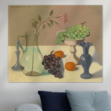
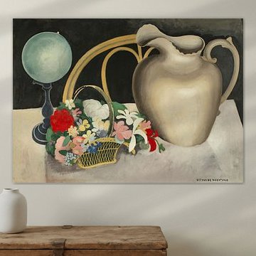
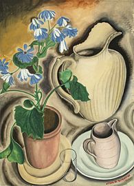
The dominant colors in Gustave van de Woestyne artworks - beige, brown, and taupe - create a warm, grounded foundation. These earthy shades work beautifully alongside natural materials like wood, linen, or terracotta. For a harmonious look, pair them with similar neutrals or add contrast with soft sage accents to bring depth to your room.
AnthiStylist & Customer service Questions? Check out our FAQ
 -
More artworks below this tip
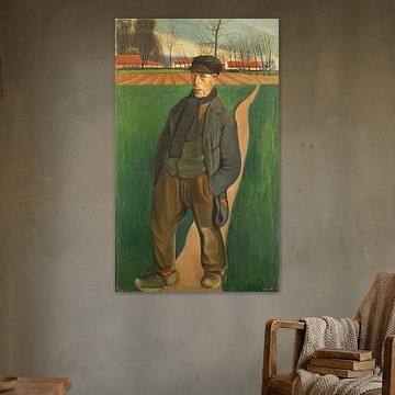
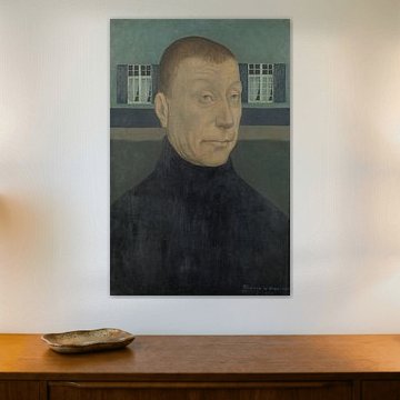
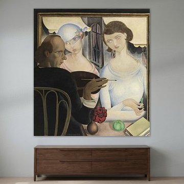
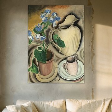
Choosing Your Display Size
Gustave van de Woestyne artworks suit a variety of display formats, so you can choose what fits your wall space best. A larger format emphasizes the detail and composition, ideal for feature walls or above furniture. Smaller formats work well in gallery arrangements or tighter spaces where you want a layered, personal look.
RosanneStylist & Customer service Questions? Check out our FAQ
Gustave van de Woestyne
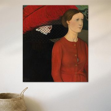
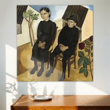
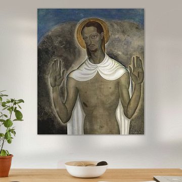
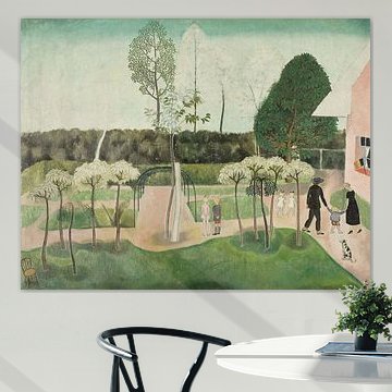
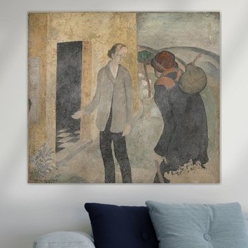
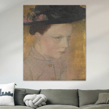
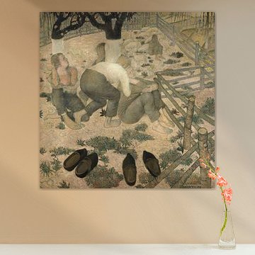
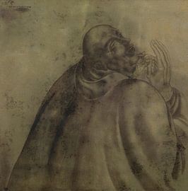
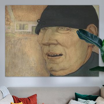
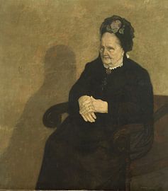
Gustave van de Woestyne's contemplative artworks speak to those who value emotional depth. His Belgian Expressionist style combines muted earthy tones with introspective figures, creating a calm yet mysterious atmosphere. These pieces work beautifully in modern and minimalist interiors, where their subdued palette and geometric forms add character without overwhelming the space. The restrained composition in Christ in the desert, Gustave Van de Woestyne shows how his desert landscapes evoke stillness and reflection.
At Art Heroes, we print each piece custom-made on Canvas, Poster, and more. Free shipping makes it easy to bring his distinctive vision into your home.


Trusted and loved
Customers rate us 4.8!
High-quality materials
Sustainable and long-lasting beauty
Different sizes
From small to large, anything is possible.
Made for you
Made the moment you order.


Which format works best for Gustave van de Woestyne artworks?
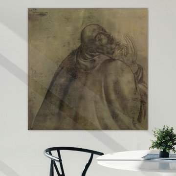
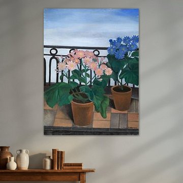
The artworks from this collection work beautifully in a variety of formats, giving you flexibility to match your space. A horizontal format is particularly effective above a sideboard or sofa, where it creates a balanced focal point without overwhelming the wall. In rooms with higher ceilings or narrow walls, a vertical format offers an elegant alternative that draws the eye upward and adds visual height to your interior.
How to style Gustave van de Woestyne with warm, earthy tones
The warm palette of beige, brown, taupe, and bronze in Gustave van de Woestyne artworks pairs naturally with country and rustic interiors. These earthy shades complement natural wood furniture, linen textiles, and terracotta accessories. The subtle green accents add depth without disrupting the cohesive warmth. Consider displaying these artworks in spaces with cream or soft grey walls to let the rich tones stand out, or pair them with darker wood finishes for a more grounded, traditional feel.
Combining Gustave van de Woestyne with calm, reflective styling
The calm, nostalgic, and mysterious moods present in Gustave van de Woestyne artworks invite thoughtful styling. Pair these pieces with understated decor - woven baskets, ceramic vessels, or vintage textiles - to enhance the reflective atmosphere. In a gallery wall arrangement, balance the warm tones with neutral frames or black-and-white photography to create contrast while maintaining harmony. Soft lighting from table lamps or candles reinforces the contemplative mood these artworks evoke.
Bring the quiet beauty of Gustave van de Woestyne into your home and discover how his work transforms everyday spaces into places of reflection.
