-
More artworks below this tip
Pairing with natural textures
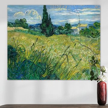
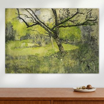
Earthy tones like brown, beige, and taupe pair beautifully with natural materials in your room. Think wooden furniture, linen textiles, or woven accents that echo these warm hues. The golden meadow tones in The Kien Valley with the Bluemlisalp Massif, Ferdinand Hodler work especially well alongside oak or walnut pieces, creating a grounded, harmonious feel.
AnouschkaArt Stylist Questions? Check out our FAQ
 -
More artworks below this tip
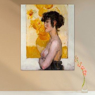
Choosing rooms for calm moods
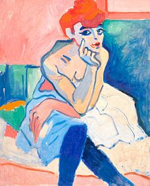
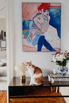
Artworks with calm, reflective qualities suit spaces where you unwind - bedrooms, reading nooks, or quiet corners of a living room. These pieces encourage a relaxed atmosphere rather than high energy. The contemplative pose in Woman in a Chemise, André Derain makes it a thoughtful choice for personal, tranquil spaces in your home.
EileenStylist & Customer service Questions? Check out our FAQ
 -
More artworks below this tip
Balancing bold color contrasts
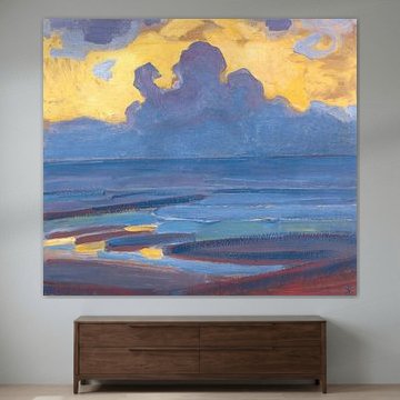
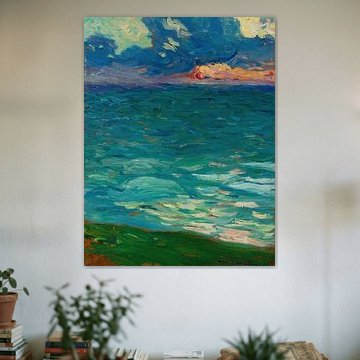
When an artwork features strong color shifts - like cool blues meeting warm pinks - balance it with neutral surroundings to let the piece breathe. Soft grays or off-whites in your walls and fabrics help the colors stand out without competing. The contrasting palette in Oceanides, Akseli Gallen-Kallela shines against understated backdrops.
RosanneStylist & Customer service Questions? Check out our FAQ
Expressionism (Old Masters)
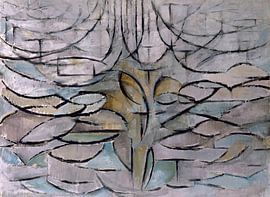
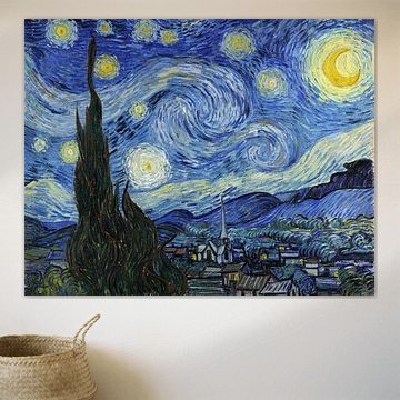
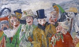
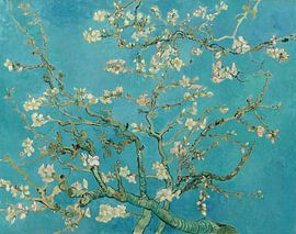
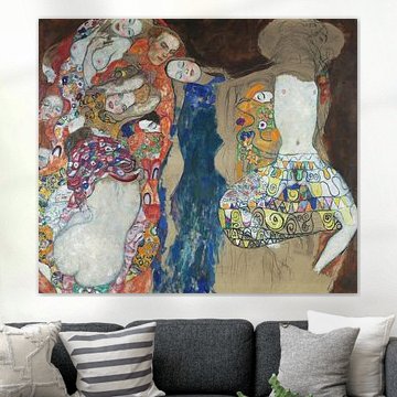
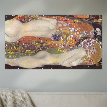
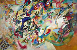
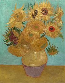
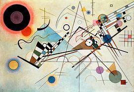
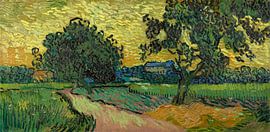
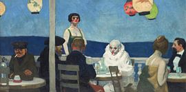
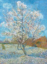
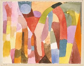
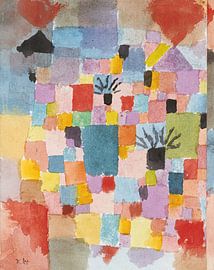
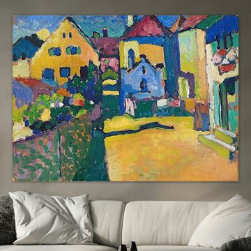
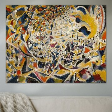
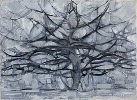
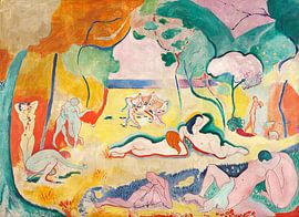
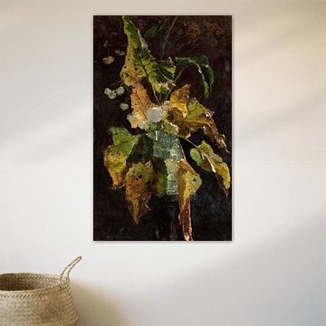
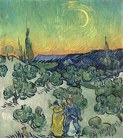
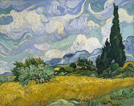
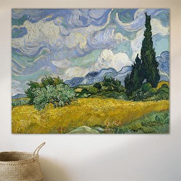
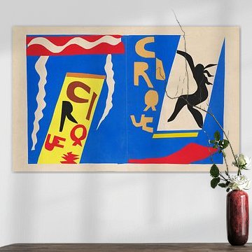
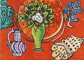
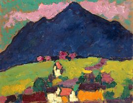
Expressionism (Old Masters) captures emotion through bold color and dynamic brushwork. Van Gogh's swirling skies and vibrant blossoms show how feeling shapes form, while Kandinsky's geometric compositions translate rhythm into paint. These artworks bring energy and depth to contemporary interiors, whether you favor calm or vivid statement pieces.
From the glowing yellow of Café terrace at night by Vincent van Gogh to abstract geometry in muted tones, each piece carries a distinct mood. Choose what suits your space - Canvas, Poster, Wallpaper, and more - all custom-made and shipped free by Art Heroes.





















Trusted and loved
Customers rate us 4.8!
High-quality materials
Sustainable and long-lasting beauty
Different sizes
From small to large, anything is possible.
Made for you
Made the moment you order.
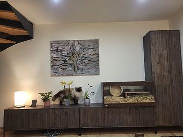
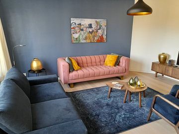
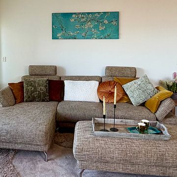
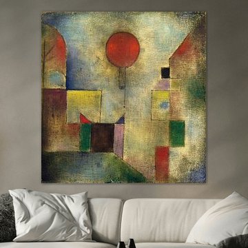
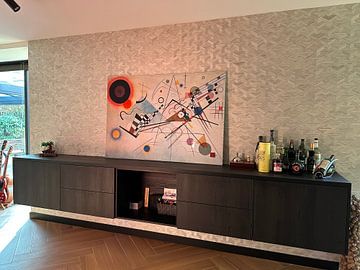
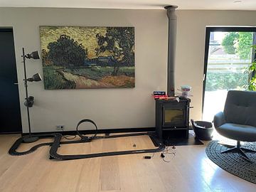
How they hang in other homes
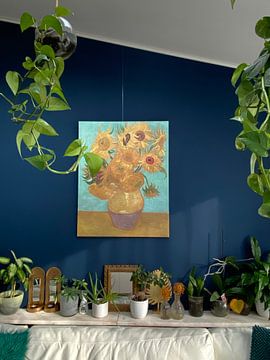
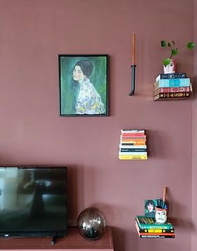
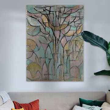
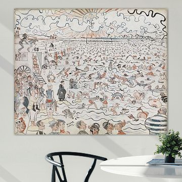
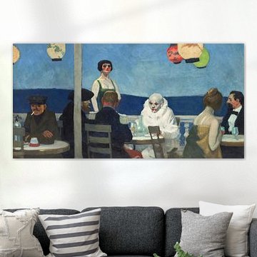
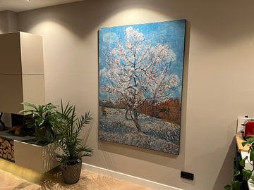
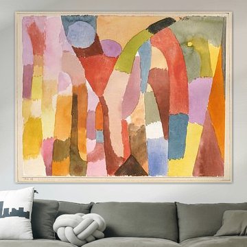
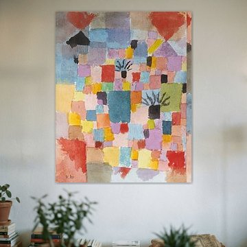
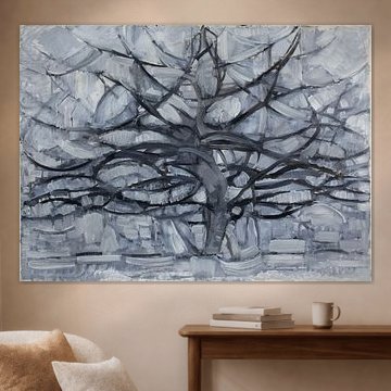
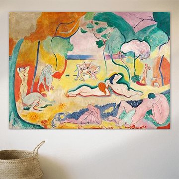
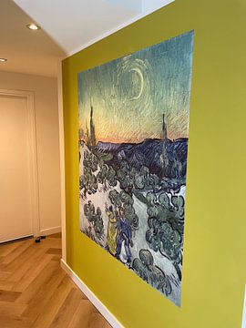
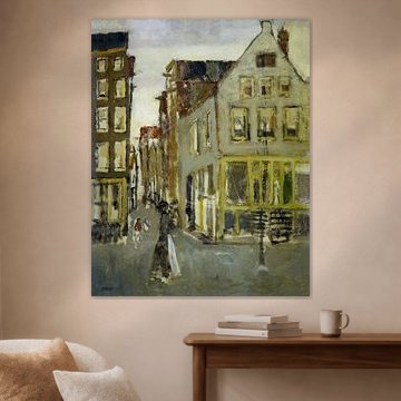
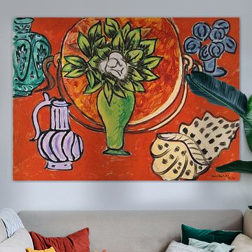
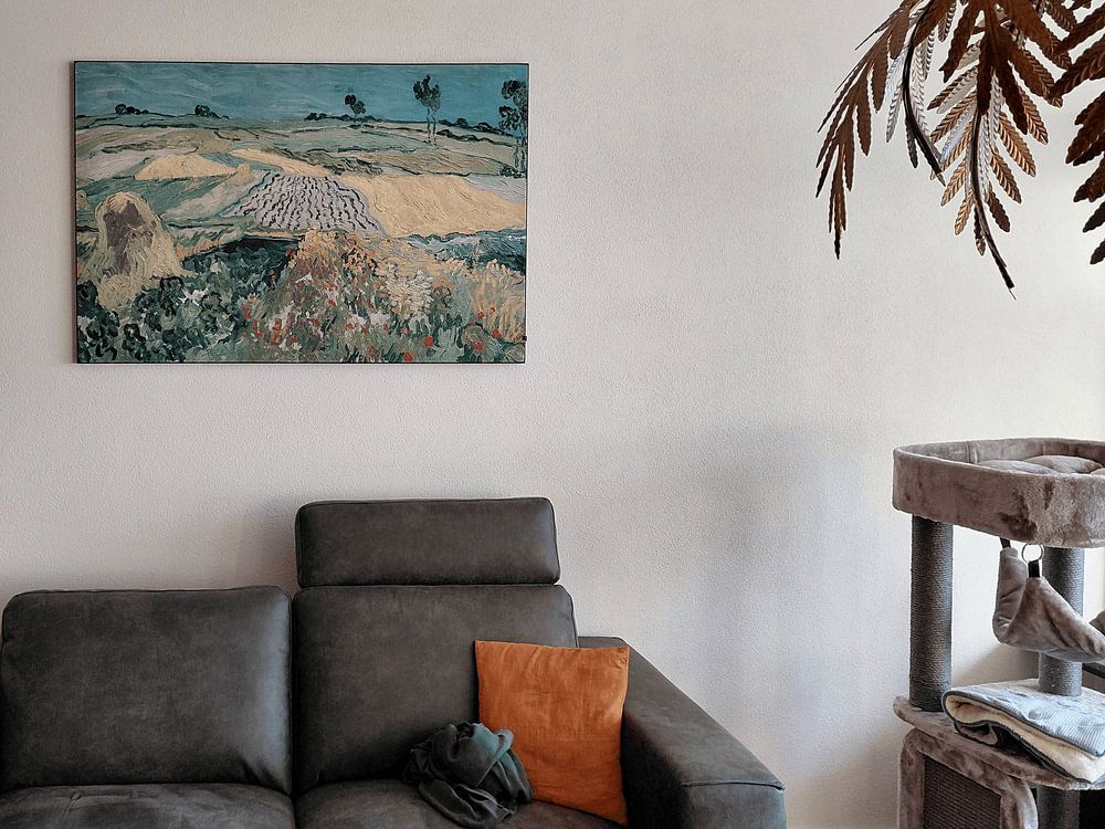
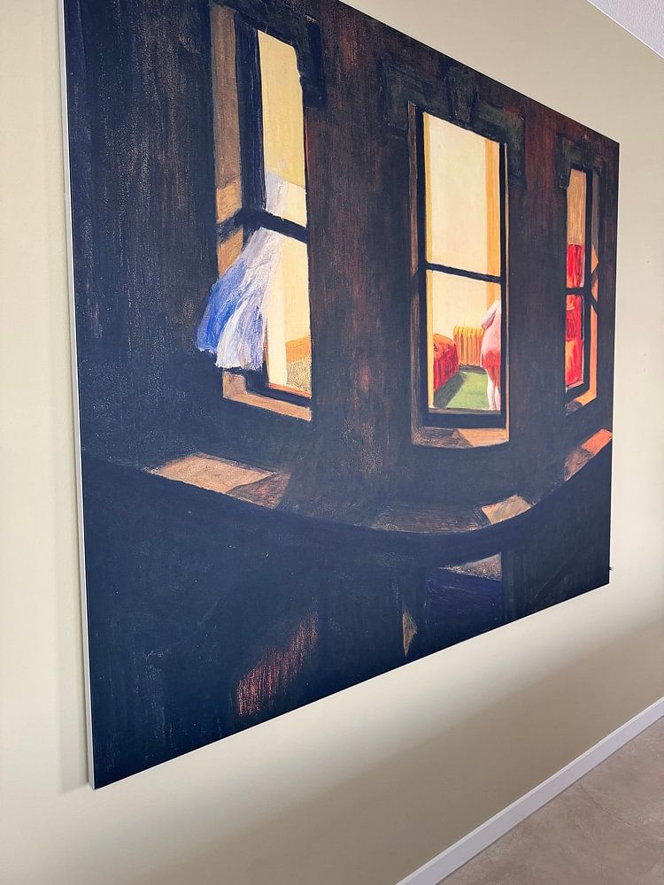
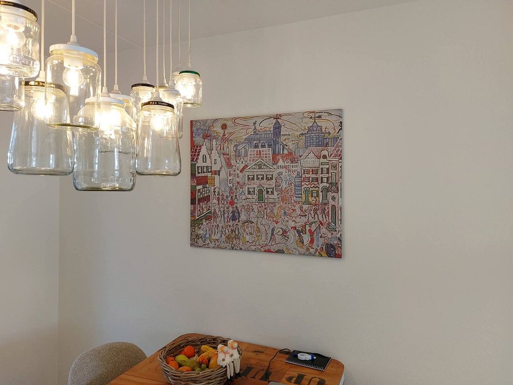
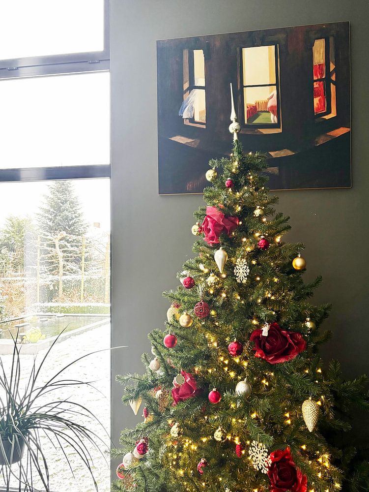
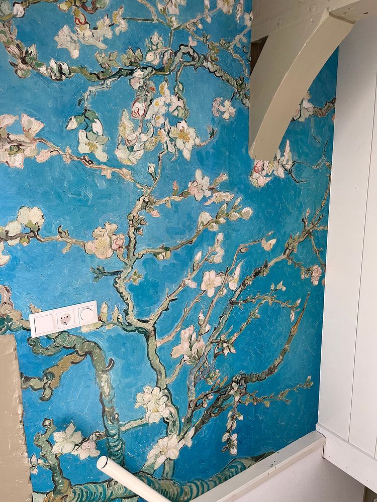
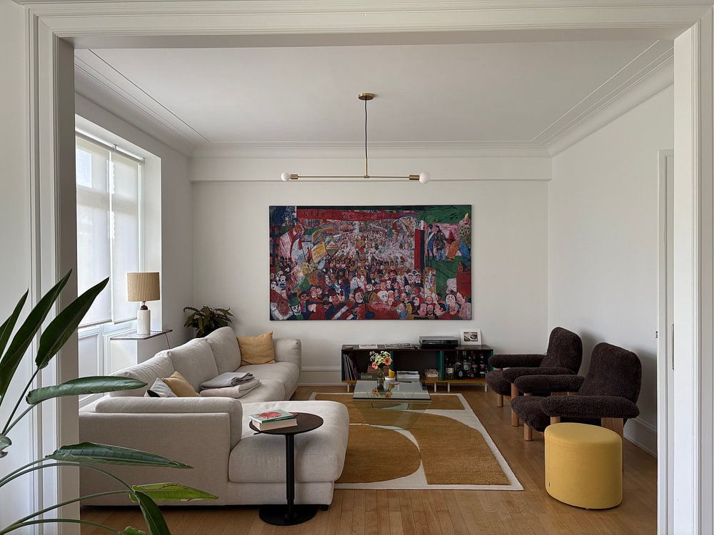
Get inspired by beautiful artworks on other people's walls and see how they truly enhance an interior.
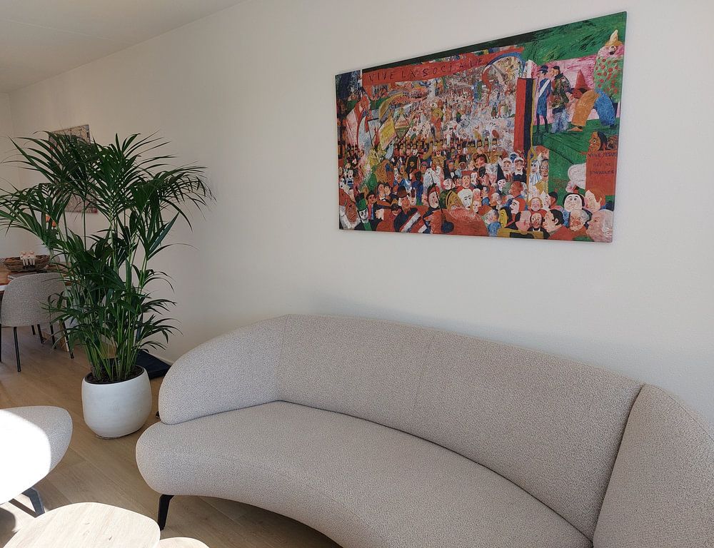
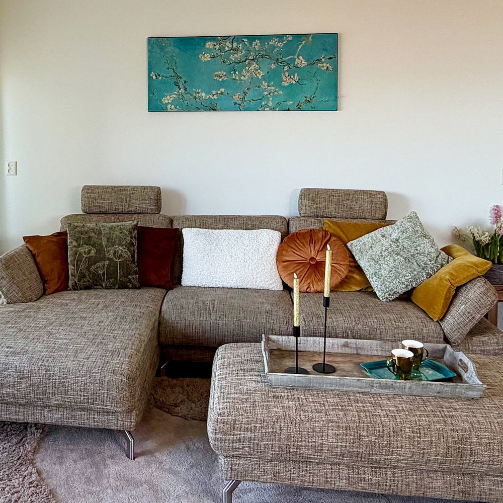
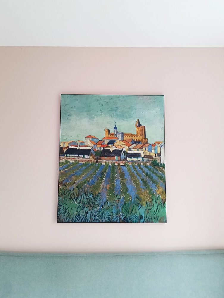
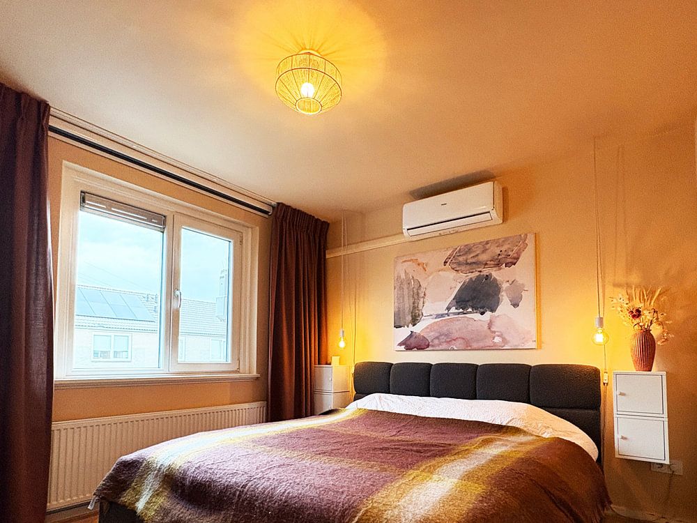


Which colors in Expressionism (Old Masters) suit a modern interior?
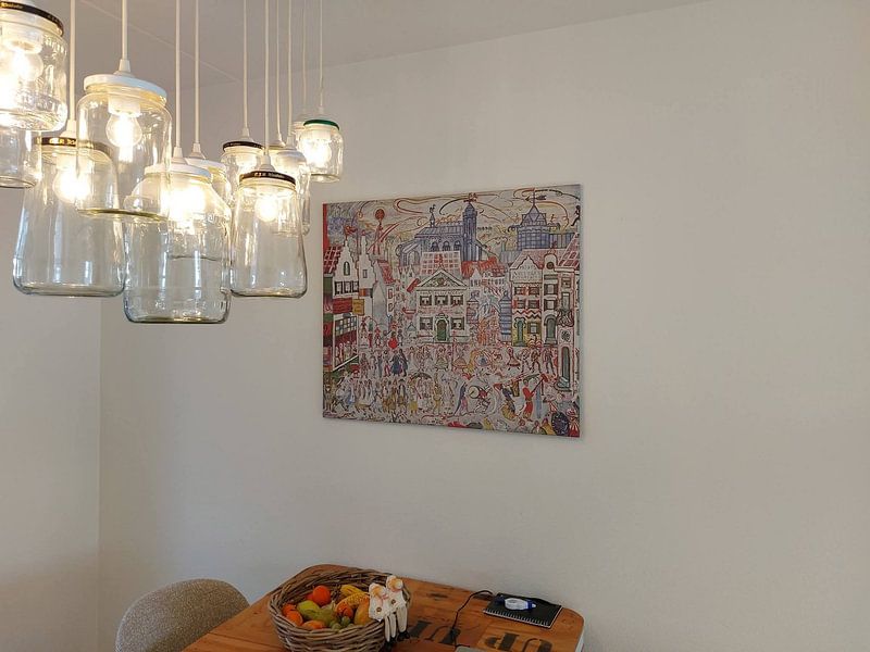
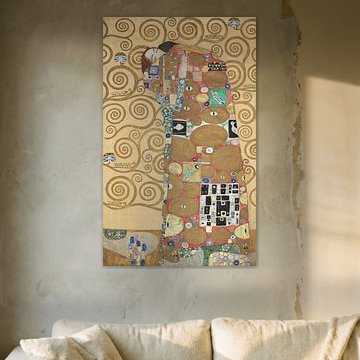
Expressionism from Old Masters brings earthy brown, beige, and taupe tones that create a warm foundation in modern interiors. Pair these neutral shades with teal accents for a contemporary contrast, or add olive green through cushions and plants to soften sleek furniture. The rich color palette balances clean lines and minimalist spaces beautifully. Choose ArtFrame™ in black or silver frames to emphasize the modern aesthetic while letting the expressive brushwork take center stage.
What format works best for Expressionism (Old Masters) artworks?
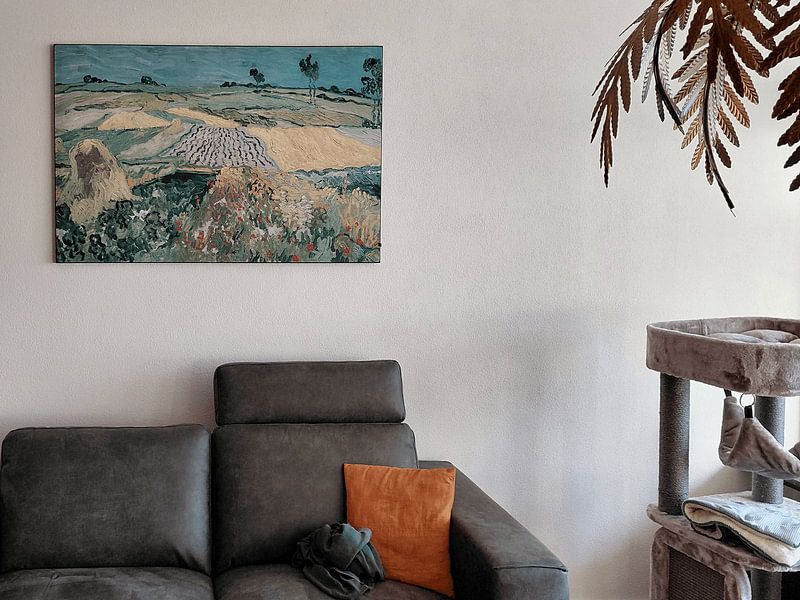
Horizontal formats dominate this collection and work perfectly above sofas, sideboards, or beds where they fill wall space without overwhelming the room. The landscape orientation suits the dramatic compositions and sweeping gestures typical of expressive painting techniques. Place a horizontal piece in your living room to anchor a seating area, or hang it in the bedroom to create a calm focal point. When wall space is limited, square formats offer a compact alternative that still captures the emotional intensity of the style.
How do you combine Expressionism (Old Masters) with other decor?
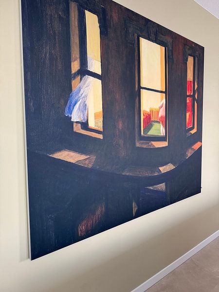
The mysterious and vibrant moods in Expressionism (Old Masters) pair well with natural materials like wood, leather, and linen that echo the organic feel of the artworks. Create depth by combining calm pieces with more vibrant examples in a gallery wall arrangement, mixing different sizes for visual interest. Add brass or copper accessories to complement the warm brown and beige tones, and place textured plants nearby to soften the dramatic expressions. The calm artworks suit quiet spaces like bedrooms, while vibrant pieces energize living areas and dining rooms.
Transform your walls with the raw emotion and bold expression that defined early expressive art movements.