
Chernobyl
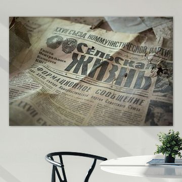
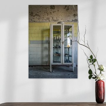
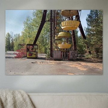
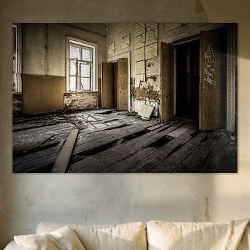
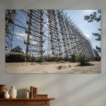
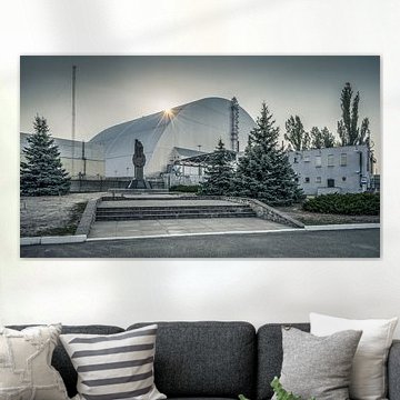
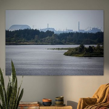
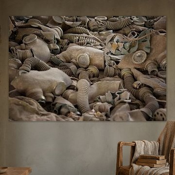
Chernobyl artworks capture something powerful. Abandoned buildings reclaimed by nature, iconic structures frozen in time - these images speak to both history and quiet beauty. The palette often leans toward earthy tones: rust, olive greens, and faded yellows that evoke autumn and decay. Works like The abandoned Ferris wheel in Pripjat show how desolation can carry unexpected calm. These pieces fit interiors that value atmosphere over decoration - industrial, minimalist, or thoughtfully eclectic spaces where stories matter.
At Art Heroes, we print every piece to order. Choose Canvas, ArtFrame™, Wallpaper and more, in sizes that suit your space.
-
More artworks below this tip
Working With Architectural Detail
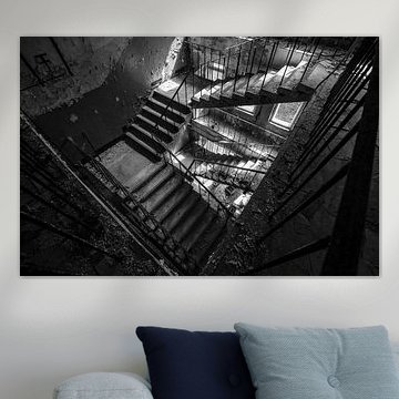
High ceilings and vertical lines complement photography with strong structure. If your space has exposed beams or tall walls, choose prints that echo those proportions and create visual harmony. The industrial scale and vertical elements in Control Room. respond well to rooms with architectural presence and height.
EileenStylist & Customer service Questions? Check out our FAQ
 -
More artworks below this tip
Choosing Your Room
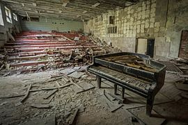
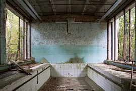
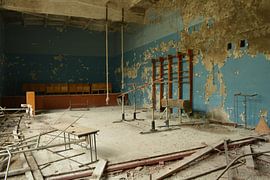
Atmospheric photography suits reflective spaces where you linger and observe. Consider placing these prints in a reading corner, home office, or hallway where the narrative detail invites closer inspection. The mysterious mood of Abandoned gym in Chernobyl. adds depth to quieter rooms that benefit from a storytelling focal point.
AnouschkaArt Stylist Questions? Check out our FAQ
 -
More artworks below this tip
Balancing Muted Tones
Earthy neutrals anchor a space without overwhelming it. Pair subdued greens and greys with natural materials like wood or linen to create a calm, grounded interior. The beige and olive tones in Abandoned gym in Chernobyl. work beautifully alongside warm timber furniture or soft textile accents in similar shades.
GinaStylist & Customer service Questions? Check out our FAQ
























Trusted and loved
Customers rate us 4.8!
High-quality materials
Sustainable and long-lasting beauty
Different sizes
From small to large, anything is possible.
Made for you
Made the moment you order.


More like this

Which colors from Chernobyl art suit industrial and minimalist interiors
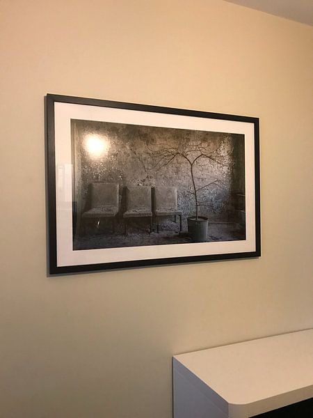
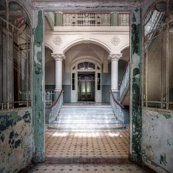
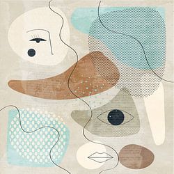
Chernobyl artworks bring muted tones that anchor contemporary spaces with quiet intensity. Grey and olive green anchor industrial interiors beautifully - pair them with exposed brick, steel fixtures, and concrete surfaces for a raw, authentic aesthetic. Brown and beige soften minimalist rooms when combined with natural wood furniture and simple white walls. Blue accents add depth without overwhelming clean-lined spaces, while these earthy hues create calm, grounded atmospheres that feel intentional rather than stark.
How to combine Chernobyl artworks with nostalgic décor elements
Chernobyl art carries melancholic and mysterious moods that pair naturally with vintage objects and weathered textures. Style these artworks alongside aged metal accessories, reclaimed wood shelving, or faded textiles that echo the nostalgic atmosphere. Dried grasses in ceramic vases and amber-toned lighting enhance the introspective feeling without competing for attention. Group multiple pieces in varying sizes to build a gallery wall that invites quiet contemplation, or place a single large artwork as a focal point above a console table dressed with old books and atmospheric candles.
What format works best for Chernobyl art placement
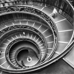
Chernobyl artworks in horizontal formats create strong visual anchors above sofas, sideboards, and bed headboards where width matters more than height. Position these pieces at eye level in living rooms or hallways to draw viewers into the atmospheric details captured through photography and digital art techniques. Horizontal orientation emphasizes the expansive, abandoned landscapes often associated with this theme. When wall space is narrow - beside doorways or on staircase walls - vertical formats work better to guide the eye upward and make the most of limited width.