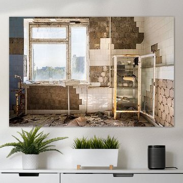
Chernobyl
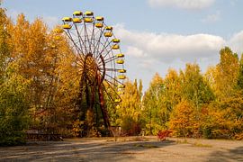
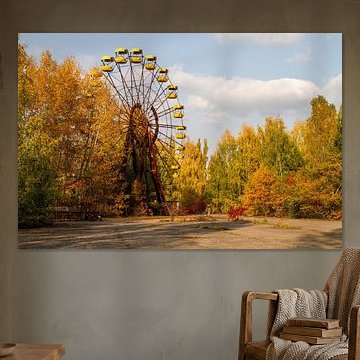
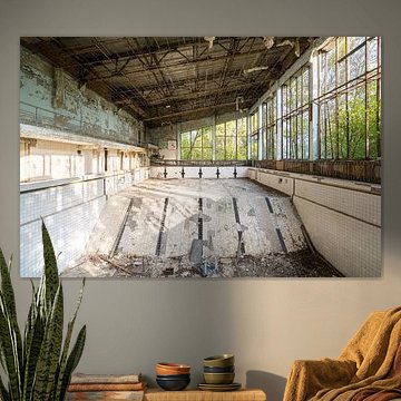
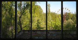
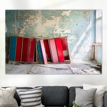
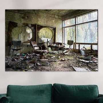
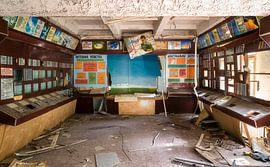
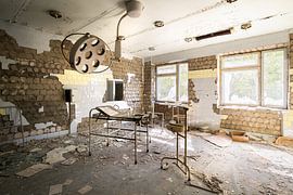
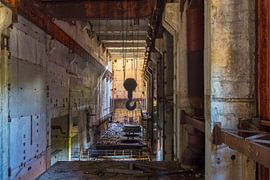
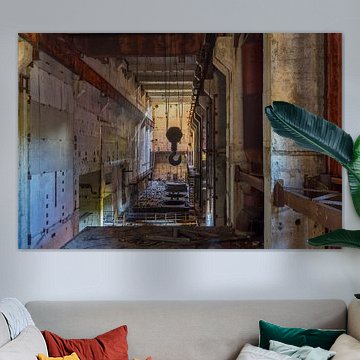
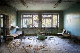
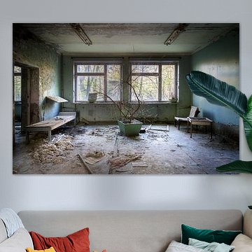
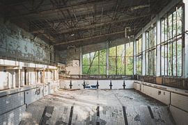
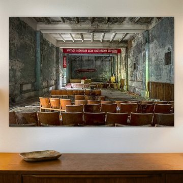
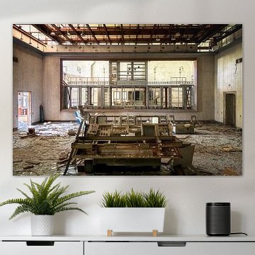
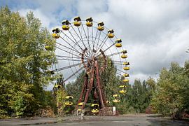
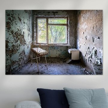
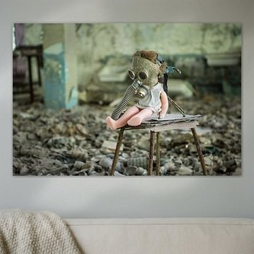
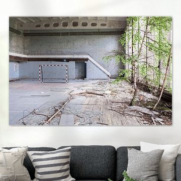
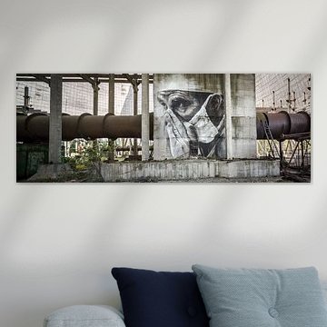
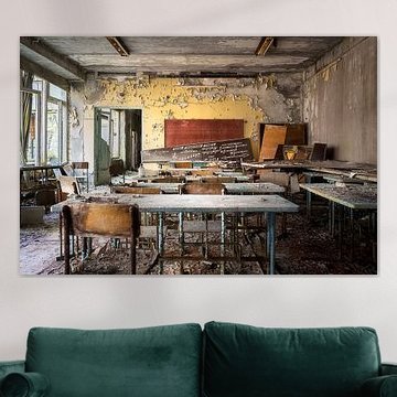
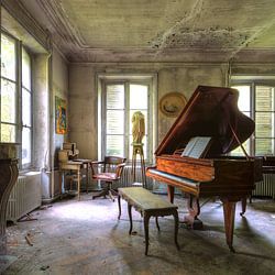
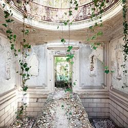
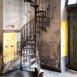
Chernobyl artworks capture something powerful. Abandoned buildings reclaimed by nature, iconic structures frozen in time - these images speak to both history and quiet beauty. The palette often leans toward earthy tones: rust, olive greens, and faded yellows that evoke autumn and decay. Works like The abandoned Ferris wheel in Pripjat show how desolation can carry unexpected calm. These pieces fit interiors that value atmosphere over decoration - industrial, minimalist, or thoughtfully eclectic spaces where stories matter.
At Art Heroes, we print every piece to order. Choose Canvas, ArtFrame™, Wallpaper and more, in sizes that suit your space.
-
More artworks below this tip
Choose your format
Portrait, square, and landscape formats are all equally popular for this collection, giving you plenty of flexibility. If you're working with a narrow wall space, portrait orientation maximises vertical impact. For wider walls or above furniture, landscape format creates a balanced, grounded presence that suits most room layouts.
EileenStylist & Customer service Questions? Check out our FAQ
 -
More artworks below this tip
Pairing with natural textures
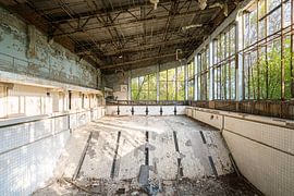
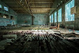
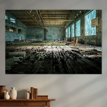
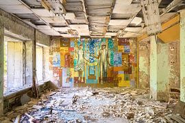
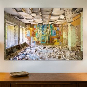
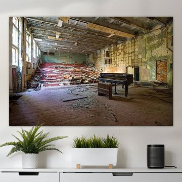
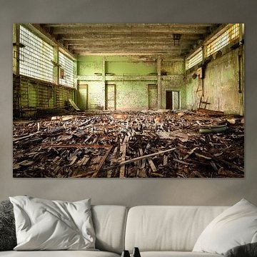
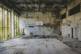
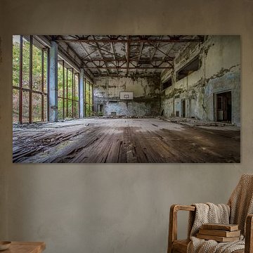
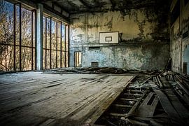
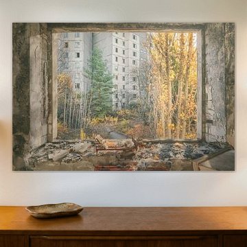
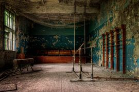
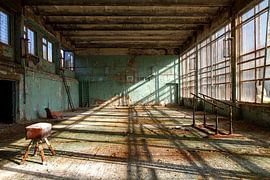
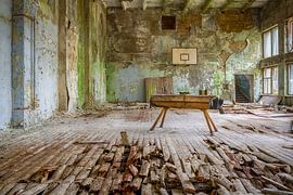
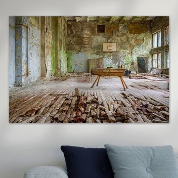
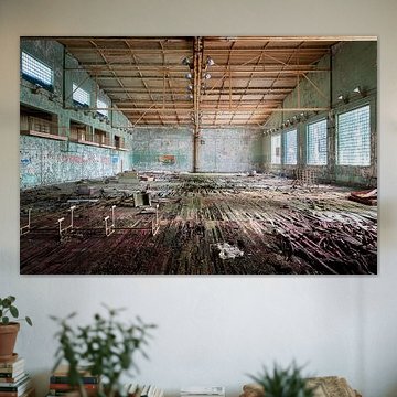
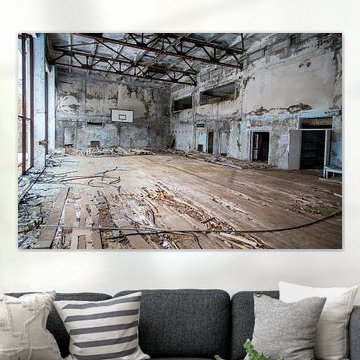
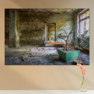
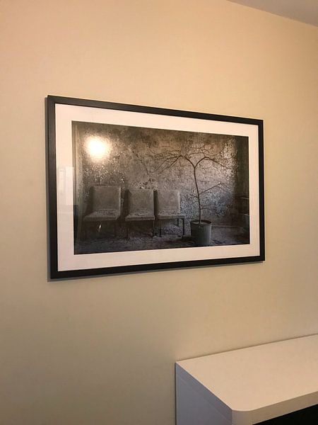
The earthy tones in these artworks create a beautiful connection with natural materials. Try pairing them with wooden furniture, linen textiles, or raw concrete surfaces to emphasise the organic colour palette. The sage green and taupe shades in Abandoned Gym in Chernobyl. work particularly well alongside light oak or weathered timber.
AnouschkaArt Stylist Questions? Check out our FAQ
 -
More artworks below this tip
Working with muted colour schemes
These artworks feature soft, desaturated colours that blend easily into calm interiors. The olive green, taupe, and beige tones work well in spaces with neutral walls and natural fabrics. If your room already uses browns and greys, these pieces will integrate seamlessly without competing for attention or overwhelming your existing palette.
LianneStylist & Customer service Questions? Check out our FAQ


Trusted and loved
Customers rate us 4.8!
High-quality materials
Sustainable and long-lasting beauty
Different sizes
From small to large, anything is possible.
Made for you
Made the moment you order.


More like this

What makes Chernobyl work well in your living room
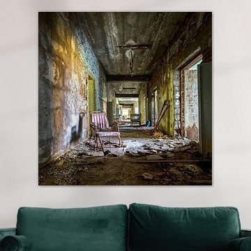
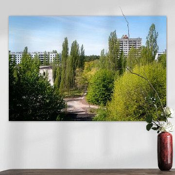
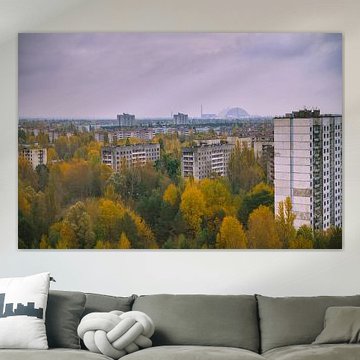
Chernobyl art works well in living rooms where its nostalgic and mysterious atmosphere can create a thoughtful focal point. The muted tones - grey, taupe, and olive green - pair naturally with neutral sofas and wooden furniture, while the melancholic mood encourages quiet reflection. Hang a landscape format piece above your sideboard or create depth with a square format on a gallery wall. These artworks invite conversation without overwhelming your space.
Choosing the right material
Chernobyl comes to life on each of our premium materials. Whether you choose Canvas, Poster, or ArtFrame™, each enhances the unique details and colors.
Choose Canvas and you benefit from a classic presentation that suits the collection's photographic and digital art techniques. The fine-art print quality on bright white poly-cotton canvas brings out the subtle contrasts between grey skies and olive green vegetation, while the muted brown and taupe tones gain depth and texture. This material connects naturally with the nostalgic mood - the traditional canvas feel mirrors the historical weight of the subject matter. You can also personalize your finish with edge wrap options and choose between 2 cm or 4.5 cm thickness, allowing the mysterious atmosphere to take center stage in both intimate and spacious rooms.
Still doubting which material suits your interior and chosen Chernobyl artwork? Use our material comparator to find the perfect match.
How to style Chernobyl in your space
Chernobyl pairs well with minimalist decor that doesn't compete with its melancholic mood. Consider combining portrait and landscape formats in a gallery wall arrangement, mixing photography with digital art pieces to build a layered narrative. Add texture through grey linen cushions, weathered wood accents, or dried grasses in ceramic vases to echo the collection's earthy palette. The mysterious atmosphere strengthens when you keep surrounding walls calm and uncluttered. Let the artwork breathe and become a window into another time.
