-
More artworks below this tip
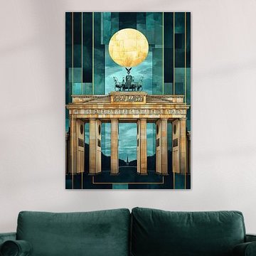
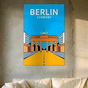
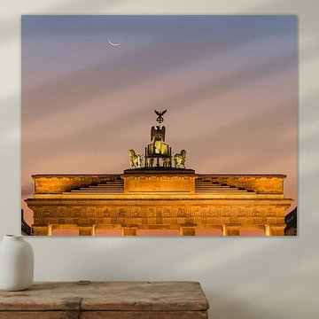
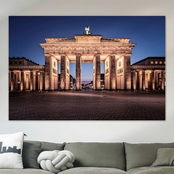
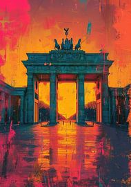
Working with warm tones
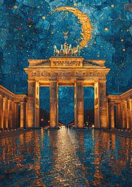
Brown and bronze tones create warmth in spaces with cooler color schemes or neutral walls. The golden illumination in Berlin, Brandenburg Gate pairs well with terracotta accessories, wooden furniture, or warm textile accents. Balance these warm hues with white or beige walls to let the artwork stand out.
LianneStylist & Customer service Questions? Check out our FAQ
 -
More artworks below this tip
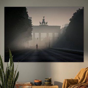
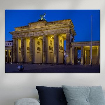
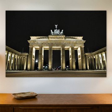
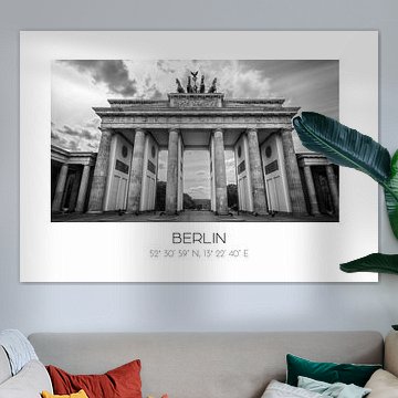
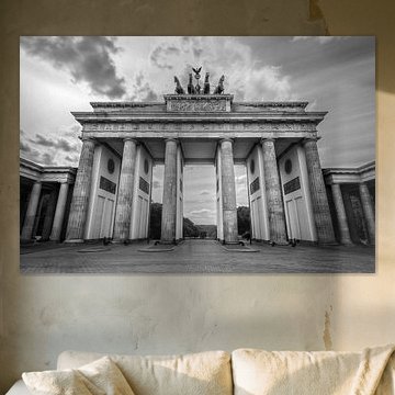
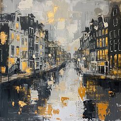
Room pairing made simple
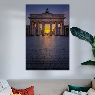
Architectural photography with strong structure and symmetry fits well in spaces where you want a sense of calm focus. The illuminated facade and evening atmosphere in Berlin, Brandenburg Gate works particularly well in a study, bedroom, or hallway where you appreciate detail without visual distraction.
EileenStylist & Customer service Questions? Check out our FAQ
 -
More artworks below this tip
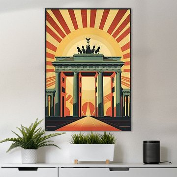
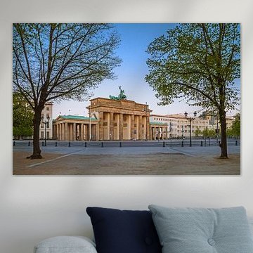
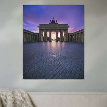
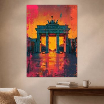
Choosing your format
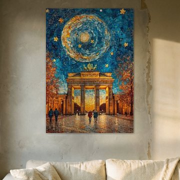
Portrait and square formats are both popular choices for this collection. A portrait format works well for narrower wall spaces like hallways or next to doorways, while square prints suit balanced compositions in living rooms or above furniture. Choose what suits your space and the artwork you've selected.
AnouschkaArt Stylist Questions? Check out our FAQ
Brandenburger Tor
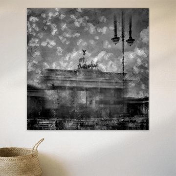
Berlin's iconic gate has inspired artists for centuries. Its neoclassical columns and powerful silhouette create timeless visual drama. From moody monochrome photographs to vibrant pop-art interpretations, these artworks capture both history and imagination.
The collection spans atmospheric night scenes, dreamy Van Gogh-inspired skies like Brandenburg Gate Berlin Moon, and minimal black-and-white compositions that emphasize architectural strength. Each piece brings Berlin's spirit into modern interiors - whether your style leans minimalist, eclectic, or boldly contemporary.
At Art Heroes, we print every artwork to order. Choose your size and material - Canvas, Poster, ArtFrame™ and more - to suit your space perfectly.


Trusted and loved
Customers rate us 4.8!
High-quality materials
Sustainable and long-lasting beauty
Different sizes
From small to large, anything is possible.
Made for you
Made the moment you order.


More like this


How to style Brandenburger Tor in your interior
The Brandenburger Tor collection brings calm, powerful, and vibrant moods together in one striking theme. Combine different formats - portrait, square, and landscape - to create a dynamic gallery wall that celebrates this architectural icon from multiple perspectives. The bronze, brown, and blue tones work beautifully with natural wood furniture, brass accents, and soft textile pieces in taupe or mauve shades. Add greenery or subtle lighting to enhance the collection's layered atmosphere and bring warmth to your space.
Choosing the right material
Brandenburger Tor comes to life on each of our premium materials. Whether you choose ArtFrame™, Canvas, or Poster, each enhances the unique details and colors.
Choose ArtFrame™ and you benefit from two standout features. First, the easily interchangeable prints let you refresh your space in just five minutes - perfect when you want to rotate between different Brandenburger Tor perspectives or switch moods seasonally. Simply swap the print without replacing the entire frame. Second, the optional acoustic function makes ArtFrame™ ideal for spaces where sound matters. The sound-dampening panels fit invisibly behind the print, reducing echo while the bronze and blue tones create a calm, focused environment. The premium aluminum frame is available in gold, black, white, or silver to complement your chosen Brandenburger Tor artwork and match your interior perfectly.
Still doubting which material suits your interior and chosen Brandenburger Tor artwork? Use our material comparator to find the perfect match for your space and style.
Where does Brandenburger Tor work well in your home
A home office or study works well for displaying the Brandenburger Tor collection. The powerful yet calm presence helps create focus, while the architectural details add visual interest without distraction. Hang a large landscape format above your desk or position a square piece on a sideboard to balance the workspace. The brown and bronze tones bring warmth to work areas that often feel too clinical, and the mix of photography, digital art, and painting techniques keeps the space feeling creative and inspiring throughout long working days.
