-
More artworks below this tip
Where to hang coastal scenes
Coastal photography brings a sense of calm to spaces where you unwind. Place A lonely sailboat on the water in a bedroom or reading corner where the quiet, expansive water view encourages relaxation. The dramatic sky adds visual interest without overwhelming quieter rooms.
EileenStylist & Customer service Questions? Check out our FAQ
 -
More artworks below this tip
Pairing warm sunset tones with your interior
Warm sunset colours create inviting atmospheres in social spaces. The orange and yellow tones in Sunset Canada Tofino complement natural wood furniture, cream textiles, and warm neutral walls. These colours work particularly well in living rooms or dining areas where you want a welcoming feel.
LianneStylist & Customer service Questions? Check out our FAQ
Vancouver
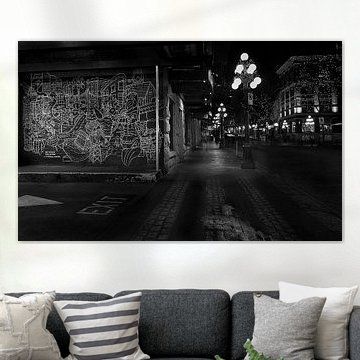
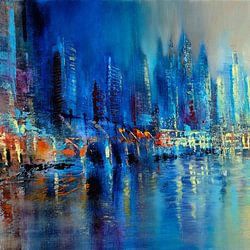
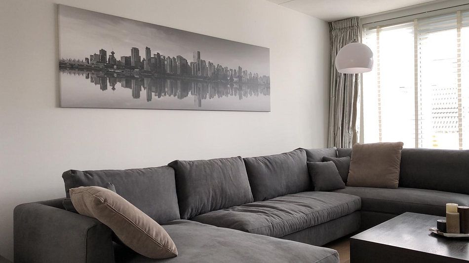
Vancouver's skyline captures a rare harmony between urban energy and natural calm. The coastal city unfolds through warm golden-hour tones, mirror-like reflections, and the quiet drama of distant mountains. These artworks translate beautifully into modern and Scandinavian interiors, where soft neutrals and serene compositions feel most at home. Whether you're drawn to the glowing warmth of Golden sunset in Vancouver or the contemplative simplicity of monochrome views, each piece reflects the city's layered character.
At Art Heroes, we print every Vancouver artwork to order on your choice of Canvas, ArtFrame™, Poster and more. Explore the collection and choose what suits your space.


Trusted and loved
Customers rate us 4.8!
High-quality materials
Sustainable and long-lasting beauty
Different sizes
From small to large, anything is possible.
Made for you
Made the moment you order.


More like this


How do Vancouver's colors suit modern and Scandinavian interiors?
The Vancouver collection brings together a balanced palette of blue, brown, olive green, taupe, and mauve - colors that work beautifully in both modern and Scandinavian spaces. Pair the cooler blues and taupes with white walls and light wood for a fresh Scandinavian look, or combine the deeper olive greens and browns with sleek furniture for a modern feel. The mauve tones add warmth without overwhelming minimalist layouts, making Vancouver adaptable to clean-lined interiors.
Where does Vancouver art work well in your home?
The living room is a good spot for Vancouver artworks, where calm and mysterious moods help create a relaxed atmosphere. These pieces work well above a sofa or sideboard, anchoring the space without demanding too much attention. Whether you lean toward photography, digital art, or painting styles, the collection's range of techniques means you can mix different pieces throughout the room. Vancouver's subtle color shifts suit spaces where you spend time unwinding and want art that invites contemplation.
Which format from Vancouver suits your wall best?
Landscape formats dominate the Vancouver collection, making them ideal for placement above horizontal furniture like dining tables, beds, or low credenzas. A landscape orientation naturally draws the eye across the wall, emphasizing width and creating balance in wider rooms. Consider hanging Vancouver artworks at eye level to maximize their calm, vibrant presence. When you have a taller, narrower wall - perhaps in a hallway or beside a doorway - the portrait pieces from Vancouver offer a better fit and help fill vertical space more effectively.
