
-
More artworks below this tip
Pairing complementary tones
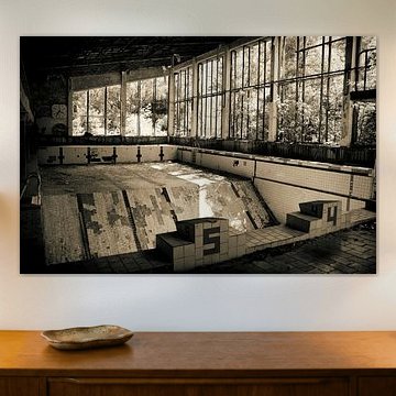
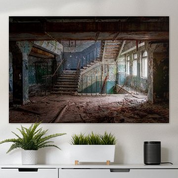
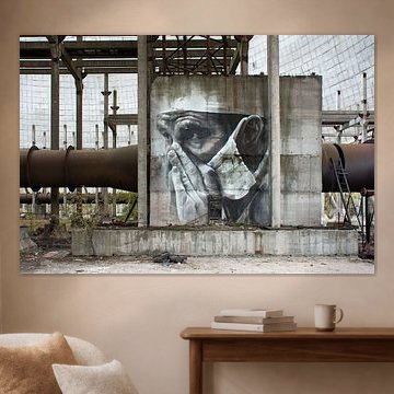
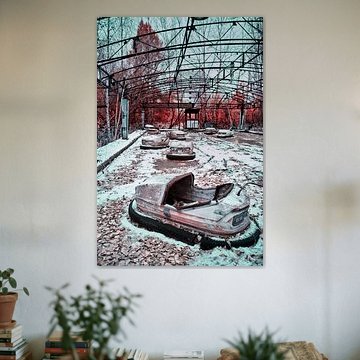
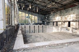
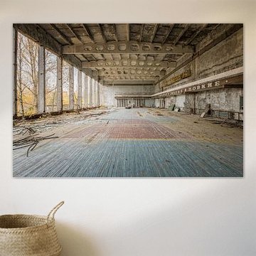
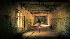
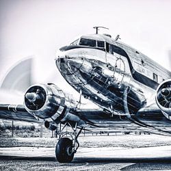
Earthy neutrals work beautifully alongside warm accents in your interior. The taupe and beige tones in Abandoned Gym in Chernobyl. pair well with natural wood furniture, linen textiles, or terracotta accessories. These combinations create a grounded, cohesive atmosphere that feels both calming and intentional in living spaces or hallways.
AnouschkaArt Stylist Questions? Check out our FAQ
 -
More artworks below this tip
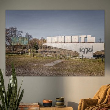
Choosing your format
Portrait and square formats are equally popular in the Ukraine collection, so your choice comes down to wall space and style. Portrait works well on narrow walls or alongside doorways, while square prints suit gallery wall arrangements or centred placements above furniture. Choose what fits your available space best.
EileenStylist & Customer service Questions? Check out our FAQ
 -
More artworks below this tip
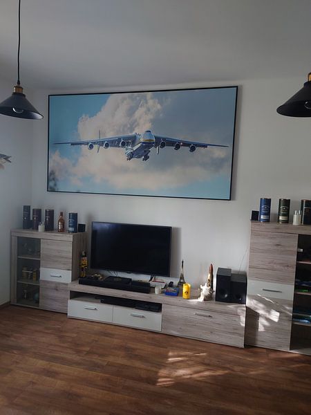
Placement for narrative artwork
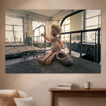
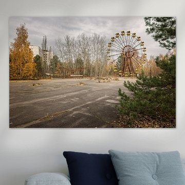
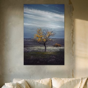
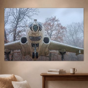
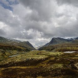
Artworks with strong visual storytelling draw the eye and spark conversation. The road.... features bold composition and vivid colour contrast, making it ideal for high-traffic areas like entryways or above a console table. Position it at eye level where guests naturally pause and look around.
RosanneStylist & Customer service Questions? Check out our FAQ
Ukraine
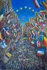
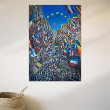
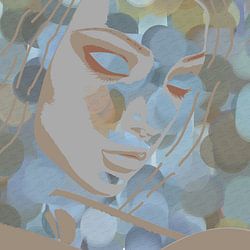
Ukraine-inspired art brings emotional depth and cultural richness to your walls. From vibrant countryside scenes to poignant historical moments, these artworks capture resilience and beauty. Peace to Ukraine shows this perfectly - a hopeful vision rendered in bold, textured brushwork that works beautifully in modern or eclectic interiors.
At Art Heroes, we print each piece to order. Choose from Canvas, ArtFrame™, Poster and more, shipped free to your door.


Trusted and loved
Customers rate us 4.8!
High-quality materials
Sustainable and long-lasting beauty
Different sizes
From small to large, anything is possible.
Made for you
Made the moment you order.


More like this


How can you combine Ukraine artworks in your interior?
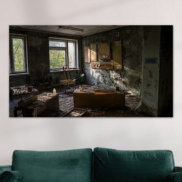
The Ukraine collection pairs beautifully with imagery from Prip'yat' and Chernobyl, creating a thoughtful gallery wall that tells a deeper story. These calm and mysterious artworks work well alongside natural textures like linen textiles or reclaimed wood frames. You can group them with other nostalgic photography to build visual depth, or let a single large-format piece stand alone above a console table. Add dried grasses or muted ceramic objects nearby to echo the earthy tones without overwhelming the subject. Let these artworks anchor a space where reflection and memory meet modern design.
Where do Ukraine artworks work well in your home?
A living room is a good spot for Ukraine imagery, particularly on walls where you want to encourage conversation and contemplation. The nostalgic mood suits spaces where you spend time with family or friends, while the calmer compositions won't dominate the room. Hang a landscape-format Poster above your sofa or position a square piece on a sideboard flanked by books or candles. The muted browns, greys, and olive greens blend naturally with neutral furniture, creating a grounded backdrop that feels both current and timeless.
Which colors and styles suit Ukraine artworks?
Ukraine artworks in brown, blue, taupe, grey, and olive green fit naturally into Scandinavian and minimalist interiors. Pair the cooler blues and greys with light wood furniture and white walls for a clean, Nordic aesthetic that feels open and calm. The warmer browns and olive tones work beautifully in modern rustic settings, especially alongside natural materials like jute rugs or stone accents. These earthy hues also complement industrial spaces - think exposed brick or metal shelving - where the muted palette softens harder surfaces without losing edge.
