-
More artworks below this tip
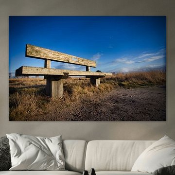
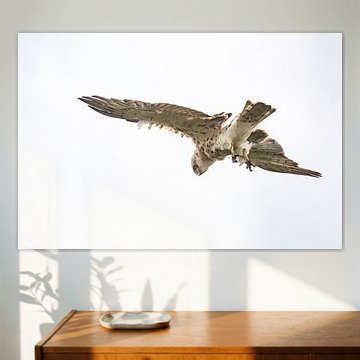
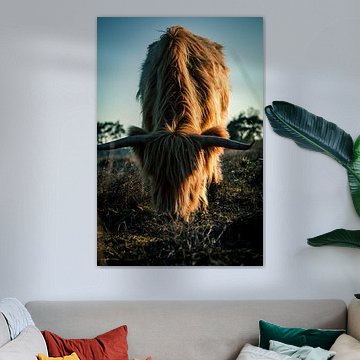
Black backgrounds create focus in bright rooms
Dark backgrounds help an artwork stand out, especially in well-lit spaces. The black backdrop in Scottish Highlander draws attention to the subject and adds visual weight to your wall. This works particularly well in rooms with white or light-coloured walls where you want a strong focal point.
AnthiStylist & Customer service Questions? Check out our FAQ
 -
More artworks below this tip
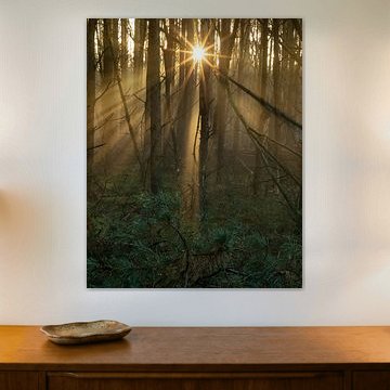
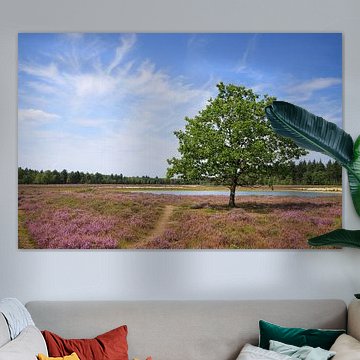
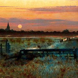
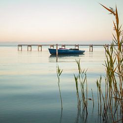
Hang landscape scenes at seated eye level
Wide landscape artworks look best when viewed from a seated position. Place Sunstar in your living room or dining area where you'll see it while relaxing. Aim for the centre of the artwork to sit around 140 - 150 cm from the floor for comfortable viewing.
KatharinaStylist & Customer service Questions? Check out our FAQ
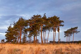
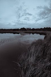
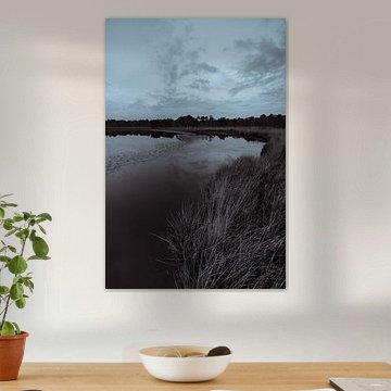
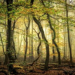
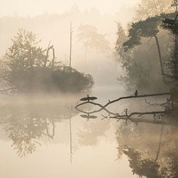
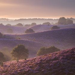
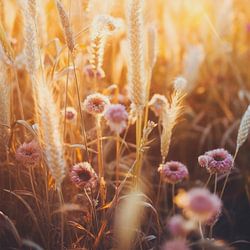
Strabrechtse Heide
Strabrechtse Heide captures the Dutch countryside at its most peaceful. Purple heather stretches toward misty horizons, while solitary birches stand against golden skies. These landscapes bring calm and natural beauty into your home. Works like Lone birch on the Strabrecht heathland and Sunrise Strabrechtse Heide show the heathland's changing moods - from dawn light filtering through trees to sunsets reflected in still water. The soft purples, warm taupes, and gentle blues suit both modern and traditional interiors.
At Art Heroes, you'll find a wide selection of Strabrechtse Heide artworks. Choose your favorite as Canvas, Poster, ArtFrame™ and more - made to order and delivered free to your door.


Trusted and loved
Customers rate us 4.8!
High-quality materials
Sustainable and long-lasting beauty
Different sizes
From small to large, anything is possible.
Made for you
Made the moment you order.


More like this

How do the colors of Strabrechtse Heide fit into your interior?
The calm blend of brown, taupe, and mauve tones in this collection works beautifully in Scandinavian and minimalist interiors. Pair the earthy browns and taupes with light oak furniture and natural textiles for a Nordic feel. In minimalist spaces, combine the subtle purple and blue hues with white walls and simple lines to create depth without clutter. These understated colors add warmth while maintaining a sense of tranquility.
Where does Strabrechtse Heide work well in your home?
The bedroom is a good spot for this collection. The calm and dreamy mood of these artworks creates a restful atmosphere that helps you unwind at the end of the day. Hang a landscape format piece above your bed, or place a square artwork on the wall opposite your headboard. The mysterious purple and blue tones add visual interest without overwhelming the space, while the earthy brown shades ground the room in natural warmth.
Choosing the right material
Strabrechtse Heide comes to life on each of our premium materials. Whether you choose Poster, Canvas, or ArtFrame™, each enhances the unique details and colors.
Choose Poster and you benefit from several qualities that complement this collection. The UV-resistant inks ensure the mysterious blue and purple tones remain vibrant year after year, preserving the dreamy atmosphere that defines these heathland scenes. This matters especially with subtle color transitions found throughout Strabrechtse Heide, where fading would diminish the delicate interplay between mauve skies and earthy browns. The thick 260-gram satin photo paper gives the photography a luxurious feel that does justice to the collection's calm, contemplative character. The substantial paper weight adds depth to the brown and taupe tones, creating a tactile quality that enhances your wall.
Still doubting which material suits your interior and chosen Strabrechtse Heide artwork? Use our material comparator to find the perfect match.
