-
More artworks below this tip
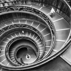
Bring architectural prints into living and work spaces
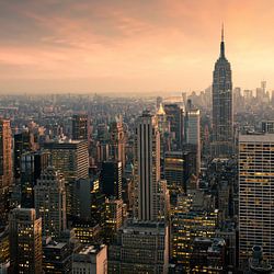
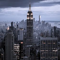
High-rise and skyline scenes suit rooms where you spend focused time. Consider living rooms, study areas, or dining spaces where architectural detail adds visual interest without distraction. The structured composition and calm palette in High rise towers makes it particularly suitable for quieter corners or reading nooks where you want subtle presence rather than bold impact.
RosanneStylist & Customer service Questions? Check out our FAQ
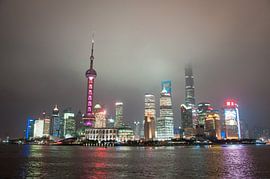
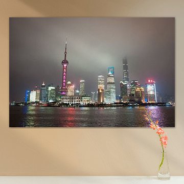
Shanghai
Shanghai's skyline captures the energy of a city constantly in motion. The blend of futuristic towers and historic architecture creates dramatic contrasts that work beautifully in contemporary interiors. Works like Skyline from Bund in Shanghai, China showcase this duality through vibrant night scenes, while misty panoramas add a contemplative quality that suits minimalist spaces.
At Art Heroes, we print each piece to order on Canvas, ArtFrame™, Poster and more. Choose what fits your space and style.


Trusted and loved
Customers rate us 4.8!
High-quality materials
Sustainable and long-lasting beauty
Different sizes
From small to large, anything is possible.
Made for you
Made the moment you order.


More like this

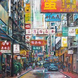

What colors from Shanghai suit modern and Scandinavian interiors
The Shanghai collection brings together blue, grey, and mauve tones that work beautifully in contemporary spaces. Modern interiors benefit from combining deep blues with black and white pieces, creating clean contrast and visual depth. For Scandinavian style, pair soft grey and mauve artworks with natural wood and white walls to maintain that light, airy feeling while adding subtle color.
Which format works best for Shanghai art in your space
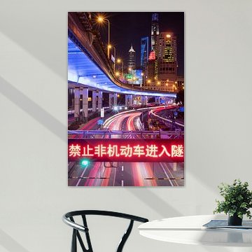
Landscape formats dominate this collection, making them ideal for placement above sofas, sideboards, or beds where horizontal wall space calls for wider artworks. A landscape piece anchors a room and draws the eye across architectural features. That said, square formats offer a balanced alternative when you're working with smaller walls or want to create a gallery arrangement with multiple Shanghai pieces side by side.
Choosing the right material
Shanghai comes to life on each of our premium materials. Whether you choose Poster, Canvas, or ArtFrame™, each enhances the unique details and colors.
Choose Poster and you benefit from museum-grade prints on thick satin photo paper. The fine-art quality captures every nuance in Shanghai's blue and grey tones, while the calm and nostalgic moods translate beautifully onto the substantial 260-gram paper. The UV-resistant inks ensure your chosen artwork maintains its vibrant blues and subtle mauve shades year after year, protecting against fading even in bright rooms. This durability makes posters particularly well-suited for Shanghai's photography and digital art pieces, where color accuracy and longevity matter most.
Still doubting which material suits your interior and chosen Shanghai artwork? Use our material comparator to find the perfect match for your space and style preferences.
