
Maps of Utrecht
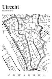
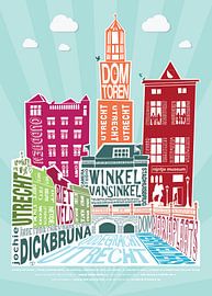
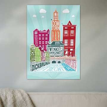
Cartographic art turns urban geography into visual poetry. Maps of Utrecht capture the city's canal rings, medieval core and modern expansion in styles ranging from austere black-and-white reliefs to kaleidoscopic timelines of architectural growth. Each interpretation reveals different layers of the Dutch city.
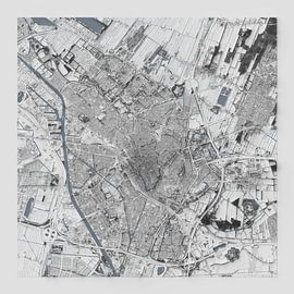
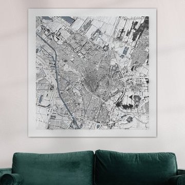
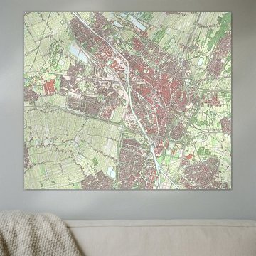
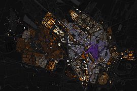
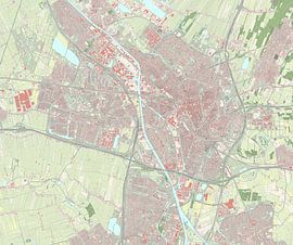
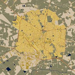
These artworks suit interiors where structure meets character - think mid-century modern, Scandinavian minimalism or industrial loft spaces. The calm, analytical aesthetic works beautifully in home offices, reading corners and gallery walls. Utrecht by CartoNext offers a tactile 3D relief perspective, while Utrecht from Waag technology & society colours every building by construction date, creating a glowing nocturnal view of urban evolution.
Available as ArtFrame™, canvas, poster and more - choose what suits your space.
-
More artworks below this tip
Hanging maps in studies and hallways
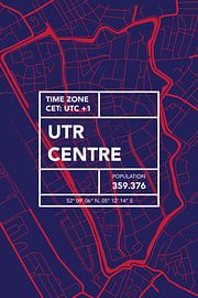
Cartographic artworks shine in spaces where you naturally pause and look closely. A detailed city map rewards closer inspection, making it ideal for a study desk wall or hallway where you pass daily. Consider placing Utrecht My City at eye level where its architectural details can be appreciated up close.
LianneStylist & Customer service Questions? Check out our FAQ
-
More artworks below this tip
Combining earthy tones with teal accents
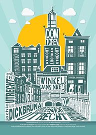
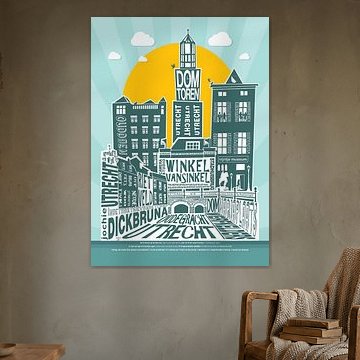
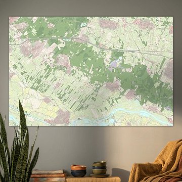
Earthy colour palettes anchor a room while teal adds a fresh, contemporary lift. If your space features sage green, beige, or taupe, a map with teal highlights creates visual interest without clashing. The teal and gold palette in Utrecht Earth tone City Map Map Map pairs well with natural wood and green plants.
AnthiStylist & Customer service Questions? Check out our FAQ









Trusted and loved
Customers rate us 4.8!
High-quality materials
Sustainable and long-lasting beauty
Different sizes
From small to large, anything is possible.
Made for you
Made the moment you order.


More like this
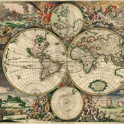
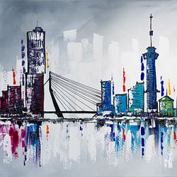


Which colors in Maps of Utrecht suit a minimalist interior
Maps of Utrecht feature beige, taupe, and sage green tones that work beautifully in minimalist interiors. Combine beige and taupe artworks with white walls and light wood furniture for a calm, uncluttered look. Sage green accents add a natural touch when paired with simple black frames and neutral textiles, creating a balanced space that feels both warm and serene.
Why Maps of Utrecht work well in a home office
A home office is a good spot for Maps of Utrecht, especially if you're drawn to historical detail and calm concentration. The beige and taupe tones create a focused atmosphere without distraction, while the intricate cartographic illustrations add visual interest during long work sessions. These artworks bring a sense of place and quiet energy to your desk area, making the space feel both professional and thoughtful.
Which material suits your Maps of Utrecht artwork best
The detailed illustrations in Maps of Utrecht come to life as Poster, offering museum-grade clarity that highlights every street and landmark. Alternatively, Canvas adds texture, while ArtFrame™ provides a frameless, contemporary finish. Choose Poster and you benefit from fine-art quality prints on heavy satin photo paper. The 260-gram weight and UV-resistant inks preserve the beige, taupe, and sage green tones year after year, keeping the calm, mysterious mood intact. The thick, durable paper gives these historical maps a luxurious appearance that suits their vintage character. You also get flexible framing options - display the print unframed, or choose black, natural, or white frames to match your interior. Still doubting which material suits your interior and chosen Maps of Utrecht artwork? Use our Material Advisor to find the perfect match.