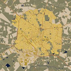
Maps of Haarlem
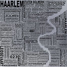
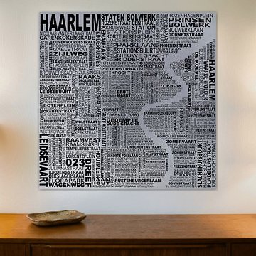
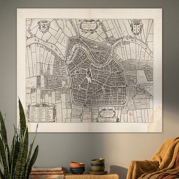
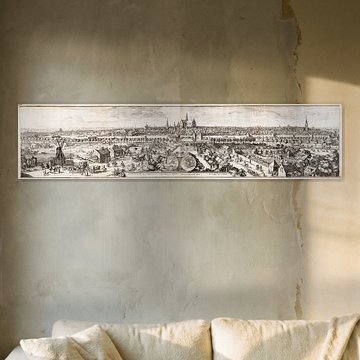
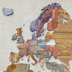
Looking for a way to celebrate Haarlem's distinctive character? Historical maps capture the city's evolution through centuries of urban development. From detailed 1652 engravings to contemporary street-name compositions, these cartographic artworks bring geographic beauty into modern interiors, which makes them ideal for anyone who values their connection to this Dutch city.
Collectors appreciate how vintage styles complement traditional spaces, while colorful interpretations like Haarlem mosaic suit contemporary homes seeking bold statements. At Art Heroes, we print every piece custom-made, giving you flexibility across Canvas, Poster, Wallpaper, and more to match your space perfectly.
-
More artworks below this tip
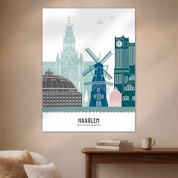
Choosing your format
Portrait and square formats are equally popular for Maps of Haarlem, giving you flexibility in how you display your artwork. A portrait format works well above narrow furniture like console tables or in hallways, while a square format suits balanced wall compositions and gallery-style arrangements.
EileenStylist & Customer service Questions? Check out our FAQ
 -
More artworks below this tip
Finding the right room
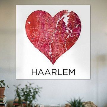
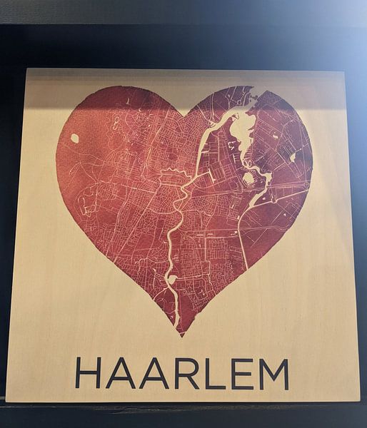
Nostalgic city illustrations feel at home in living spaces where you gather and reflect. The calm, sentimental quality of Love for Haarlem | City map in a heart suits a reading corner, bedroom wall, or dining area - anywhere you want to celebrate your connection to Haarlem in a warm, understated way.
GinaStylist & Customer service Questions? Check out our FAQ
 -
More artworks below this tip
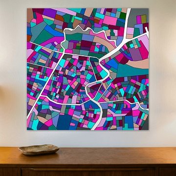
Where to hang your map
Heart-shaped cartography adds personal meaning to spaces where connection matters. Place Haarlem in a black heart | City maps as a Wall Circle in an entryway to welcome guests with a nod to your favourite city, or hang it in a study where the detailed street layout becomes both decoration and conversation piece.
RosanneStylist & Customer service Questions? Check out our FAQ


Trusted and loved
Customers rate us 4.8!
High-quality materials
Sustainable and long-lasting beauty
Different sizes
From small to large, anything is possible.
Made for you
Made the moment you order.


More like this


Where to hang Maps of Haarlem in your home office
Maps of Haarlem works well in a home office, where the historical detail adds character without overwhelming the space. The calm, nostalgic mood suits focused work environments, while the beige and taupe tones create a grounded backdrop. Hang a larger landscape format above your desk or position a portrait piece on the wall behind your monitor. The cartographic lines and architectural details bring a sense of place and history to your workspace.
Combining Maps of Haarlem with other decorative elements
Maps of Haarlem pairs beautifully with vintage-inspired accessories and natural textures. The nostalgic mood invites you to layer in aged brass frames, linen textiles, or botanical prints that echo the same earthy palette. A gallery wall mixing these artworks with botanical illustrations or architectural sketches creates visual rhythm while keeping the space calm. Add a wooden console or woven basket to reinforce the warm, lived-in feel. Let the soft pink and grey accents guide your choice of cushions or ceramics for a cohesive look.
Choosing the right material
Maps of Haarlem comes to life on each of our premium materials. Whether you choose ArtFrame™, Canvas, or Poster, each enhances the unique details and colors.
Choose ArtFrame™ and you benefit from real flexibility and acoustic comfort. The interchangeable prints let you refresh your Maps of Haarlem display whenever you want - simply swap the artwork without replacing the frame. The beige, taupe, and grey tones of these historic maps suit the modern aluminum frame finish, whether you pick black for contrast or gold for warmth. The optional sound-dampening panels are a smart addition for home offices, reducing echo while staying hidden behind the print - perfect for focused work or video calls.
Still doubting which material suits your interior and chosen Maps of Haarlem artwork? Use our material comparator to find the perfect match for your space and style.
