
Jan Hendrik Weissenbruch
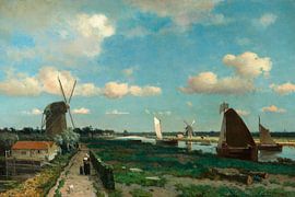
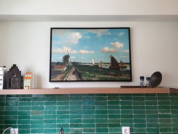
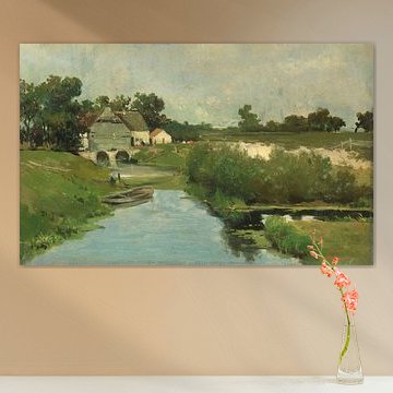
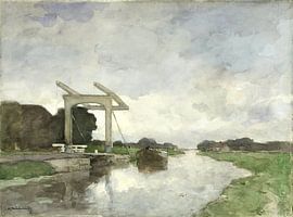
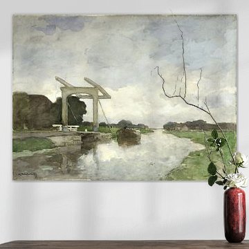
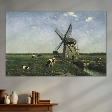
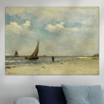
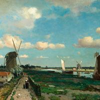
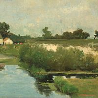
Jan Hendrik Weissenbruch captured the quiet beauty of the Dutch countryside with remarkable subtlety. His landscapes breathe tranquility - think soft skies, grazing cattle, and windmills reflected in still water. These gentle, earthy tones complement interiors that value calm and authenticity, from farmhouse kitchens to modern living spaces. Works like Landscape with Windmill near Schiedam, Johannes Hendrik Weissenbruch showcase his mastery of light and atmosphere, perfect for creating a peaceful corner in your home.
We print each piece to order, so you can choose the size and finish that suits your space. Available as Canvas, Poster, ArtFrame™ and more - all with free shipping.
-
More artworks below this tip
Layer Earthy Accent Colors
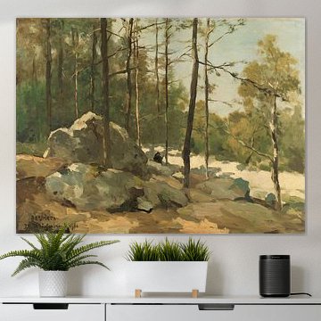
Beige and brown tones anchor a room without competing for attention. These dominant colors across Jan Hendrik Weissenbruch's landscapes complement terracotta pots, warm wood finishes, and neutral upholstery. Add subtle green accents through cushions or plants to tie the palette together naturally.
KatharinaStylist & Customer service Questions? Check out our FAQ






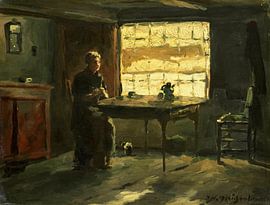


Be sure to check out the creative new masters
Our artists have created artworks inspired by the old masters.
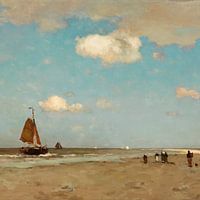
Trusted and loved
Customers rate us 4.8!
High-quality materials
Sustainable and long-lasting beauty
Different sizes
From small to large, anything is possible.
Made for you
Made the moment you order.


More like this




Why Jan Hendrik Weissenbruch works well in a home office
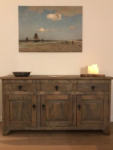
Jan Hendrik Weissenbruch brings a sense of calm to spaces where focus matters. His muted palette of sage green, olive, and early dew tones creates a restful backdrop that supports concentration without distraction. These nostalgic Dutch landscapes work particularly well in a home office, where the melancholic mood helps maintain a thoughtful atmosphere throughout the workday. The earthy beige and brown hues ground the space, making it easier to settle into long stretches of creative or analytical work.
Styling art by Jan Hendrik Weissenbruch in your space
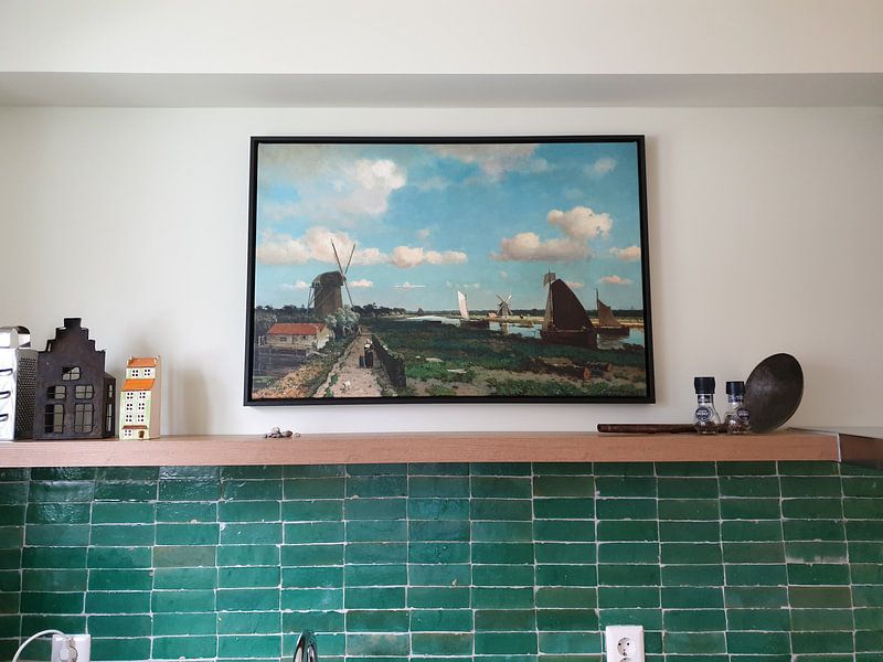
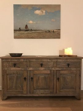
Works by Jan Hendrik Weissenbruch pair beautifully with natural materials that echo his earthy color palette. Consider combining these paintings with wooden furniture, linen textiles in neutral tones, and terracotta pots filled with trailing greenery. The calm, nostalgic mood of the collection benefits from understated styling - avoid busy patterns or bright accessories that compete for attention. Instead, let the subtle variations in olive and sage create a cohesive gallery wall, or hang a single piece above a sideboard dressed with simple ceramic pieces and dried grasses.
Which interior styles suit Jan Hendrik Weissenbruch best
Jan Hendrik Weissenbruch fits naturally into Scandinavian and rustic country interiors. For a Scandinavian approach, combine the sage green and early dew tones with pale wood, white walls, and soft gray textiles - the paintings add warmth without overwhelming the minimalist aesthetic. In a country setting, lean into the brown and olive green hues alongside reclaimed wood, stone accents, and woven baskets. Both styles celebrate the understated beauty of natural landscapes, making these artworks feel like a genuine part of your home rather than an afterthought.