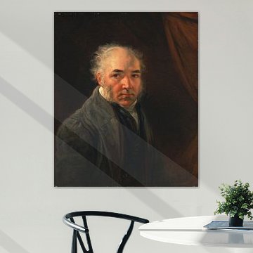
James Ward
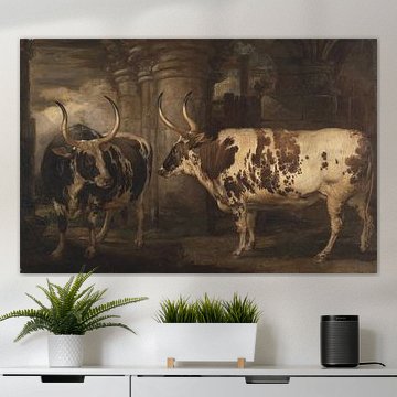
James Ward's animal paintings bring the British countryside to life with remarkable detail and warmth. His work celebrates rural beauty through pastoral scenes, noble horses, and peaceful livestock. These earthy tones - bronze, sage green, and warm beige - suit interiors that value natural calm and timeless character, whether your style leans traditional or gently modern.
At Art Heroes, we print each piece to order. Choose Canvas, Poster, Wallpaper, and more to match your space perfectly.
-
More artworks below this tip
Work with warm, earthy tones
The brown, bronze, and taupe tones create a naturally warm palette. These earthy shades pair well with cream walls, wooden furniture, or terracotta accents. If you're working with cooler interiors, the warmth in Diana at the Bath, James Ward can add balance and soften the overall feel of the room.
EileenStylist & Customer service Questions? Check out our FAQ
 -
More artworks below this tip
Choose a room that complements the mood
Classical mythological scenes often feel at home in quieter, more personal spaces. The calm, dreamy atmosphere in Venus Rising from her Couch, James Ward suits bedrooms or reading corners where you want to create a relaxed ambience. Pair it with soft textiles and warm lighting to enhance the serene setting.
AnthiStylist & Customer service Questions? Check out our FAQ


Trusted and loved
Customers rate us 4.8!
High-quality materials
Sustainable and long-lasting beauty
Different sizes
From small to large, anything is possible.
Made for you
Made the moment you order.


More like this


Which formats work best with James Ward's paintings?
James Ward's paintings often shine in horizontal formats, making them well-suited for placement above sofas, sideboards, or headboards where they can anchor a wall with balanced proportions. A horizontal artwork draws the eye across the composition, letting you appreciate the artist's careful attention to detail and atmospheric depth. That said, square formats can work beautifully above a console table or in a gallery wall arrangement, while vertical pieces suit narrower spaces like hallways or between windows.
Where James Ward artworks feel at home in your living room
The living room is a good spot for James Ward's animal paintings and pastoral scenes. The warm palette of browns, beiges, and bronze tones complements upholstered furniture and wooden accents, creating a cohesive, inviting atmosphere. Hang a James Ward artwork above your sofa to establish a natural focal point, or position one near a reading chair where its nostalgic, romantic mood encourages quiet contemplation. These paintings work well in spaces where you gather with family or unwind after a long day.
Pairing James Ward's palette with classic interiors
James Ward's warm color scheme - brown, beige, taupe, bronze, and gold - suits classic and country interiors particularly well. In a classic setting, the rich bronze and gold accents echo traditional brass fixtures, wood paneling, and antique furniture, while the softer beige and taupe tones keep the look grounded and calm. For a country or rustic style, combine James Ward artworks with natural linen textiles, weathered wood, and terracotta accessories. The nostalgic mood of these paintings pairs beautifully with layered textures and timeworn finishes that celebrate craftsmanship and history.
