-
More artworks below this tip
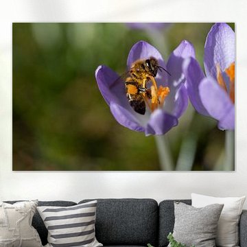
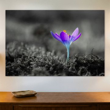
Pair purple tones with neutrals
Purple and violet shades bring a sense of calm energy to your walls. Balance these cooler tones with warm neutrals like taupe, beige, or soft grey to create harmony in your room. The lilac and mauve hues in Crocus pair beautifully with natural wood or cream-coloured furniture.
AnthiStylist & Customer service Questions? Check out our FAQ
 -
More artworks below this tip
Layer olive green with warm accents
Olive green adds depth without overwhelming a room. This earthy tone pairs well with warm browns, soft mauve, or golden beige to create a grounded, natural palette. If your space already features wood or terracotta elements, olive green artwork will feel right at home.
KatharinaStylist & Customer service Questions? Check out our FAQ
 -
More artworks below this tip
Create a focal point in your entryway
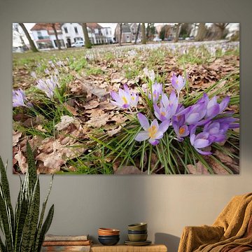
An entryway is the perfect spot for artwork that sets a welcoming tone. Hang a piece at eye level, roughly 145 - 155 cm from the floor to the center of the artwork. The joyful mood and vibrant colour in Springtime in Groningen works particularly well in hallways or entrance areas.
EileenStylist & Customer service Questions? Check out our FAQ
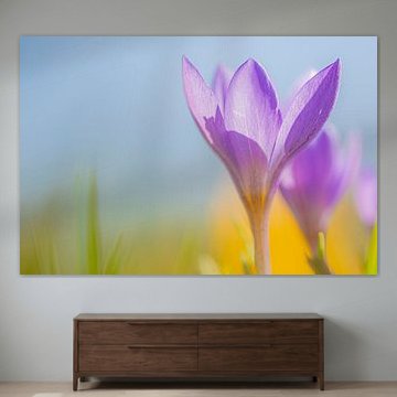
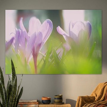
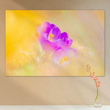
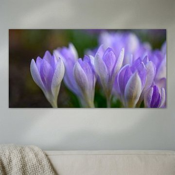
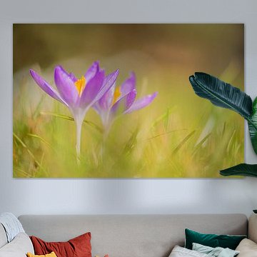
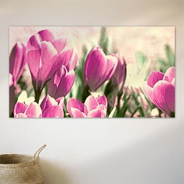
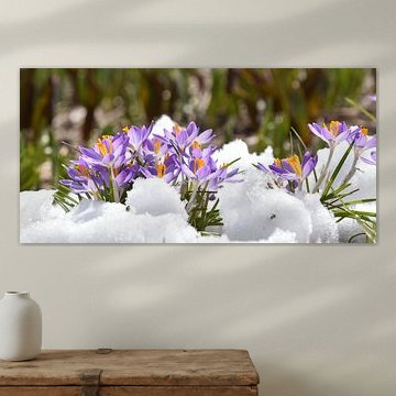
Crocus
Crocus artwork brings the first signs of spring into your home. Soft purples, delicate lavenders, and bright yellows capture the gentle energy of early blooms, which creates a calm and uplifting atmosphere in any space. These artworks suit minimalist interiors and nature-inspired styles alike, blending seamlessly with neutral palettes or adding a subtle splash of color to modern rooms.
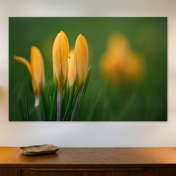
From close-up portraits that reveal intricate stamens to sweeping meadow scenes, crocus prints offer visual variety without overwhelming your walls. Choose what suits your space - whether you prefer the soft focus of Thinking of you or the vibrant contrast of alpine landscapes. At Art Heroes, every piece is custom-made and ships free, available as Canvas, Poster, Wallpaper, and more.


Trusted and loved
Customers rate us 4.8!
High-quality materials
Sustainable and long-lasting beauty
Different sizes
From small to large, anything is possible.
Made for you
Made the moment you order.


More like this


Where does Crocus art work well in your home?
Crocus art works beautifully in a bedroom, where the delicate purple and mauve tones help create a calm atmosphere that invites rest. These gentle colors soften the space without overwhelming it, making them a good spot for unwinding at the end of the day. The violet hues pair naturally with neutral bedding and wooden furniture, adding a touch of nature-inspired color that feels both vibrant and soothing.
Which material suits Crocus art best?
ArtFrame™ brings out the delicate character of Crocus art with its modern aluminum frame and textile print. Canvas offers a classic gallery feel, while Poster provides an accessible way to enjoy these floral designs.
Choose ArtFrame™ and you benefit from two practical advantages. First, the easy interchangeability lets you refresh your space whenever the mood strikes - swap between calm and vibrant Crocus designs without replacing the entire frame. The aluminum frame comes in gold, black, white, or silver, so you can match it to the olive green or violet tones in the collection. Second, the optional acoustic panels work quietly behind the print to reduce echo, which is especially helpful in bedrooms or home offices where peaceful surroundings matter. The panels are made from recycled materials and stay completely hidden, so you get better sound quality without compromising the artwork's delicate appearance.
Still doubting which material suits your interior and chosen Crocus artwork? Use our Material Advisor to find the perfect match.
How to style Crocus art in your space
Crocus art pairs well with other botanical themes or nature-inspired decor that shares its calm, delicate mood. Consider grouping multiple Crocus pieces in different formats to create a gallery wall, or combine them with green plants and linen textiles in mauve or olive tones. This approach brings the outdoors in and builds a cohesive look that feels fresh and grounded. Start with one piece and layer in complementary colors to discover your style.
