Catalonia
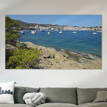
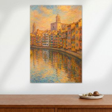
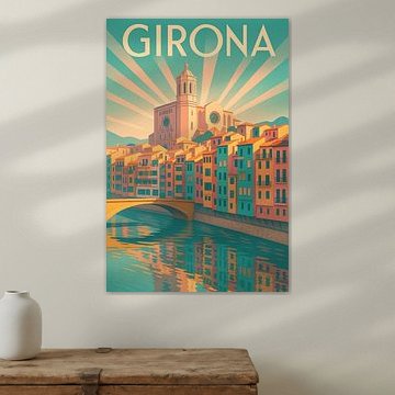
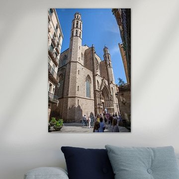
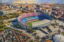
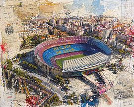
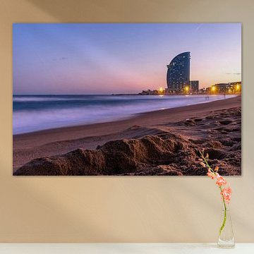
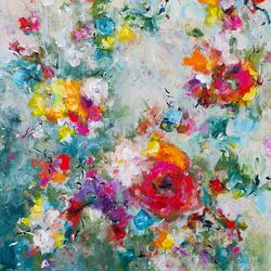
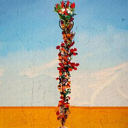
Catalonia captivates with its architectural wonders and coastal beauty. From Gaudí's dreamlike details to sun-drenched Mediterranean shores, this region offers rich visual inspiration. Our collection features vibrant cityscapes like Park Guell in Barcelona, Spain., alongside serene beaches and striking Gothic cathedrals. These artworks blend historic grandeur with modern charm, fitting contemporary and classic interiors alike.
At Art Heroes, every piece is custom-made for you. Choose from Canvas, ArtFrame™, Poster and more, all delivered with free shipping.
-
More artworks below this tip
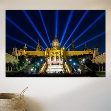
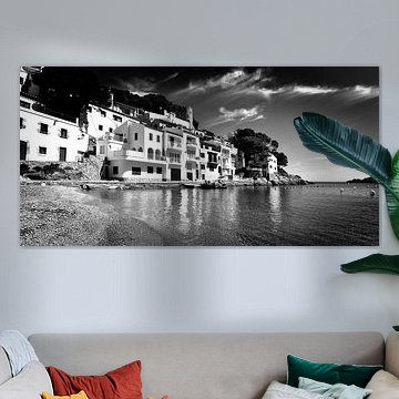
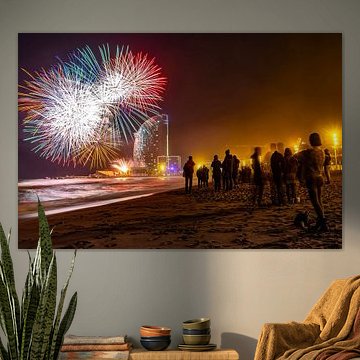
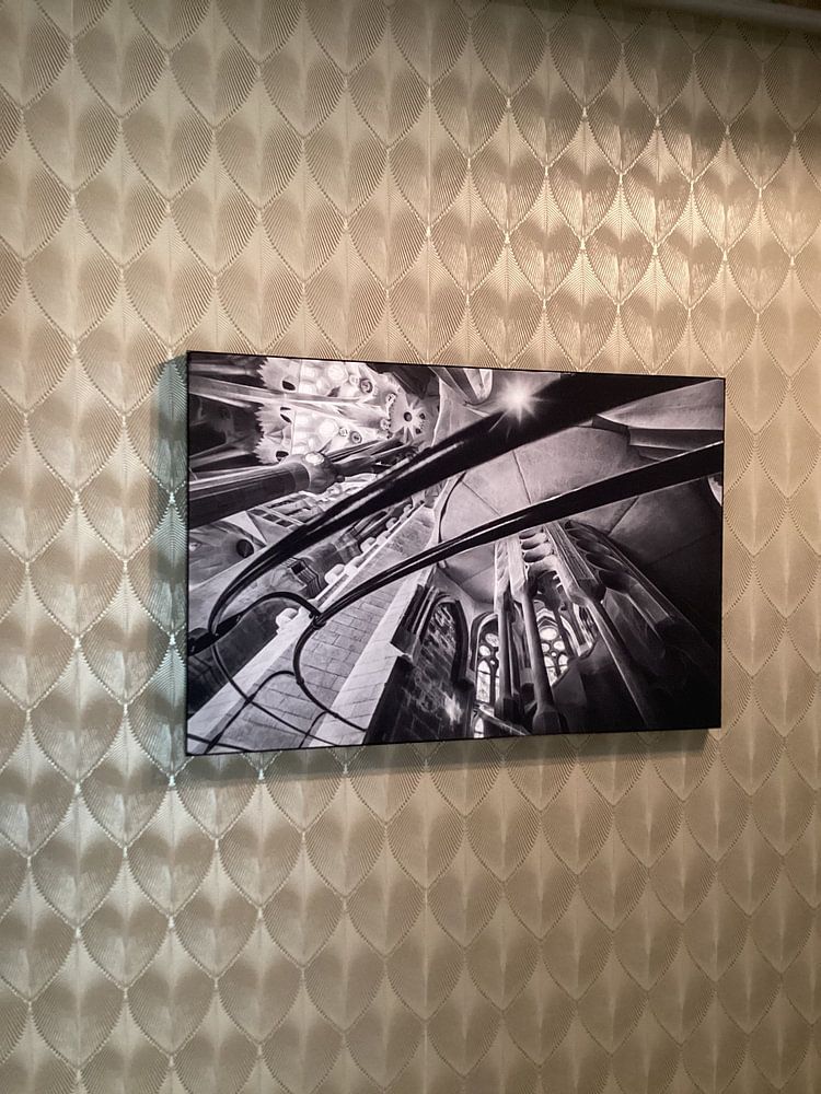
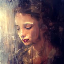
Create contrast with monochrome drama
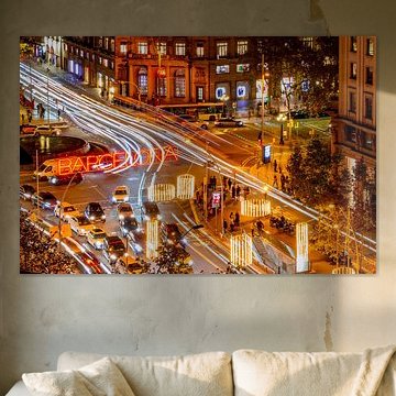
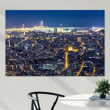
Black and white photography brings striking contrast to rooms with warm wood or neutral upholstery. The interplay of light and shadow adds depth without competing with existing colours. For a calming focal point above your sofa or sideboard, consider Barcelona panorama at night, where the city lights create natural visual interest against the dark sky.
AnouschkaArt Stylist Questions? Check out our FAQ
 -
More artworks below this tip
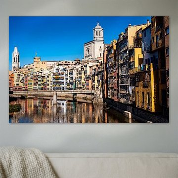
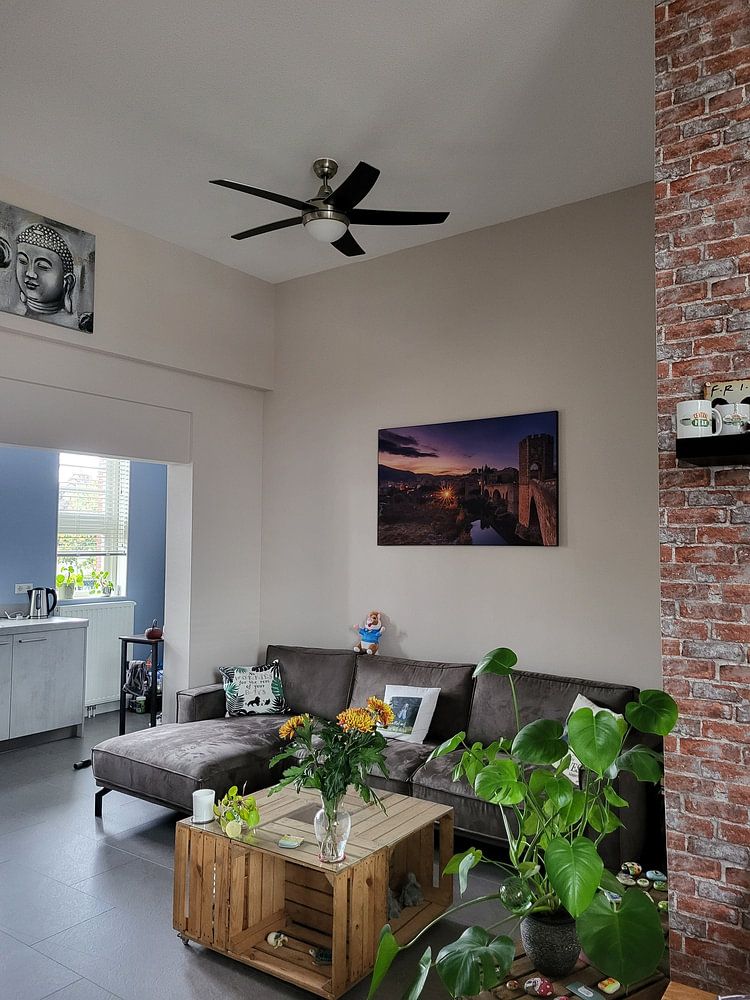
Work with blue and taupe for layered warmth
Blue and taupe create a balanced palette that feels both grounded and airy. Use blue as your anchor colour in soft furnishings, then echo the taupe through wood furniture or linen textures. The combination of turquoise sky and beige stonework in Barcelona | Passeig de Gracia Panorama bridges these tones naturally, tying the look together without effort.
RosanneStylist & Customer service Questions? Check out our FAQ
 -
More artworks below this tip
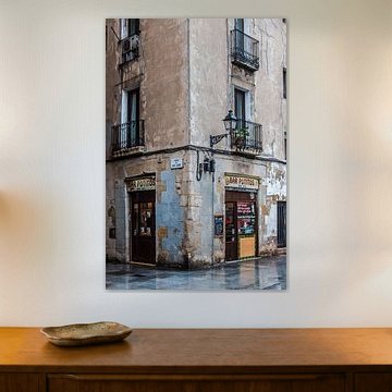
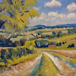
Choose portrait or landscape for different walls
Portrait and landscape formats are equally popular across this range, giving you flexibility for various wall shapes. Portrait suits narrow walls beside doorways or between windows, while landscape fills the space above beds or consoles more naturally. Choose the format that mirrors your wall proportions rather than fighting against them.
LianneStylist & Customer service Questions? Check out our FAQ


Trusted and loved
Customers rate us 4.8!
High-quality materials
Sustainable and long-lasting beauty
Different sizes
From small to large, anything is possible.
Made for you
Made the moment you order.
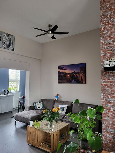
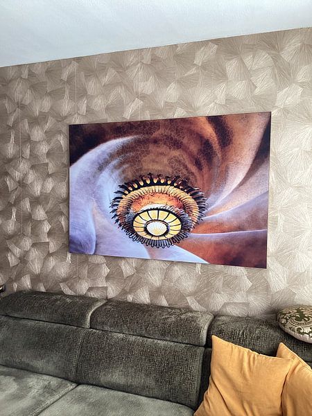
How they hang in other homes
Get inspired by beautiful artworks on other people's walls and see how they truly enhance an interior.


More like this


What colors from Catalonia suit your interior style?

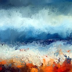
The Catalonia collection brings together earthy blues, warm browns, and soft beige tones that work beautifully in modern and Scandinavian interiors. Pair the deep blues with crisp white walls and natural wood furniture for a fresh Scandinavian look. The bronze and taupe artworks complement modern spaces with concrete accents and metallic details. Combine beige pieces with light oak or birch furnishings to create a calm, cohesive atmosphere in any room.
How to style Catalonia artworks in your space
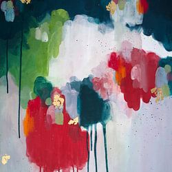
The calm and vibrant moods within the Catalonia collection make it easy to create dynamic gallery walls that never feel overwhelming. Mix nostalgic pieces with contemporary photography to add depth and visual interest above your sofa or sideboard. Pair Catalonia artworks with natural textures like linen cushions, ceramic vases, or indoor plants to enhance the earthy color palette. The variety of portrait, square, and landscape formats gives you flexibility to fill empty walls or create balanced groupings. Let the collection's versatile moods guide your room's character, from serene bedrooms to lively living areas.
Choosing the right material
Catalonia comes to life on each of our premium materials. Whether you choose Canvas, Poster, or ArtFrame™, each enhances the unique details and colors.
Choose ArtFrame™ and you benefit from two practical advantages. The interchangeable print feature means you can swap between different Catalonia artworks whenever you want a new look - perfect for rotating between the collection's calm and vibrant moods throughout the seasons. The high-quality textile print brings out the rich blues and warm bronze tones with sharp detail and depth, while the modern aluminum frame adds a professional finish that suits both minimalist and contemporary interiors without competing with the artwork itself.
Still doubting which material suits your interior and chosen Catalonia artwork? Use our material comparator to find the perfect match for your space.
