
Carel Fabritius
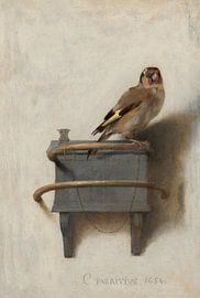
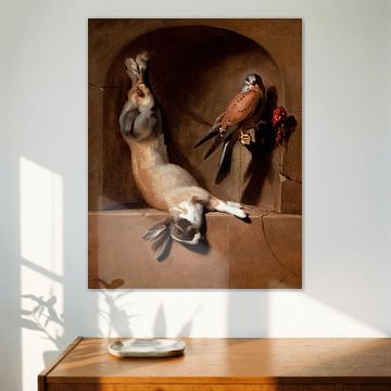
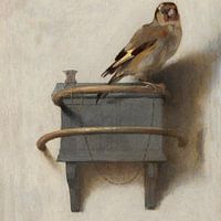
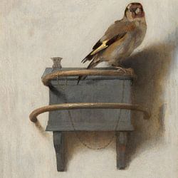
Carel Fabritius belongs to the most intriguing painters of the Dutch Golden Age. His small surviving body of work reveals a bridge between Rembrandt's dramatic shadows and Vermeer's luminous clarity. Warm earth tones - bronze, taupe, deep browns - dominate his palette, creating calm, nostalgic atmospheres that suit both classic and contemporary interiors. A View of Delft, Carel Fabritius shows his experimental approach to perspective, while Portrait of Abraham de Potter, Carel Fabritius demonstrates his skill in lifelike detail.
Whether you prefer canvas, poster, ArtFrame™ or wallpaper, each piece brings 17th-century Delft craftsmanship into your space.
-
More artworks below this tip
Balance dramatic contrasts with soft lighting
Artworks with strong light and shadow effects respond beautifully to their surroundings. Soft, diffused lighting enhances depth without creating glare, while spotlighting can emphasize the chiaroscuro technique. A piece like Hagar and the Angel, Carel Fabritius reveals more detail when placed where natural daylight shifts throughout the day, bringing out the bronze and grey tones.
LianneStylist & Customer service Questions? Check out our FAQ
 -
More artworks below this tip
Choose what suits your wall space
These artworks adapt to different display needs depending on your available wall area and room layout. Smaller formats work well in hallways or grouped arrangements, while larger prints make strong standalone statements in living rooms or above furniture. Browse the size options for each artwork to find what fits your space.
KatharinaStylist & Customer service Questions? Check out our FAQ


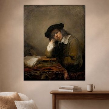
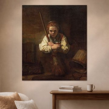

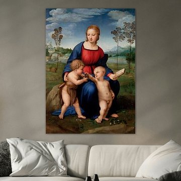




Be sure to check out the creative new masters
Our artists have created artworks inspired by the old masters.


Trusted and loved
Customers rate us 4.8!
High-quality materials
Sustainable and long-lasting beauty
Different sizes
From small to large, anything is possible.
Made for you
Made the moment you order.
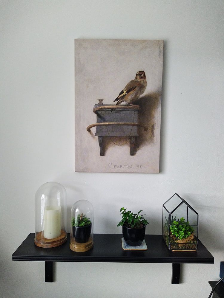
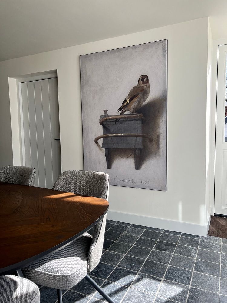
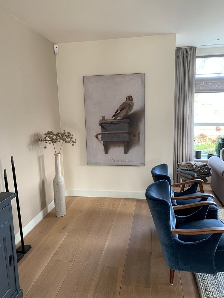
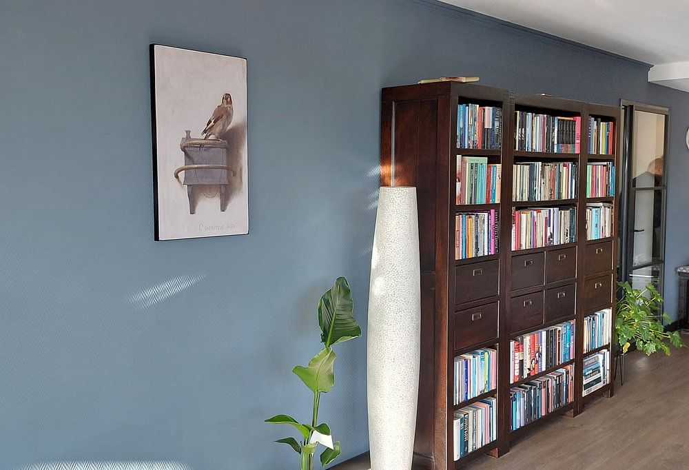
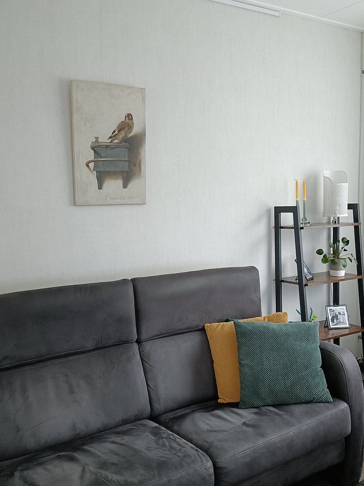
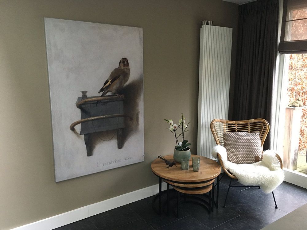
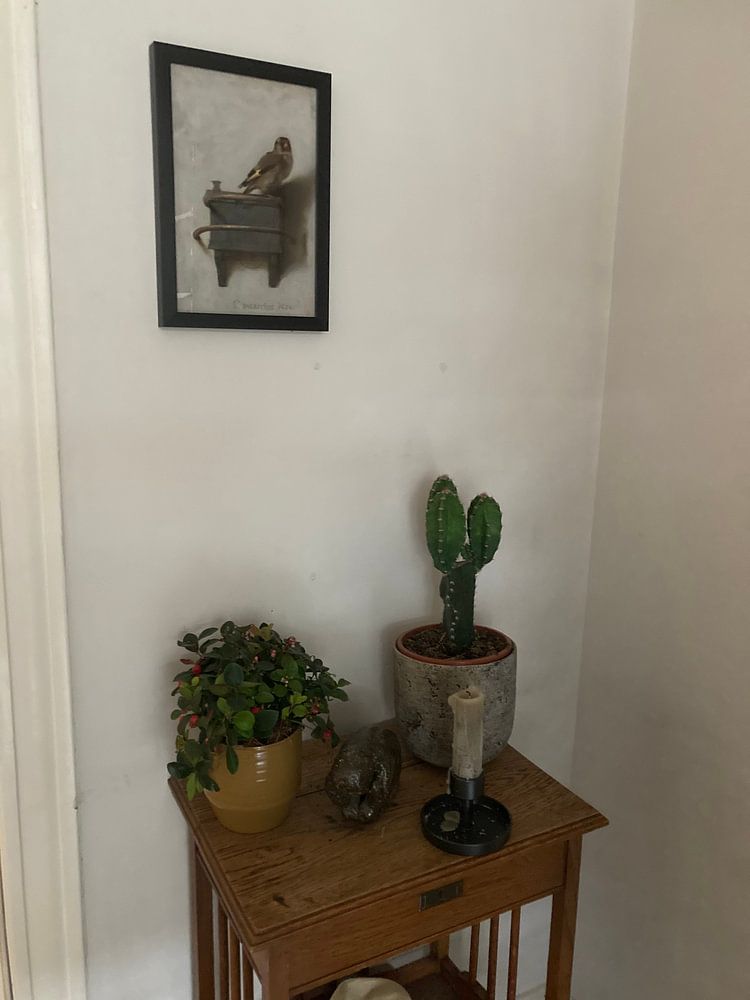
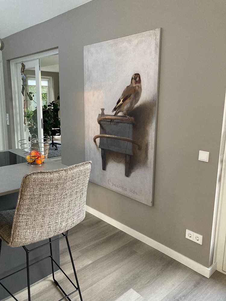
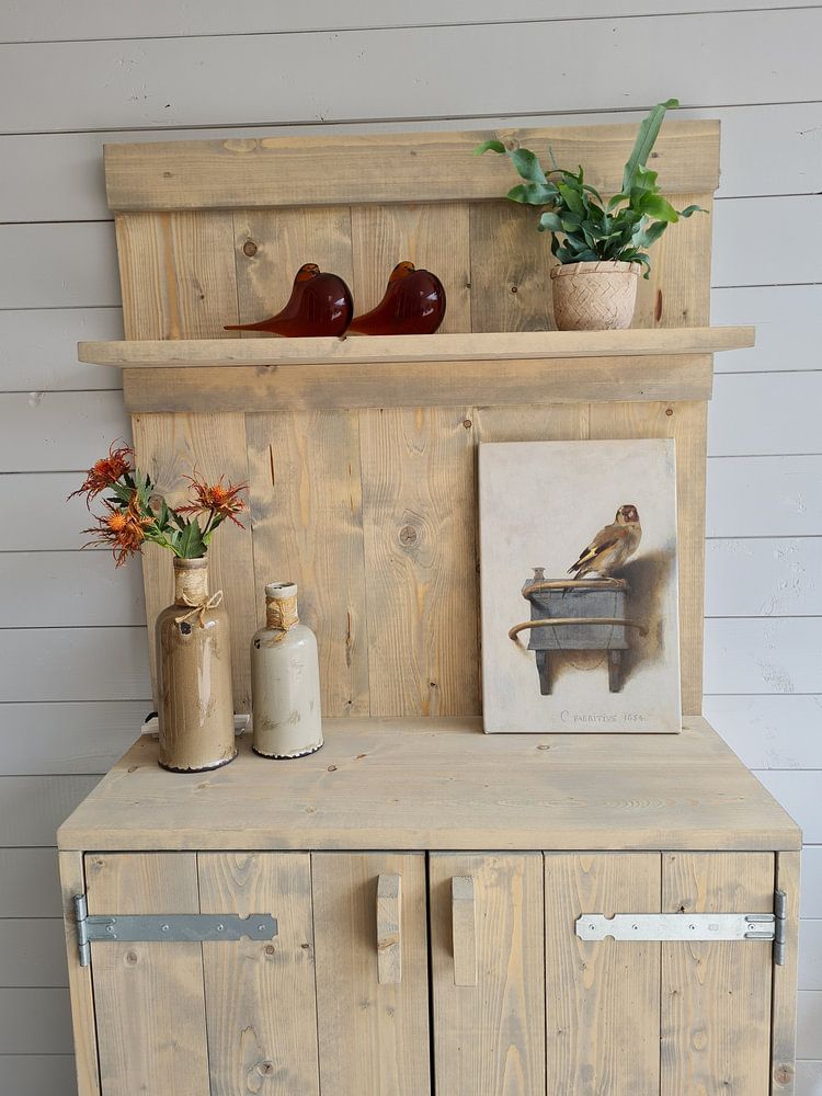
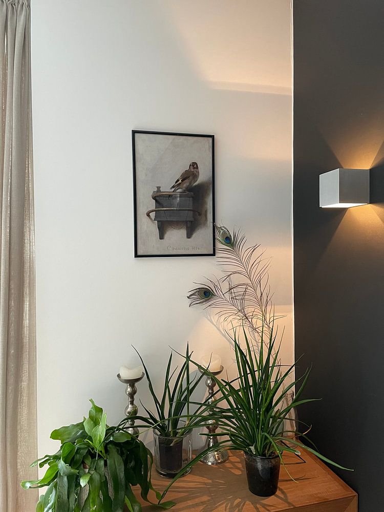
How they hang in other homes
Get inspired by beautiful artworks on other people's walls and see how they truly enhance an interior.


More like this






How Carel Fabritius works with warm, earthy interiors
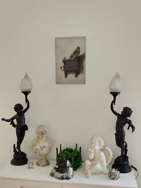
Carel Fabritius artworks feature warm brown, taupe, bronze, and beige tones that suit classic and Scandinavian interiors beautifully. In a classic setting, pair the rich bronze and brown hues with dark wood furniture and warm brass accents. For Scandinavian spaces, combine the softer beige and taupe shades with light oak, linen textiles, and muted ceramics. These earthy colors create a grounded, inviting atmosphere that feels both timeless and refined.
Where to display art by Carel Fabritius in your home
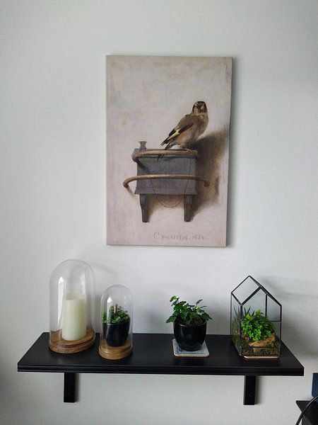
Though popular formats aren't specified for this collection, Carel Fabritius artworks adapt well to multiple placements depending on your chosen size. Horizontal formats work beautifully above a sideboard in the hallway or behind a dining table, creating a calm focal point. Vertical pieces suit narrower walls beside doorways or in reading corners. For intimate spaces like a home office, smaller square formats bring focus without overwhelming the room.
Styling Carel Fabritius to enhance calm, nostalgic spaces
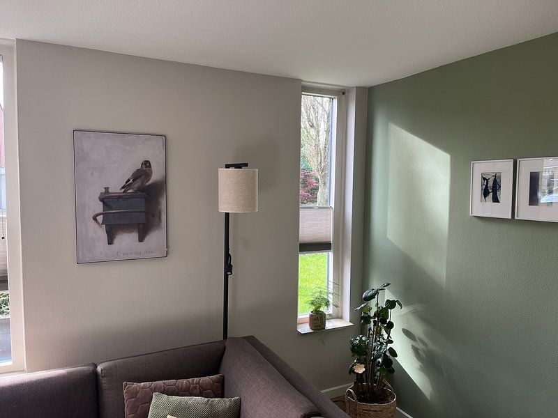
The calm and nostalgic mood of Carel Fabritius artworks pairs naturally with vintage-inspired decor and soft textures. Add weathered wood frames, aged brass candleholders, or linen cushions in complementary taupe tones to enhance the melancholic atmosphere. In a gallery wall, combine these artworks with botanical prints or antique mirrors to create layered visual interest. Choose what suits your space and let the quiet, reflective character of these pieces bring warmth to your everyday surroundings.