-
More artworks below this tip
Choose your format
Portrait and square formats are equally popular in this collection. Portrait works well on narrow walls or between windows, while square prints suit balanced, centered compositions. Both formats give you flexibility to fit your available wall space without compromise.
LianneStylist & Customer service Questions? Check out our FAQ
 -
More artworks below this tip
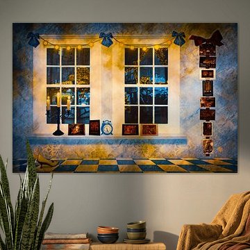
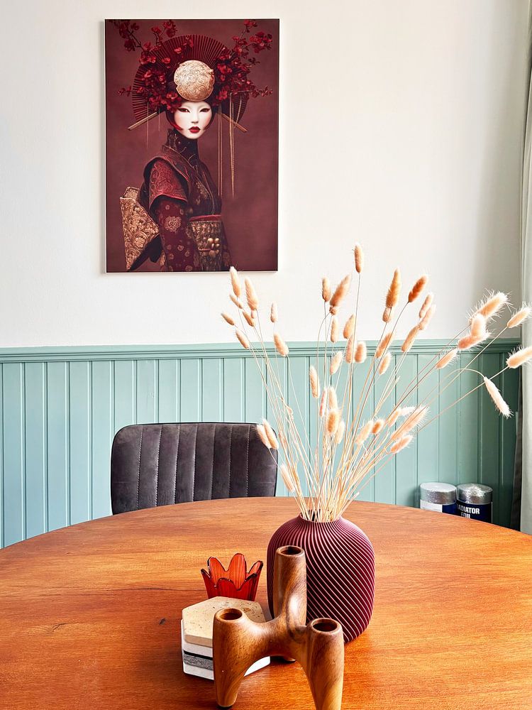
Hang at eye level
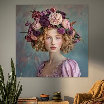
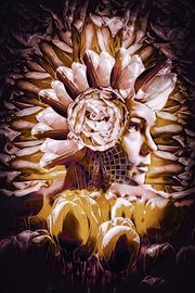
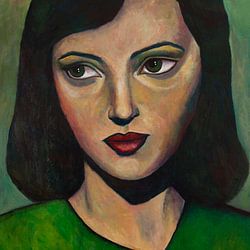
Position your artwork so the center sits at eye level - roughly 145 - 150 cm from the floor. This creates a natural focal point in any room. For pieces with strong color like Colourful portrait with leaves, ensure the center of the image aligns with your natural sightline when standing.
AnthiStylist & Customer service Questions? Check out our FAQ
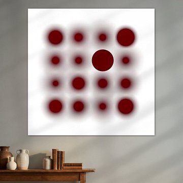
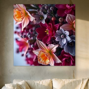
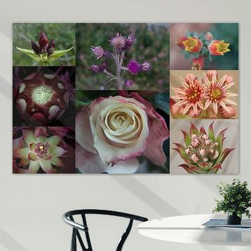
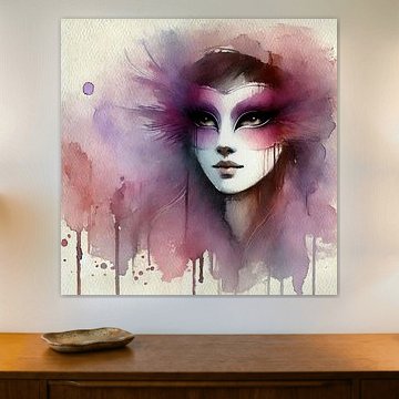
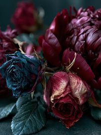
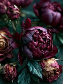
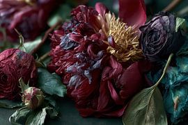
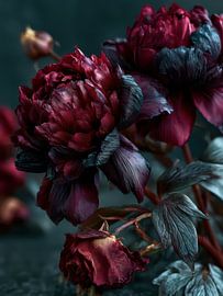
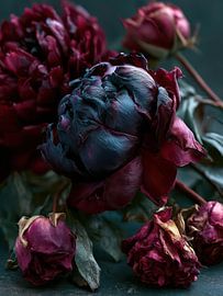
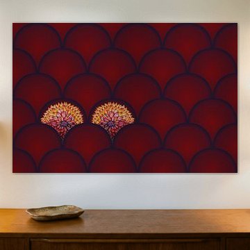
Burgundy red
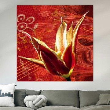
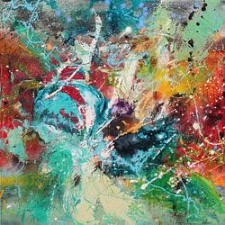
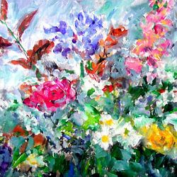
Why does burgundy red feel both bold and inviting? This rich, wine-inspired shade brings warmth and sophistication to any interior. Deep reds meet earthy tones in artworks like Tulips Abstract II, where abstract forms create visual depth. These pieces work beautifully in modern and classic spaces alike, adding character without overwhelming.
At Art Heroes, we work with talented European artists who capture this timeless colour in countless styles. Choose your favourite as ArtFrame™, Canvas, Poster and more - all custom-made and shipped free to your door.


Trusted and loved
Customers rate us 4.8!
High-quality materials
Sustainable and long-lasting beauty
Different sizes
From small to large, anything is possible.
Made for you
Made the moment you order.
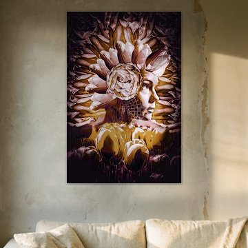
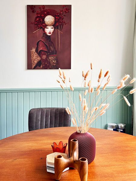
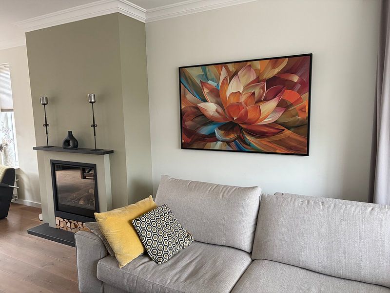
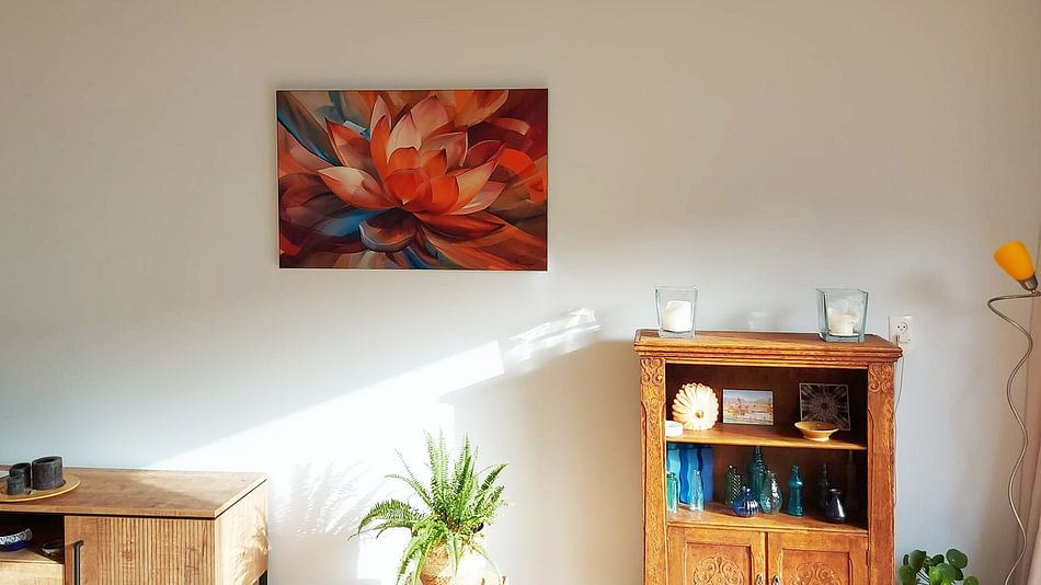
How they hang in other homes
Get inspired by beautiful artworks on other people's walls and see how they truly enhance an interior.


More like this


How does Burgundy red work in the bedroom?
Burgundy red works beautifully in the bedroom, where its rich, warm tones create a calm and elegant atmosphere. The deep hues in this collection pair well with soft textiles and warm lighting, helping to set a restful mood. Consider placing these artworks above your bed or on a feature wall opposite the window, where natural light can bring out the subtle mauve and terracotta accents. This collection suits bedrooms that lean towards a cosy, sophisticated style.
Styling Burgundy red with complementary tones
The Burgundy red collection combines well with other warm neutrals and earthy shades found throughout your home. Try pairing these artworks with taupe cushions, terracotta planters, or brown wooden furniture to create a cohesive look. A gallery wall mixing Burgundy red pieces with lighter neutral artworks can add depth without overwhelming the space. For a calm, layered interior, consider adding soft lighting and natural materials like linen or wool. Let the mysterious and elegant moods guide your choices for a space that feels both grounded and inviting.
Which format works best for Burgundy red artworks?
Portrait format is a good choice for Burgundy red artworks, as the vertical orientation draws the eye upward and works well on narrower walls or in hallways. Position a portrait-format Poster beside a doorway or above a console table to make the most of the space. If you have a wider wall area, a landscape format can balance the composition better, especially above a sideboard or desk. Choose the format that suits your wall dimensions and the furniture you're working with.
