
Amsterdam city map
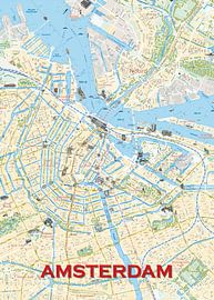
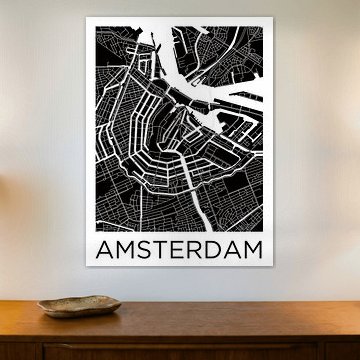
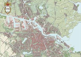
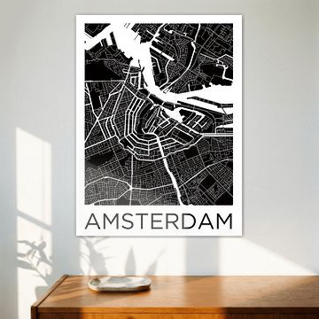
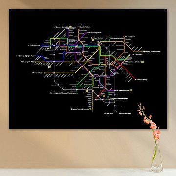
Amsterdam's canal rings and historic streets translate beautifully into map art. These cartographic designs bring urban energy and architectural character to your walls, blending heritage with contemporary style.
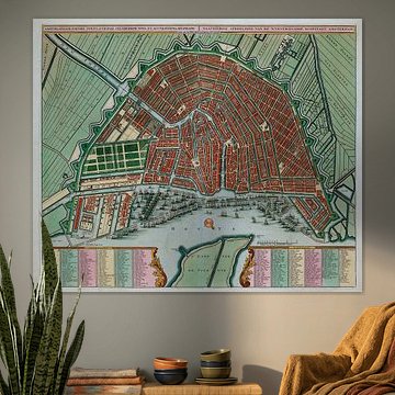
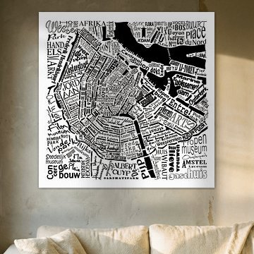
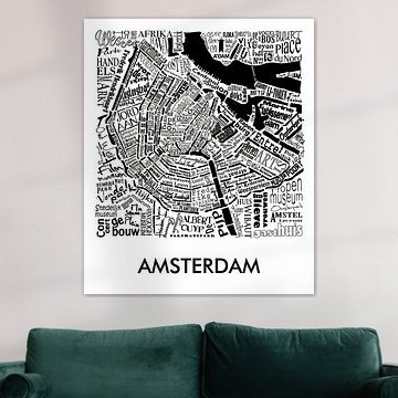
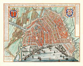
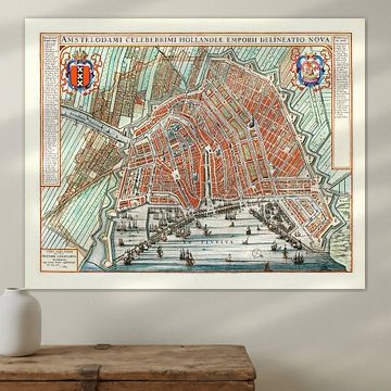
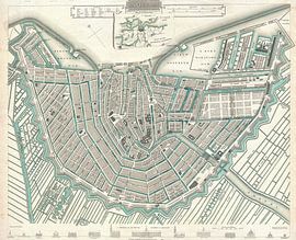
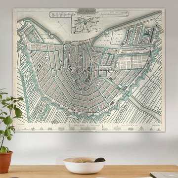
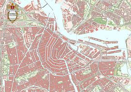
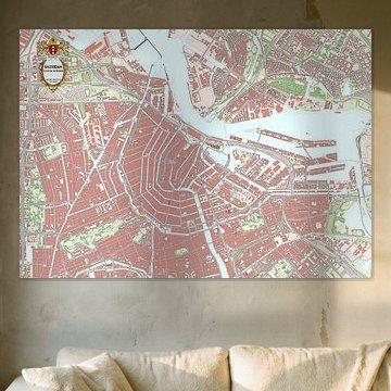
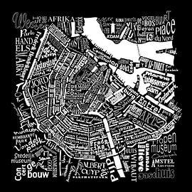
From typographic word clouds to antique maps, each piece captures the city's distinctive layout. Works like Amsterdam, typographical map with A'dam tower show how playful design meets geographic detail, while historic reproductions reveal Amsterdam's evolution through centuries. The palette ranges from bold navy and teal to muted sage and early dew, fitting minimalist and eclectic interiors alike.
At Art Heroes, we print your chosen Amsterdam city map on Canvas, Poster, ArtFrame™ and more. Custom-made to order with free shipping across Europe.
-
More artworks below this tip
Pair neutral tones with natural materials
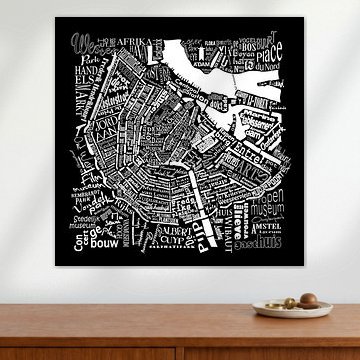
The beige and sage green tones that appear throughout this collection work beautifully alongside natural wood furniture and linen textiles. These soft, earthy colors create a calm backdrop in living rooms and bedrooms. For a grounded, understated look, Map of Amsterdam in words pairs well with oak frames and woven accessories.
AnthiStylist & Customer service Questions? Check out our FAQ










Trusted and loved
Customers rate us 4.8!
High-quality materials
Sustainable and long-lasting beauty
Different sizes
From small to large, anything is possible.
Made for you
Made the moment you order.


More like this






How to style an Amsterdam city map in your space
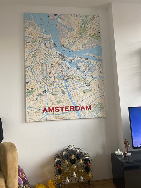
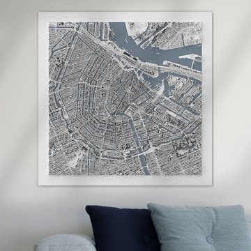
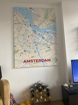
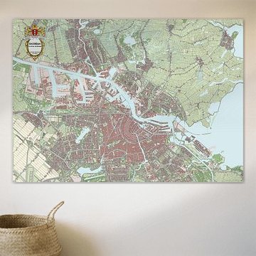
An Amsterdam city map brings both nostalgic charm and vibrant energy to your interior. Create a compelling gallery wall by pairing it with complementary decor that echoes its calm yet lively character - think botanical prints, vintage travel posters, or simple line drawings. The map's detailed street layout works beautifully alongside natural textures like woven baskets or potted greenery. Layer different frame colors to add depth, or keep it minimalist with matching tones for a cohesive look. This approach transforms a single map into a curated corner that feels both personal and inviting.
Which colors suit an Amsterdam city map best
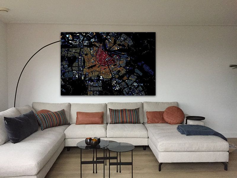
An Amsterdam city map in white, beige, early dew, sage green, and taupe fits seamlessly into Scandinavian and minimalist interiors. These soft, earthy tones create a serene backdrop that enhances light-filled spaces without overwhelming them. Pair the map with natural wood furniture, linen textiles, and muted accent pieces to reinforce the calm atmosphere. In a Scandinavian setting, combine the sage green tones with pale oak and off-white walls for a fresh, airy feel. For minimalist spaces, let the beige and taupe shades anchor the room while keeping accessories to a thoughtful few.
Where to place your Amsterdam city map
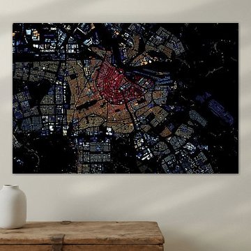
Horizontal formats work exceptionally well for Amsterdam city maps, as they mirror the canal structure and wide city layout. Hang your map above a sofa or sideboard to create a balanced focal point that draws the eye without dominating the wall. In narrower spaces like hallways or above a desk, a vertical format can highlight the map's intricate street details. Consider a panoramic option for long, empty walls where you want to make a bold statement. Choose your size and material to match both your wall dimensions and the room's overall style.