


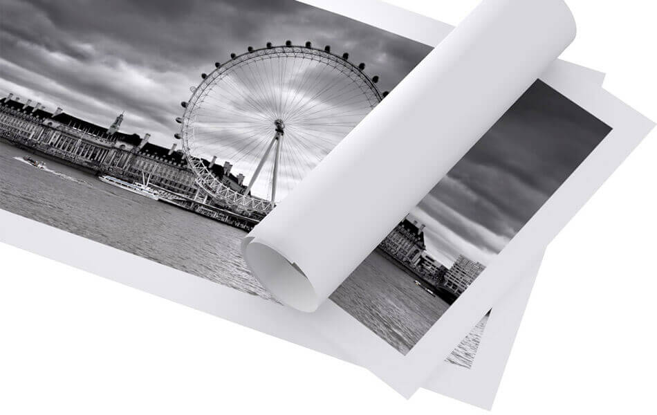
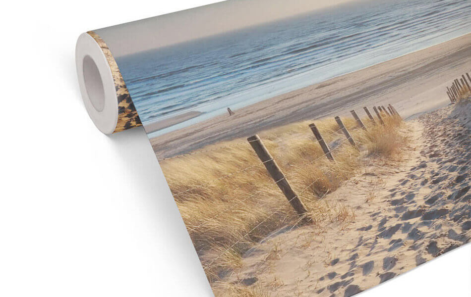
Buy the photo Metro moment in Hong Kong: street signs & travelling culture by NZME Photography on canvas, ArtFrame, poster and wallpaper, printed on demand in high quality.
About "Metro moment in Hong Kong: street signs & travelling culture"
by NZME Photography
About the artwork
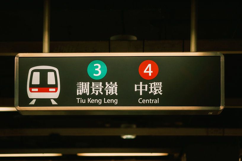
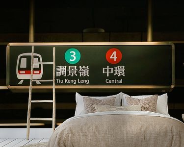
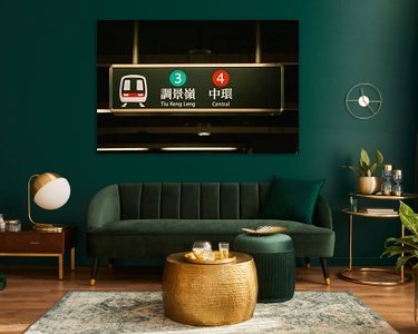
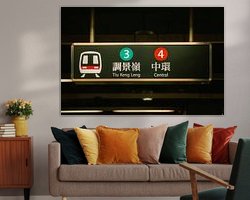
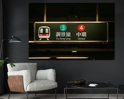
he image captures the atmosphere of a typical Hong Kong metro station and emphasises the importance of public transport for the city. The sign features both Chinese and English characters, alongside the line numbers in distinctive coloured dots - green for Tiu Keng Leng and red for Central. The stylised metro icon emphasises the modern transport system and the constant movement of the city's population. The clear typography and visual structure reflect Hong Kong's efficient infrastructure and international orientation. The motif exemplifies everyday life, mobility and the combination of tradition and progress in Asian city life. For fans of urbanity, graphic design and travel photography, this image is a perfect eye-catcher. As a wall mural, it brings the dynamism, pulse and diversity of Hong Kong directly into workrooms, reception areas or flats - and provides inspiration and cosmopolitan energy in modern rooms.

About NZME Photography
NZME is a versatile photographer and videographer based in Berlin whose work is strongly influenced by his passion for travelling and experiencing different cultures. His portfolio includes striking street, landscape and architectural photography from different regions of the world - including Thailand, Hong Kong, Colombia, Spain,.. Read more…
 Asia
Asia China
China Countries & Travel
 Graphics
 Hong-Kong
 Photo wallpaper
 Photography
 Serene Peace
 Subway
 Transport
 Typography
 Germany
 Ordered in December 2021
 Netherlands
 Ordered in February 2023
Netherlands
Ordered in February 2023
Netherlands Ordered in January 2020
Germany
Ordered in January 2022
Netherlands
Ordered in August 2019
Germany
Ordered in April 2020
Netherlands
Ordered in October 2021
Netherlands
Ordered in September 2019
Germany
Ordered in May 2025
Netherlands
Ordered in April 2019
Germany
Ordered in November 2020
Netherlands
Ordered in June 2020
Ordered in January 2020
Germany
Ordered in January 2022
Netherlands
Ordered in August 2019
Germany
Ordered in April 2020
Netherlands
Ordered in October 2021
Netherlands
Ordered in September 2019
Germany
Ordered in May 2025
Netherlands
Ordered in April 2019
Germany
Ordered in November 2020
Netherlands
Ordered in June 2020
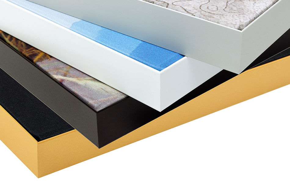
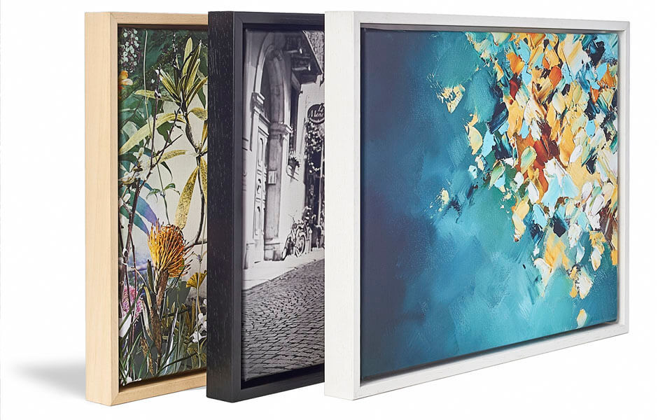
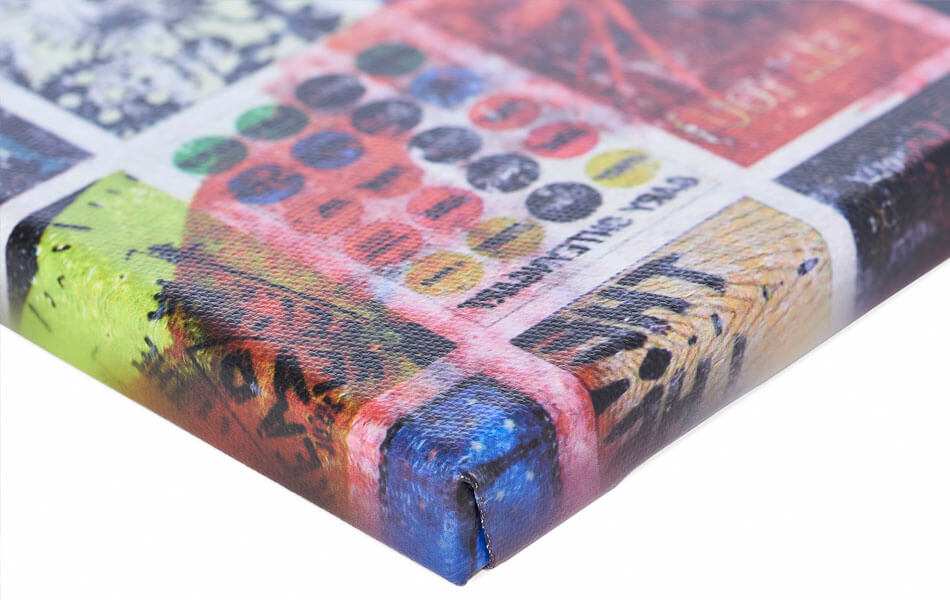
About the material
ArtFrame™
Interchangeable Art Prints
- High-quality print
- Easily interchangeable
- Acoustic function
- Large sizes available
Discover the artworks of NZME Photography
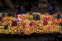 Diversity of the fruit market: a blaze of colour from Latin AmericaNZME Photography
 White alpaca on grassy green Andean pastureNZME Photography
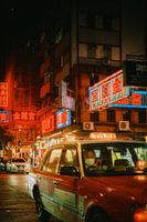 Hong Kong city life - Red taxi in neon lightNZME Photography
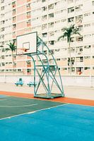 Urban sports field in Hong Kong: colours and architectureNZME Photography
 Urban Colombia: graffiti, architecture and life in MedellínNZME Photography
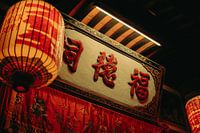 Tradition and art - Historical signs & lanternsNZME Photography
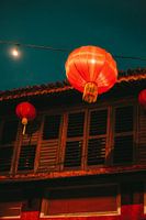 Chinese lanterns in the twilight - Urban cultural experienceNZME Photography
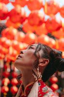 Colourful celebration - Chinese lanterns in the sunlightNZME Photography
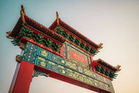 Traditional Chinatown gate at sunsetNZME Photography
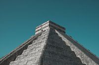 The pyramid of Chichén Itzá: Mayan cultural heritage in YucatánNZME Photography
 Bangkok Tuk Tuk - Urban life in Thailand's capital cityNZME Photography
 Natural sculptures: cacti in the sunlightNZME Photography
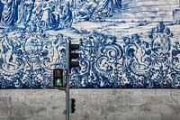 Street scene in Porto: Pedestrian traffic lights in front of historical wall artNZME Photography
 Velvety seduction - artistic boudoir photography in greenNZME Photography
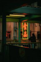 Hong Kong neon lights - urban nightlife in AsiaNZME Photography
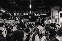 Rush hour in Tokyo: Crowds at the railway station in JapanNZME Photography
 Dynamics of the street: focus on the skateboard lifestyleNZME Photography
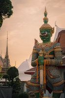 Guardians of the temple at sunsetNZME Photography
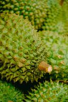 Royal fruit: Close-up of a durianNZME Photography
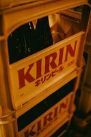 Japanese flavour: KIRIN beer crates in warm lightNZME Photography


