
Thérèse Schwartze
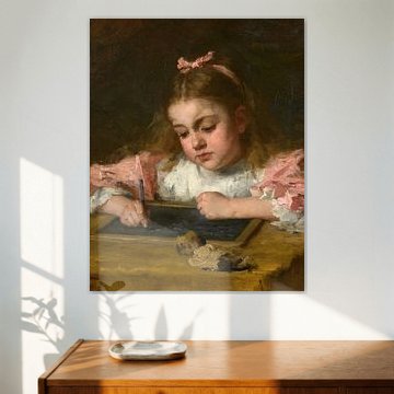
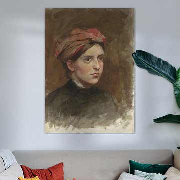
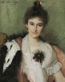
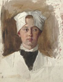
Looking for timeless Dutch portraiture that brings quiet elegance to your walls? Thérèse Schwartze captured 19th-century society with remarkable sensitivity, painting aristocrats, orphans, and families with equal grace. Her palette - soft olives, warm taupes, and muted greys - creates a calming, nostalgic mood that complements both classic and contemporary interiors.
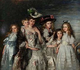
Works like Portrait of Mrs. A.G.M. van Ogtrop-Hanlo (1871-1944) and her five children, Thérèse Schwartze showcase her skill in rendering fabric, light, and character, while pieces such as Three girls from the Amsterdam orphanage, Thérèse Schwartze reveal her compassionate eye for everyday life. At Art Heroes, we print each piece to order, ensuring your chosen artwork fits your space perfectly. Explore the full collection as a Canvas, Poster, Wallpaper, and more.
-
More artworks below this tip
Layer Grey and Green for Subtle Depth
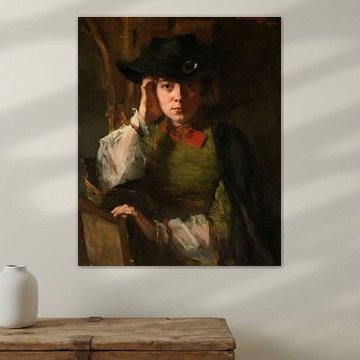
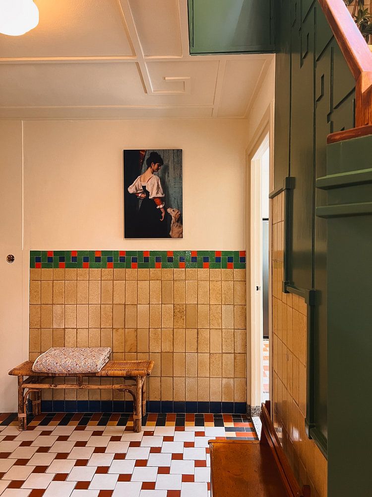
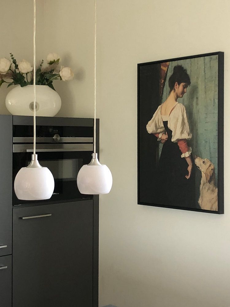
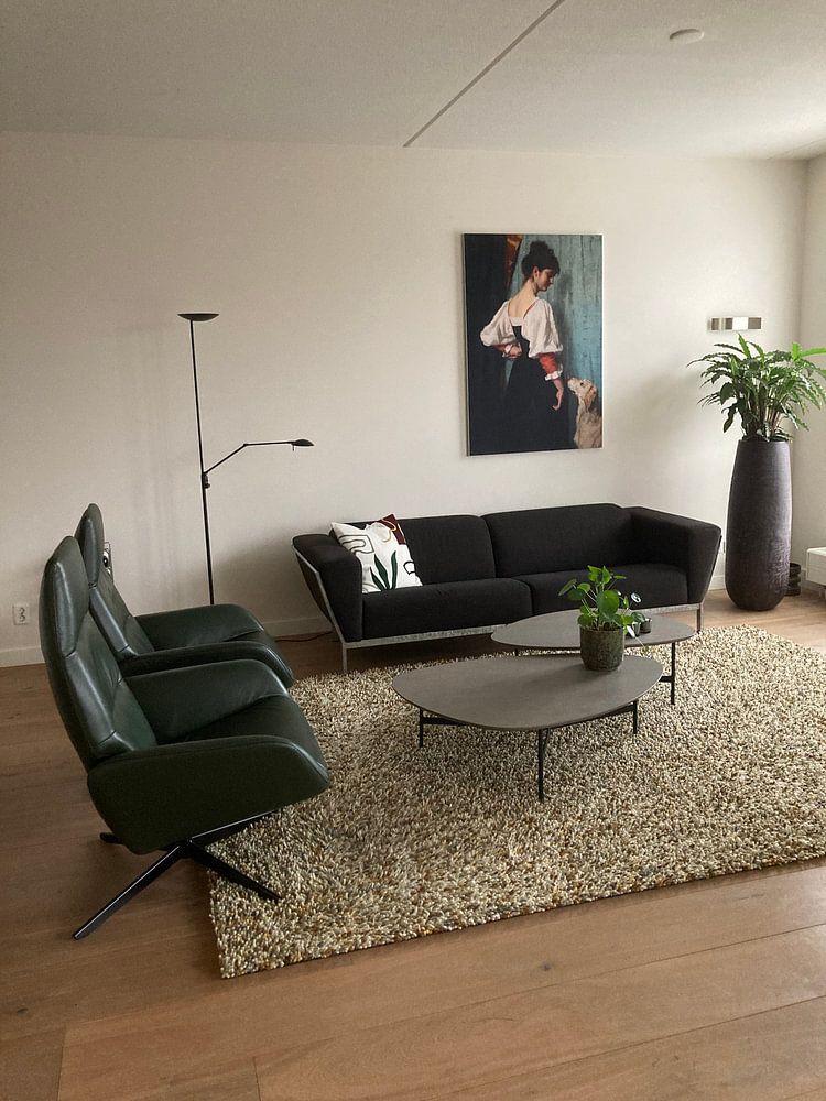
When an artwork combines grey with olive or emerald tones, it offers flexibility for styling. These colours sit comfortably beside both warm and cool interiors. The grey and green combination in Portrait of a young woman with the dog Puck - Thérèse Schwartze pairs well with sage walls, charcoal sofas, or brass lighting fixtures for a balanced, layered look.
GinaStylist & Customer service Questions? Check out our FAQ
 -
More artworks below this tip
Find the Right Space for Historic Portraits
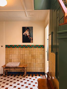
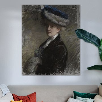
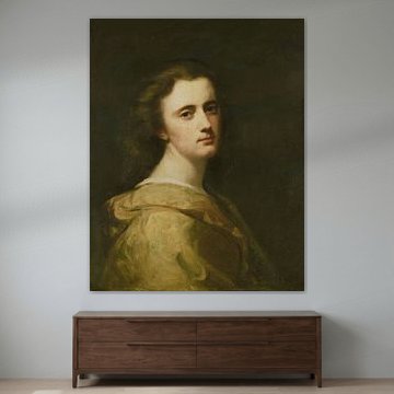
Portraits with eye contact work beautifully in intimate spaces where they invite connection. Consider placing them in hallways, reading corners, or above a console table where viewers can pause and engage. The direct gaze in Portrait of Lizzy Ansingh, Thérèse Schwartze suits a spot where people naturally slow down and take notice.
AnthiStylist & Customer service Questions? Check out our FAQ
 -
More artworks below this tip
Choose Calm Artworks for Restful Rooms
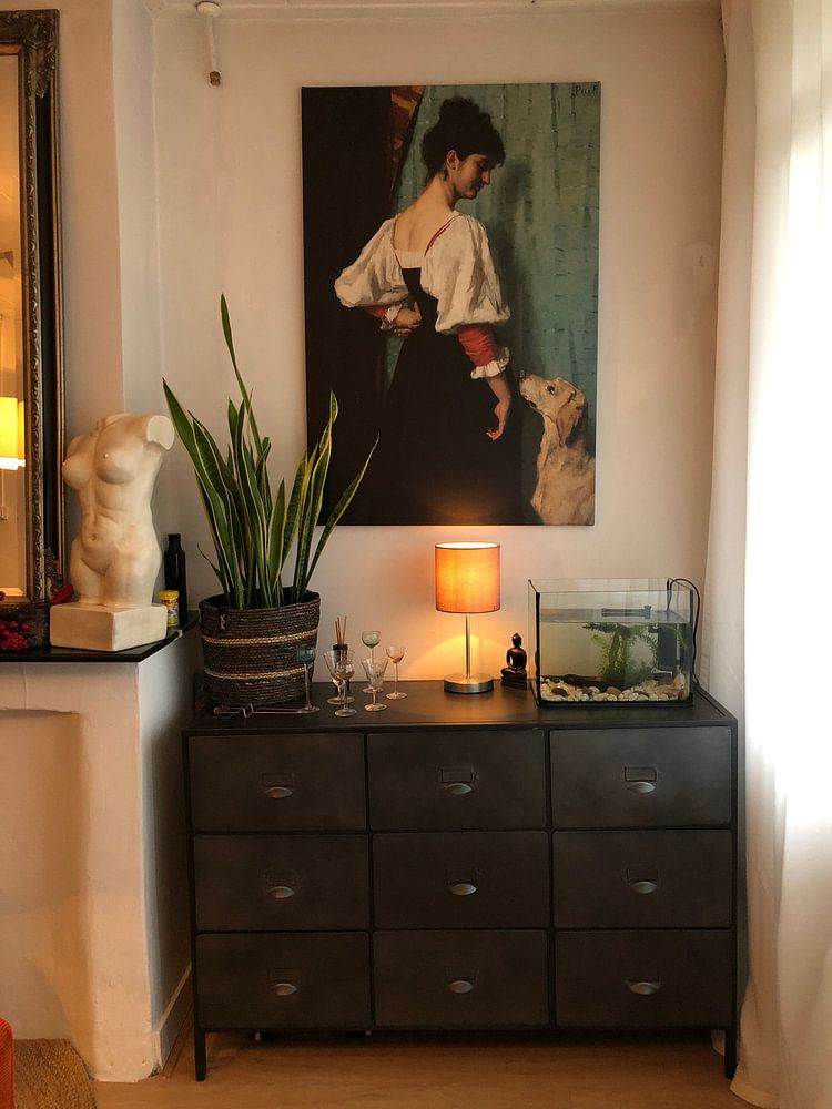
Nostalgic, delicate artworks help create peaceful environments in bedrooms, studies, or quiet corners. Their gentle mood supports spaces meant for rest and reflection rather than high energy. The calm atmosphere in Portrait of a young woman with the dog Puck - Thérèse Schwartze makes it well-suited to rooms where you want to unwind and feel at ease.
RosanneStylist & Customer service Questions? Check out our FAQ














Trusted and loved
Customers rate us 4.8!
High-quality materials
Sustainable and long-lasting beauty
Different sizes
From small to large, anything is possible.
Made for you
Made the moment you order.
How they hang in other homes
Get inspired by beautiful artworks on other people's walls and see how they truly enhance an interior.



More like this




Which colors work well with art by Thérèse Schwartze
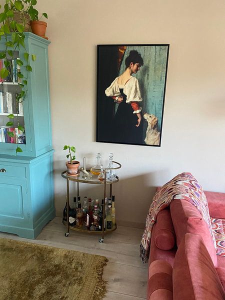
Art by Thérèse Schwartze pairs beautifully with classic and Scandinavian interiors. The warm brown and taupe tones blend naturally with cream walls and oak furniture in a classic setting, while the grey and beige hues complement light wood and neutral textiles in Scandinavian spaces. Combine the olive green accents with soft linen cushions or ceramic decor to add warmth without overwhelming the calm, elegant character of these artworks.
Where art by Thérèse Schwartze works well in your home
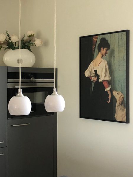
A hallway is a good spot for art by Thérèse Schwartze, especially if you appreciate its nostalgic and elegant mood. The brown and taupe palette creates a welcoming first impression without being too bold, while the calm atmosphere suits transitional spaces where you pass through regularly. These artworks add character to narrow walls and work well alongside wooden console tables or vintage mirrors.
Choosing Canvas, Poster, or Wallpaper for art by Thérèse Schwartze
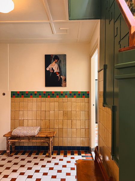
Canvas brings out the painterly quality of this collection, honoring its original technique while the neutral palette gains depth on fabric. Poster and Wallpaper offer lighter alternatives. Choose Canvas and you benefit from two thoughtful advantages. The fine-art print quality on bright white poly-cotton canvas ensures the brown, beige, and olive green tones stay rich and accurate, which matters when subtle taupe and grey shades define the elegant mood. The sustainable and durable construction guarantees your artwork lasts at least ten years, making it a worthwhile investment for nostalgic pieces that deserve longevity and proper display. Still doubting which material suits your interior and chosen art by Thérèse Schwartze? Use our Material Advisor to find the perfect match.