-
More artworks below this tip
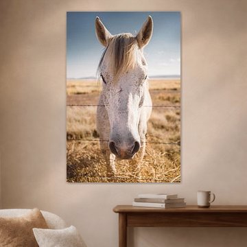
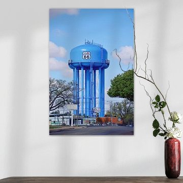
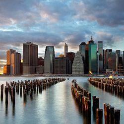
Portrait and square formats lead
Portrait format remains the most popular choice for this collection, followed closely by square. Portrait prints suit narrow wall spaces and create vertical interest above furniture, while square formats work well in gallery walls or symmetrical arrangements. Choose the format that best fits your available wall space.
RosanneStylist & Customer service Questions? Check out our FAQ
 -
More artworks below this tip
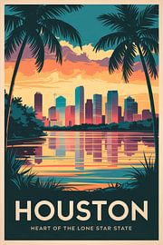
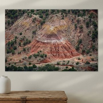
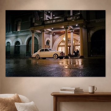
Working with warm earth tones
Taupe and beige tones create a calm, grounded foundation that pairs beautifully with natural materials like wood, linen, and rattan. These neutral shades allow you to layer in warmer accent colors - think terracotta cushions or ochre throws - without overwhelming your space. Houston | Main Street | Historic District shows how these tones work together in architectural settings.
EileenStylist & Customer service Questions? Check out our FAQ
 -
More artworks below this tip
Room pairing with natural light
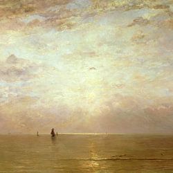
Soft skies and open horizons benefit from rooms with natural daylight, where shifting light brings out subtle color variations throughout the day. The gradient sky and delicate plumage in Rosy pair (Roseate Spoonbills) suit spaces like bedrooms or reading corners, where you want a sense of calm movement without visual intensity.
LianneStylist & Customer service Questions? Check out our FAQ
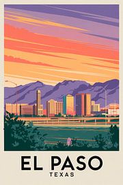
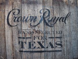
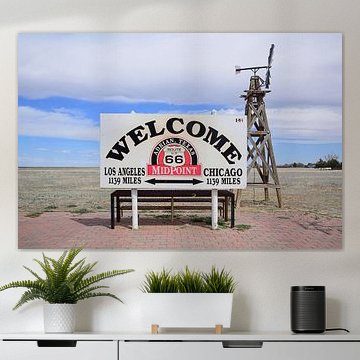
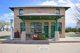
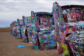
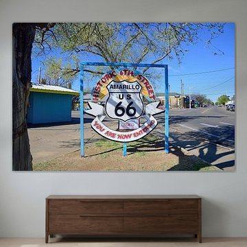
Texas
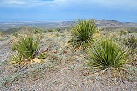
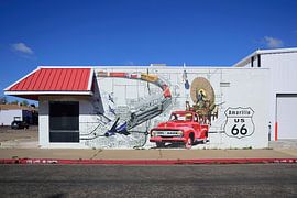
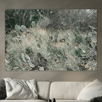
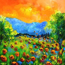
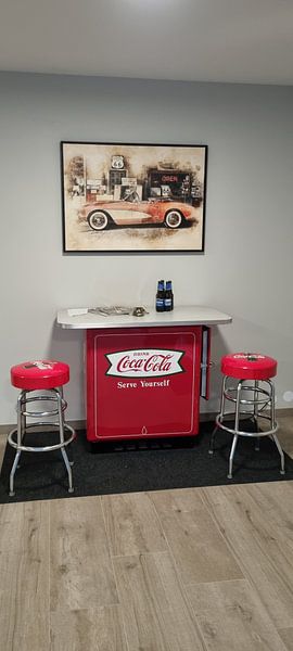
Texas art captures the spirit of wide-open landscapes and bold American heritage. Whether you're drawn to desert sunsets, vintage roadside scenes, or weathered rural icons, this collection reflects the character that defines the Lone Star State.
From the vibrant cacti in Arizona to the nostalgic charm of Cadillac Ranch, each piece brings authentic Texan atmosphere into your space. These artworks suit rustic interiors, modern lofts, and everything in between - anywhere you want to feel that sense of freedom and grit.
At Art Heroes, we print every order custom-made and ship it free. Explore your options in Canvas, Poster, ArtFrame™ and more - choose what works for your wall.


Trusted and loved
Customers rate us 4.8!
High-quality materials
Sustainable and long-lasting beauty
Different sizes
From small to large, anything is possible.
Made for you
Made the moment you order.


More like this


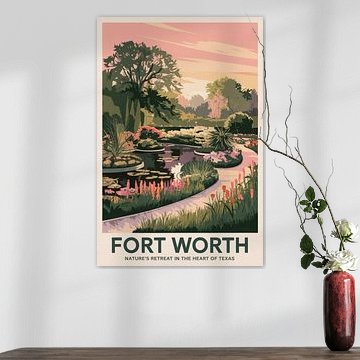
Which format works best for Texas artwork?
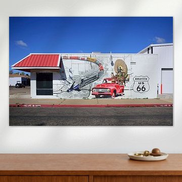
Texas art looks striking in landscape format, which captures the state's wide-open horizons and expansive spirit. This horizontal orientation works particularly well above a sofa or sideboard, where it can stretch across the wall and draw the eye naturally. Landscape pieces also suit dining room walls, creating a focal point that doesn't overwhelm the space. That said, square formats offer a balanced alternative for smaller walls or when you're arranging a gallery-style display with other artworks.
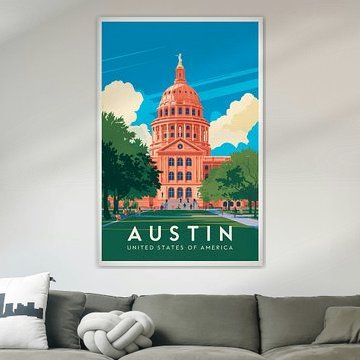
Where does Texas art work well in your home?
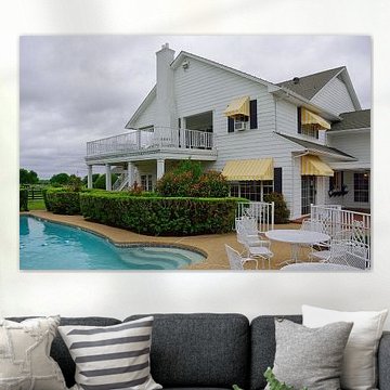
The living room is a good spot for Texas-themed artwork, where its nostalgic and vibrant qualities can set the tone for the entire space. These artworks complement rooms where you gather with family and friends, adding character without demanding too much attention. Place a landscape piece above your sofa to anchor the seating area, or hang a square format near a bookshelf to create visual interest. The warm palette of taupe, beige, and brown tones blends naturally with wood furniture and textile accents, making styling straightforward.
How to style Texas art with your décor
Texas artwork pairs beautifully with natural materials and earthy accessories that echo its calm and nostalgic mood. Consider adding woven baskets, ceramic pieces in blue or mauve tones, or plants with soft foliage to create a cohesive look. For a layered effect, combine Texas prints with vintage-inspired décor objects or textiles in complementary brown and beige shades. Wallpaper offers a bold option if you want to transform an entire accent wall into an immersive Texas scene. Choose what suits your space and create a warm, welcoming atmosphere that reflects the character of the Lone Star State.
