-
More artworks below this tip
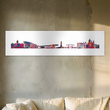
Choosing between portrait and landscape formats
Both portrait and landscape formats are popular choices for the NEMO collection. Portrait works well on narrow walls beside doorways or windows, while landscape suits the space above sofas or sideboards where width matters more than height.
LianneStylist & Customer service Questions? Check out our FAQ
 -
More artworks below this tip
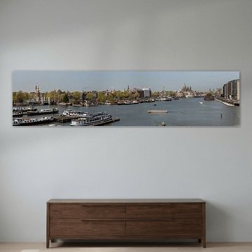
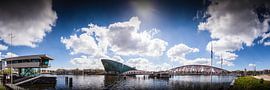
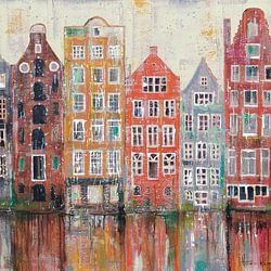
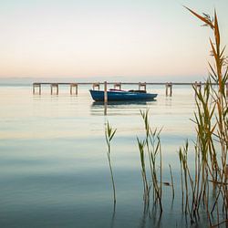
Pairing blue-grey tones with warm interiors
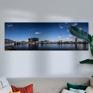
Cool grey and blue tones balance warm wood furniture and create a calming contrast in busy living areas. The soft blue-grey palette in Amsterdam and Oosterdok, Waalseiland and Open Harbour Front and and and and ... works well alongside oak, walnut, or beech furnishings without competing for attention.
EileenStylist & Customer service Questions? Check out our FAQ
 -
More artworks below this tip
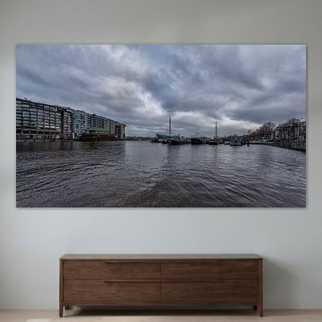
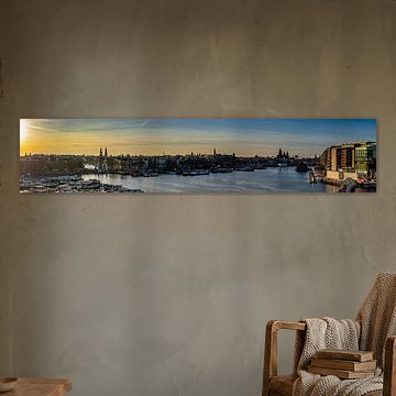
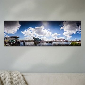
Where to hang your Amsterdam waterfront photograph
Waterside scenes bring a sense of openness to spaces that feel enclosed or lack natural light. Try hanging Amsterdam and Oosterdok, Waalseiland and Open Harbour Front and and and and ... in a hallway or narrow room where the wide water view creates visual breathing space and depth.
AnouschkaArt Stylist Questions? Check out our FAQ
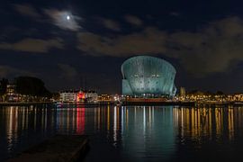
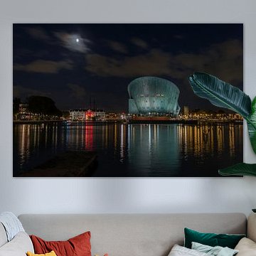
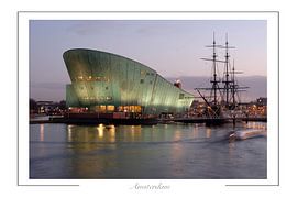
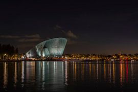
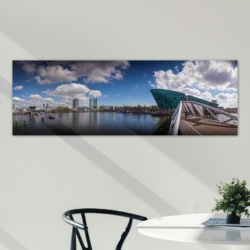
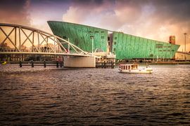
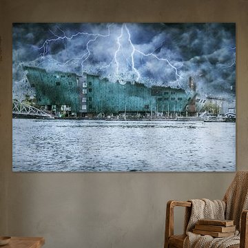
NEMO
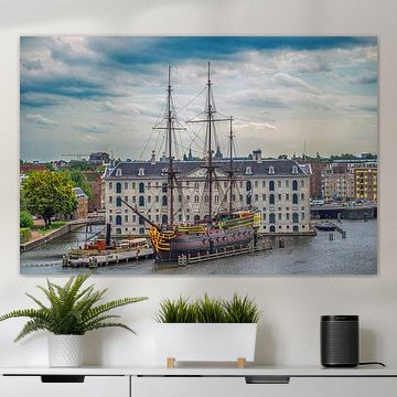
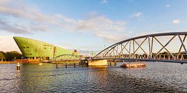
Looking for art that celebrates bold, modern architecture? NEMO's distinctive green structure dominates Amsterdam's waterfront, captured beautifully in The NEMO Science Center in Amsterdam in the evening. These artworks showcase the iconic science museum through different moods - from calm evening reflections to vibrant summer scenes. Blue, mauve, and teal tones create atmospheric cityscapes that suit contemporary and industrial interiors alike, while golden hour photography adds warmth to minimalist spaces.
We print each piece to order, which means you can choose the material that works best for your wall. Explore Canvas, Poster, ArtFrame™ and more - all with free shipping across Europe.


Trusted and loved
Customers rate us 4.8!
High-quality materials
Sustainable and long-lasting beauty
Different sizes
From small to large, anything is possible.
Made for you
Made the moment you order.


More like this
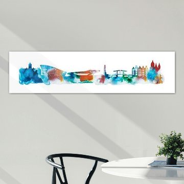
Which format works best for NEMO art?
NEMO artworks look striking in square format, which creates a balanced focal point on any wall. A square piece works well above a sideboard or console table, where the proportions feel natural and grounded. This format also suits narrow walls in hallways or between windows. If you're working with a wider wall above a sofa or bed, a landscape format offers better visual coverage and balance.
How to combine NEMO with your interior
NEMO artworks bring calm, vibrant, and mysterious moods into your space, making them easy to pair with natural materials and soft textiles. The blue, mauve, and grey tones work beautifully alongside white linen cushions, wooden furniture, or ceramic vases in earthy shades. For a cohesive look, group NEMO pieces with subtle decor objects rather than bold patterns - think simple planters or matte metal accessories. Let the artwork set the mood while your surroundings support it quietly.
Where NEMO artworks work well in your home
The living room is a good spot for NEMO pieces, especially if you want to create a calming yet visually engaging atmosphere. The mix of photography, digital art, and painting techniques adds depth without overwhelming the space, making it ideal above a sofa or on a feature wall. Pair a large Wallpaper with neutral furniture to let the colours breathe, or choose a Canvas for a softer, more textured presence. NEMO artworks anchor the room while inviting quiet reflection and conversation.
