

ARTEO Paintings
Painter
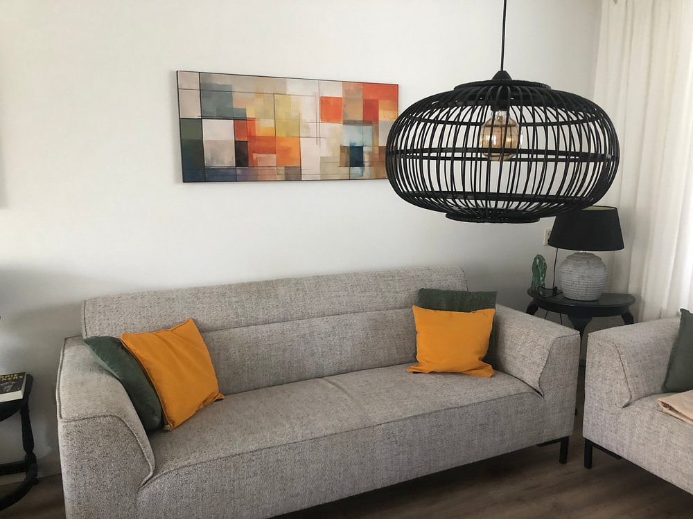
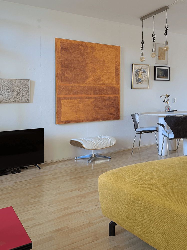
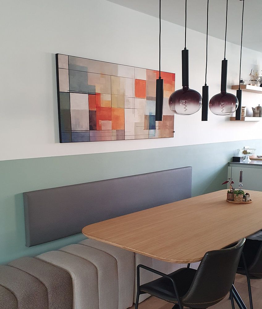
Looking for art that invites contemplation through bold, layered color? The Ode to Mark Rothko collection honors the visual language of color field painting - where horizontal bands meet, overlap, and breathe. Think muted greens, warm ochre, soft pinks and deep burgundy, layered with subtle gradients. Abstract painting green and orange shows how green and orange can create striking calm. These artworks feel at home in minimalist, Scandinavian and eclectic interiors, where simplicity and emotion find balance.
Each piece is available as Canvas, Poster, ArtFrame™ and more - choose what suits your space and style.
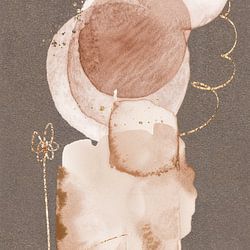
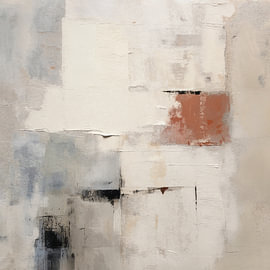
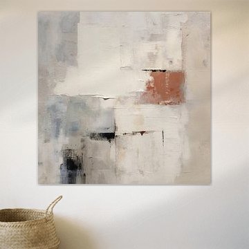
The warm tones in this collection work beautifully with natural materials. Taupe and beige create a calm, grounded base, while terracotta and orange add warmth without overwhelming your space. Try pairing Scandinavian painting with linen textiles, light wood furniture, or clay accents to bring out its earthy palette.

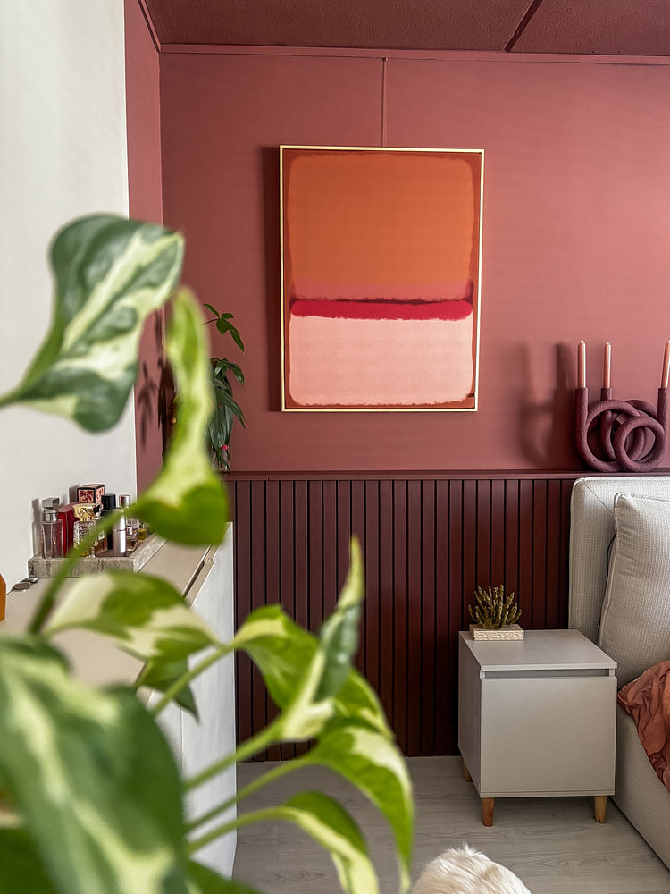
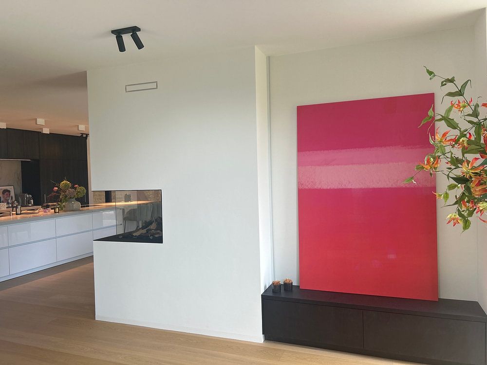
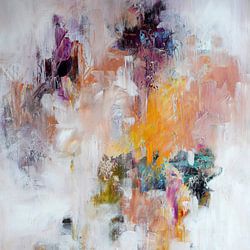
Large areas of solid colour need space to breathe. Hang abstract artworks at eye level in rooms where you spend quiet time - a bedroom, reading corner, or hallway. The layered pink and red tones in Modern abstract in pink and orange gradient. Rothko inspired create a bold focal point above a sideboard or sofa.

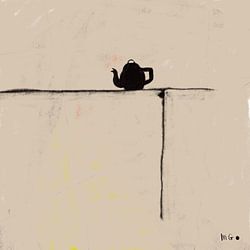
Neutral doesn't mean bland. You can combine calming earth tones with brighter accents to add personality without clashing. The muted browns and beiges in Scandinavian painting pair well with coral or tangerine accessories - think cushions, throws, or ceramics - to create balance and visual interest.

Customers rate us 4.8!
Sustainable and long-lasting beauty
From small to large, anything is possible.
Made the moment you order.
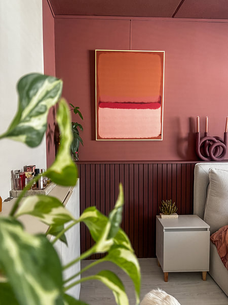
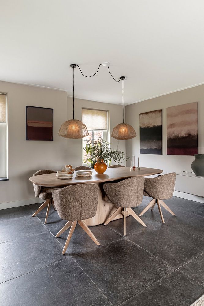
A bedroom is a good spot for Ode to Mark Rothko. The warm taupe, beige, and terracotta tones create a calm atmosphere that helps you wind down at the end of the day, while the occasional orange accents add just enough vibrancy to keep the space from feeling too muted. These earthy colors pair naturally with soft textiles and wooden furniture, making your bedroom feel grounded and restful without becoming monotonous.
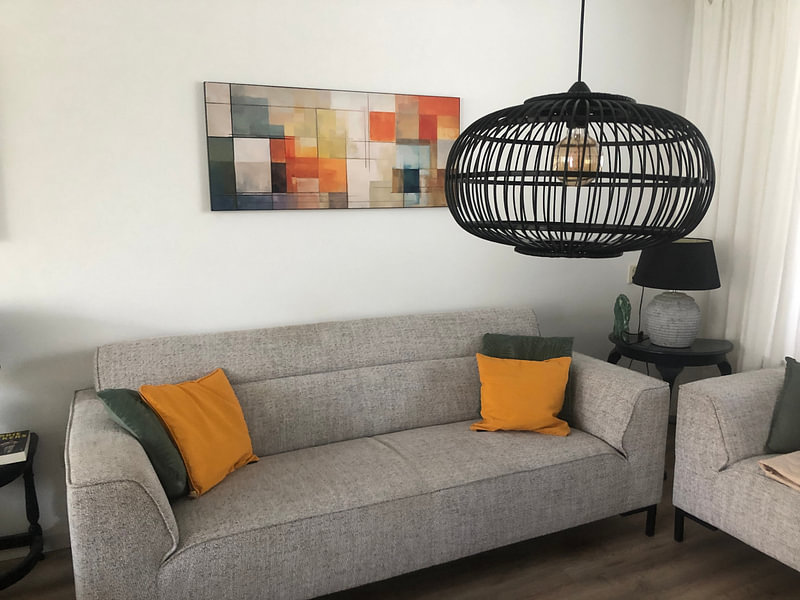
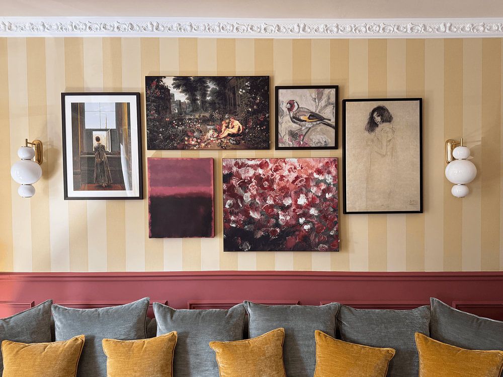
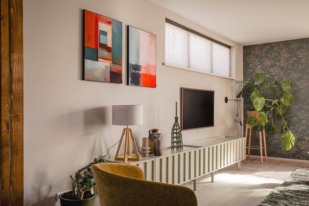
Ode to Mark Rothko works well when you balance its calm and vibrant moods in one space. Try hanging a larger piece above a sideboard and flanking it with smaller artworks in complementary warm tones to create a cohesive gallery wall. Add natural materials like terracotta pots, woven baskets, or a rust-colored throw to echo the collection's earthy palette. This approach brings the mysterious depth of the artworks into conversation with tactile objects that feel inviting and lived-in.
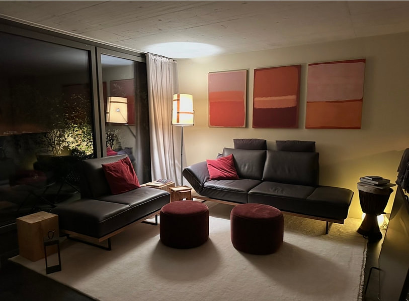
The taupe, beige, and brown hues in Ode to Mark Rothko fit beautifully within a minimalist interior. Keep walls neutral and let the terracotta and orange accents provide warmth without overwhelming the space. Choose furniture with clean lines in natural wood or matte finishes, and layer in soft textiles in complementary beige or warm grey tones. This combination allows the artworks to stand out while maintaining the simplicity and breathing room that defines minimalist design.