-
More artworks below this tip
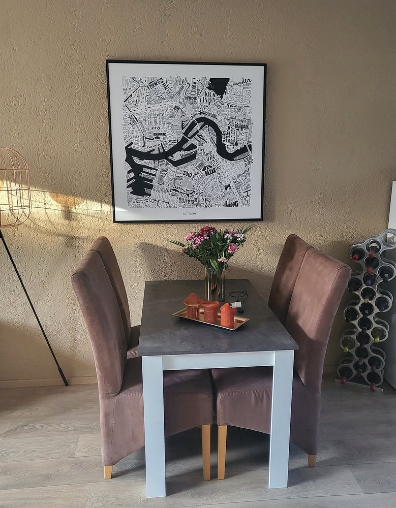
Pair with natural textures for warmth
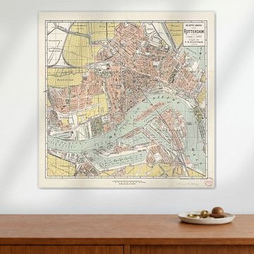
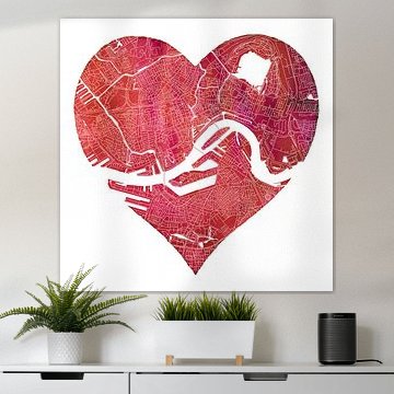
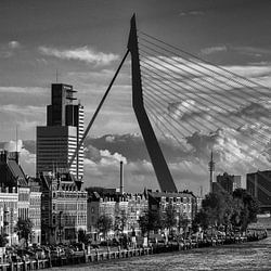
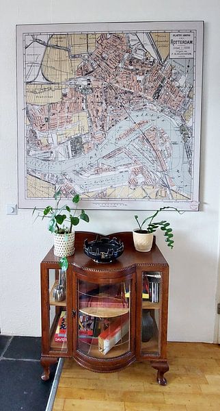
Neutral map prints work beautifully alongside wood, linen, or stone finishes. The understated palette creates a calm backdrop that lets your furniture and materials shine. For a soft, inviting look, try pairing Rotterdam North and South | City map in a heart | Black and white with warm oak or rattan accents in your living room.
AnouschkaArt Stylist Questions? Check out our FAQ
 -
More artworks below this tip
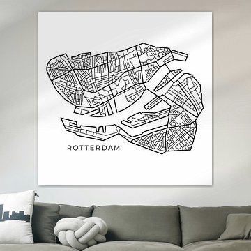
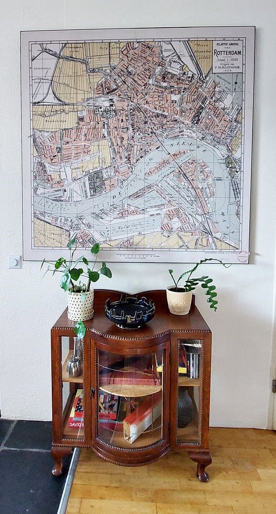
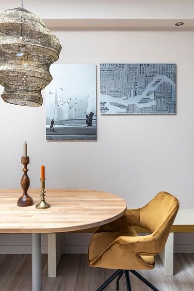
Hang above a console for a welcoming entry
A detailed city print makes a thoughtful first impression in your hallway. Position it above a console table or bench at eye level, so visitors can take in the street names and landmarks. This works especially well if you have a personal connection to the city.
RosanneStylist & Customer service Questions? Check out our FAQ
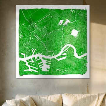
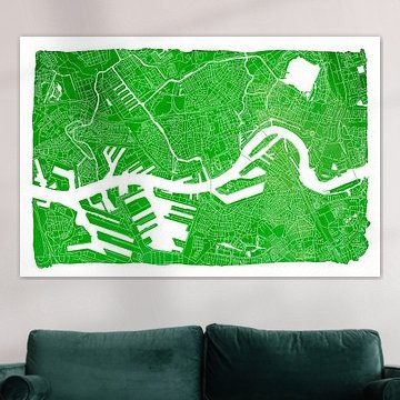
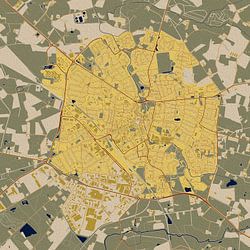
Maps of Rotterdam
Maps of Rotterdam capture the city's iconic layout in styles ranging from serene watercolour to bold geometric lines. These artworks reflect calm moods and vibrant energy alike, making them perfect companions for contemporary and minimalist interiors. Whether you're drawn to the nostalgic charm of Map of Rotterdam / drawn by J.J. Claus or the playful typography of Map of Rotterdam, each design tells Rotterdam's story through streets, waterways, and landmarks.
At Art Heroes, we print your chosen map to order. Explore Poster, Canvas, Wallpaper and more to find what suits your space.


Trusted and loved
Customers rate us 4.8!
High-quality materials
Sustainable and long-lasting beauty
Different sizes
From small to large, anything is possible.
Made for you
Made the moment you order.
How they hang in other homes
Get inspired by beautiful artworks on other people's walls and see how they truly enhance an interior.


More like this


How do Maps of Rotterdam fit into a gallery wall?

Maps of Rotterdam bring a calm yet vibrant character to your walls, making them easy to combine with different art styles. Their nostalgic charm pairs well with botanical prints or vintage photography when you're creating a gallery wall. You can also mix portrait and square formats to add visual rhythm, or place a larger landscape map as the focal point alongside smaller complementary pieces. The beige and blue tones work beautifully with natural textures like rattan baskets or linen textiles. Let the timeless appeal of cartographic art guide your creative arrangements and personal style choices.
Where do Maps of Rotterdam work well in your home?
A home office is a good spot for Maps of Rotterdam, where historical detail and visual interest support focus without being distracting. The crisp lines and structured layouts of cartographic artwork complement desk areas and reading corners, while the nostalgic mood adds depth to work-from-home environments. Hang a large landscape format above a sideboard or desk to create a sophisticated backdrop, or group smaller maps on the wall beside bookshelves. Maps of Rotterdam bring both decorative appeal and a sense of place to spaces where you need clarity and inspiration.
Which interior style suits Maps of Rotterdam best?
Maps of Rotterdam fit naturally into Scandinavian and classic interiors, where their beige, white, and blue color palette enhances light and airy spaces. In Scandinavian settings, combine these maps with pale wood furniture and soft whites to keep the look clean and uncluttered. For classic interiors, the red accents and early dew tones add warmth when paired with darker wood or navy textiles. Choose Poster for a traditional framed look, or try Canvas for a softer, more relaxed finish that works across both styles.
