
Maps of Haarlem
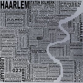
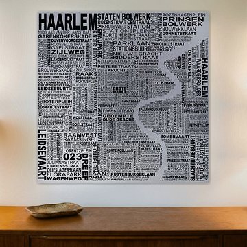
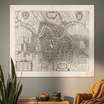
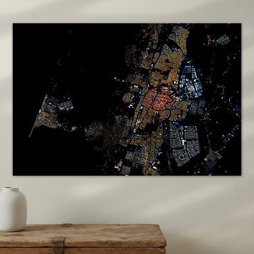
Haarlem told through cartography. These maps capture the Dutch city's evolution from historic engravings to bold, contemporary visualizations. Each piece reveals a different perspective - intricate street networks, neighborhoods color-coded by age, or typographic interpretations where street names form the city itself.
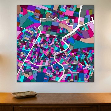
Perfect for those drawn to urban design, local history, or graphic aesthetics. Map of Haarlem transforms street names into abstract art, while Haarlem uses archival data to illuminate construction periods. Both approaches celebrate Haarlem's layered identity.
Choose your size and finish - ArtFrame™, Canvas, Poster and more. Make it personal to your space.
-
More artworks below this tip
Heart-shaped designs shine in personal spaces
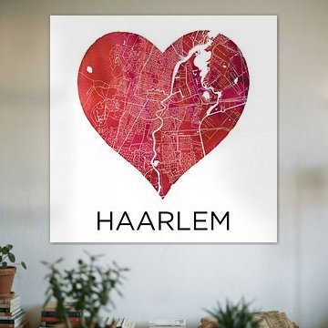
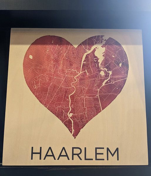
Maps shaped as hearts add a personal touch to rooms where memories matter. The detailed street layout in Haarlem in a black heart | City maps as a Wall Circle works well in a bedroom, hallway or home office - anywhere you want to celebrate your connection to the city. Hang it at eye level for maximum impact.
LianneStylist & Customer service Questions? Check out our FAQ
-
More artworks below this tip
Balance detailed maps with breathing room
Intricate city maps need space around them to let the details speak. When you hang a piece with fine street patterns, leave the surrounding wall clear of other frames or decorations. This approach helps viewers appreciate the craftsmanship without visual distraction, especially with densely illustrated artworks.
AnthiStylist & Customer service Questions? Check out our FAQ
-
More artworks below this tip
Pair nostalgic pastels with calm neutrals
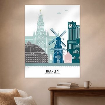
The soft turquoise, lilac and blue tones in Skyline illustration city of Haarlem in colour work beautifully alongside beige or taupe walls. These gentle colour combinations create a relaxed atmosphere without competing for attention. Add natural wood frames or linen textiles to complete the look and keep the focus on the illustration.
AnouschkaArt Stylist Questions? Check out our FAQ







Trusted and loved
Customers rate us 4.8!
High-quality materials
Sustainable and long-lasting beauty
Different sizes
From small to large, anything is possible.
Made for you
Made the moment you order.


More like this






Which material suits Maps of Haarlem best?
Historic maps of Haarlem deserve a presentation that honors their nostalgic charm while fitting modern interiors. ArtFrame™ works beautifully here, though Poster and Canvas offer great alternatives depending on your space. Choose ArtFrame™ and you benefit from two key advantages for cartographic art. First, the easy-swap system lets you rotate between different Haarlem map periods - from early beige city layouts to vibrant pink-tinted editions - without replacing the entire frame. The aluminum frame in gold or silver particularly complements the taupe and grey tones found in many historical maps. Second, the optional acoustic panels prove invaluable when displaying these detailed artworks in home offices or studies, where the sound-dampening qualities create a focused atmosphere while the intricate street patterns remain the visual centerpiece. Still doubting which material suits your interior and chosen Maps of Haarlem artwork? Use our Material Advisor to find the perfect match.
Where do horizontal Maps of Haarlem work best?
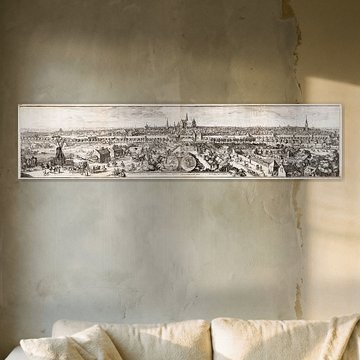
Horizontal formats dominate historic cartography, and Haarlem maps follow this traditional orientation naturally. These wider prints suit walls above sideboards, desks, or dining tables perfectly - anywhere you want a calm, grounding presence that invites closer inspection of street names and landmarks. The beige and grey color palette creates a sophisticated backdrop in living rooms or hallways without overwhelming the space. For narrow walls or vertical spaces beside doorways, consider panoramic formats that emphasize the city's characteristic canal structure and bring nostalgic detail to otherwise tricky areas.
Styling Maps of Haarlem with complementary decor
Maps of Haarlem pair beautifully with botanical prints or vintage photography that shares the same nostalgic mood and neutral palette. Create a gallery wall mixing different map editions with small framed artworks in matching beige, taupe, and grey tones. Add brass or wooden frames on surrounding pieces to echo the cartographic theme. Plants with structured forms - ferns or olive branches - soften the linear detail without competing visually. This approach transforms historical maps into a cohesive interior statement that feels both vibrant and grounded.