
Jacob Jordaens
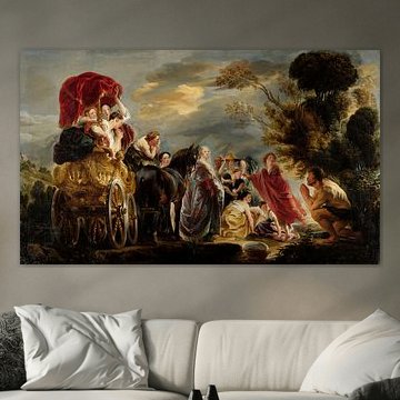
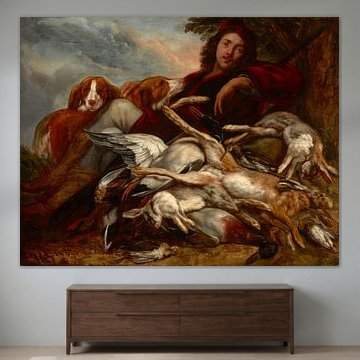
Jacob Jordaens painted with raw vitality. His Baroque scenes burst with movement, color, and unfiltered emotion - never polite, always powerful. From mythological drama to joyful celebrations, his artworks capture life at its most vivid.
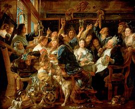
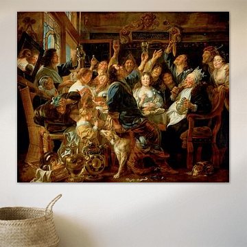
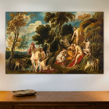
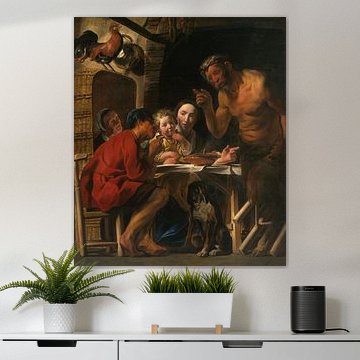
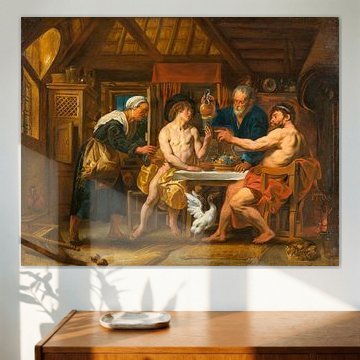
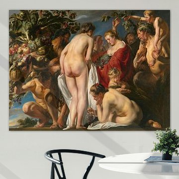
Rich earth tones and bold compositions make Jordaens' work a natural fit for modern interiors that welcome character. The Feast of the Bean King, Jacob Jordaens shows his mastery of crowded, chaotic energy, while Nymphs Cutting Off Pan's Beard, Jacob Jordaens reveals his softer, dreamlike side.
Available as Poster, Canvas, ArtFrame™ and more - choose the size and material that suit your space.
-
More artworks below this tip
Pair warm neutrals with natural textures
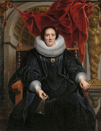
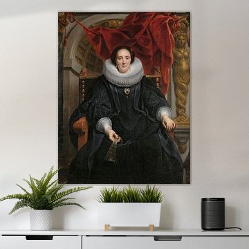
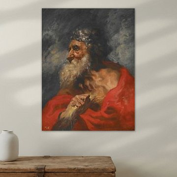
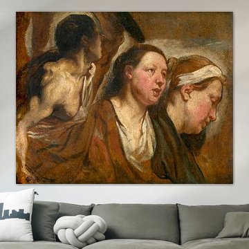
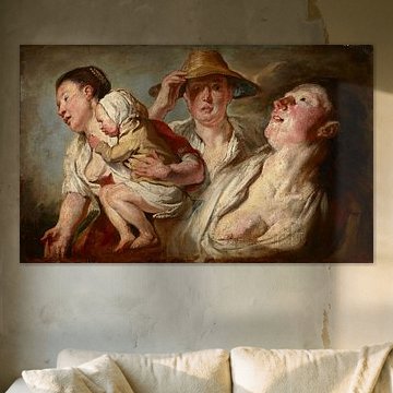
Brown and beige tones create a calming foundation in any room. These earth shades work beautifully alongside wood furniture, linen textiles, or terracotta accents. The soft palette in Head to the right, Jacob Jordaens (I), 1603 - 1678 pairs effortlessly with natural materials like rattan, jute, or weathered oak for a grounded, inviting look.
AnouschkaArt Stylist Questions? Check out our FAQ
-
More artworks below this tip
Hang portraits at natural eye level
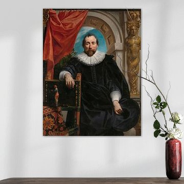
Profile studies and character portraits feel most engaging when placed where you'd naturally meet someone's gaze. In sitting areas, aim slightly lower than standing eye level - around 140 - 150 cm from the floor. This creates an intimate connection, especially with expressive pieces like Head to the right, Jacob Jordaens (I), 1603 - 1678.
LianneStylist & Customer service Questions? Check out our FAQ
-
More artworks below this tip
Layer olive green with warm metallics
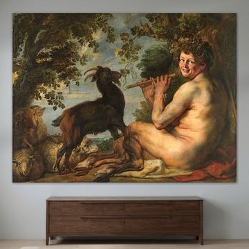
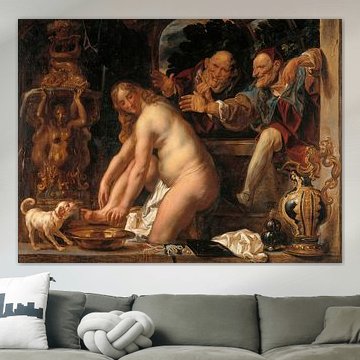
Forest greens and sage tones bring depth without overwhelming a space. Balance these cooler shades with warm accents - think brass frames, gold cushions, or amber glass. The olive and gold combination in A satyr, Jacob Jordaens (I), 1630 - 1635 pairs beautifully with velvet textures or aged leather furniture.
RosanneStylist & Customer service Questions? Check out our FAQ


















Trusted and loved
Customers rate us 4.8!
High-quality materials
Sustainable and long-lasting beauty
Different sizes
From small to large, anything is possible.
Made for you
Made the moment you order.


More like this




How to style artworks by Jacob Jordaens in your interior
Artworks by Jacob Jordaens bring a calm yet joyful presence to your home, making them ideal for creating a warm, inviting atmosphere. The brown, bronze, beige, and taupe tones work beautifully in living rooms or dining areas where you want to encourage conversation and comfort. Pair these artworks with natural textures like linen cushions, wooden furniture, or terracotta accents to enhance the nostalgic character. Add greenery - ferns or olive branches - to soften the earthy palette and bring balance to your walls.
Which material suits your Jacob Jordaens artwork best
Canvas highlights the painterly brushstrokes typical of artworks by Jacob Jordaens, especially when you want to bring out the warm bronze and beige tones. Alternatively, Poster offers an accessible option, while ArtFrame™ adds a modern edge with its frameless finish. Choose Canvas and you benefit from classic print quality and customization options that match your interior perfectly. The bright white poly-cotton canvas fabric ensures the brown and taupe hues stay rich and detailed, while the mirrored or continuous edge wrap extends the composition naturally around the sides - ideal for these dynamic paintings. The sustainable wooden frame and folded canvas construction guarantee durability of at least ten years, so your Jacob Jordaens artwork remains a reliable focal point in your space. Still doubting which material suits your interior and chosen Jacob Jordaens artwork? Use our Material Advisor to find the perfect match.
Which format works best for Jacob Jordaens artworks
Artworks by Jacob Jordaens often shine in horizontal formats, making them perfect above a sofa, sideboard, or dining table where they can anchor a room without overwhelming it. The landscape orientation suits the narrative quality of these paintings and draws the eye across the composition. If you're working with a narrow wall or hallway, a vertical format offers a strong alternative that adds height and elegance to tighter spaces.