


Remko Heemskerk
Illustrator
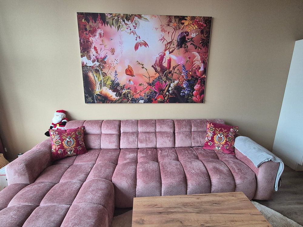
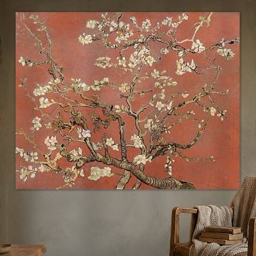
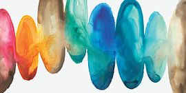
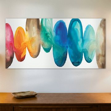
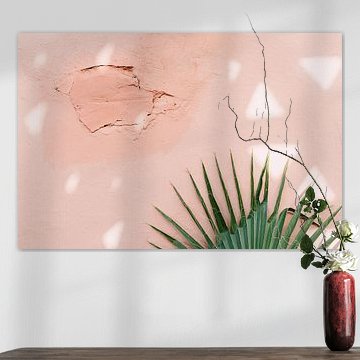
Coral tones bring warmth without overwhelming. They soften modern interiors while adding energy to calmer spaces. This colour family ranges from peachy pinks to deeper terracotta shades, each creating a different mood.
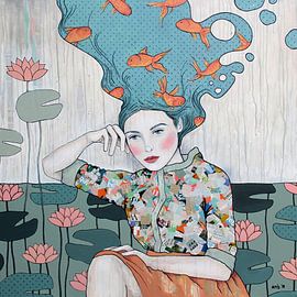
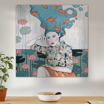
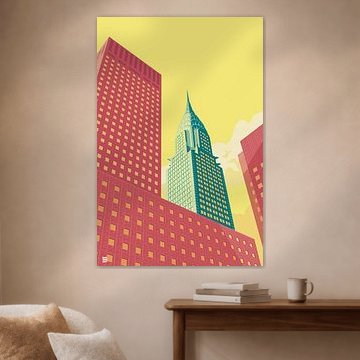
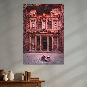
From architectural pop-art like Flatiron building NYC landscape to botanical dreamscapes, these artworks pair beautifully with neutral palettes or teal accents. The gentle vibrancy works in bedrooms, living areas, and creative workspaces alike.
At Art Heroes, every piece is printed to order by talented European artists. Choose your size and material - Canvas, ArtFrame™, Poster and more - to match your space perfectly.
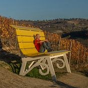
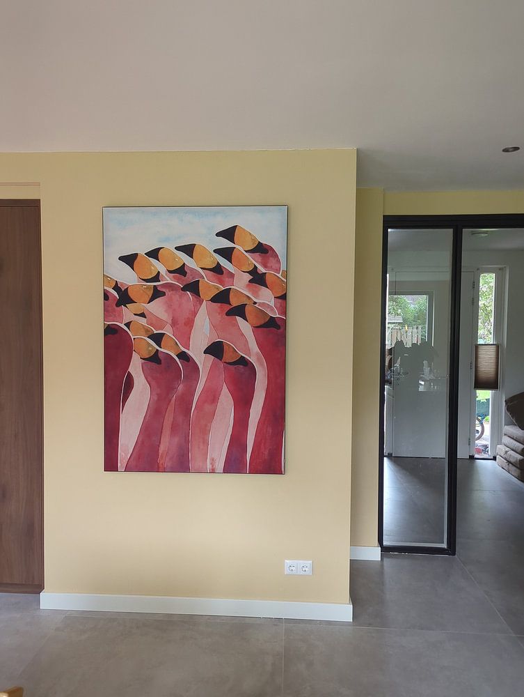
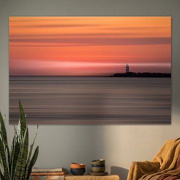
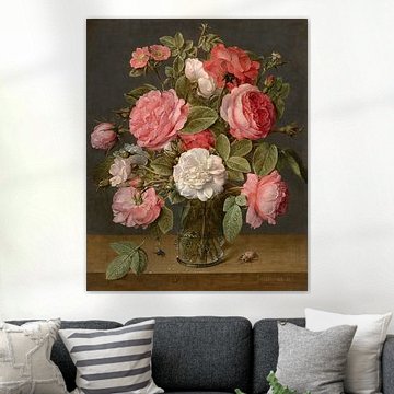
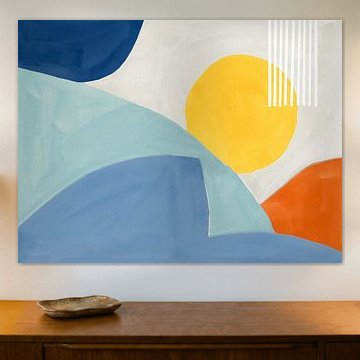
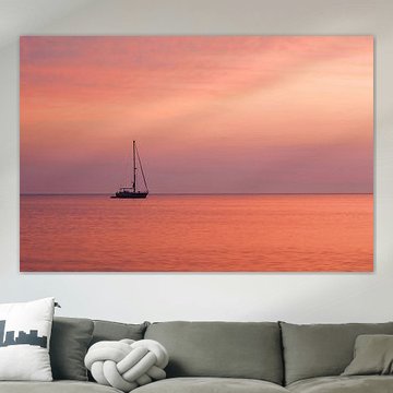
Both portrait and landscape formats are popular choices for coral colour artworks. Portrait works well for narrow wall spaces like hallways or beside doorways, while landscape suits wider areas above sofas or sideboards. Choose the format that fits your available wall space and complements your room layout.

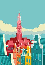
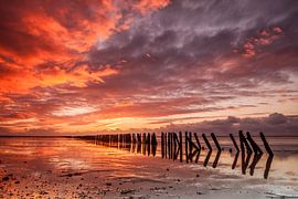
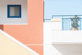
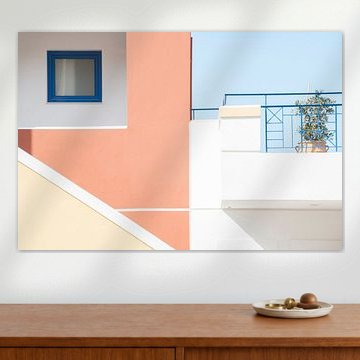
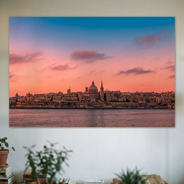
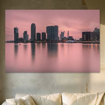
Coral pairs beautifully with cooler shades that balance its warmth. The teal sky and sage green buildings in Amsterdam Westerkerk show how blue-green tones create harmony alongside pink and burgundy. Use soft furnishings or painted surfaces in similar cool hues to let coral artwork stand out naturally.

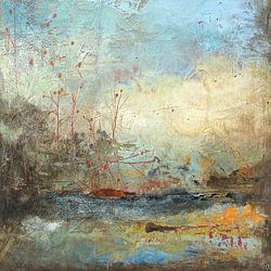
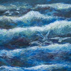
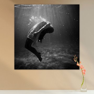
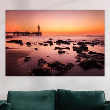
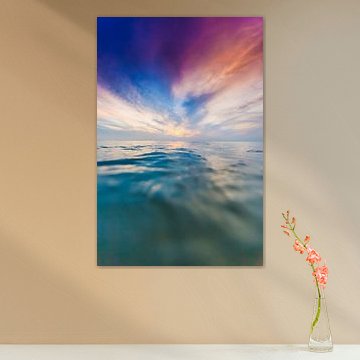
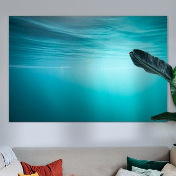
Coral tones suit both modern and natural interiors. The coastal scene in Taste the sea!, with its mauve, pink and taupe palette, works particularly well in bedrooms or reading corners where you want a calm, reflective atmosphere. The soft colours create a restful backdrop without feeling too bold or energetic.

Customers rate us 4.8!
Sustainable and long-lasting beauty
From small to large, anything is possible.
Made the moment you order.

Coral colour comes to life on each of our premium materials. Whether you choose Wallpaper, Canvas, or Poster, each enhances the warm terracotta, pink, and mauve tones that define this collection.
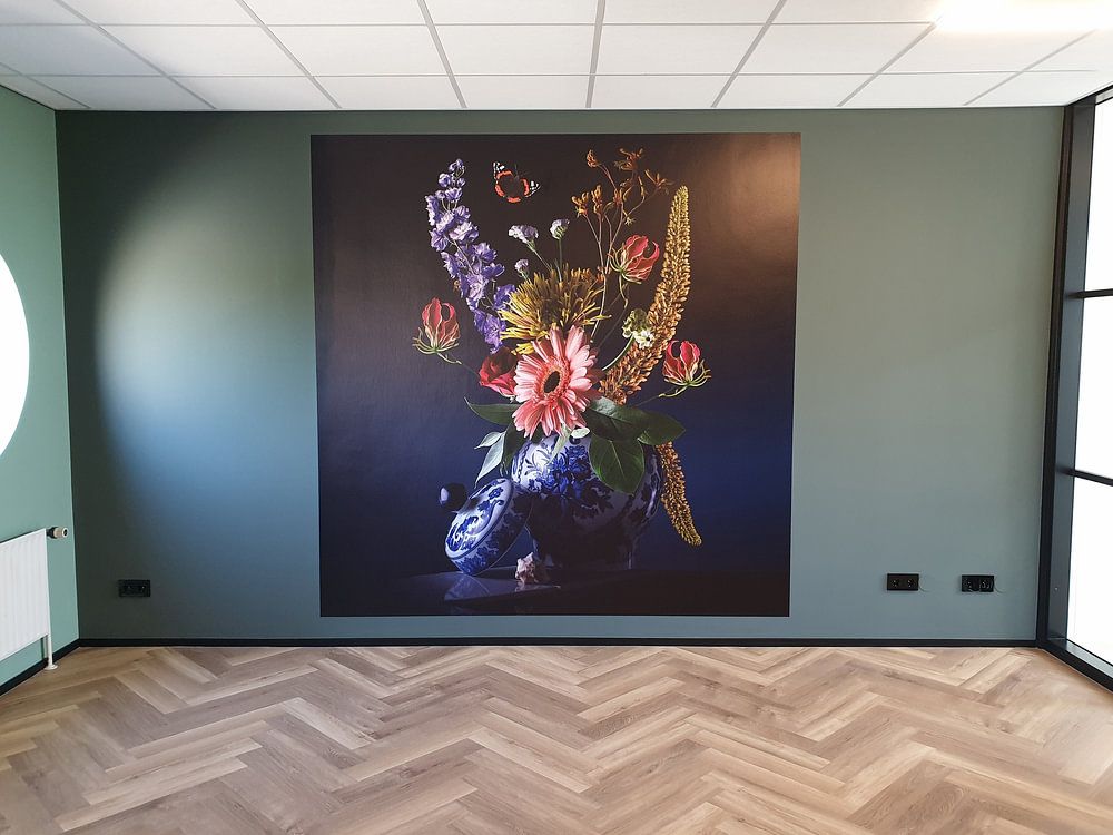
Choose Wallpaper and you benefit from two distinctive advantages. First, make a statement by turning your entire wall into art. Why limit coral colour artworks to a frame? With wallpaper, you bring these dreamy pink and taupe hues home in large format, transforming any room instantly. The warm brown and terracotta shades gain striking presence when displayed floor-to-ceiling, creating an immersive atmosphere. Second, every detail comes to life razor-sharp with vivid colors, even on large formats. The delicate balance between calm and vibrant moods in coral colour photography and paintings becomes an eye-catching focal point that commands attention in any space.
Still doubting which material suits your interior and chosen coral colour artwork? Use our material comparator to find the perfect match for your home.
Coral colour artworks pair beautifully with natural materials and soft textures. Combine these warm terracotta and pink tones with cream-colored textiles, rattan furniture, or sage green plants to create a balanced, inviting space. The dreamy mood of this collection works well alongside brass lighting fixtures and wooden accessories. For a gallery wall, mix portrait and square formats to create visual rhythm while maintaining the calm, cohesive atmosphere. Layer different coral colour artworks together, or pair them with neutral photography to let the warm mauve and taupe shades take center stage without overwhelming your room.

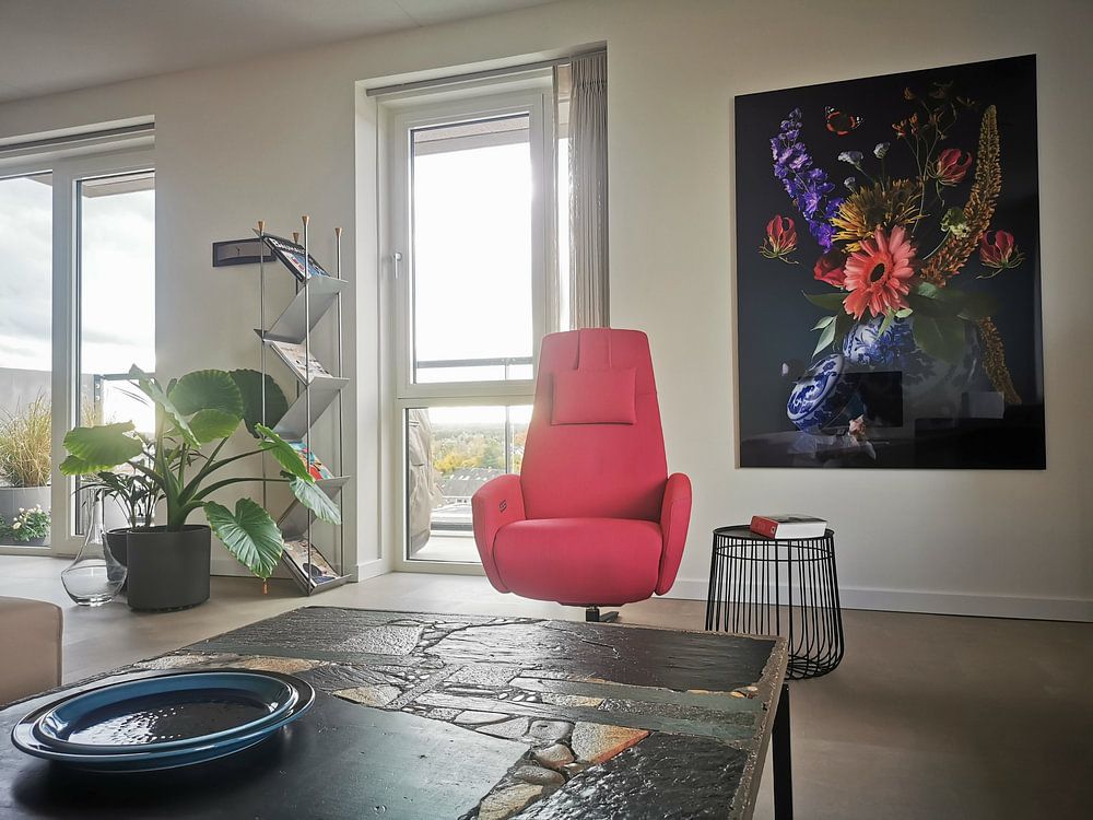
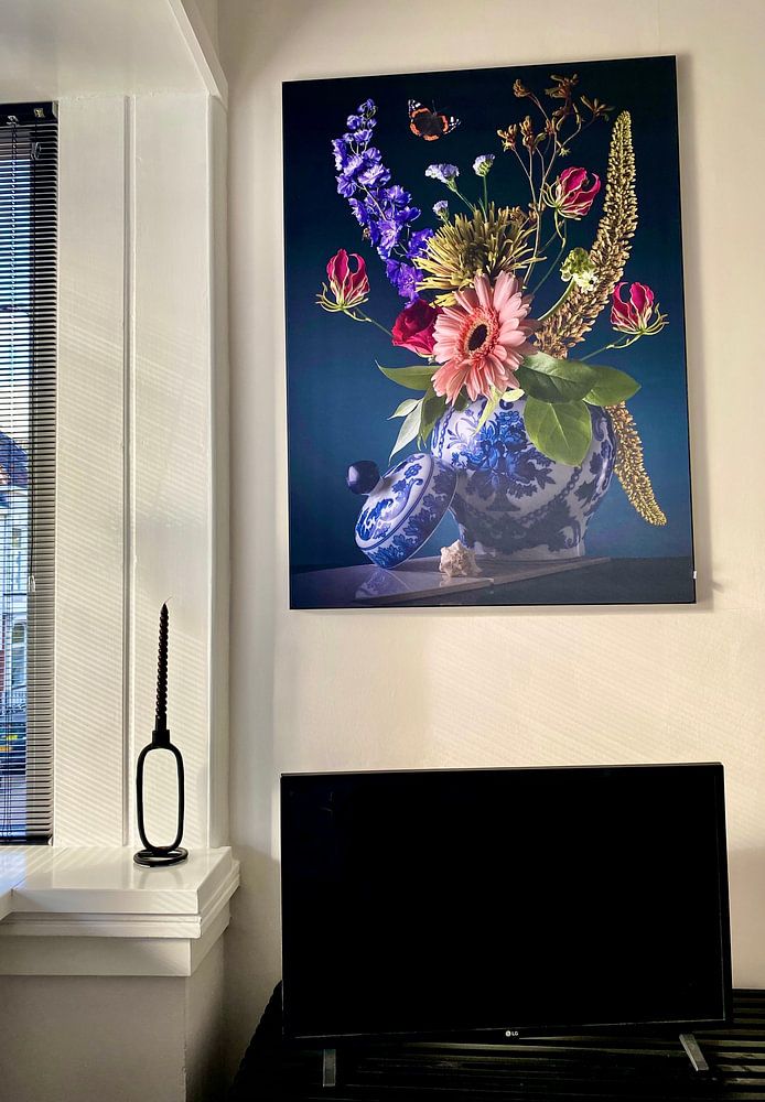
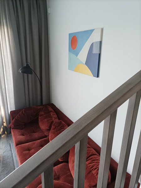
Portrait formats work exceptionally well for coral colour artworks, especially above narrow furniture like sideboards or console tables in hallways. The vertical orientation emphasizes the layered colors and creates an elegant focal point without dominating the wall. Hang portrait coral colour pieces in your bedroom to draw the eye upward and make the space feel more spacious. However, square formats offer a contemporary alternative for coral colour artworks when you want to create symmetry above a bed or sofa, bringing the warm pink and brown tones into perfect balance.