-
More artworks below this tip
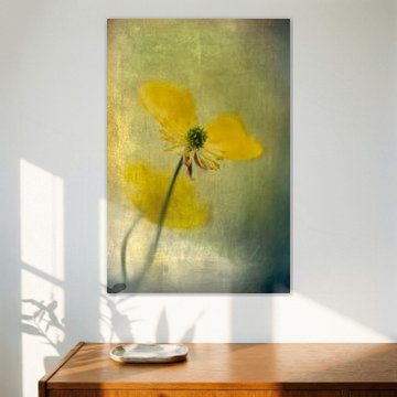
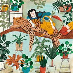
Choosing your format
Portrait and square formats are equally popular in the Buttercup collection, making them safe choices for most spaces. Portrait works well on narrow walls or beside doorways, while square pieces fit neatly above side tables or in hallway groupings. Choose what suits your wall space best.
AnouschkaArt Stylist Questions? Check out our FAQ
 -
More artworks below this tip
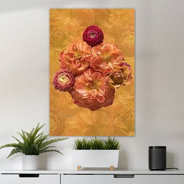
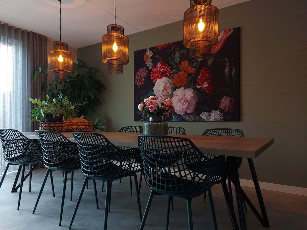
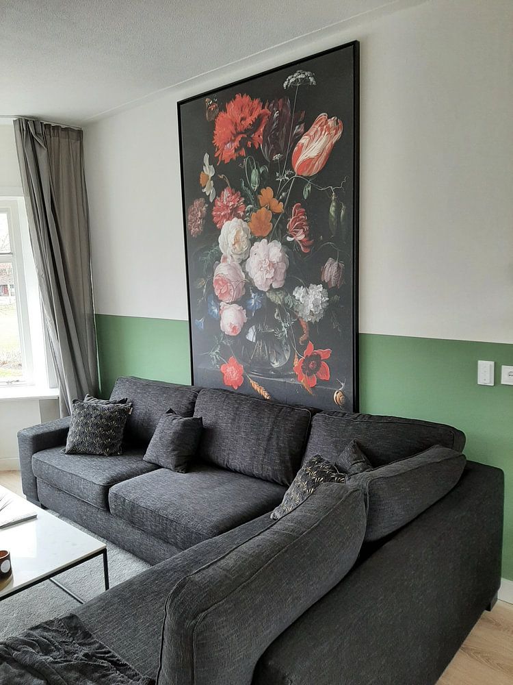
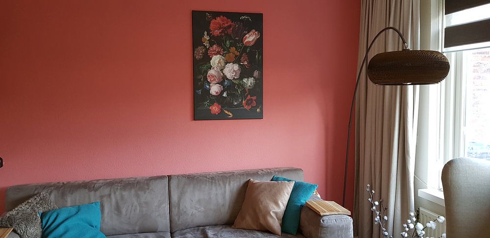
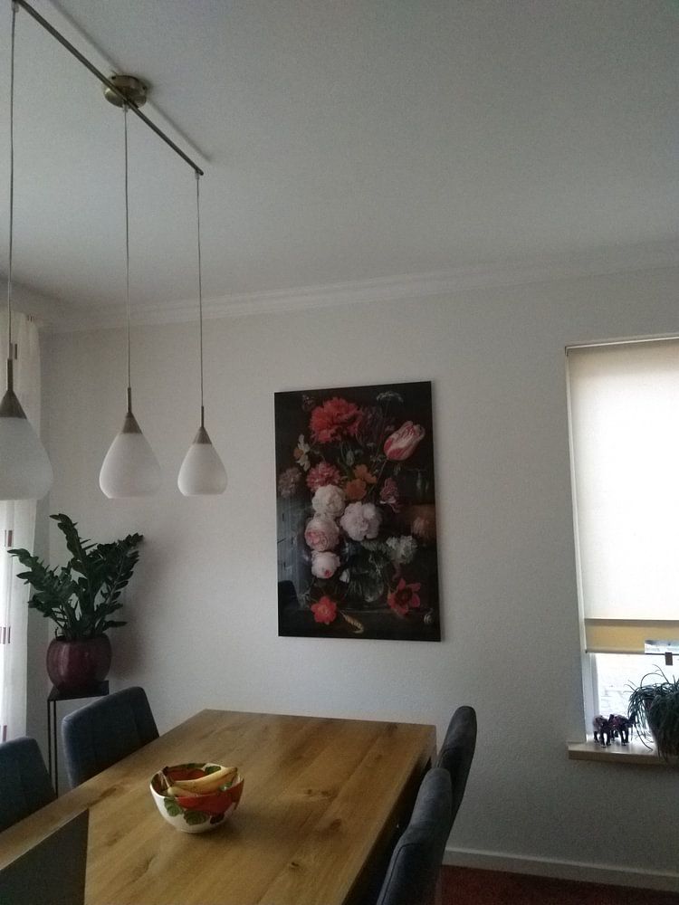
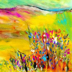
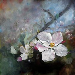
Where to hang botanical pieces
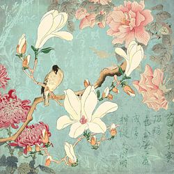
Botanical artworks feel at home in rooms where you relax or gather. Hang them in dining areas to bring nature to the table, or in bedrooms where their calm mood supports rest. The soft composition in Pastel Bouquet suits spaces where you want a gentle, romantic touch.
AnthiStylist & Customer service Questions? Check out our FAQ
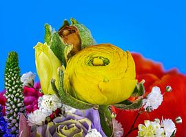
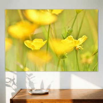
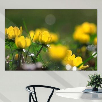
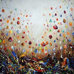
Buttercup
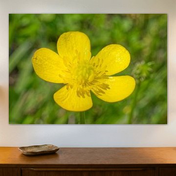
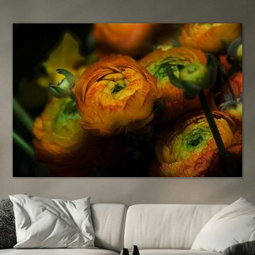
Buttercup artwork brings gentle warmth into your home. These delicate yellow blooms, whether captured in close-up photography or woven into classical still life compositions, radiate quiet joy and natural beauty. The collection spans soft botanical studies to richly detailed flower arrangements, which complement both contemporary and traditional interiors with their timeless appeal.
At Art Heroes, we print each artwork to order. Choose from Canvas, Poster, ArtFrame™ and more materials to match your space perfectly.


Trusted and loved
Customers rate us 4.8!
High-quality materials
Sustainable and long-lasting beauty
Different sizes
From small to large, anything is possible.
Made for you
Made the moment you order.
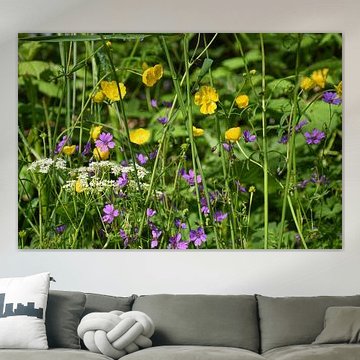
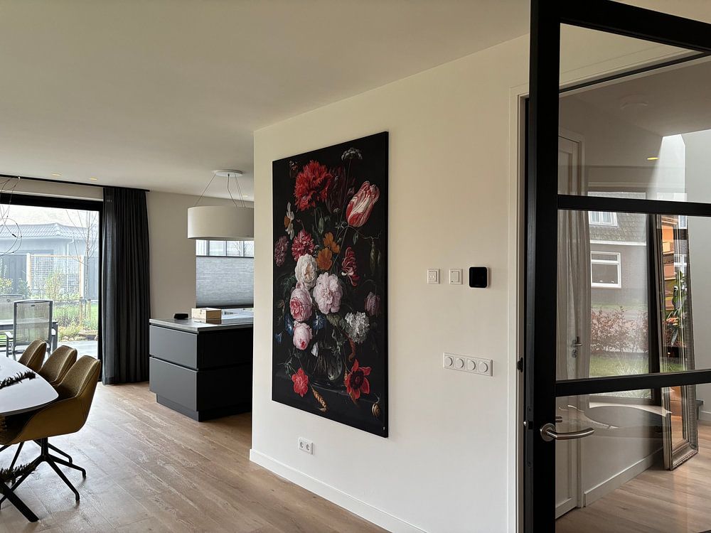
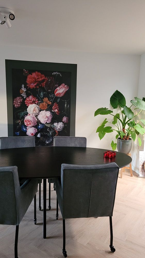
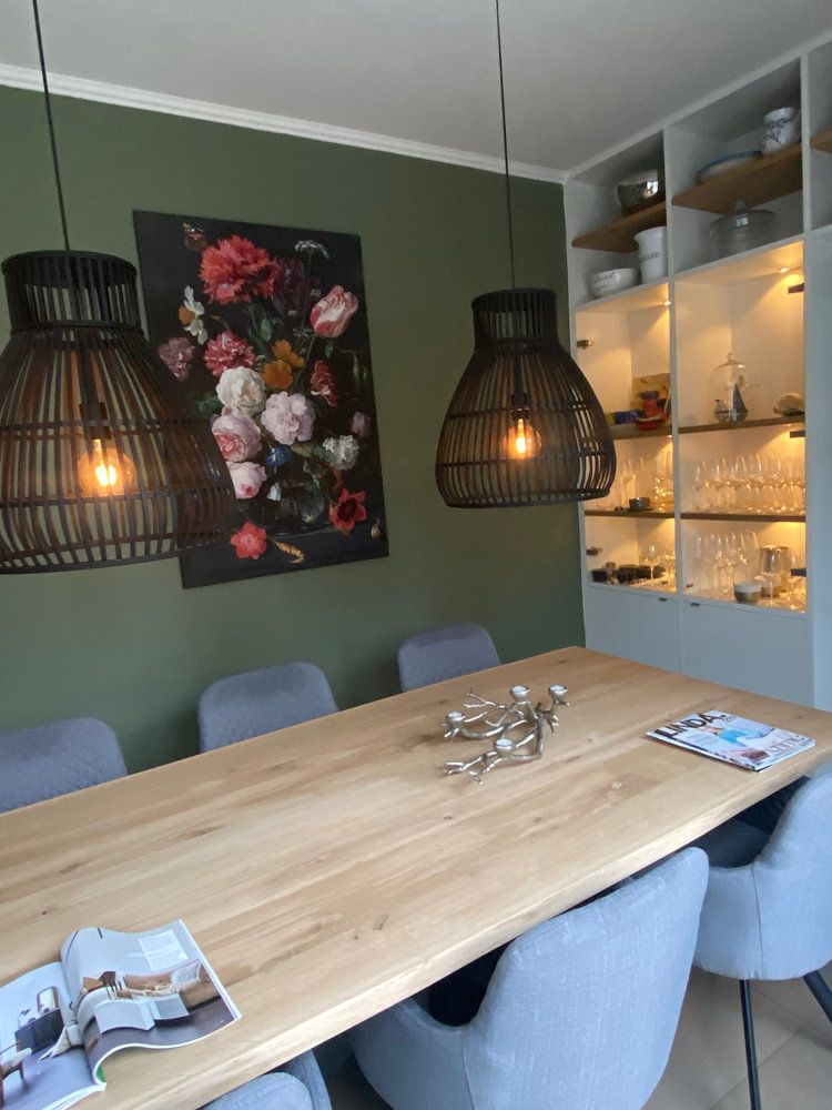
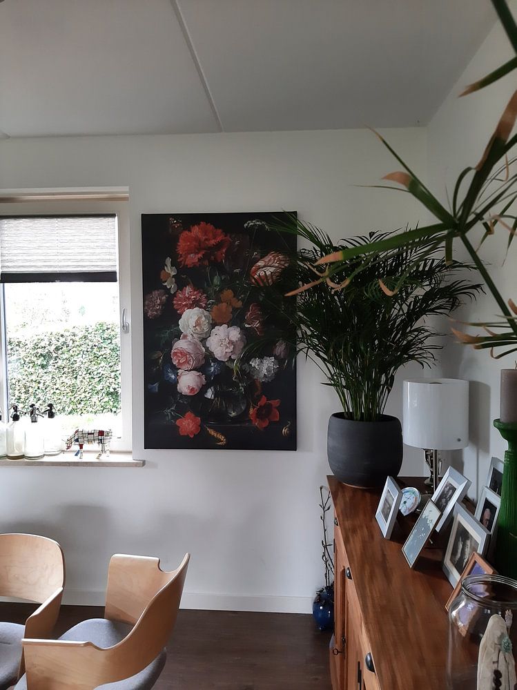
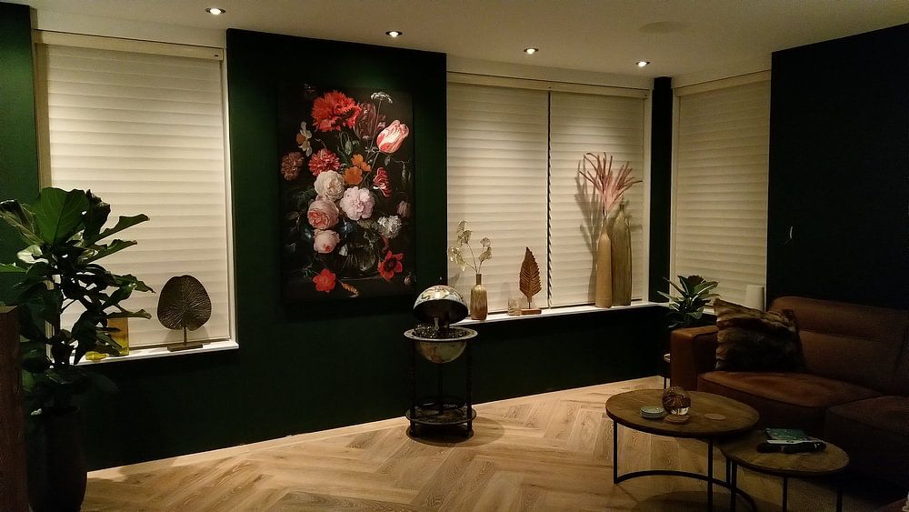
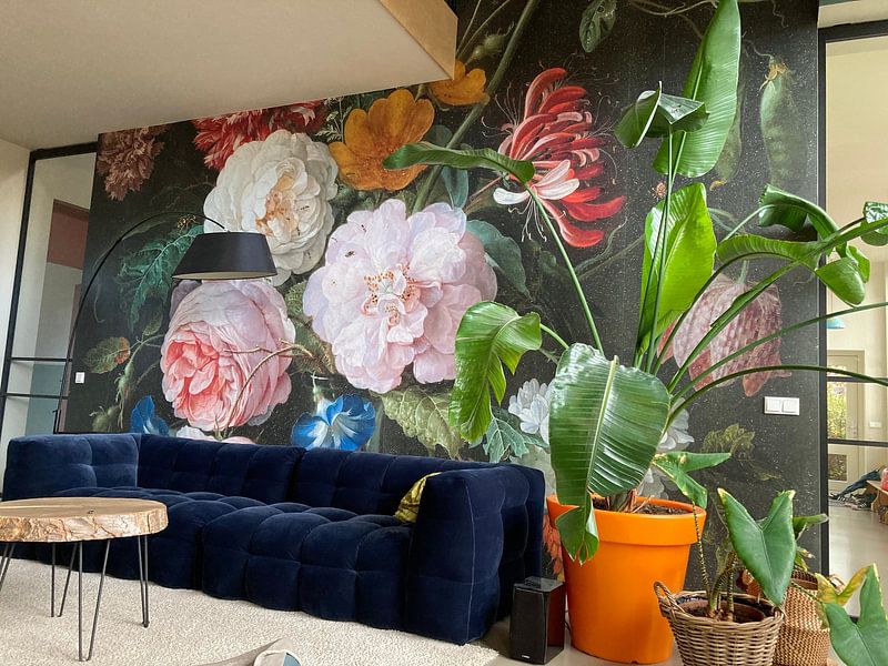
How they hang in other homes
Get inspired by beautiful artworks on other people's walls and see how they truly enhance an interior.


More like this


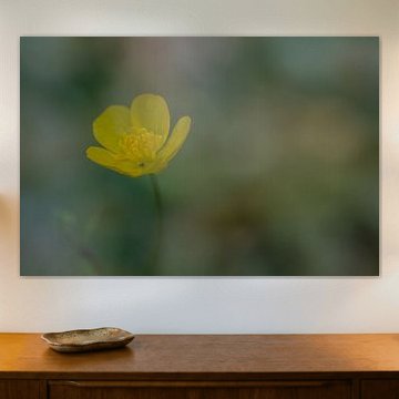
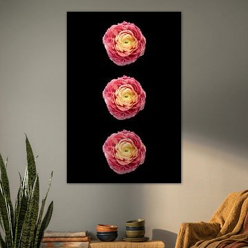
Which format works best for Buttercup artworks?
Portrait format is the dominant choice for Buttercup artworks, making them ideal for narrower wall spaces like hallways, beside doorways, or above console tables. The vertical orientation draws the eye upward and works beautifully flanking windows or creating gallery arrangements. If you're decorating a wider space above a sideboard or desk, consider a square format instead for balanced visual impact.
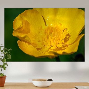
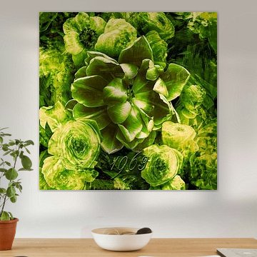
How to style Buttercup with natural color palettes

Buttercup artworks bring together olive green, yellow, beige, and brown tones that fit perfectly within Scandinavian and bohemian interiors. Pair the olive and beige shades with light oak furniture and linen textiles for a calm Scandinavian look. For a bohemian feel, combine the warmer yellows and browns with rattan accents, terracotta pots, and layered textures. These earthy color combinations create welcoming spaces that feel both vibrant and grounded.
Choosing the right material

Buttercup comes to life on each of our premium materials. Whether you choose Wallpaper, Canvas, or Poster, each enhances the unique details and colors.
Choose Wallpaper and you benefit from two standout advantages. First, razor-sharp prints deliver vivid colors even in large formats - the olive greens, yellows, and browns in Buttercup artworks become eye-catching focal points that command attention in any room. This precision matters when you want the delicate details and calm moods of these artworks to shine across an entire wall. Second, the wallpaper is fully customizable to your exact wall dimensions, so you can create an accent wall in your bedroom or living room that fits your space perfectly without awkward gaps or cuts.
Still doubting which material suits your interior and chosen Buttercup artwork? Use our material comparator to find the perfect match for your home.
