Studio BB
Digital artist
Serenity Pantone 2016 captures the gentle power of soft blue. This delicate shade soothes the senses, inviting calm into busy lives. It's a color that whispers rather than shouts, creating space to breathe.
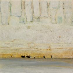
These artworks blend dreamy atmospheres with subtle elegance - from abstract portraits to misty seascapes and delicate nature studies. The palette ranges from pale turquoise to deeper teal, often paired with warm beige, taupe, or soft mauve. Perfect for minimalist, Scandinavian, or contemporary interiors that value tranquility. Into the mist no.7 shows how serene pastels can transform a room.
Available as Canvas, ArtFrame™, Poster and more - choose what suits your space.
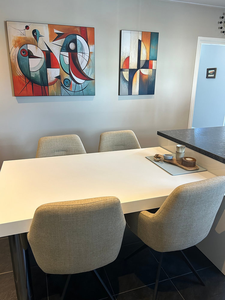
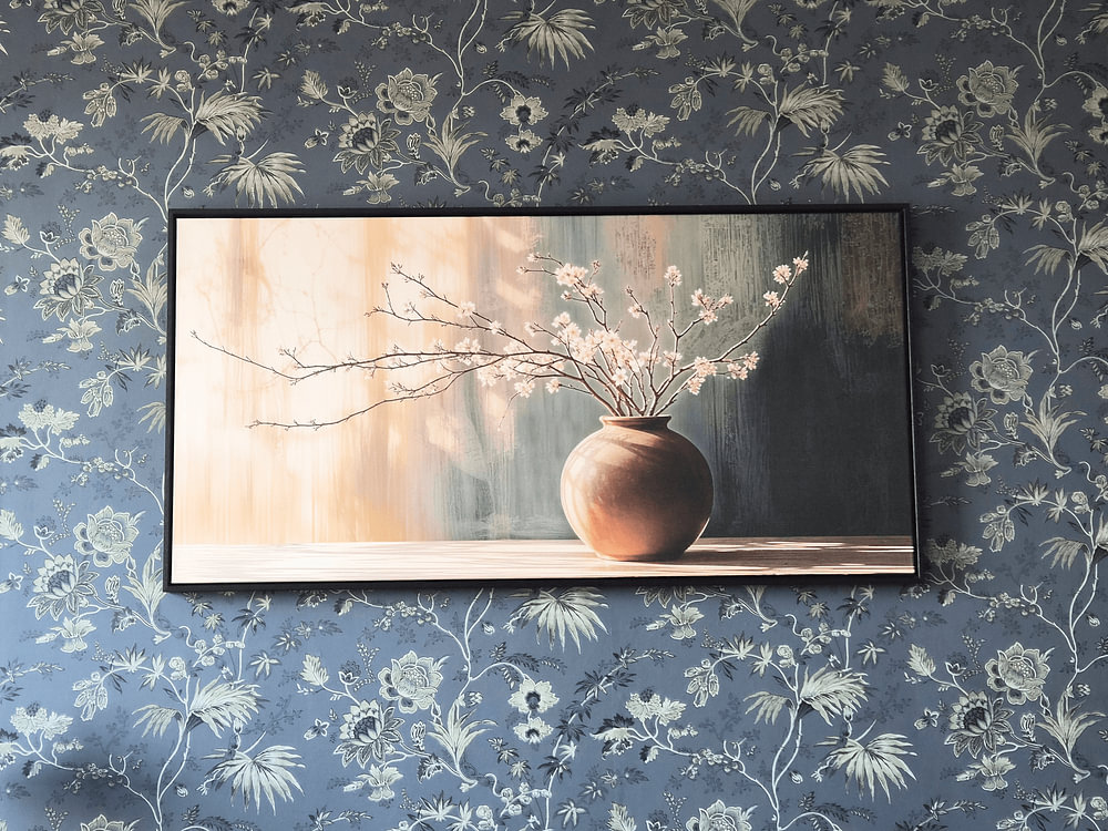
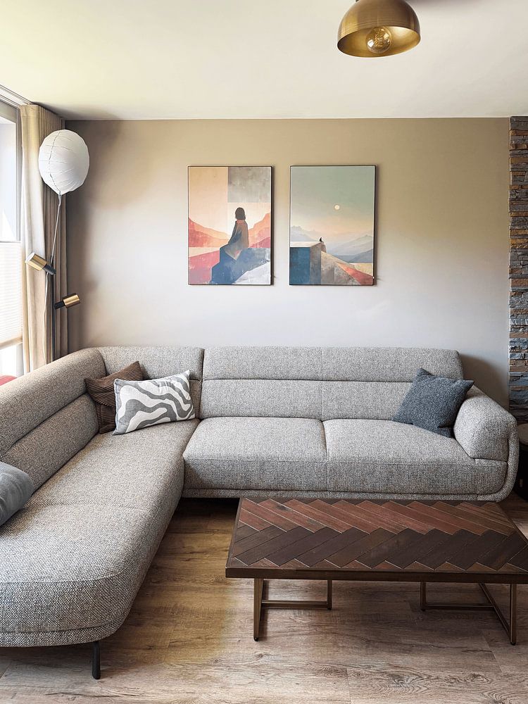
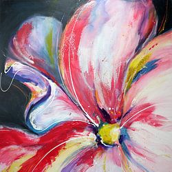
Pairing warm sunset hues with cooler sky tones adds depth without creating contrast. The orange and teal palette in Mountain Blossom Meditation shows how complementary colors can feel both vibrant and serene. Try echoing these shades in cushions, throws, or ceramics to tie your artwork into the room.

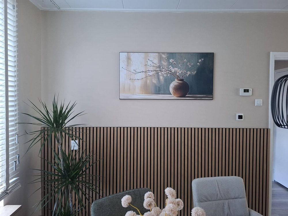
Beige and taupe create a warm, grounded backdrop that pairs easily with natural materials like wood, linen, and ceramic. These earth tones bring balance without overwhelming your space. If you're drawn to subtle, harmonious interiors, these dominant shades will blend seamlessly with neutral furniture and soft textiles.

Calming artworks work beautifully in spaces where you want to unwind. The soft tones and peaceful composition in Timeless still life with peaches and bread make it a natural fit for a kitchen or dining area, where everyday rituals take place. Hang it where you'll see it during quiet moments - over a breakfast nook or sideboard.

Customers rate us 4.8!
Sustainable and long-lasting beauty
From small to large, anything is possible.
Made the moment you order.
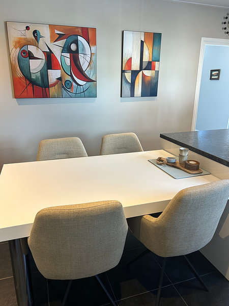
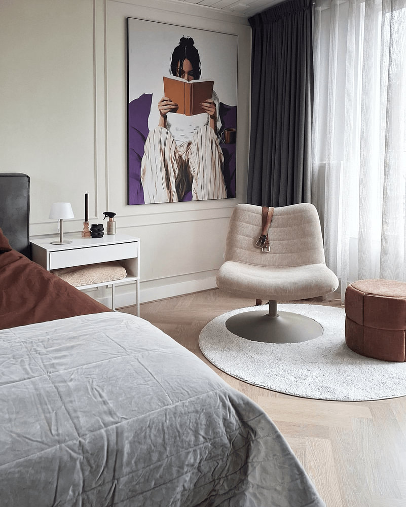
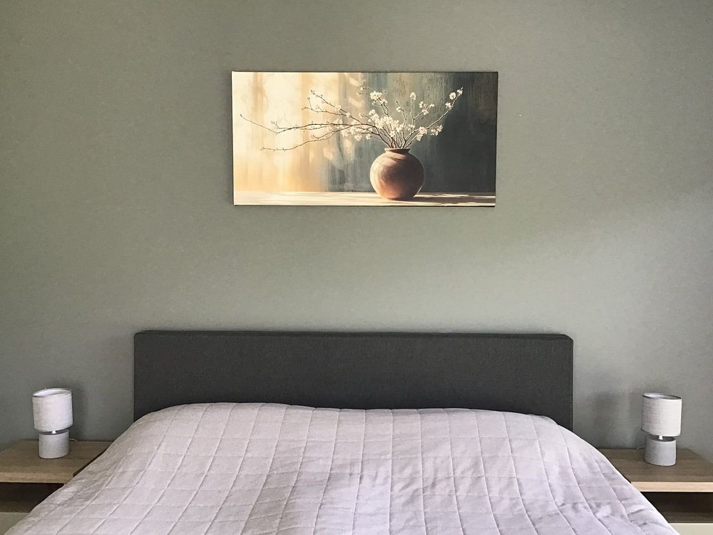
The bedroom is a good spot for Serenity Pantone 2016 artworks, thanks to the collection's calm and dreamy moods. The soft blue and grey tones help create a quiet, restful atmosphere that works well above the headboard or on the wall opposite your bed. These delicate hues naturally encourage relaxation, making them a thoughtful choice for a space meant for unwinding at the end of the day.
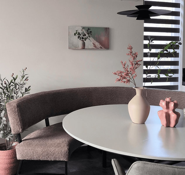
Serenity Pantone 2016 pairs beautifully with Scandinavian style through its gentle palette of grey, beige, and blue. Combine the cooler grey and blue artworks with light wood furniture and white walls to maintain the clean, airy feel typical of Scandinavian rooms. The taupe and beige pieces work well as warmer accents near textured throws or natural linen fabrics, balancing the minimalist aesthetic without overwhelming it.
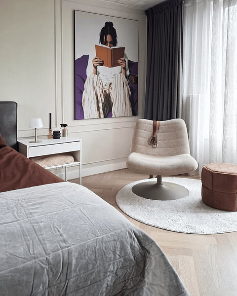
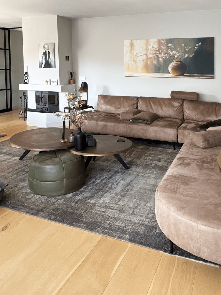
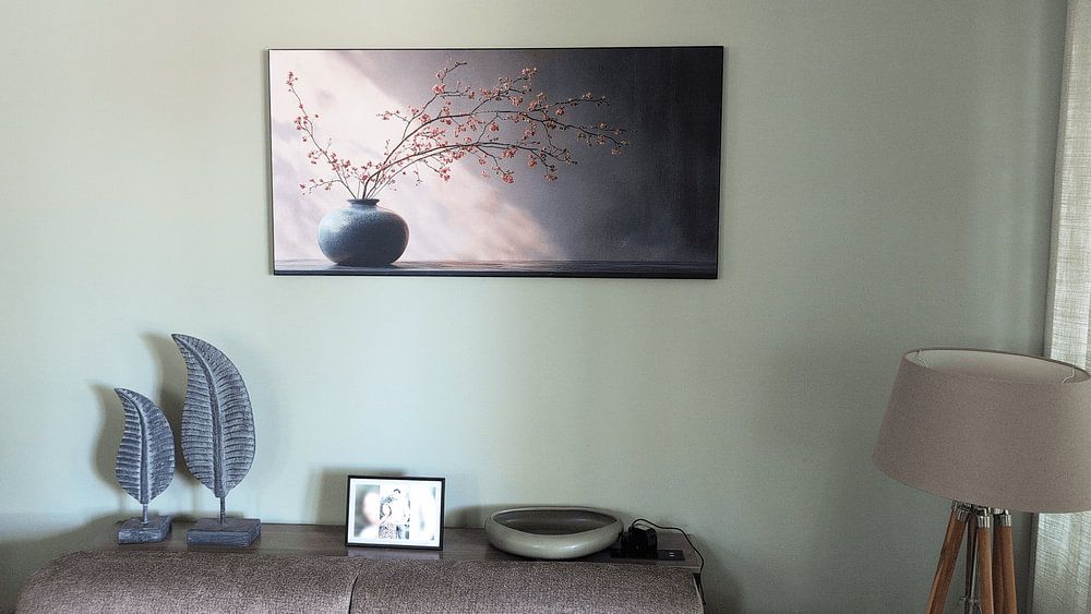
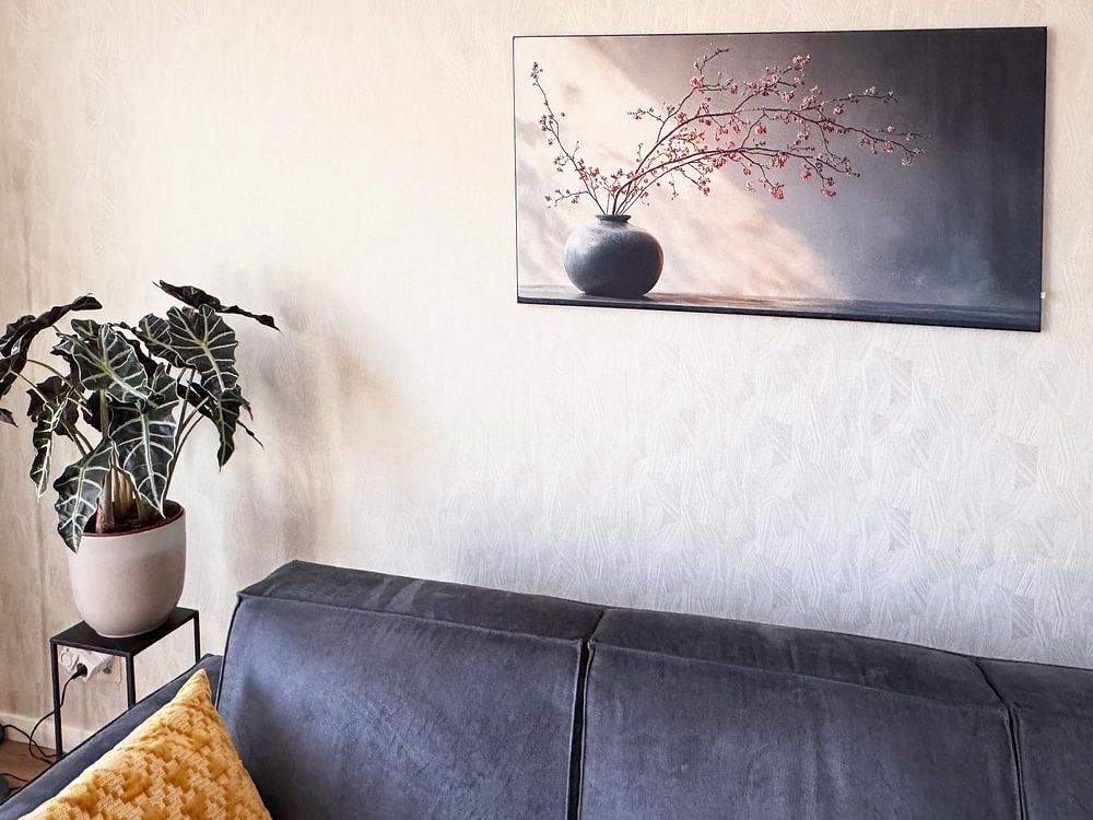
Square formats dominate this collection and work particularly well on narrow walls beside wardrobes or above nightstands where space is limited. A square artwork creates visual balance without requiring much width, making it ideal for smaller bedroom walls or cozy reading corners. If you have a wider wall above a sideboard or sofa, a horizontal format offers a better fit and draws the eye across the space more naturally.