


Buy this landscape artwork Two Worlds | A Dialogue between Summer and Autumn by Karina Brouwer on canvas, ArtFrame, poster and wallpaper, printed on demand in high quality.
About "Two Worlds | A Dialogue between Summer and Autumn"
by Karina Brouwer
About the artwork
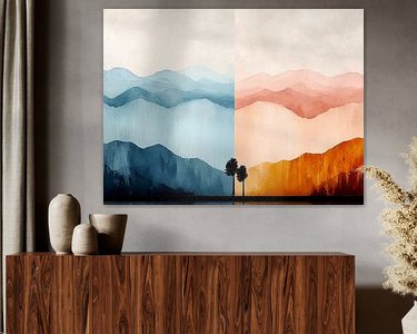
This artwork shows a beautiful contrast between two trees representing the symbolism of the seasons.
On one side of the work is a tree in warm hues that evokes the abundance and vibrancy of summer. The radiant red and orange tones of the foliage reflect the warmth and energy of the season.
On the other side is a tree in cooler colour tones, such as blue and green, depicting the fresh and soothing atmosphere of autumn. The work captures the transition between the two seasons, when the sun slowly becomes less powerful and autumn makes its appearance.
The balance between warm and cool colours creates a sense of harmony and change, perfect for those who want to incorporate symbolism into their interiors.
This wall decoration not only brings out the beauty of nature, but also the rhythm of the seasons. This piece is ideal for a space that wants to exude calm and reflection, whether in a modern, minimalist setting or a more eclectic interior.
It highlights the transition between summer and autumn, adding a unique visual experience to your interior.
Conceived by Karina Brouwer, visualized with AI.

About Karina Brouwer
KRABsursionism! A name that reflects exactly what my style is. KRA are my initials, the B stands for "pictorial" or "extraordinary" or .... is simply the first letter of my surname. 'KRABsursionism' is not only an amalgamation of my initials and artistic style, but also a reflection of.. Read more…
 Autumn
 Digital art
 Indian Summer
 Landscapes
 Pastel
 Serene Peace
 Summer
 Trees
Trees Netherlands
 Ordered in August 2017
 Germany
 Ordered in November 2020
Netherlands
Ordered in November 2020
Netherlands Ordered in November 2021
Germany
Ordered in December 2024
Germany
Ordered in January 2022
Netherlands
Ordered in May 2025
Netherlands
Ordered in August 2022
Germany
Ordered in May 2021
Netherlands
Ordered in September 2023
Germany
Ordered in March 2023
Germany
Ordered in December 2021
Germany
Ordered in June 2022
Ordered in November 2021
Germany
Ordered in December 2024
Germany
Ordered in January 2022
Netherlands
Ordered in May 2025
Netherlands
Ordered in August 2022
Germany
Ordered in May 2021
Netherlands
Ordered in September 2023
Germany
Ordered in March 2023
Germany
Ordered in December 2021
Germany
Ordered in June 2022
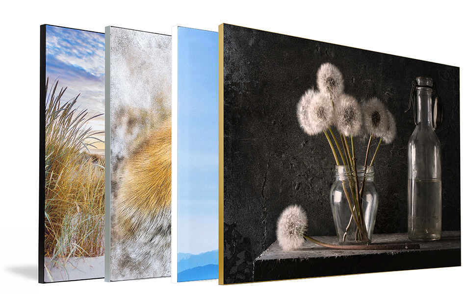
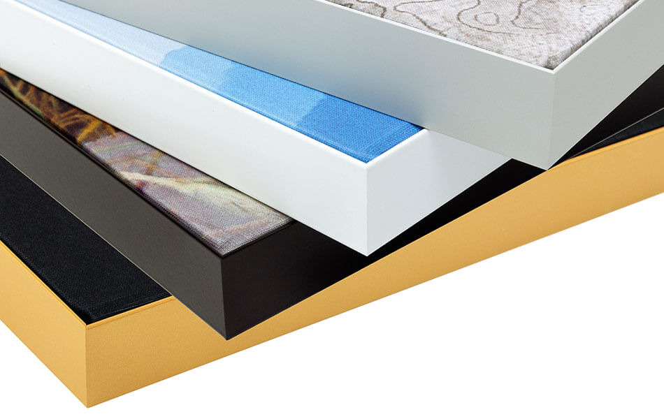
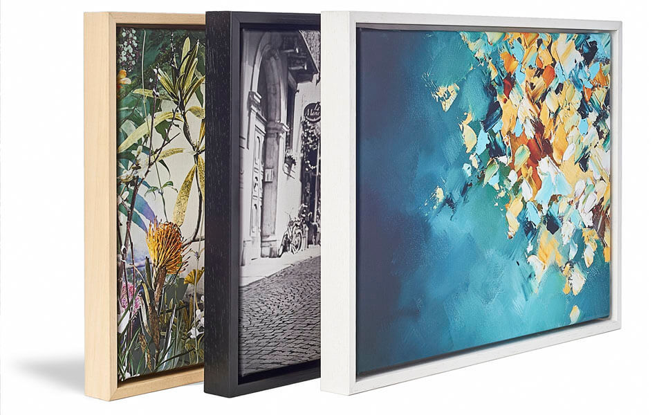
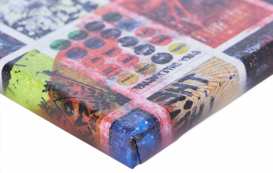
About the material
ArtFrame™
Interchangeable Art Prints
- High-quality print
- Easily interchangeable
- Acoustic function
- Large sizes available
Discover the artworks of Karina Brouwer
 Majestic Deer in a Misty Forest: Inspired by British Landscapes and Baroque AnimalsKarina Brouwer
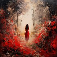 Lady in RedKarina Brouwer
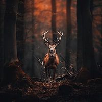 The Bronze Conqueror - The King of the ForestKarina Brouwer
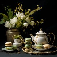 High Tea in the Garden of EleganceKarina Brouwer
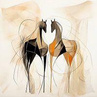 Mystical Horse EnsembleKarina Brouwer
 Lime SplashKarina Brouwer
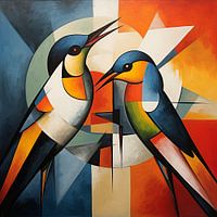 Winged AbstractionKarina Brouwer
 A Bird in the Heart of NatureKarina Brouwer
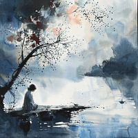 Silent ReflectionKarina Brouwer
 Emptiness's SongKarina Brouwer
 Dachshunds in a Line GameKarina Brouwer
 Graceful horse | AbstractKarina Brouwer
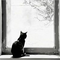 The Silent Company of the Black CatKarina Brouwer
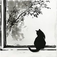 Silence Behind the Glass - The Black Cat as GuardianKarina Brouwer
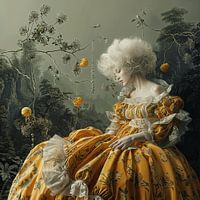 Victorian Elegance | An Exuberant Dress, White Wig and a Perfect OrangeKarina Brouwer
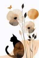 A Kitten in Japandi Abstract MinimalismKarina Brouwer
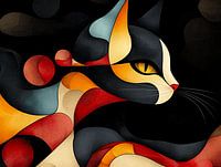 Mystical Cat in Colourful AbstractionKarina Brouwer
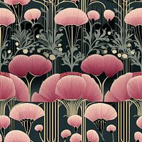 Art Deco Pink Flowers | Wall WallpaperKarina Brouwer
 Here on the coastKarina Brouwer
 Whispering wings | setting sunKarina Brouwer


