



About ‘Play hard but fair’ by Björn Nelke
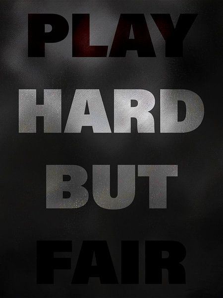
Play Hard But Fair describes a way of life. Stay tough but fair towards others.
The lettering stands on a foggy background and emphasises the insecurity of others.
However, Play Hard But Fair has another message: Play Fair. Play and Fair are written in red and thus form a different visual statement.
Colors
Discover our ArtFrame
The modern canvas alternative
Your chosen art on a textile print, stretched in an aluminum or wooden frame. Quick and easy to change for a fresh look and exactly as you want it.
- High-quality print
- Easily replaceable
- Acoustic function
- Large formats possible

Meet the artist
Björn Nelke
Erfurt, Germany

I am Björn Nelke, from Erfurt, and I have been working in graphic design for 18 years. I am a self-taught designer specialising in poster design. I also have experience with Adobe Illustrator, InDesign, web coding and design as well as logo design. I work with attention to detail and structure, and like blue and green tones in my work. As an amateur photographer and passionate designer, my focus is on creating unique designs.
Visit shop
Discover the artworks of Björn Nelke


Customer reviews
4.8/5

Related collections