
About ‘More Amore Por Favor Typography’ by Niklas Maximilian
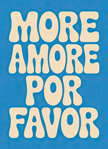
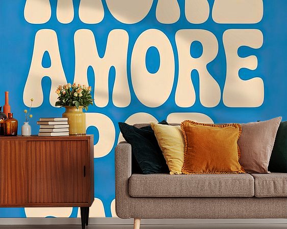
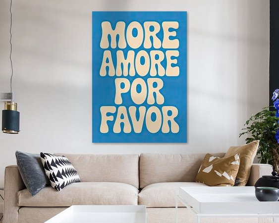
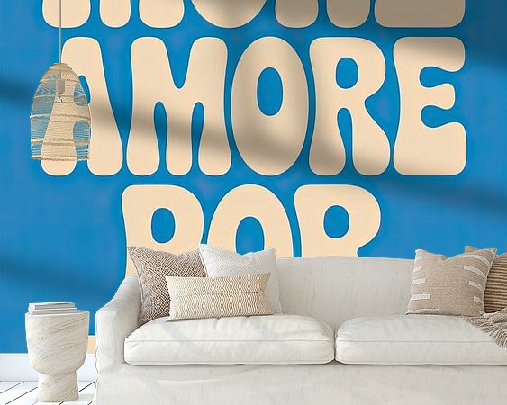
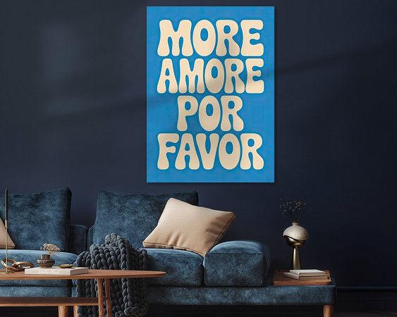
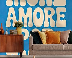
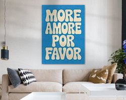
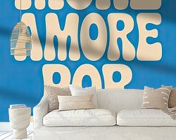
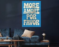
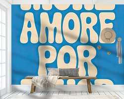
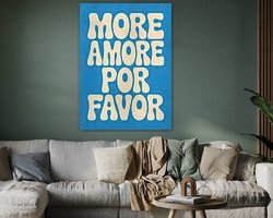
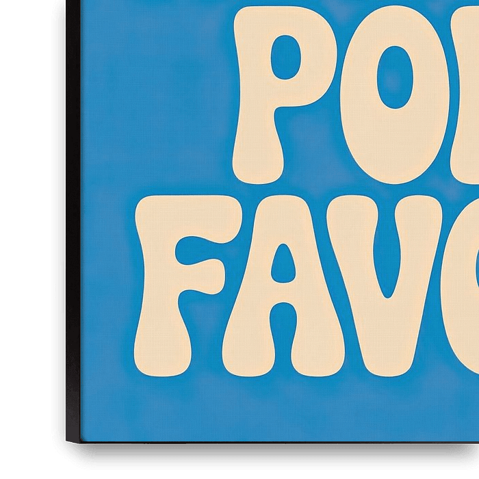
A striking design with cream-coloured, rounded lettering on a bright blue background. The text " "MORE AMORE POR FAVOR" " is arranged in four lines and conveys a positive, retro-inspired message. The rounded, organic typography is reminiscent of the style of the 1970s.
Colors
Discover our ArtFrame
The modern canvas alternative
Your chosen art on a textile print, stretched in an aluminum or wooden frame. Quick and easy to change for a fresh look and exactly as you want it.
- High-quality print
- Easily replaceable
- Acoustic function
- Large formats possible
Meet the artist
Niklas Maximilian
Berlin, Germany
I've been a passionate art lover for as long as I can remember. I loved museums until I wanted my own ;).
Searching for high quality art prints was disappointing, so I took it into my own hands to create the posters for my home. I would like to give you the opportunity to beautify your living or office space with fascinating art too.
In the shop you will find a diverse collection of prints by renowned artists. The artworks range from abstract masterpieces to…
Discover the artworks of Niklas Maximilian







Customer reviews
4.8/5
Related collections