-
More artworks below this tip
Pair coastal tones with natural textures
Coastal scenes work beautifully alongside natural materials in your interior. The soft taupe and beige tones in Serene Beach Sunset Wijk aan Zee, The Netherlands pair well with linen fabrics, light wood furniture, or woven accessories. These combinations create a relaxed, grounded feel that brings the beach atmosphere into your home without overwhelming your existing palette.
EileenStylist & Customer service Questions? Check out our FAQ
 -
More artworks below this tip
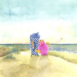
Create calm in your bedroom or living space
Tranquil beach scenes help create a restful atmosphere in rooms where you unwind. The gentle colors and horizontal lines in Starfish suit bedrooms, reading corners, or living areas where you want to encourage relaxation. Hang your chosen artwork at eye level when seated for the most calming effect.
RosanneStylist & Customer service Questions? Check out our FAQ
 -
More artworks below this tip
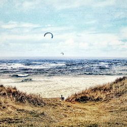
Balance warmth with cooler accents
Brown and taupe create warmth, while blue and grey add breathing space to your interior. If your room already features warm wood or neutral tones, introducing artwork with cooler blue or teal accents helps balance the overall feel. A good example is Starfish, which combines both warm beach sand and cool ocean tones.
LianneStylist & Customer service Questions? Check out our FAQ
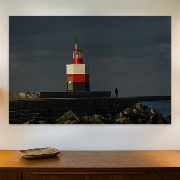
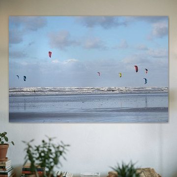
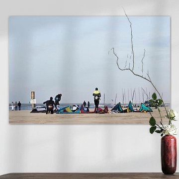
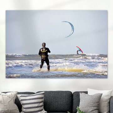
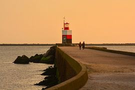
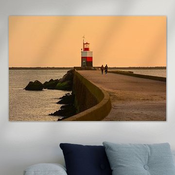
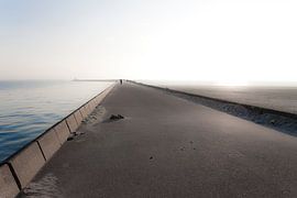
Wijk aan Zee
Searching for coastal artwork that captures the quiet beauty of the North Sea? Wijk aan Zee inspires artists with its dramatic skies, iconic lighthouses, and windswept dunes. The collection here ranges from serene blue-hour seascapes like blue hour to dynamic black-and-white surf photography, each piece reflecting the calm yet powerful character of this Dutch coastline. Soft blues, mauves, and sandy taupes dominate the palette, which makes these artworks a natural fit for modern, Scandinavian, or coastal interiors where light and space matter.
At Art Heroes, every piece is printed to order on your choice of material - ArtFrame™, Canvas, Poster, and more - so you can choose what works for your space and style.


Trusted and loved
Customers rate us 4.8!
High-quality materials
Sustainable and long-lasting beauty
Different sizes
From small to large, anything is possible.
Made for you
Made the moment you order.


More like this


Which colors from Wijk aan Zee suit a modern interior?
The blue, grey, and taupe tones in this collection work beautifully in modern and Scandinavian interiors. Pair soft greys with white or concrete surfaces for a clean, minimalist look. Blue accents add depth without overwhelming the space, while brown and mauve bring warmth to cool-toned rooms. These muted coastal shades create calm, layered interiors that feel both contemporary and inviting.
Where does art from Wijk aan Zee work well in your home?
This collection is a good spot for the bedroom, where the calm and mysterious moods help create a restful atmosphere. Photography and digital artworks inspired by coastal scenes bring a sense of openness without dominating the room. Hang a landscape or square format above your bed, or place a portrait piece on a sideboard. The subtle color palette complements natural textiles like linen and wool.
How to combine Wijk aan Zee with other decor
Style these artworks alongside natural materials that echo the coastal theme - think driftwood, ceramic vases, or woven baskets. The powerful yet calm mood pairs well with soft lighting and organic textures. Create a gallery wall mixing portrait and landscape formats for visual variety, or let a single square piece anchor a quiet corner. Add green plants to lift the grey and blue tones and bring life to the arrangement. Let the understated palette guide your room without dictating every detail.
