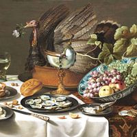
Pieter Claesz.
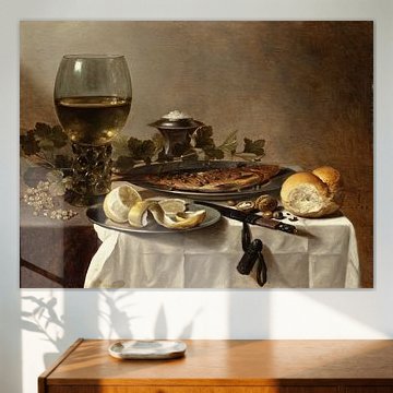
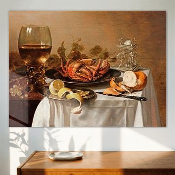
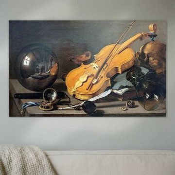
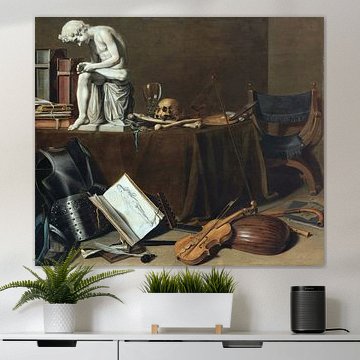
Looking for art that brings quiet sophistication to your walls? The still life paintings of Pieter Claesz capture everyday beauty with remarkable detail. His compositions feature oysters, lemons, glassware and bread arranged in serene harmony, which makes them timeless additions to classic or contemporary interiors. Warm browns, soft teals and muted golds create depth in each scene, while the calm, nostalgic mood invites peaceful contemplation.
At Art Heroes, we offer these Dutch Golden Age masterpieces as Canvas, Poster, ArtFrame™ and more - all custom-made to fit your space perfectly.
-
More artworks below this tip
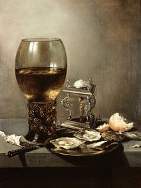
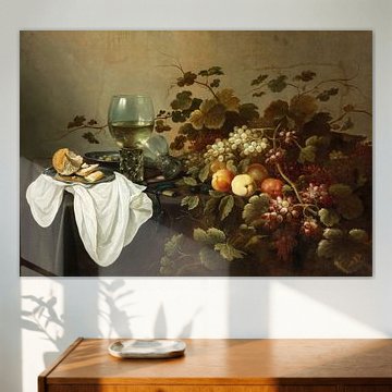
Working with Earthy Tones
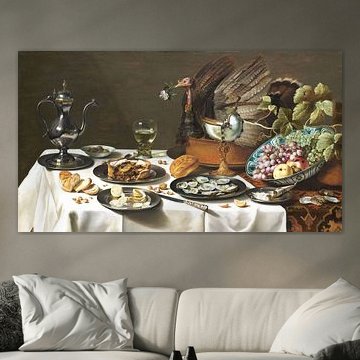
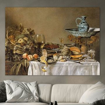
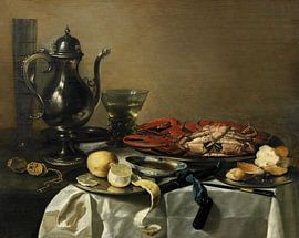
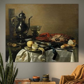
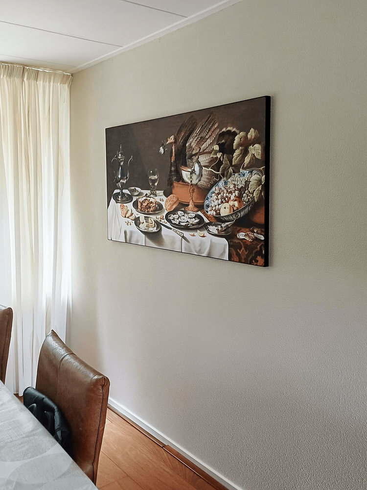
The warm brown and taupe tones in Still life with a peacock pie pair beautifully with natural materials in your room. Think wooden furniture, linen textiles, or terracotta accents. These earthy colors create a grounded, cohesive look that feels warm without overwhelming your space.
EileenStylist & Customer service Questions? Check out our FAQ
 -
More artworks below this tip
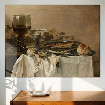
Room Pairing Advice
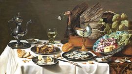
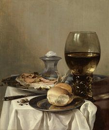
Historical still life scenes feel naturally at home in traditional dining rooms and kitchens, where food and tableware connect past and present. The calm, elegant mood in Pieter Claesz. Still Life with Turkey Pie also suits a study or reading corner, adding visual interest without distraction.
LianneStylist & Customer service Questions? Check out our FAQ


Be sure to check out the creative new masters
Our artists have created artworks inspired by the old masters.

Trusted and loved
Customers rate us 4.8!
High-quality materials
Sustainable and long-lasting beauty
Different sizes
From small to large, anything is possible.
Made for you
Made the moment you order.
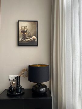
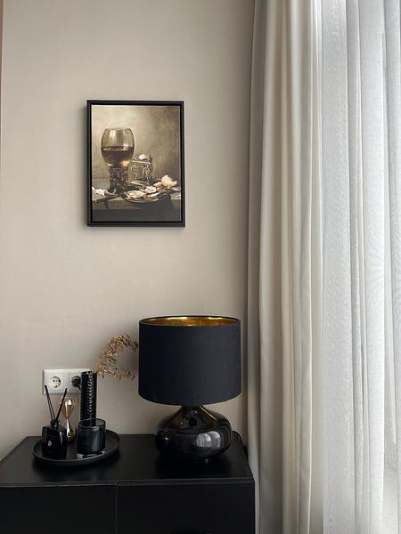
How they hang in other homes
Get inspired by beautiful artworks on other people's walls and see how they truly enhance an interior.


More like this


Choosing the right material for Pieter Claesz. still lifes

Pieter Claesz. comes to life on each of our premium materials. Whether you choose ArtFrame™, Canvas, or Poster, each enhances the unique details and warm color palette.
Choose ArtFrame™ and you benefit from interchangeable prints that let you refresh your space whenever inspiration strikes. The warm browns, taupes, and bronze tones in Claesz.'s still lifes gain depth against the modern aluminum frame, available in gold for a luxurious touch or black for sleek contrast. When you want to swap your artwork for a different mood, simply remove the print and replace it in moments - no need to buy a new frame. Additionally, ArtFrame™ offers acoustic functionality through optional sound-dampening panels that reduce echo and reverberation. These panels fit invisibly behind the print, making them ideal for home offices or living rooms where these calm, mysterious compositions deserve to be appreciated in comfort.
Still doubting which material suits your interior and chosen Pieter Claesz. artwork? Use our material comparator to find the perfect match.
How to style Pieter Claesz. with complementary decor
The calm and nostalgic mood of these still lifes pairs beautifully with natural materials and muted tones. Display your Claesz. artwork alongside warm wood furniture, earthenware ceramics, or dried botanicals to echo the organic textures found in his compositions. Soft linen textiles in beige and taupe create a cohesive look, while brass or bronze accents subtly reference the metallic glints in his painted objects. These artworks work especially well in dining rooms or reading corners where their quiet, contemplative character invites closer observation.
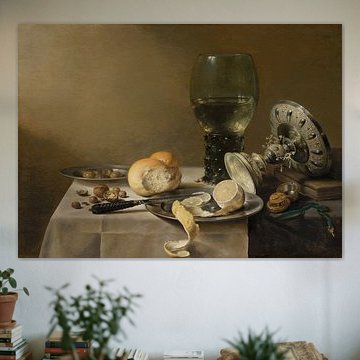
Which format works best for Pieter Claesz. artworks

Landscape format dominates this collection, reflecting the horizontal compositions favored by Dutch still life masters. Hang a landscape Claesz. above a sideboard or dining table where the elongated format naturally complements the furniture beneath. This orientation draws the eye across the carefully arranged objects, enhancing the narrative quality of each scene. Portrait and square formats offer elegant alternatives for narrower walls beside doorways or in hallways, where vertical space deserves attention without overwhelming the passage.
