-
More artworks below this tip
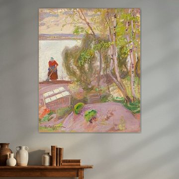
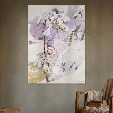
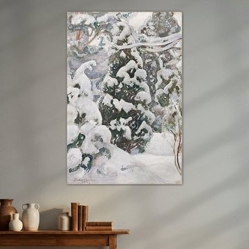
Working with muted winter tones
Soft, cool palettes need careful color companionship to avoid feeling cold. The mauve, grey, and beige shades in Village in Winter, 1913, Pekka Halonen pair well with warm wood furniture or cream textiles to balance the cooler tones. Add natural materials like wool or linen to bring warmth into the space.
EileenStylist & Customer service Questions? Check out our FAQ
 -
More artworks below this tip
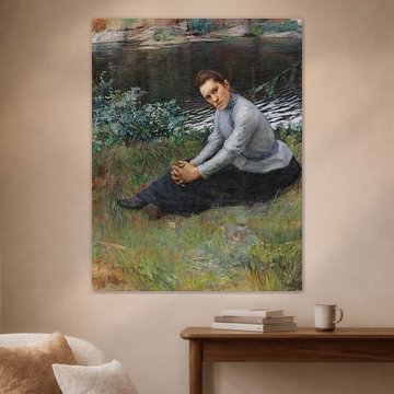
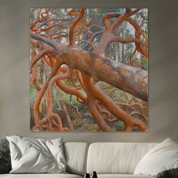
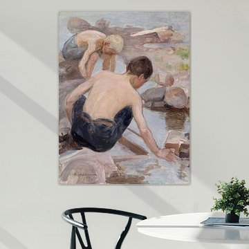
Choosing earthy accents for natural scenes
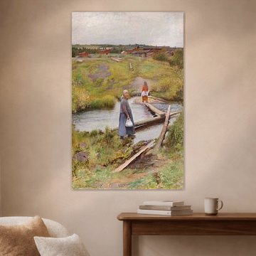
Artworks featuring natural settings often benefit from echoing their organic colors elsewhere in the room. The olive green and brown tones in Sitting on the Shore, 1893, Pekka Halonen connect beautifully with terracotta pots, wooden frames, or moss-green cushions. These earthy touches help the artwork feel rooted in your space.
RosanneStylist & Customer service Questions? Check out our FAQ
 -
More artworks below this tip
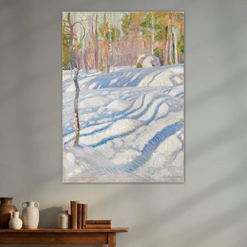
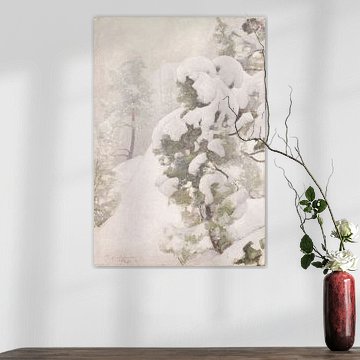
Pairing tranquil art with the right room
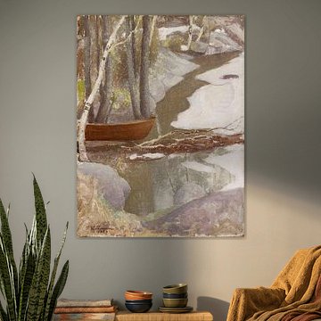
Artworks with a calming mood often work beautifully in spaces where you unwind. The serene atmosphere of Winter Landscape, 1899, Pekka Halonen makes it well-suited to bedrooms or reading corners, where its quiet winter forest scene can help create a restful retreat. Choose a room where gentle reflection feels natural.
AnthiStylist & Customer service Questions? Check out our FAQ
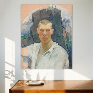
Pekka Halonen
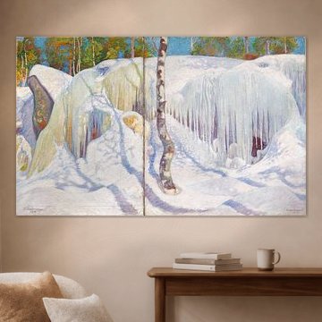
Pekka Halonen captures the quiet beauty of Finnish nature with remarkable clarity. His winter scenes and forest landscapes bring a sense of calm that feels both timeless and deeply personal. The soft color palettes and serene compositions, like those in Sunlit Winter Landscape, 1911, Pekka Halonen, suit interiors that value simplicity and connection to nature.
Art Heroes offers these artworks custom-made in various materials including Canvas, Poster, and more. Each piece ships free, letting you bring a touch of Nordic tranquility into your space.


Trusted and loved
Customers rate us 4.8!
High-quality materials
Sustainable and long-lasting beauty
Different sizes
From small to large, anything is possible.
Made for you
Made the moment you order.


What format works best for Pekka Halonen artworks?
The earthy tones and delicate brushwork in Pekka Halonen's paintings look particularly strong in horizontal formats. These wider compositions suit the calm, nostalgic character of his work beautifully. A horizontal piece works well above a sideboard or dining table, where the extended format complements the furniture beneath. If you're working with a narrower wall space, a square format can be a good alternative that still captures the gentle mood.
Where Pekka Halonen paintings work well in your home
A bedroom is a good spot for Pekka Halonen's calm and nostalgic artworks. The muted palette of browns, taupes, and olive greens creates a restful atmosphere that helps you wind down at the end of the day. Hang a piece above your bed or on the wall opposite to set a soothing tone. Pair it with natural linen bedding and wooden furniture to echo the organic feel of his painting technique.
How to combine Pekka Halonen with other decor
The delicate mood in Pekka Halonen's work pairs naturally with soft textiles and warm wood accents. Think woolen throws in beige or grey, ceramic vases in earthy tones, or dried botanicals that echo the olive green hues in his paintings. You can also create a small gallery arrangement by mixing different sizes of his artworks on one wall, keeping the spacing generous to preserve the calm character. Let the quiet beauty of these paintings anchor your space with warmth and timeless appeal.
