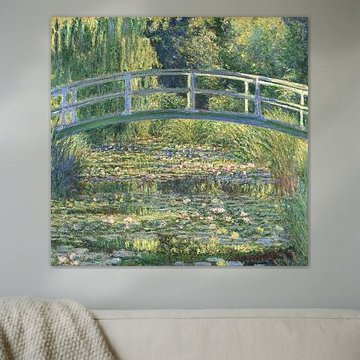
Impressionism (Old Masters)
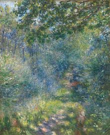
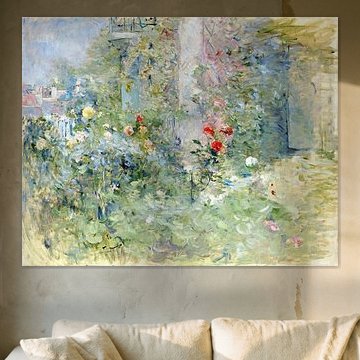
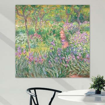
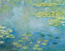
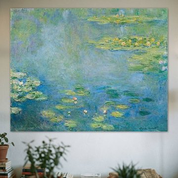
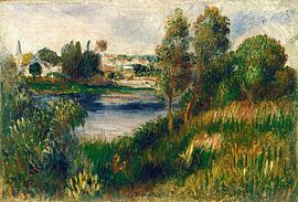
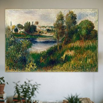
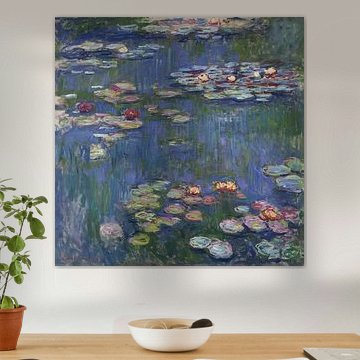
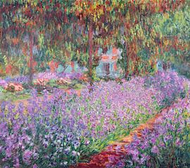
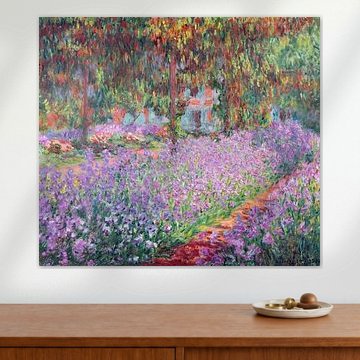
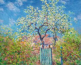
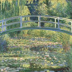
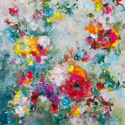
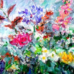
Impressionism captures light, color, and fleeting moments in ways that feel alive. Soft brushstrokes and shifting tones bring warmth and movement to any space. From Renoir's dappled forest paths to Monet's luminous garden scenes, these artworks add depth and tranquility to modern interiors. August Renoir. In the forest glows with autumn hues, while The Artist's Garden at Giverny, Claude Monet radiates vibrant springtime energy.
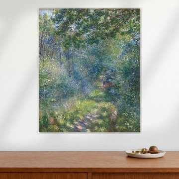
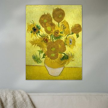
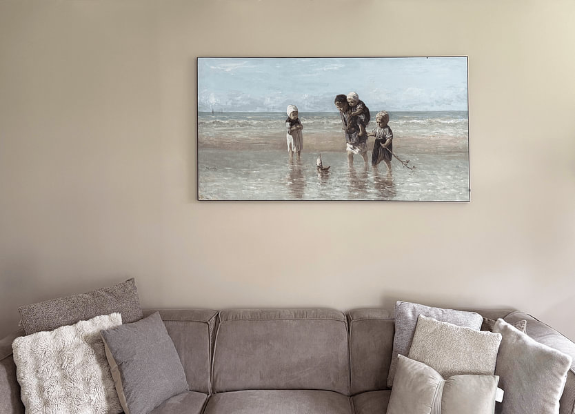
At Art Heroes, we print your chosen piece to order on Canvas, Poster, Wallpaper and more. Discover what suits your space.
-
More artworks below this tip
Match your artwork to your lighting
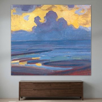
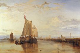
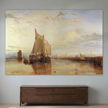
Paintings with muted, earthy colors reveal their detail best in natural daylight or warm artificial light. If your room has cooler lighting, the olive and bronze tones in Wijnhaven, Pieter J. A. Wagemans may appear flatter. Position your artwork near windows or use warm bulbs to bring out texture and depth.
RosanneStylist & Customer service Questions? Check out our FAQ
 -
More artworks below this tip
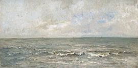
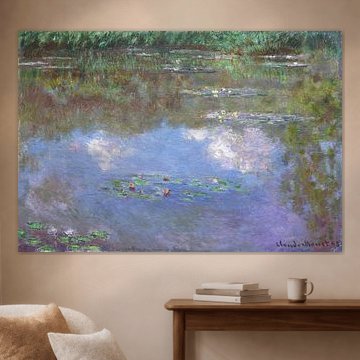
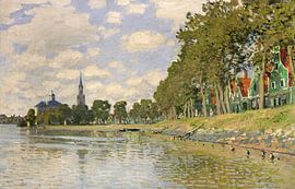
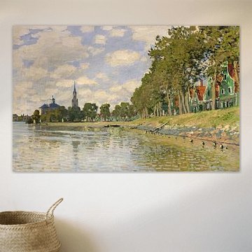
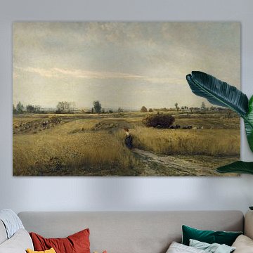
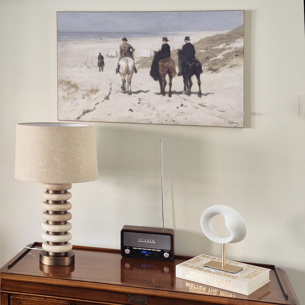
Where to place canal and landscape scenes
Horizontal compositions with open skies and water benefit from eye-level placement in living rooms or hallways. The expansive sky and architectural detail in Wijnhaven, Pieter J. A. Wagemans draws the eye naturally when hung where you can view it from a comfortable distance - ideally across the room or along a corridor.
AnouschkaArt Stylist Questions? Check out our FAQ
 -
More artworks below this tip
Earthy tones create natural harmony
The warm brown and beige palette in Potato-picking peasant women, Vincent van Gogh pairs beautifully with natural materials like wood, linen, and terracotta. These earthy tones work especially well alongside soft greens or neutral grays. Layer different shades of brown together to add depth without overwhelming your space.
KatharinaStylist & Customer service Questions? Check out our FAQ


Be sure to check out the creative new masters
Our artists have created artworks inspired by the old masters.

Trusted and loved
Customers rate us 4.8!
High-quality materials
Sustainable and long-lasting beauty
Different sizes
From small to large, anything is possible.
Made for you
Made the moment you order.
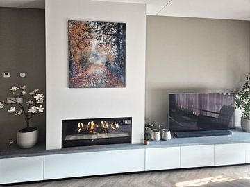
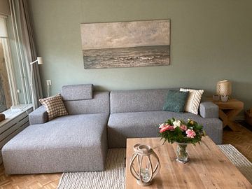
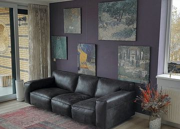
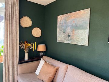
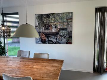
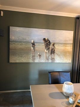
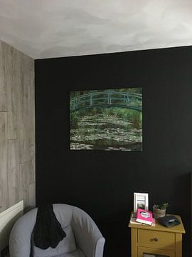
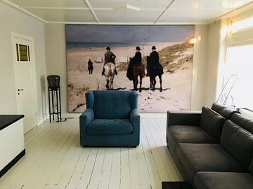
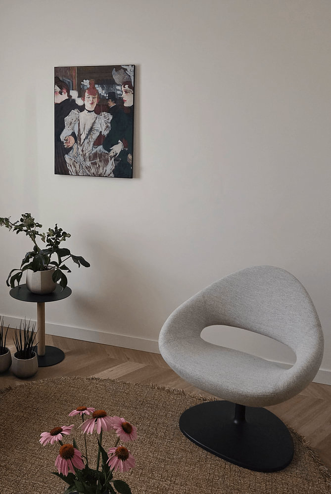
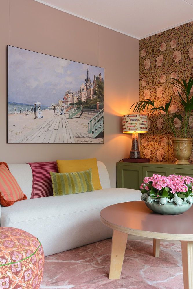
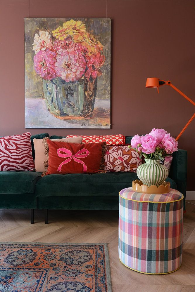
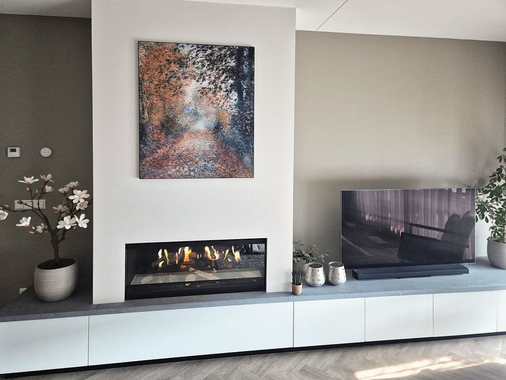
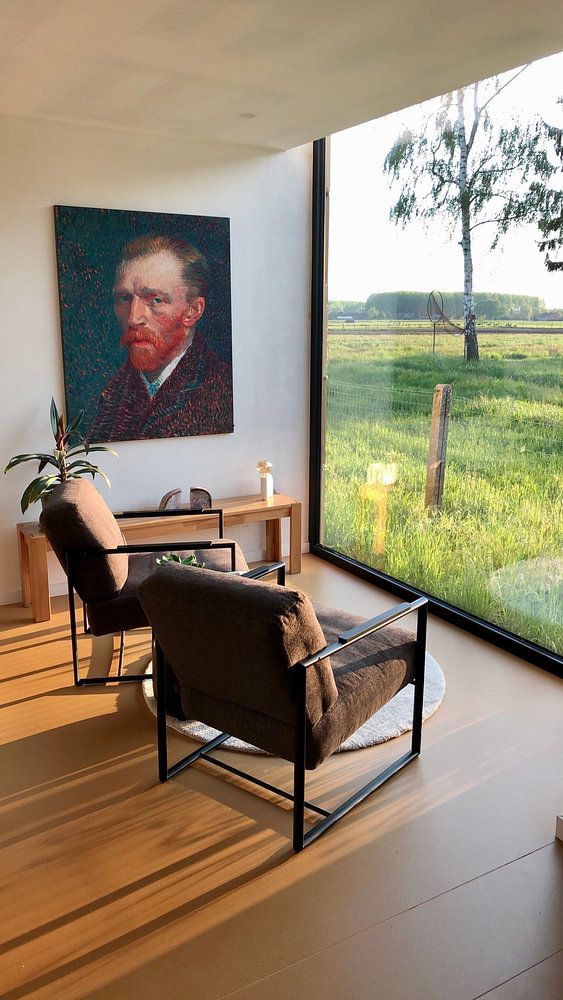
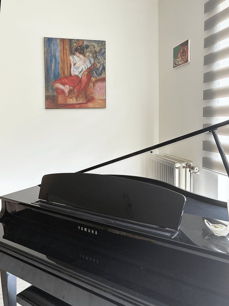
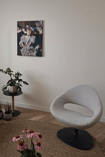
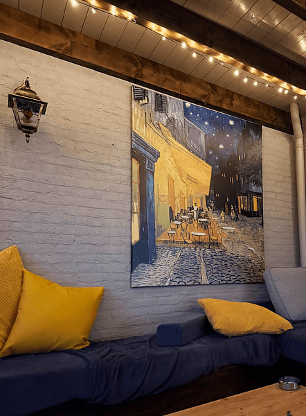
How they hang in other homes
Get inspired by beautiful artworks on other people's walls and see how they truly enhance an interior.


More like this


Which colors from Impressionism (Old Masters) suit a modern or Scandinavian interior?
The soft palette of Impressionism (Old Masters) works beautifully in contemporary spaces. Brown and beige tones create warmth in minimalist Scandinavian rooms, especially when paired with natural wood furniture and light textiles. Olive green and sage green add depth to modern interiors - try combining these earthy shades with white walls and metallic accents. Early Dew brings a subtle freshness that complements both styles without overwhelming the space.
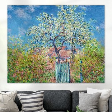
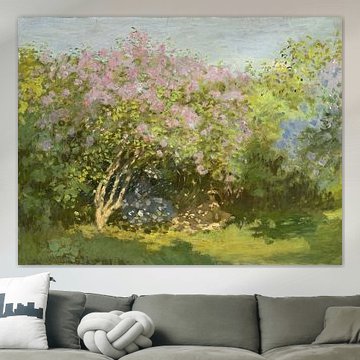
Where do horizontal formats work best for Impressionism (Old Masters)?
Horizontal artworks from the Impressionism (Old Masters) collection suit wide wall spaces perfectly. Hang them above your sofa, sideboard, or bed to create balance and draw the eye across the room. These proportions work particularly well in living rooms and bedrooms where you want to emphasize width rather than height. If you have a narrow hallway or a tall wall beside a staircase, consider a vertical format instead to make better use of the space.
How to style Impressionism (Old Masters) with other decor elements
The calm and nostalgic mood of Impressionism (Old Masters) pairs naturally with vintage-inspired accessories and organic materials. Style these artworks alongside ceramic vases, linen cushions, or dried botanicals to enhance the serene atmosphere. The vibrant brushwork also creates interesting contrast when combined with modern sculptural objects or brass candleholders. For a cohesive gallery wall, mix different sizes of Impressionism (Old Masters) artworks and leave generous spacing between frames to let each piece breathe.
Bring the gentle beauty of Impressionism (Old Masters) into your home with ArtFrame™, available in gold, silver, black, or white frames.
